3D Walkthrough For A Luxury Penthouse in Ottawa
This 3D walkthrough for a luxury condo was created for Surface Developments, a premium real estate development company in Ottawa. They sell upmarket housing and offer custom design services, so that the buyer doesn’t need to go search for designers elsewhere. Instead, they can get with Surface Developments a ready apartment that was designed to suit their every need.
That was exactly what the 3D walkthrough needed to showcase. Our task was to demonstrate how one condo can be adjusted to totally different tastes and wishes. The resulting video ad is now placed on our clients’ website https://surfacecondos.com/why-surface/custom-design/.
Wonder what the pipeline of the 3D walkthrough production looked like? Read further to follow our work step by step.
3D Animation Team
The project team included 3 Senior 3D Artists, one of them being a Team Leader. They split the workload and remained in close communication throughout work so as to create a glamorous, cozy, and a stylistically cohesive project. As for the software, the team worked in 3DS Max and Vray.
The Main Object
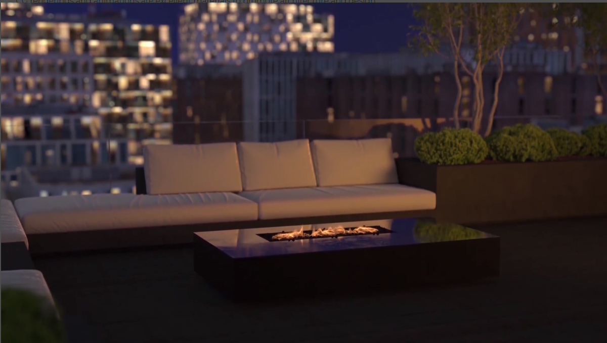
The 3D walkthrough was to take the viewers around a luxurious penthouse in Ottawa. The apartment was an imaginary project, designed specifically for the ad. For the sole function of the architectural animation was to show how Surface Developments can turn the space into anything their client wishes.
As you’d see in the next paragraph, the character of the project had an impact on the brief for the 3D walkthrough. Our 3D animators had a lot of creative freedom and could tweak the concept when it’d benefit the ad.
Technical Assignment
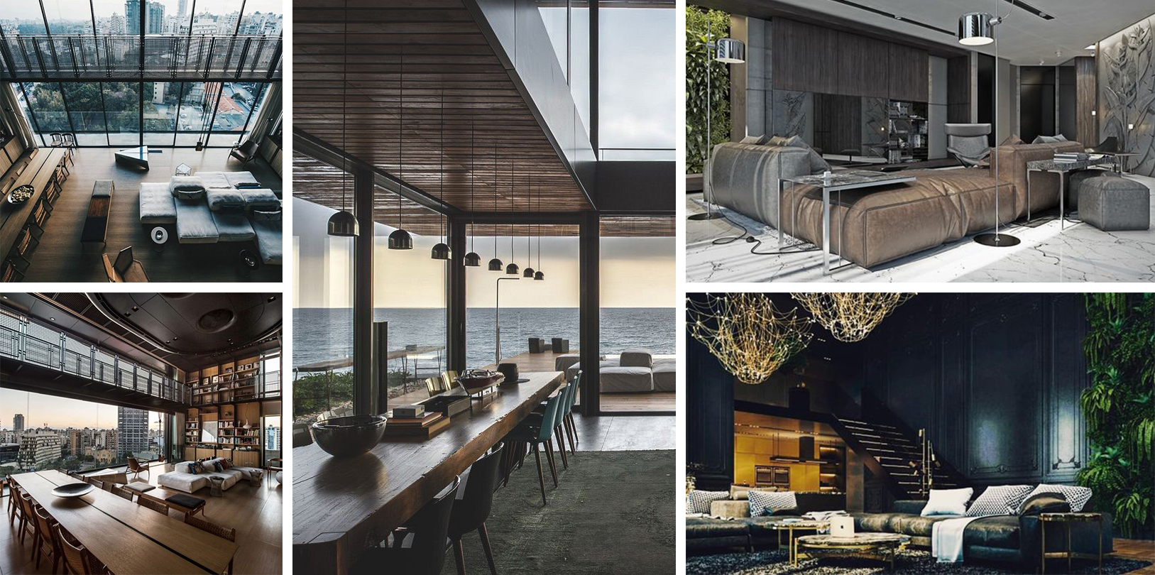
We worked with Jakub Ulak, President of Surface Developments. He sent us a detailed brief, which included the following elements:
- A hand-drawn plan;
- Sketchup model;
- CAD model;
- Interior design legend;
- Written description saying that the result was to be an eye-level walkthrough showcasing a condo unit in 3 styles with the lighting transitioning from day to night;
- A scenario for camera movements with illustrations;
- Reference imagery for 3 styles to feature in the video – NY Loft, Sophisticated Modern, Transitional.
Updates to the Concept

The assignment Jakub sent for the 3D walkthrough was very thorough and professional, and he specifically added that we could suggest changes. So we tweaked the space plan a little bit for added effect and proposed to change the way interior design transformed.
Initially, Jakub wanted the design to change as the camera went through space. That meant a lot of objects moving, appearing, and disappearing. Which would sure look amazing, but also require a large budget and additional time. So we proposed to hide the transformation itself and show the result only.
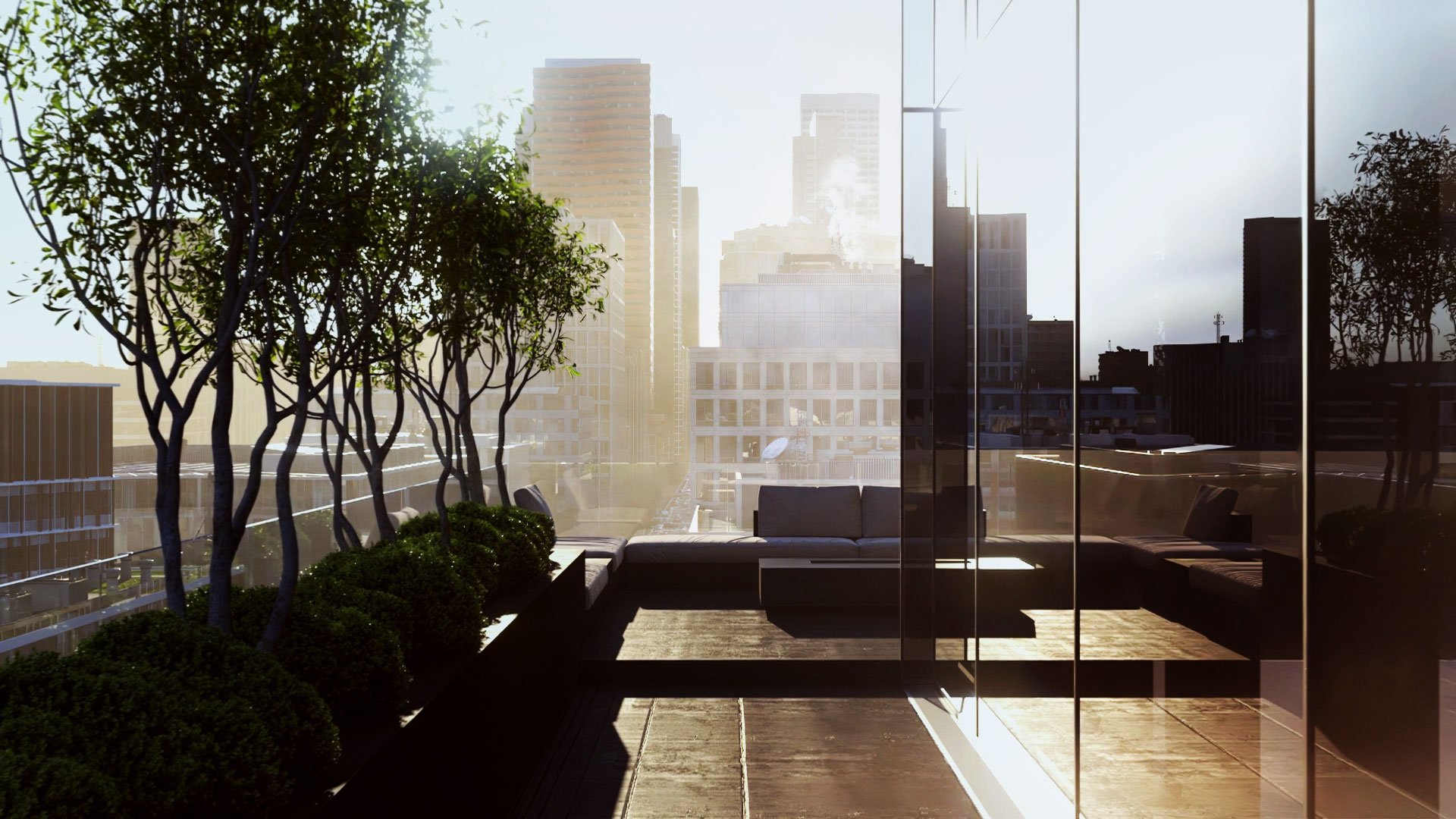
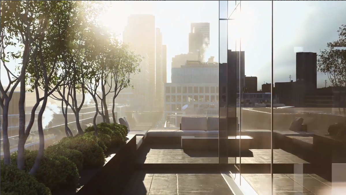
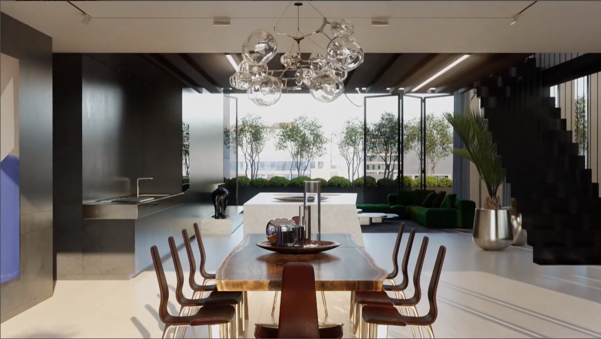
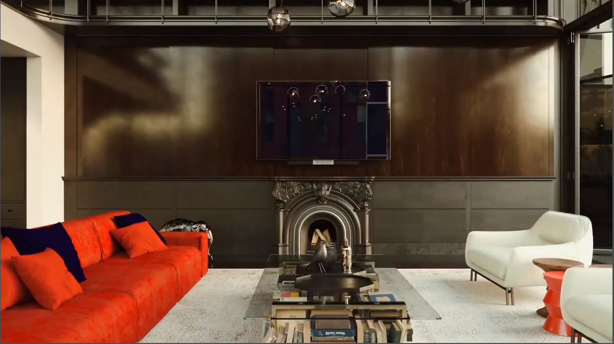
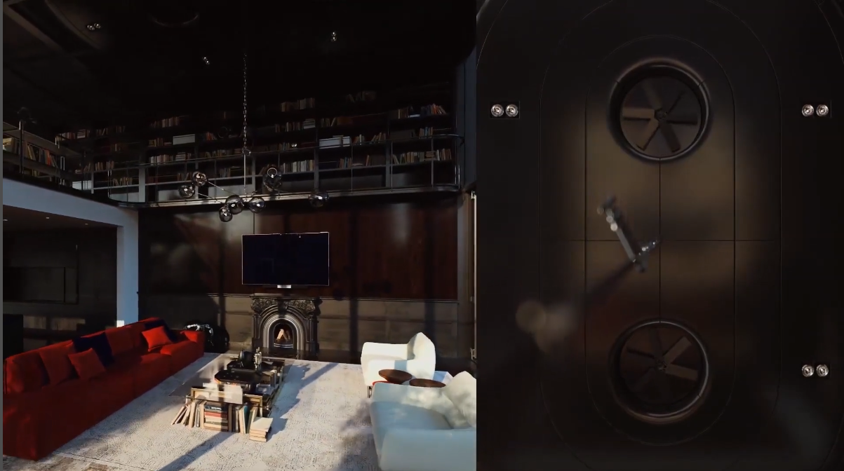
Jakub approved the idea and this is the technique you can see in the final 3D walkthrough. The first transition happens when the camera has walked us across space and approached the stairs. For a brief moment, the stairs bar the view, and when the camera emerges, we see that the space looks totally different. New style, new mood, new atmosphere – and that in the same apartment!
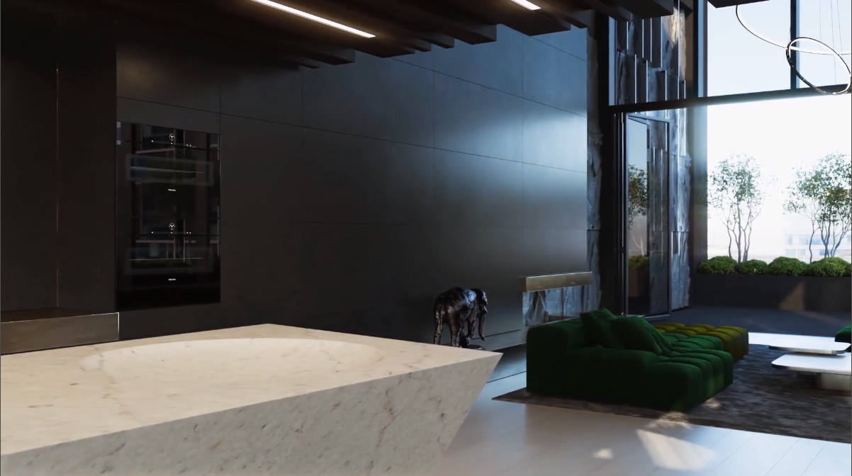
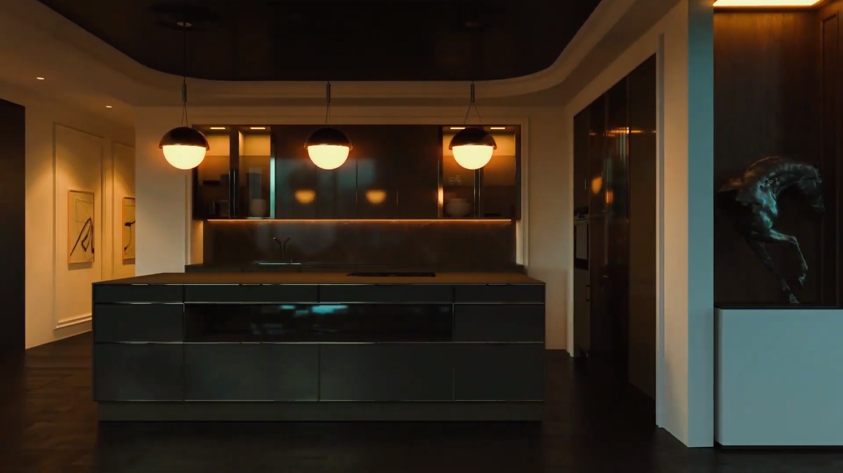
The second transformation happens when the camera walks back past the kitchen. In a blink of an eye, the kitchen interior transforms, and we see a completely new kitchen and even catch a glimpse of a transformed living room we’ve left behind. Again, we see a totally new look. Neat and elegant, don’t you think?
Ensure your exterior design project leaves a lasting impression and takes your clients’ breath away with stunning visuals.
The Working Process
Now that we know about the input and concept, let’s discover how our 3D Animators worked on this 3D walkthrough.
Building Architecture
Based on the Sketchup model that Jakub had sent, the 3D Animators built a 3D model in 3DS Max. They built the walls, ceiling, and floor.
Filling the Scenes
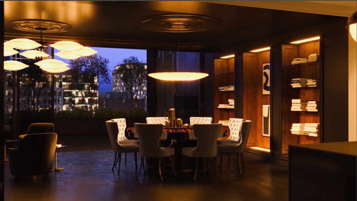
Once the architecture was in place, the 3D artists started work on interior design. They developed the layout and functional zoning for each space, chose furniture, and put their 3D models in the scene.
At that very time, the Team Lead agreed with the artists on which parts of each space will be seen in the 3D walkthrough. This way, they built:
- sophisticated modern design apartment – in full
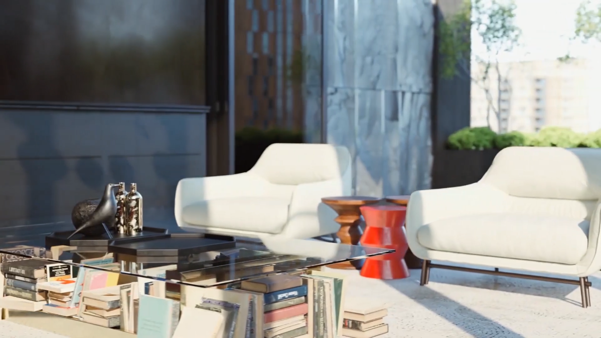
- loft design apartment – except for the dining area
- transitional style apartment – except for the living area, which is built only in part.
Final 3D Walkthrough
Once everything was ready, the Leading 3D Artist sent the result to the rendering farm and waited for the animation. When it was ready, he added a few final touches to improve color balance and atmosphere, and that was it!
The team of our 3D interior renderings company enjoyed working on this 3D walkthrough. The task was creative, ambitious and the client – highly professional, a sheer pleasure to work with. Not to mention we admire the work of Surface Developments and what they stand for – a comfortable and unique home for every client. A dream come true!
CG renderings and animations are excellent materials to promote architecture and design. One can use computer-generated imagery on the website, social media, banners, presentations, and pitching, listings, brochures, flyers, and billboards, etc. And there’s nothing like a creative video ad to show off an excellent offer!
Need high-impact visuals for your marketing campaign or sales? Contact our architectural visualization company for services. We’ll create for you attention-grabbing imagery that’ll make your clients’ hearts beat faster!

Irma Prus
Content Writer, Copywriter
Irma writes articles and marketing copy for ArchiCGI. Her dream is that more people discover the power of CGI for architecture. Irma is into neuromarketing, ruby chocolate and Doctor Who series.
Like this project? We’ve got plenty more! Check out these CGI beauties.



Comments
Sam
Dan
Cliff Martin