CG Rendering companies help Architects and Interior Designers present their projects and win presentations with excellent visual materials. Yet not all 3D companies provide the same level of services. Mistakes in choice lead to inferior quality of the three-dimensional rendering and complications at negotiations. Sometimes the colors aren’t correct, the scale is wrong or the overall rendering looks rough and therefore doesn’t do the design justice.
But all CG Rendering companies promise to deliver the quality that’ll amaze the clients and present the design in all its splendor. None of them says “Well, you know, we’re still struggling with V-Ray, but we are eager to try. What do you think?”.
How does one make the right choice in such conditions?
There are two ways to proceed:
- Trial and error: rely on intuition and accept that a certain quantity of failures is inevitable on the road to success.
- Examine the portfolio of a cg rendering company before starting communication. Analyze the quality of the renders the studio have done before and contact only the ones meeting all your standards.
The second option looks cheaper and more reliable. But how does one analyze a cg rendering properly?
Actually, this is something you can learn within 5 minutes. Just read these 5 easy criteria and use them every time you look at the portfolio of an Architectural Visualization Studio.
5 Criteria To Understand The Quality Of A CG Rendering
Now, let’s imagine you’ve opened the Portfolio page of a certain 3D company. The first look at the renders doesn’t make you scream in horror, so you proceed to more in-depth analysis.
#1. The Daylight Is Neutral

Sometimes you see that the cg rendering looks cold and lifeless. Everything is right, but objects have a bluish hue to them, and the overall impression is unpleasant.
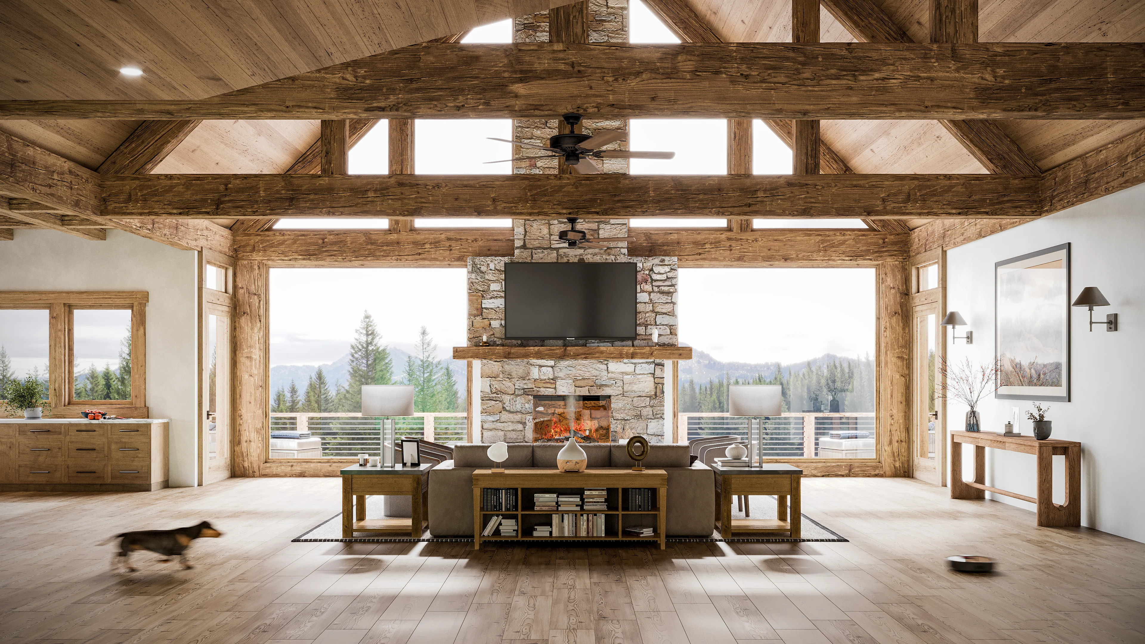
That happens when the camera balance and V-Ray (rendering plugin for 3D Max) settings are off. The daylight should be neutral – like on the cg image above. The beams of light coming through the window are pure white, without a hint of blue. As a result, the interior looks bathed in sun, lively and inviting.
#2. The Nightlight At The CGI Rendering Should Be Cold

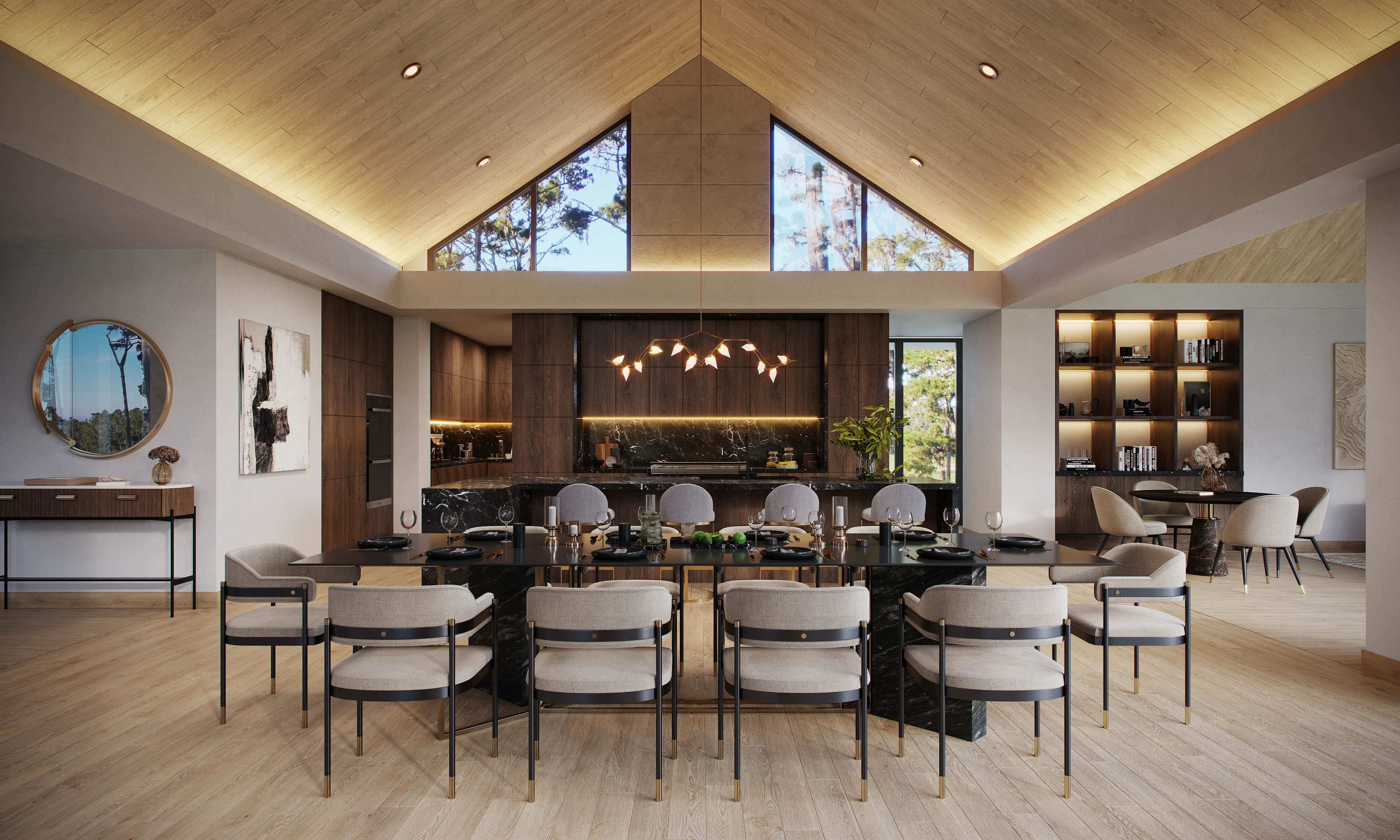
To create a comfortable night environment, 3D artists must use a Vray night HDRI environment instead of VraySky. They must also adjust Vray Light settings. Take a look at the 3D render above. The cold light fills the room with crispness and gives it an edge. The overall atmosphere is festive, and the interior design looks harmonious.
The ability to set the light in 3D Max is a key quality to consider when judging a 3D rendering for interior designers. It can make or break the image.
Take your design presentation to a new level with interior rendering
#3. The Light Emanates From A Certain Source

Sometimes there is a sort of “fantom” light in the architectural cg render that comes from nowhere. And you can see that the lighting is too sharp in the areas concerned. It looks unnatural, for materials thus reflect more light than they get from the source – the sun, chandelier or spotlights.
The origins of this mistake can be different. Most often, 3D Artist decides to liven the scene up and add additional lighting with Photoshop at the post-production stage, or increase the existing one. Anyway, it is important to remember that all light should come from a visible source and have a corresponding brightness.
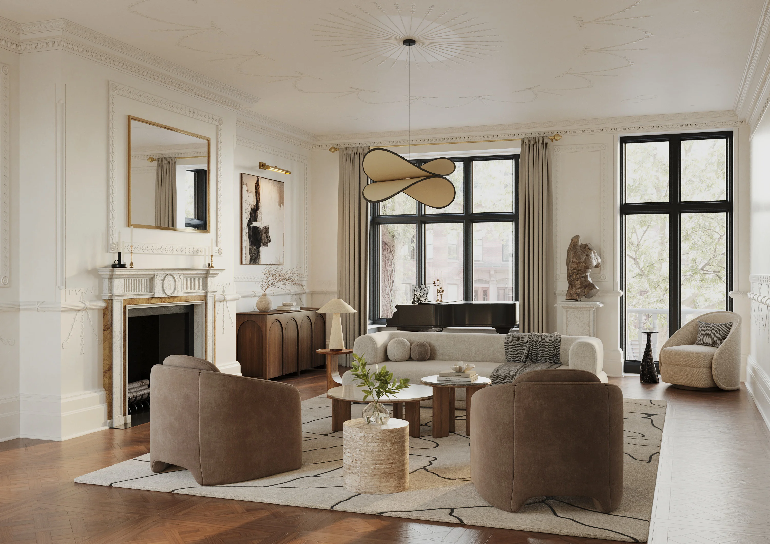
Take a look at the interior design CG Image above from ArchiCGI 3D rendering company. You find no light patches or materials looking burned out. The reflective surfaces shine evenly, and the quantity of light bouncing off is perfectly natural. One could mistake this render for a photography!
#4. The Composition Of The CG Rendering Has A Center

When there is no centre in the composition, the architectural CG render looks chaotic. It is much like a picture taken by accident. It means the 3D artist did not apply the rule of thirds.
According to the rule of thirds, a CG rendering must be divided into nine even parts by four lines. Two lines are horizontal. Two lines are vertical. The objects of focus should be placed at the intersection of these lines. As a result, the 3D interior render looks full of impact and harmony. This is the most basic rule of storytelling for 3D rendering services for interior design.
#5. The Presence Of All Objects In The Scene Is Functionally And Stylistically Justified

Decor is of the utmost importance to the atmosphere of a space. This is true for any type of interior, whether it is a residential or restaurant 3D visualization.
A small detail can spoil a scene. For example, a mixer tap instead of a kitchen faucet, or a jacket hanging in the bathroom instead of a gown. There is nothing wrong with it technically. However, it compromises the story of the 3D rendering.
Professional CG rendering artists are trained to create and enhance the story with details like decor. If the project is a house for a high flying businessman, the wardrobe should be filled with suits. If the house is located in Miami, there will be palms by the window, not pines. This way, the client can picture himself living in such a house.
Now you know how to evaluate the quality of a cg rendering in portfolio of a company and find the partners that will help to produce a long-lasting impression at the Design Presentation. Moreover, you can use these rules to judge the quality of the cg images you get from them.
And for the cg images that meet all quality requirements and exceed your expectations, contact ArchiCGI. We’ll make sure that the Design is represented at its best, with all functional and aesthetic advantages highlighted, and with a dizzying photorealism.
You can learn more about ArchiCGI services and get an estimate cost of your project by contacting our Project Managers via the form on the website or email address.
Want to learn how much your project costs? See how we evaluate 3D rendering projects
May your cg renderings be photorealistic beyond measure, and partners – reliable!

Irma Prus
Content Writer, Copywriter
Irma writes articles and marketing copy for ArchiCGI. Her dream is that more people discover the power of CGI for architecture. Irma is into neuromarketing, ruby chocolate and Doctor Who series.


