Realistic Architectural Rendering for a Modern Villa
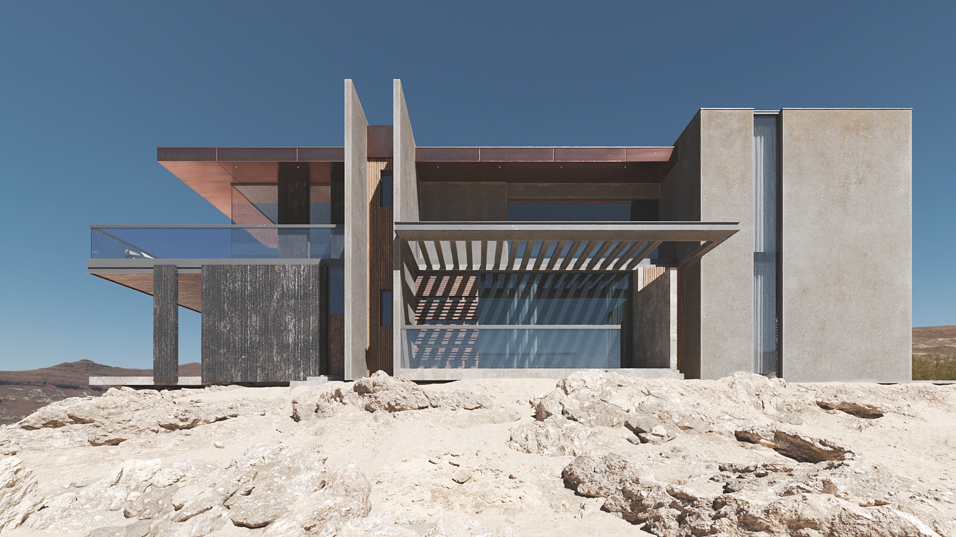
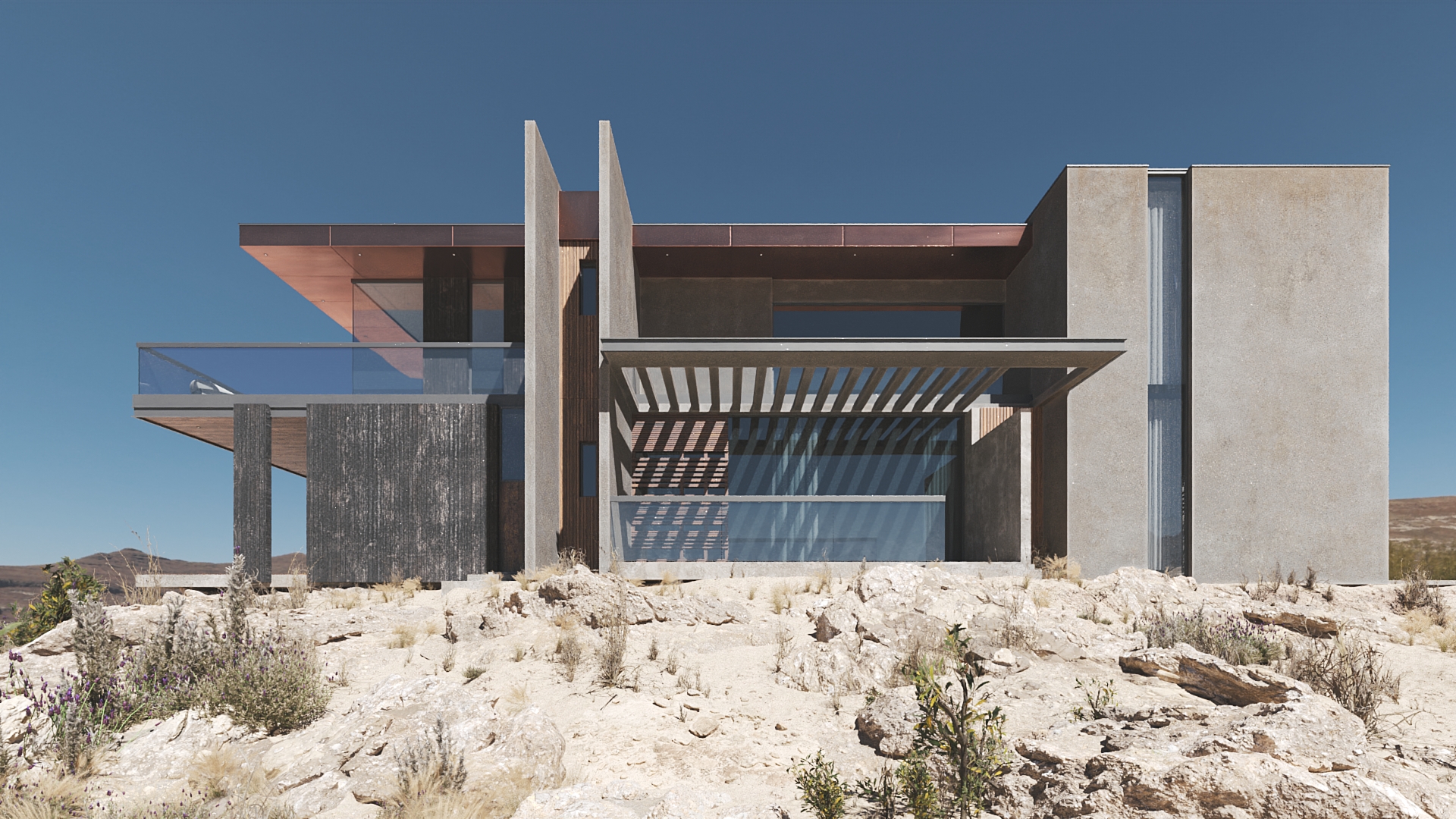
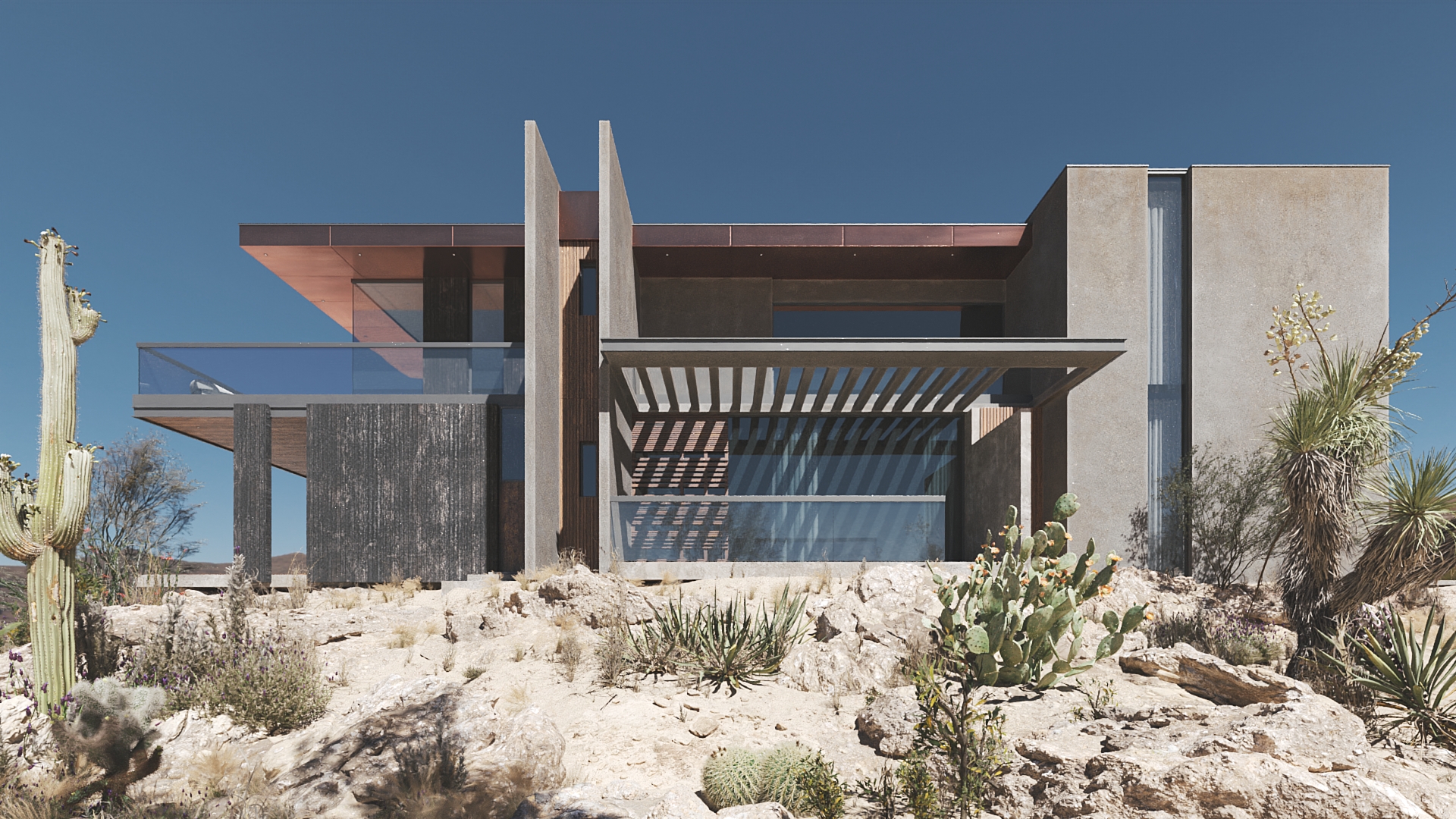
Doesn’t this realistic architectural rendering look like a photo? A beautiful pic from a magazine. Yet it’s a computer-generated image of the finest quality. Anton Berezhnyi, a senior 3D artist at ArchiCGI, created it to showcase how a 3D render can present a luxurious property.
And the answer is – with accuracy, impact, and style. Just look. Everything’s perfect about the image: composition, materials, lighting, atmosphere, color balance. The villa looks utterly chic.
Anton created this architectural rendering service for an internal competition. Which means there wasn’t any technical assignment as such, and the 3D artist was free to develop any concept. As he was searching for ideas, he remembered a project he had worked on once. This was a concept of a modern house that he liked immensely. Anton decided to transform it into something completely different and place it in a new environment. You can see the result! Now, let’s find out how the 3D visualizer came up with the idea and created this breathtakingly realistic architectural rendering.
The Location
The villa could be situated in California state, in a desert, about a 30-minute drive from the nearest city. The property is an ultimate retreat for a hard-working creative person who needs to escape from a hectic urban life, find inspiration and listen to one’s own thoughts.
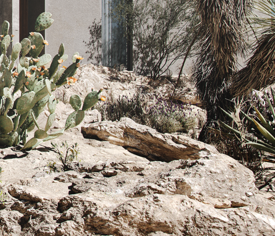
And the landscape in the rendering is perfect for that. It has nothing to remind the occupant about civilization. The hill on which the house is situated is irregularly shaped, strewn with stones, peppered with cactuses. Not a hint of a garden, no traces of attempts to create a manicured lawn. The house stands like an oasis in an untamed desert.
The Property
The property in the realistic architectural rendering is suited for rent. The occupants would find there lots of space, light, a comfortable minimalist interior, and breathtaking views. Just like in the landscape, everything here is about rest. There isn’t a detail extra.
The task of the 3D rendering was to showcase and sell the idea of such a retreat. So the 3D artist wanted to show the appeal of the design to the target audience, its potential to make occupants come back later and recommend the retreat to friends.
Realistic Architectural Rendering Creation
Developing a concept from scratch and delivering a 100% photorealistic, technically impeccable image requires time, effort, and careful planning. For the purpose of reading, the process was broken down into neat, easy steps. Enjoy the read and the result!
#1. Architectural Design
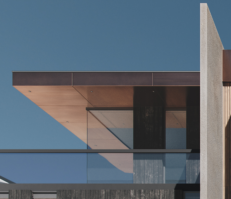
To adjust the villa to the new 3D rendering concept, the 3D artist altered its appearance. The architecture remained the same, yet the cladding materials were different. In particular, the plaster changed from white to gray, and the brown wood – to black. There were also a few new thoughtful details like a recycled wood wall and columns, and copper roof plates. The latter would look amazing in this desert aesthetic. Copper would reflect the sky, yellow sand, and glitter in the sun. Adding reflective metal was inspired by Freddie’s Mercury car that the 3D visualizer had seen in “The Bohemian Rhapsody” movie.

#2. Searching for Environment Inspiration
To find the references, the 3D visualizer looked through hundreds of desert scenes on the Internet. He selected 17 photos he liked best and used them as inspiration for his realistic architectural rendering.
#3. Low-Poly 3D Modeling
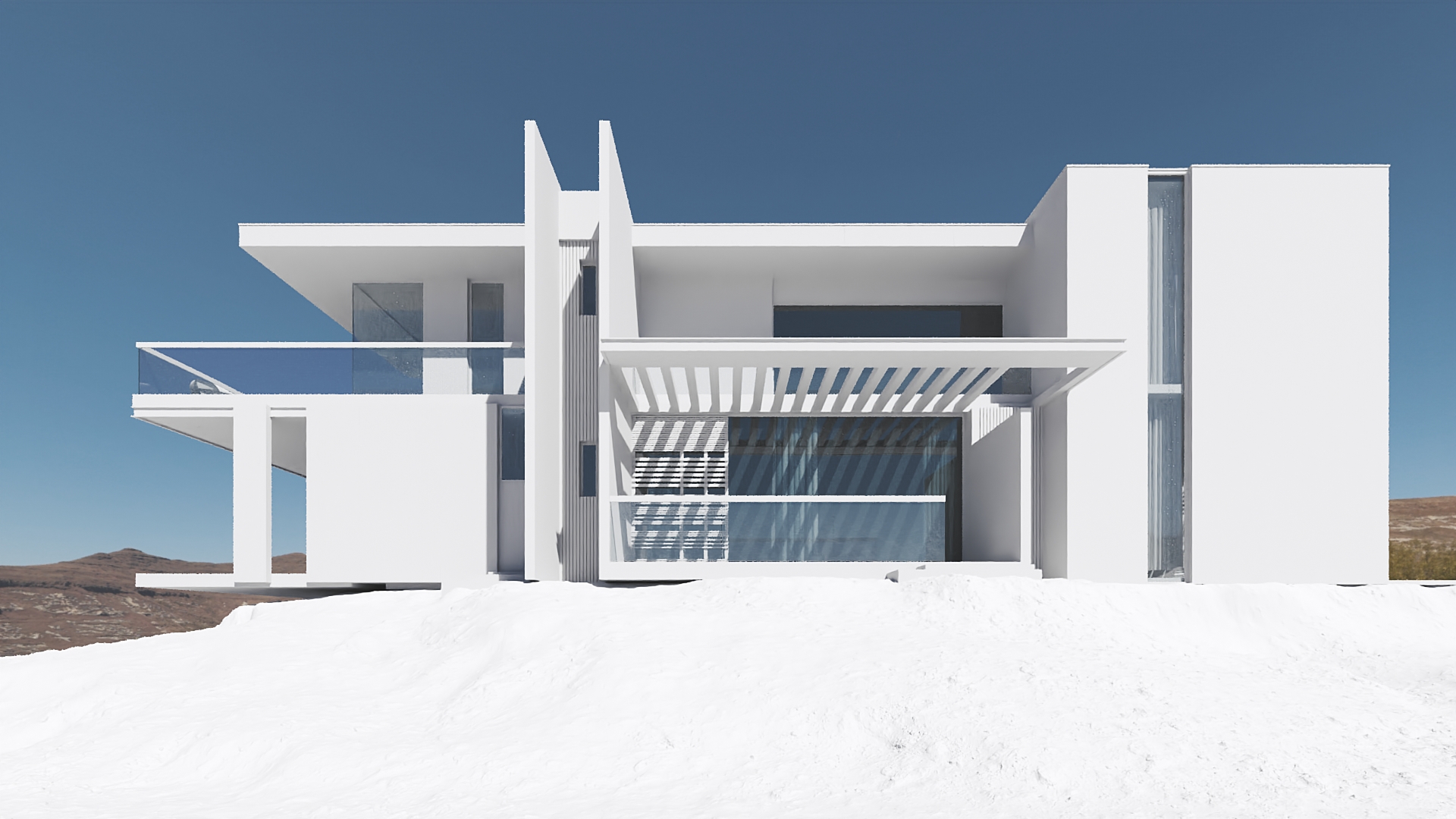
Anton created a mass 3D model, put it in the center of the scene, and started to build the composition. He tried different options, estimated the effect, and settled for a hill with stones and scarce greenery. Then, the 3D visualizer roughly modeled the landscape and got a low-poly 3D model of the scene.
#4. CG Landscape Modeling
At this stage, the CG artist added details to the 3D model geometry. Then, it was time to develop the landscape geometry in high detail. So the CG artist refined the terrain by specifying its shape, adding slopes. He also introduced variety to the scene – an essential element of a realistic architectural rendering.
For perfect symmetry never looks natural. Unless it’s a well-kept French garden, there always should be an element of randomness to the environment. For that purpose, Anton added large stones to the hill and made the slopes tilt at different angles.
#5. Texturing
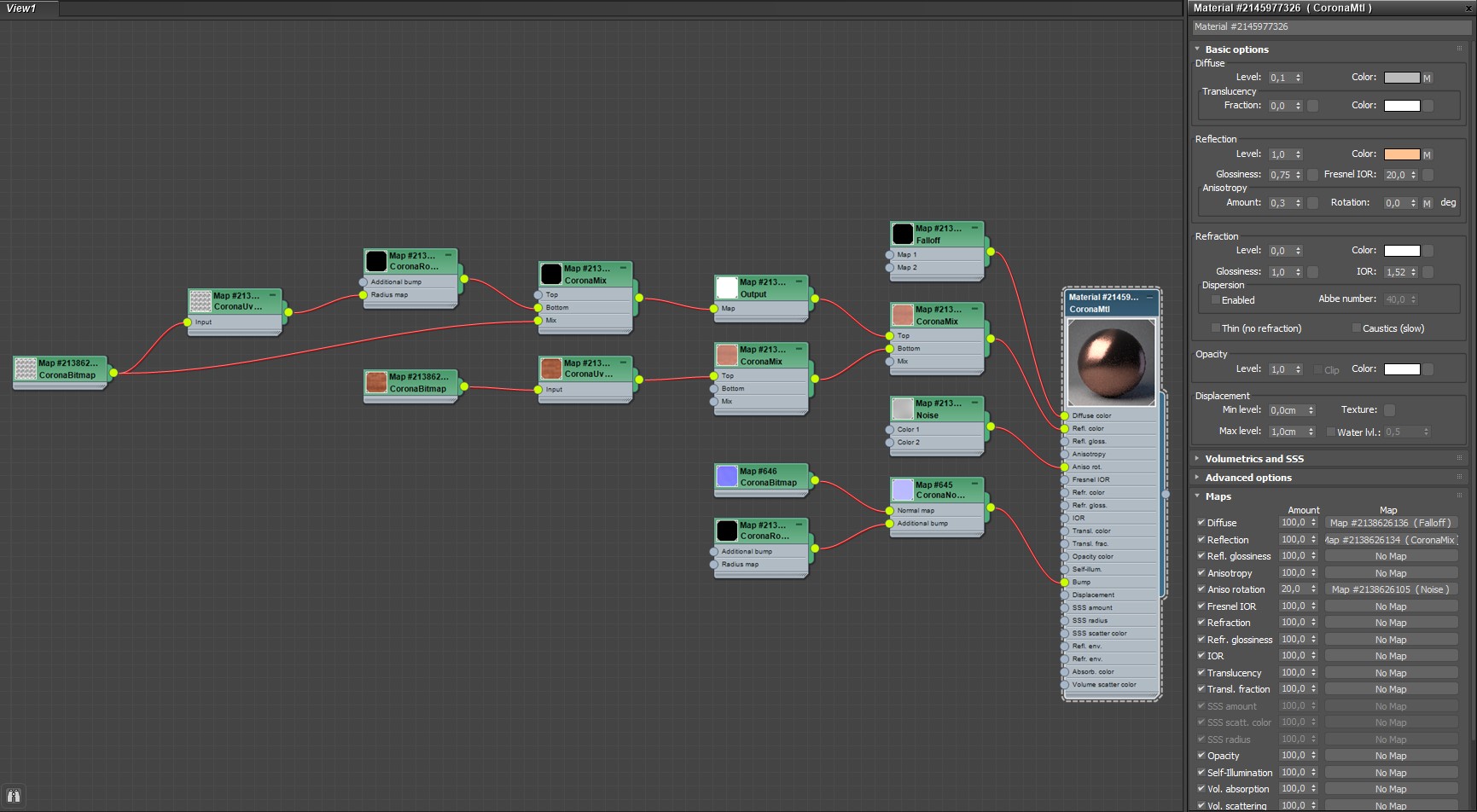
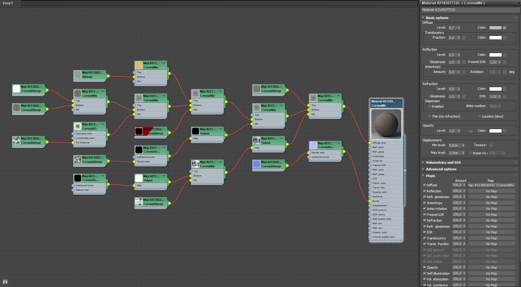
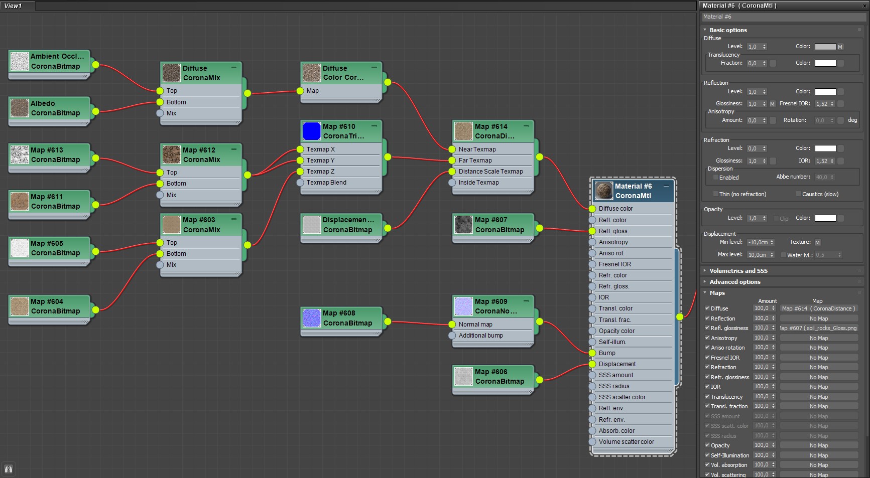
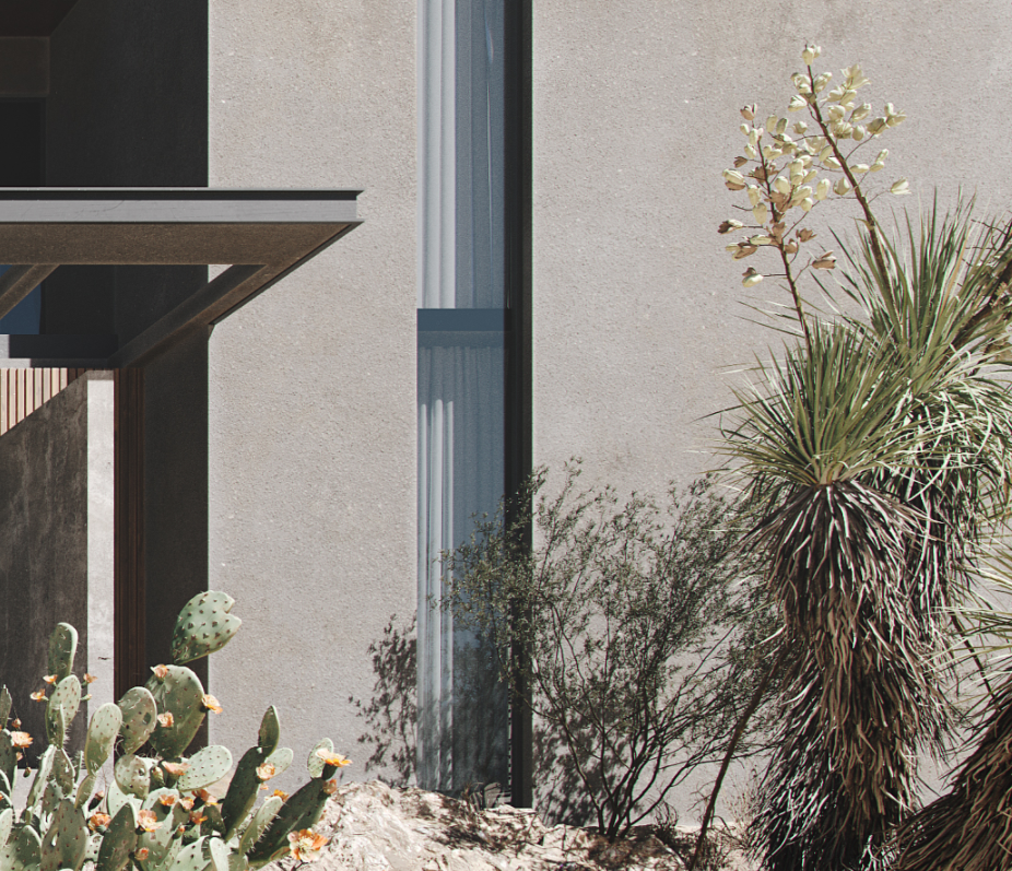
Once the high-poly model was ready, Anton proceeded to set the materials of the villa and its surroundings, specifically the copper, stucco, and sand. The resulting level of detail and accuracy is just incredible! Below you can see how they look in the final 3D exterior rendering.
The sky and light were essential to setting the atmosphere of a desert. The viewer had to feel the heat of the sun on the face, see the sharp shadows, the sky without a single cloud. For that purpose, Anton used an HDRI map for a clear sky and the sun in a high position.
To achieve the most appealing look, the 3D artist needed to play with the sun a little. So he started to change its position slightly until he found the one that suited the realistic architectural rendering best. He looked at how the villa would look in each setup: which parts would be shadowed, which ones would be lit, and how the reflective surfaces would behave. It’s important to note that there was not a single fake light source or any embellishments. The visualizer wanted this 3D architectural visualization to be 100% realistic.
#6. Spicing Up with Details
Then, it was time to make the surroundings look as natural as a photo. It came down to 3 main factors:
- adding interest with stones and unevenness of the ground
- scattering greenery, such as dry grass and plants
- adding big plants like cactuses and trees.
#7. Post-production
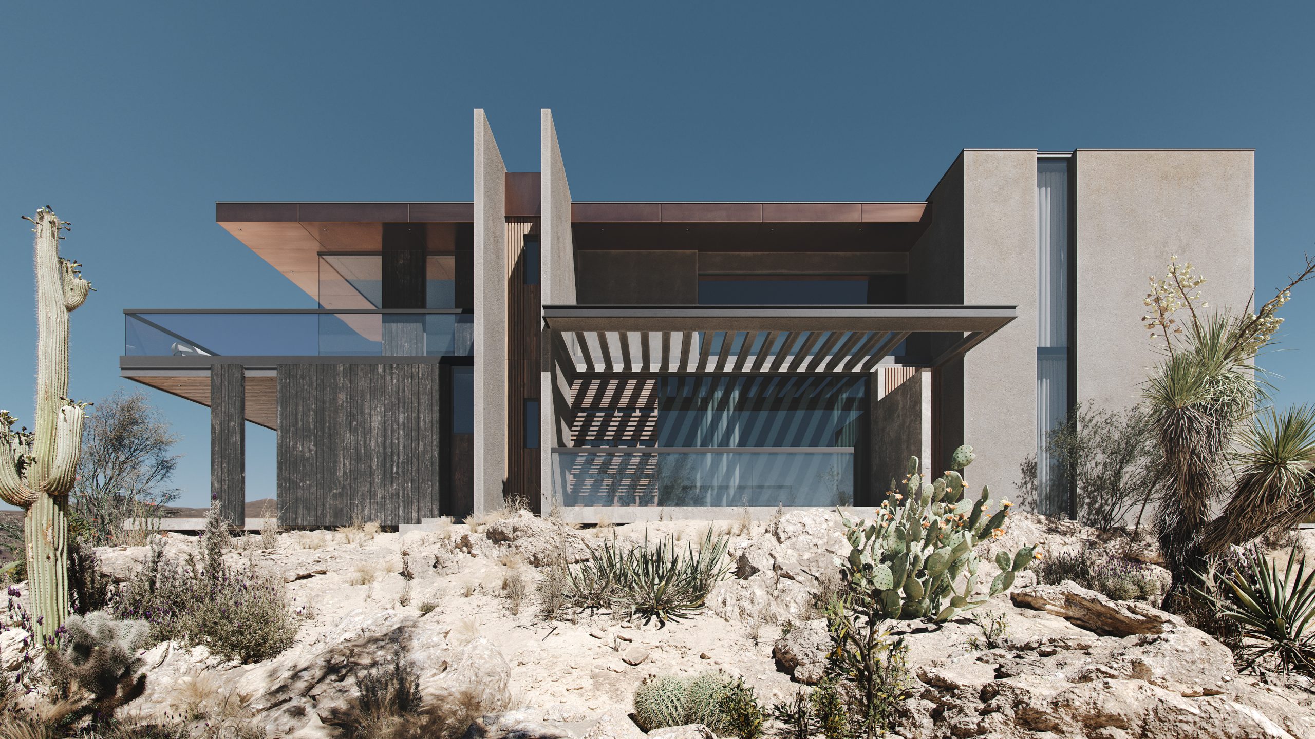
As Anton used Corona Renderer, he could control artistic aspects like color grading at the rendering stage. He only added a few touches in Adobe Photoshop and increased contrast. Voilà! The CGI chef-d’œuvre is ready.
This realistic architectural rendering would make a nice ad for a real estate listing, digital marketing campaign, and any print materials. It’s got the mood, the character, and the property in it looks breathtaking. A real CGI jewel! Just what a good architectural design needs.
Delivering such realistic art pieces requires extensive experience, flexibility, mastery of cutting-edge CGI software, and a deep understanding of photography as an art form. The author of this work took an existing concept and transformed it to create a completely new feel, a new product, and, as a result, appeal to a different target audience. That’s why the best 3D visualizers are professional storytellers.
Think your marketing and presentation materials should look like that? Contact us for 3D services. We’ll find the story for your design and make sure the imagery is nothing less but showstopping!
Want to learn how much your project costs? See how we evaluate 3D rendering projects

Irma Prus
Content Writer, Copywriter
Irma writes articles and marketing copy for ArchiCGI. Her dream is that more people discover the power of CGI for architecture. Irma is into neuromarketing, ruby chocolate and Doctor Who series.


