Making brilliant architecture presentations is an art in itself. Because no matter how genius a concept is, poor delivery can bury it for good. The thing is, it’s not about just presenting a great idea. It’s about convincing a potential client that it’s the best solution for them. Now, this might seem a bit too complicated, but it absolutely isn’t. In fact, creating a successful demo is more like following a recipe that guarantees amazing results.
In this article, architecture professionals will learn about 7 surefire ways to improve their project presentations. Those include optimizing the pitch for the audience, adding character to it, and making the most out of 3D architectural visualization. So, ready to become a guru of killer presentations? Then let’s get to it!
#1. Make It Short

This first tip is rather universal for all concept demos. Surely, architecture presentations are meant to showcase large-scale projects, so one shouldn’t try to make an elevator pitch here. However, it’s important to be concise and focus on the main concept. For instance, if the goal was to design an energy-efficient building, the primary focus of the presentation must be on the ways this very idea would be brought to life.
Furthermore, the architect must arrange the visuals on the slides to clearly illustrate all the key points of the pitch. For that, one needs to design a clean and efficient deck layout that will complement the work style-wise. Overall, it’s best to use large high-quality images, large captions, minimum text, and white backgrounds for maximum contrast. In terms of time, the presentation itself should take up to 20 minutes, ideally. Also, the architect must take questions and discussions into account as well.
#2. Mention the Source of Inspiration

Starting architecture presentations by briefly telling about the source of inspiration for the concept is a great way to make the audience interested. Moreover, it adds character to the demo, making it more memorable and easier to understand for prospects who know little about architectural development. This way, potential clients will have a clear association between the project that’s being presented to them and the inspirational reference. The latter can be a particular style, decade, design movement, philosophy, country, etc.
#3. Don’t Get Too Technical

At every stage of making architecture presentations, professionals must remember to optimize the information for their audience. Most of the time, prospects aren’t interested in technical drawings, complex explanations, and other such details. Of course, that doesn’t mean there should be no drawings at all in a deck. However, they rather serve to show the amount of work the architect has done and to prove that the concept is implementable. But they really aren’t that informative for people with no background in architecture. So, it’s better to use them as secondary visuals next to realistic images of projects.
Showcase your architectural project like a true work of art, brought to life with cutting-edge AI-powered CGI technology.
#4. Use CGI

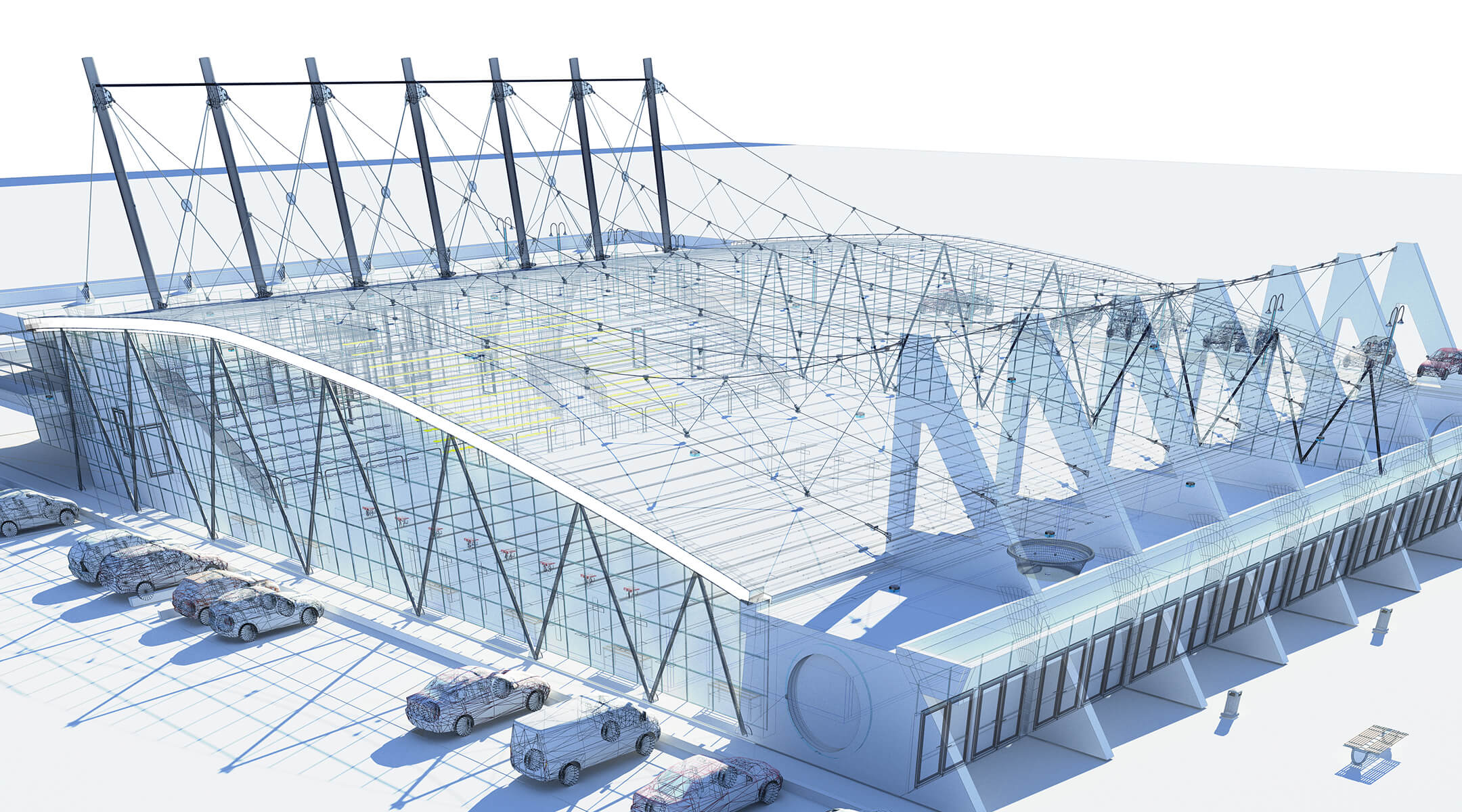
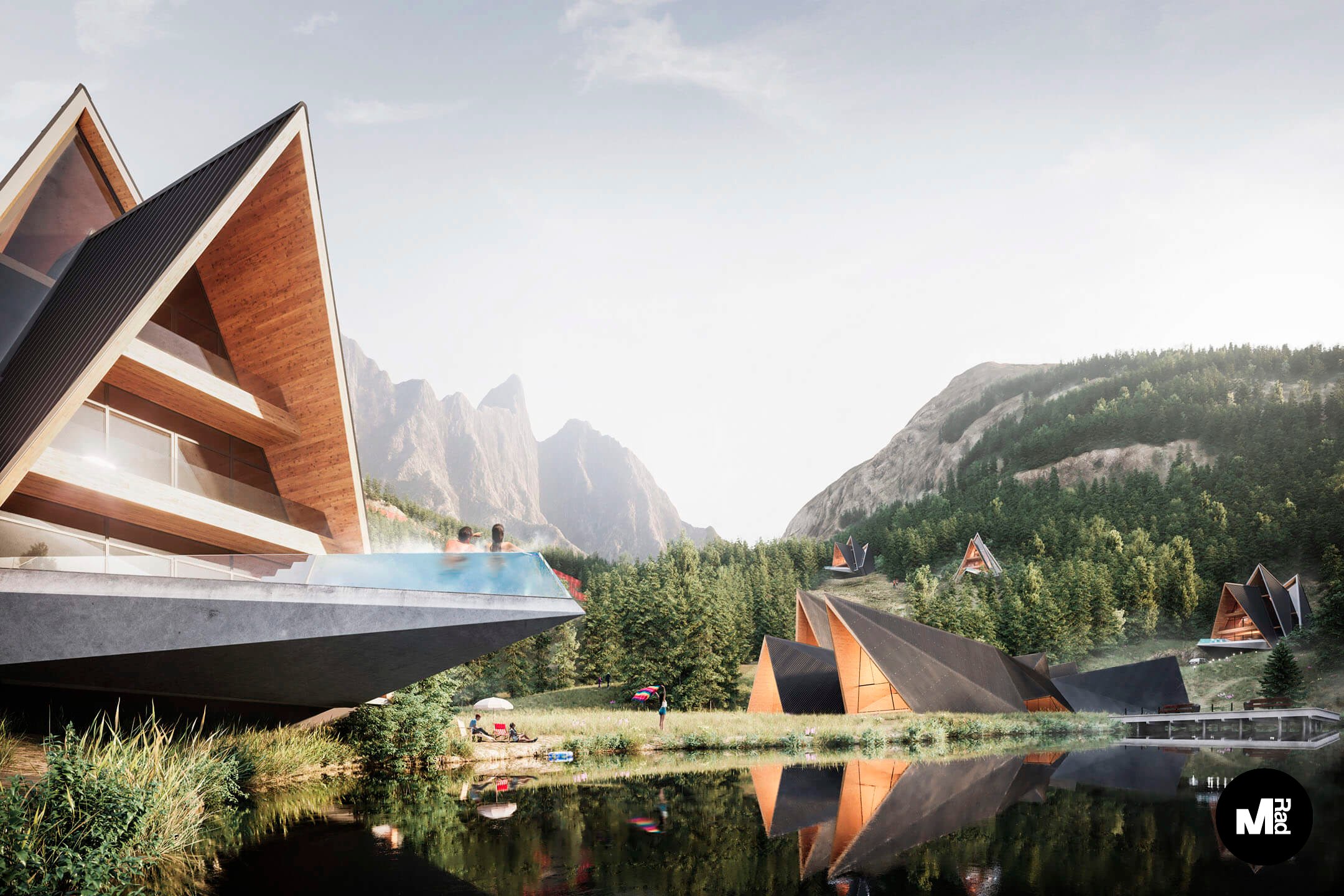
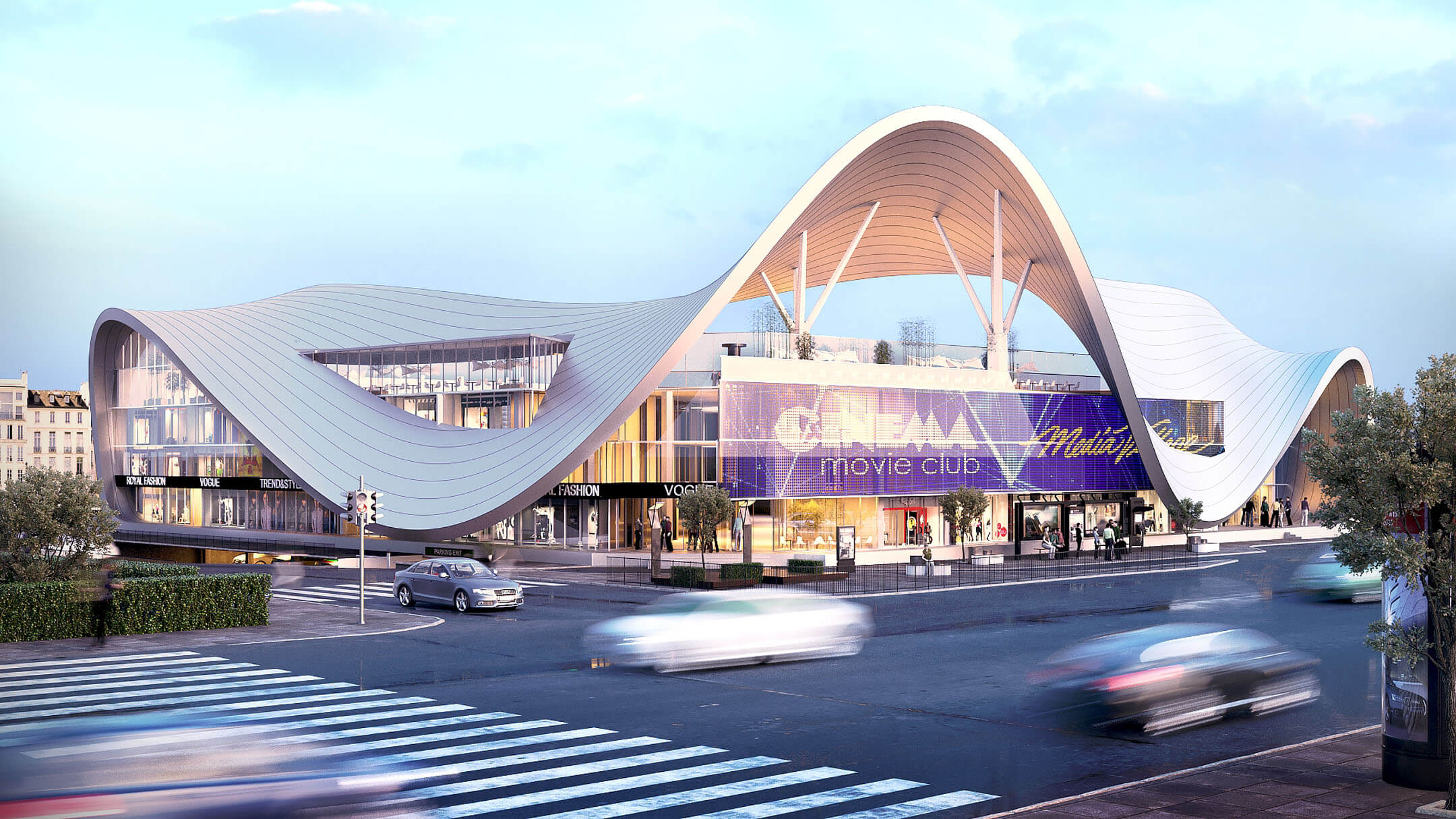
Speaking of realistic images, there is one amazing way for architects to get highly photorealistic visuals within a very short time. That is 3D visualization for architecture. By means of 3D modeling and rendering, one can have photo-like images of an architectural object that doesn’t exist yet.
With CGI, architects don’t have to draw or build scaled models to photograph. Instead, they can spend more time on perfecting their architecture presentations. As a result, they’ll have perfectly polished decks and well-rehearsed pitches, as well as stunning visuals. The latter will help prospects understand every design aspect clearly and see what the whole thing will look like if the project is given a green light.
#5. Tell a Story

There is one common mistake that many professionals make in their architecture presentations. That is, they go through every detail about a building’s design, it’s features and functions, materials to be used in construction, etc., without telling how people will actually experience the place. So, it can be useful to change the perspective for a bit and take the potential client on an imaginary tour.
For instance, when presenting a design of a mall, an architect can talk about everything a regular visitor would experience. That includes the way they come in, the things they see first, the feeling they get, how easy it is for them to find their way around the place, and so on. Plus, it’s easier to explain certain design decisions this way. For example, the location of food courts and lounge areas, the lighting system, the stylistic importance of unusual building geometry, etc.
#6. Avoid Using Professional Jargon

To some, this tip might seem rather obvious, but it’s actually one of the most relevant on this list. Truth be told, even top-tier specialists make this mistake a lot. Some of them think that using jargon makes them sound more professional. However, that couldn’t be any further from the truth. On the contrary even, those who use too many specialized terms in their architecture presentations usually end up losing their prospects’ attention and causing misunderstandings.
Furthermore, it just makes people feel uncomfortable. And constantly explaining every term might make it even worse, adding a patronizing tone to a presentation. So, it’s crucial to only use the words the potential client will definitely understand, without making it look like one’s trying to explain rocket science.
#7. Provide an Approximate Cost Estimate

Finally, it’s important to always be ready to answer questions regarding the budget. Some professionals include approximate cost estimates in their architecture presentations. It’s not necessary to do that in every case, but it’s crucial to remember that answering questions is part of the presentation as well. Therefore, the architect must be ready to discuss the budget and to provide an approximate estimate when asked. The best way to do that is to give some examples of one’s previous similar projects.
Those were the 7 go-to tips on how to enhance architecture presentations. If we had to boil it all down to one single principle, it would be “respect the listener”. After all, it’s all about respecting a prospect’s time and interest by making a pitch concise, informative, visually pleasant, and easy to understand. Also, one needs to learn about things that can help to achieve all that, such as architectural CGI. Understanding this can be a key for every architecture professional to unlock their full potential and always impress clients and get projects approved.
Want to learn how much your project costs? See how we evaluate 3D rendering projects
Are you looking for professional 3D visualization services to make your own presentations unforgettable? Contact us and get unbelievably photorealistic images of even the most complex designs within only 1 week!

Ana Wayne
Content Writer, Copywriter
Ana is a content writer for ArchiCGI. She has a passion for design and architecture - and for talking about it. Outside of work, she is a fan of sci-fi movies and a street food connoisseur.


