When architects need to show the expected outcome of their projects at presentations, in portfolios, or marketing materials, they opt for architectural 3D visualization services. CGI is an ultra-convenient option for getting photoreal images showing the future look of spaces that aren’t finished yet. But there is an issue — with so many producers of 3D visualization for interior design on the market, how to determine which ones make the most quality renderings? If the architect fails to do that, they may end up getting CG visuals that turn the potential clients off instead of swaying them to sign the deal.
To prevent this, an architecture specialist should evaluate a potential CGI contractor’s competence by checking their portfolio. But what should one look out for, specifically?
A good 3D visualization studio always follows strict guidelines based on 3D modeling and rendering standards. These rules might not be obvious to those without 3D graphics background but there are common errors that can be easily noticed by anyone. So, let’s explore 10 mistakes in a 3D visualization for interior design that are a dead giveaway of an unprofessional CGI contractor!
#1. Improper setting of the camera

To make a 2D interior render, a CGI artist needs to create a 3D scene of the room first. After that, they set a virtual camera — just like a professional photographer — to ‘take a shot’ of the place. If a 3D visualization is made by an amateur, this setting can be done incorrectly.
For example, a low-quality interior rendering might show a large part of the ceiling while the floor is not shown at all, and the legs of the furniture look cropped. These are serious mistakes that must be avoided at all costs. In professional CGI, all the vital elements of the scene are always fully visible and arranged according to the rules of composition. Only this way, a viewer can get a comprehensive understanding of an interior design solution.
#2. Lack of necessary design elements in the interior scene
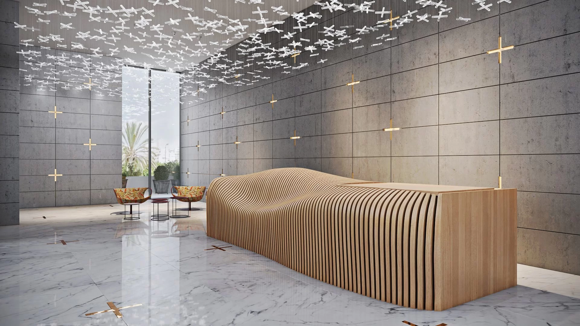
Interior 3D renders must feature all crucial architectural elements. This includes doors, windows, radiators, overhead lighting, and a baseboard. If something from this list is missing, such a 3D visualization for interior design cannot be considered as a high-quality one. An exception can be made for a CG render showing a room in a hot country. In such a case, there may be no radiators in the image. But the upper lighting is always a must, as well as a baseboard. This rule is not applied only for a few specific interior styles, for example, loft. Professional CGI artists know these nuances and take care to show essential design elements in the renderings.
#3. Wrong dimensions and placing of architectural elements
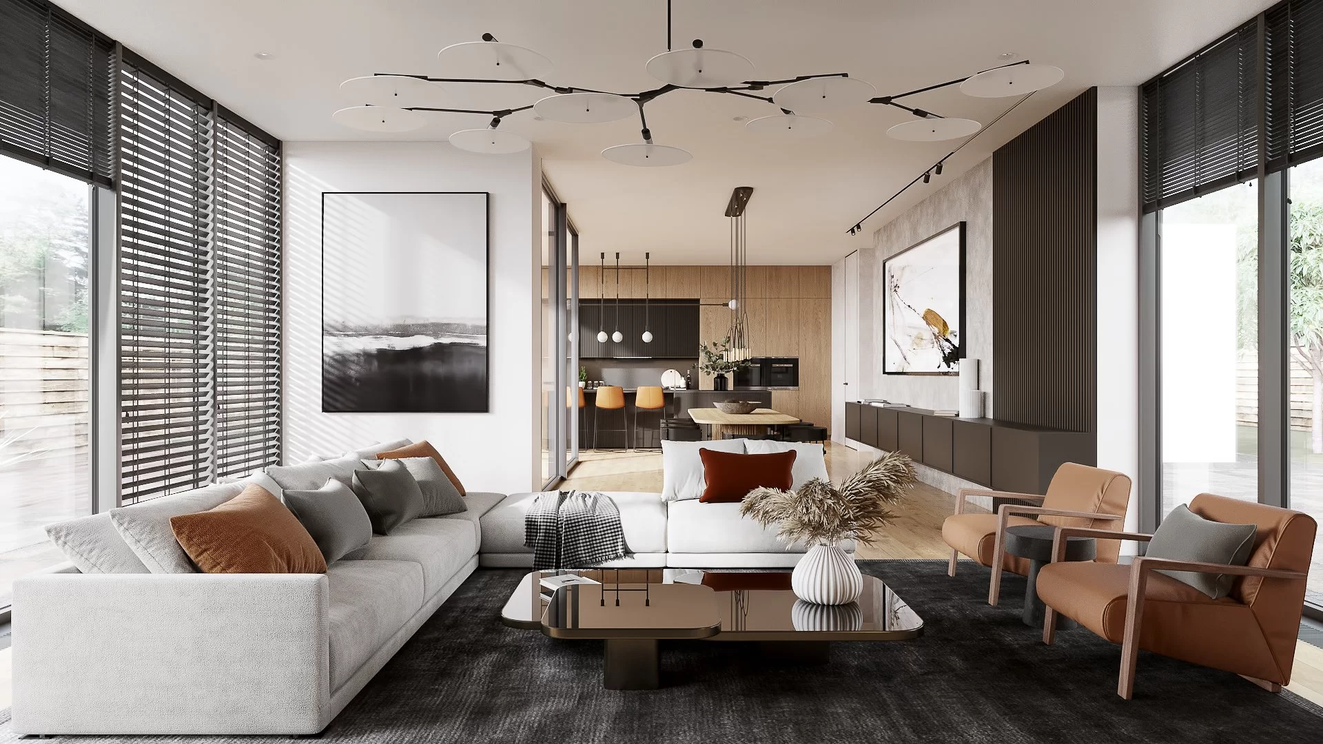
In any 3D visualization for interior design, balanced proportions are crucial. Let’s take an example of a 3D rendering of a bar. If it’s a low-standard CG image, bar stools might appear too tall, a doorway might look too small, a chandelier might hang too low over a counter, and so on. These errors will disharmonize the picture and distort the viewers’ perception of it.
A professional 3D artist knows that all the objects in the scene must be consistent with ergonomic rules. The size of doors and windows, height of seats, working surfaces, and tables have to be standardized. That is why 3D professionals check the real dimensions of the objects when creating 3D models for renderings. If such an option is not available, they use manuals, for instance, Ernst Neufert’s guidebook.
#4. Incorrect usage of objects in 3D visualization for interior design
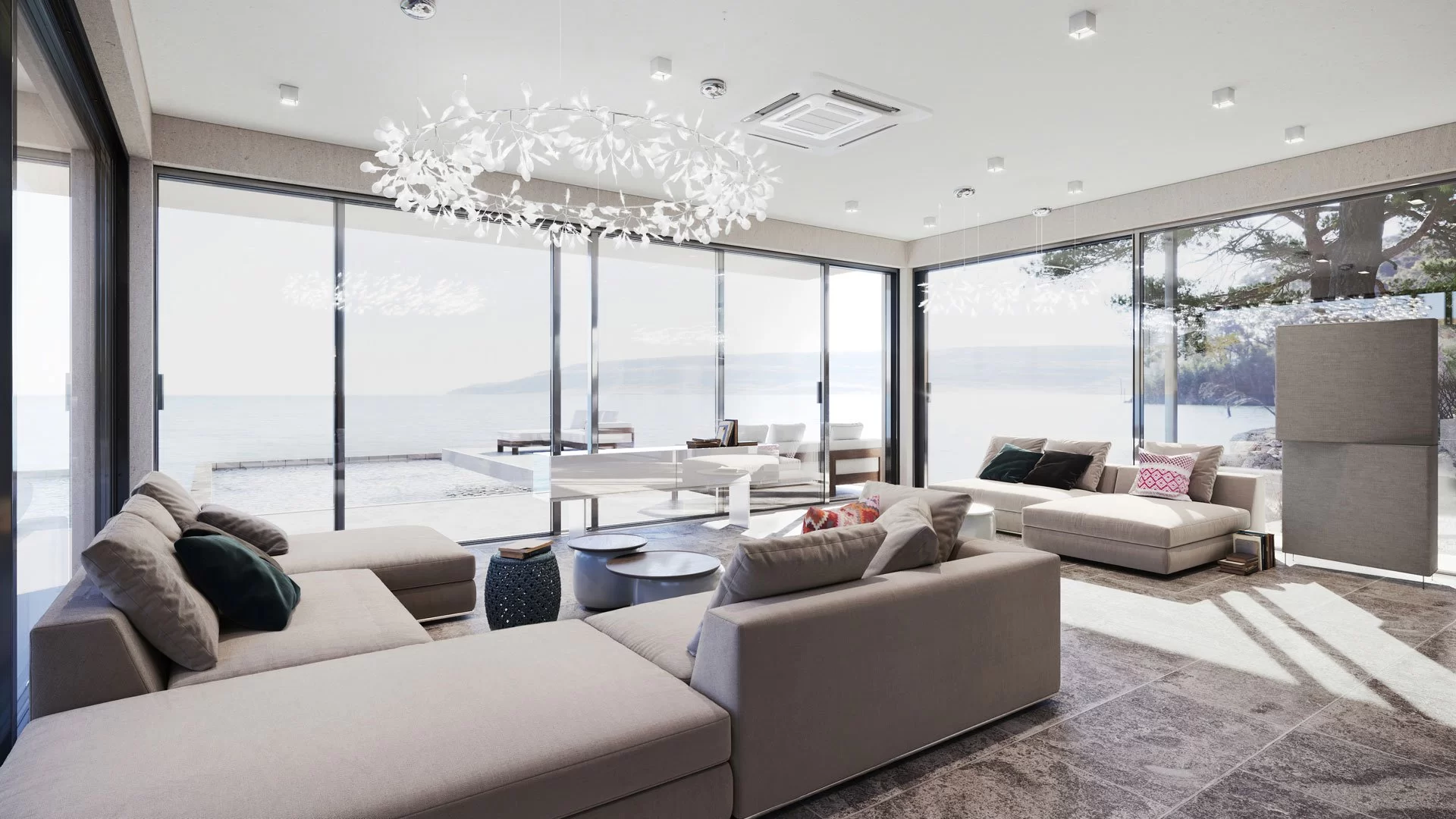
All materials, pieces of furniture, and decor in the CG imagery should be in harmony with each other in terms of both stylistics and functionality. If even the smallest detail in 3D visualization for interior design looks out of the place, it can ruin the whole picture.
For example, a bathrobe on a hanger in a hallway will confuse the viewers about the purpose of the room. And pretentious decor in an interior that is supposed to be designed in the style of minimalism will look weird and inappropriate. Such mistakes mean that a CGI contractor lacks professionalism. While expert 3D specialists know the specifics of interior design and select elements that perfectly suit the style and purpose of a room.
Take your design presentation to a new level with interior rendering
#5. Lack of polygons in 3D models

3D models used in CG renderings are made of tiny blocks called polygons. For a 3D visualization to look photorealistic, they should not be visible in the image. To achieve this effect, 3D artists use high-poly models with many polygons. There should be enough of them so that the viewer could not see the segmentation of mesh.
If a CGI specialist doesn’t take care of this point, objects that are supposed to have a smooth surface might seem faceted and therefore unrealistic. Experienced 3D specialists know how to avoid such lapses when creating 3D visualization for interior design. They add more polygons to the areas of surface where the mesh is visible, or simply pick another 3D model.
#6. Low-quality textures

To make 3D models look realistic, 3D artists apply textures to them. The latter are 2D images simulating materials that objects are supposed to be made of: wood, glass, metal, bricks, and so on. If texturing is not done properly, the resulting images will look poor and unrealistic.
So, what defects can they have? The textures in a 3D visualization for interior design might be scaled incorrectly, lack relief, or have unnaturally bright colors. Another possible error is applying textures in such a way that the viewers can notice seams between them. This flaw is called tiling. An inattentive 3D specialist can also mismatch textures, applying them sideways or upside-down. Finally, if the texture resolution is low, the models would look “grainy” and pixelated. All these signs indicate a lack of proper quality control — how else would such an image make it to the proud display in the gallery?
#7. Dark areas in the room
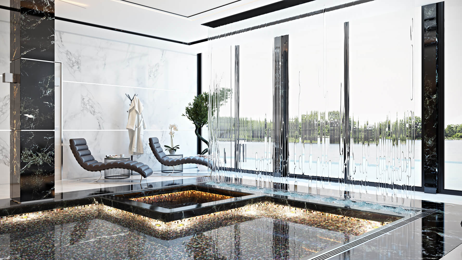
When looking at an interior 3D visualization for interior design, a viewer must be able to clearly see the geometry and textures of all the surfaces and objects in the image. That is why there should be no totally dark areas in the pictures. So, to allow a viewer to examine all the details, professional CGI specialists make sure there are no darkened parts anywhere in the room. While amateur 3D artists can leave a dark area somewhere — for example, under a table or between a wall and a shelving unit.
#8. Secondary light sources dominating over the primary ones
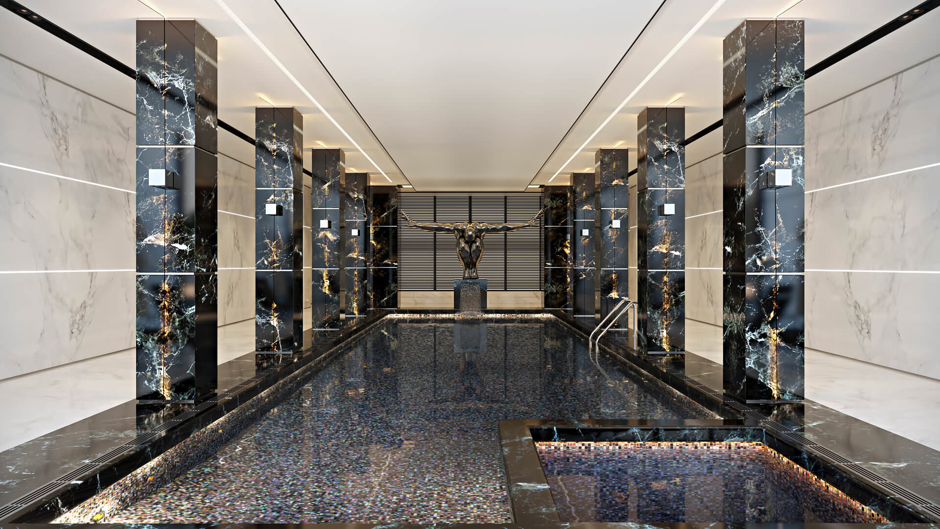
Another red flag of unprofessional 3D residential design services is improperly set lighting. In a good interior 3D render, secondary light sources must not be brighter than primary ones. The latter are large chandeliers, windows, etc. While lighting fixtures behind curtains, sconces, floor and table lamps are secondary sources and should produce less bright illumination than the primary ones. In amateurish CG imagery, this balance can be messed up. While experienced 3D specialists are aware of this rule and always set the lighting in interior renders correctly.
#9. Inconsistency of lighting with the time of day
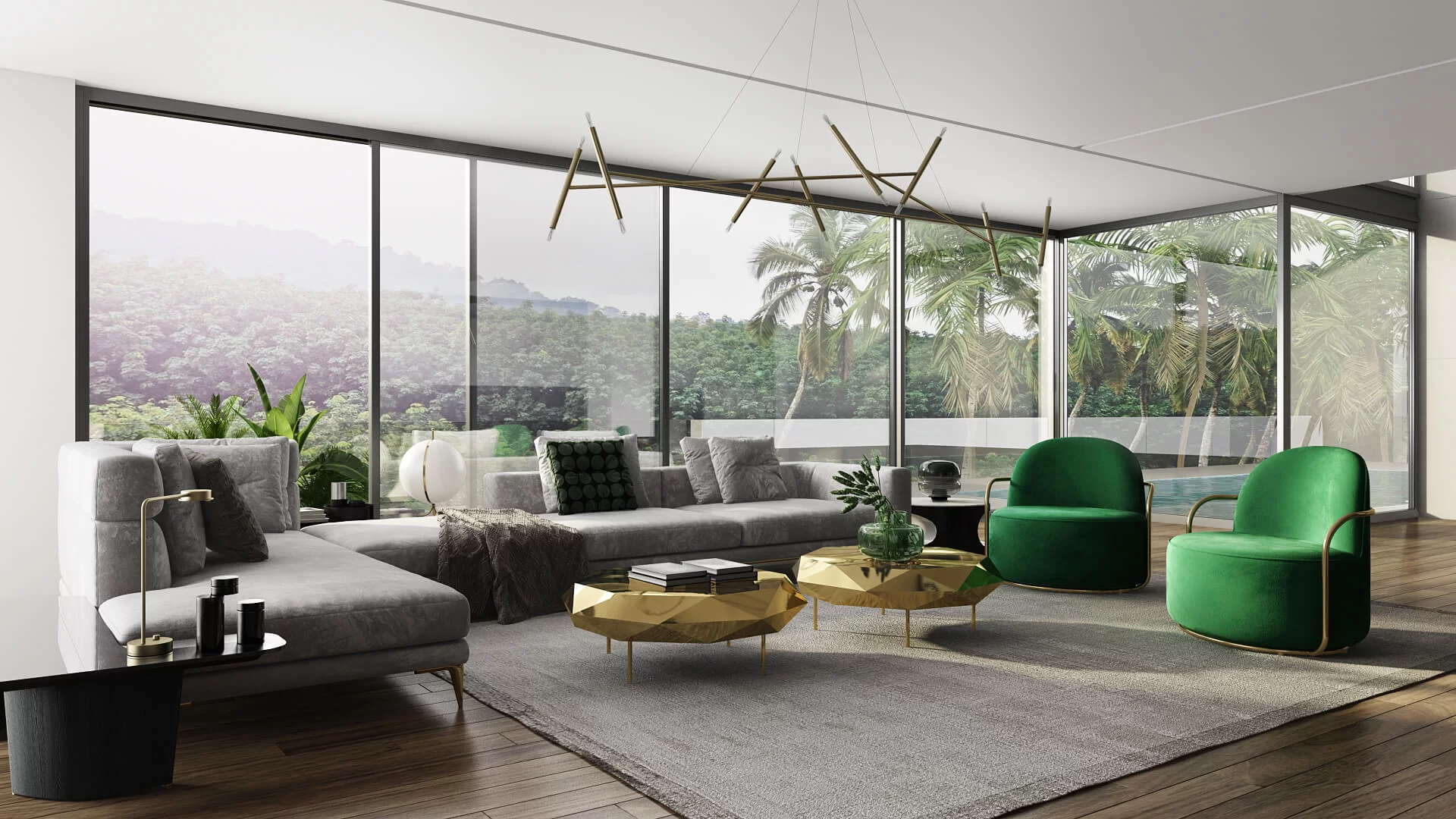
Lighting in 3D visualization for interior design should always correspond to the time of day shown in the image. So, what does it mean exactly? If a rendering depicts a day scene, natural light from windows should dominate. In this case, artificial lighting from lamps and chandeliers should serve only as a support. While in a night scene, on the contrary, lighting fixtures should produce brighter illumination than light coming from the windows. If a CGI artist fails to meet this rule, they are definitely an amateur.
#10. Too heavy shadows

Skilled photographers usually set the lighting in a way that makes shadows look soft and transparent. And 3D artists do the same to achieve photorealism in 3D visualization for interior design. They know that rough, dark, sharp-edged shadows don’t look aesthetically appealing and can spoil the picture. That is why professional interior 3D renders feature delicate, soft shadows.
To get a high-quality 3D visualization for interior design, architects should watch out for red flags in the portfolio of the potential contractor. The list above provides them with a description of 10 common mistakes that help detect CGI of low quality. Armed with this knowledge, the architects will be able to select only the best 3D visualization providers.
Get your project estimated in just 1 hour - fill out this brief!
Want 3D renders to showcase your designs at their best? Contact our team for professional interior rendering service and get CG imagery that will help win clients easier than before!

Catherine Paul
Content Writer, Editor at ArchiCGI
Catherine is a content writer and editor. In her articles, she explains how CGI is transforming the world of architecture and design. Outside of office, she enjoys yoga, travelling, and watching horrors.



Comments
Michael
Ricky
Leslie
David
Steven
Helga Brown