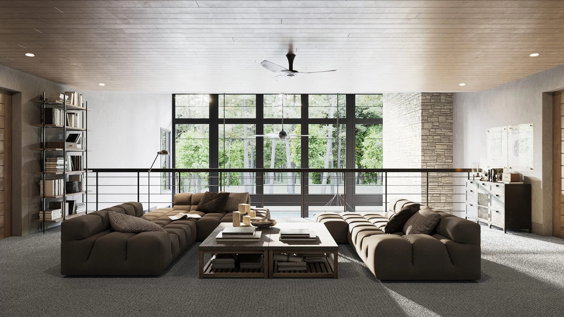
What is 3D interior visualization? In recent years, it has become the buzzword in the architectural and design community. 3D interior visualization is a realistic computer-generated image showing the future result of a design project. It is an irreplaceable presentation tool for designers and architects. To get CGI services, the designer sends a brief to a 3D rendering company and soon receives the visuals. Naturally, the designer wants to be the judge of the output quality too. For that, they need to understand what exactly a “perfect 3D rendering” is and to speak the same language with 3D artists.
Explaining corrections is another trouble. How to translate the feeling about the image into words and facts? Does the designer have to learn 3Ds Max, Corona, and interior photography to do that? Actually, they don’t. All the designer needs is to learn the essentials — the main components of a quality interior 3D rendering. Wonder what they are? Let’s check them out!
#1. Proper Lighting
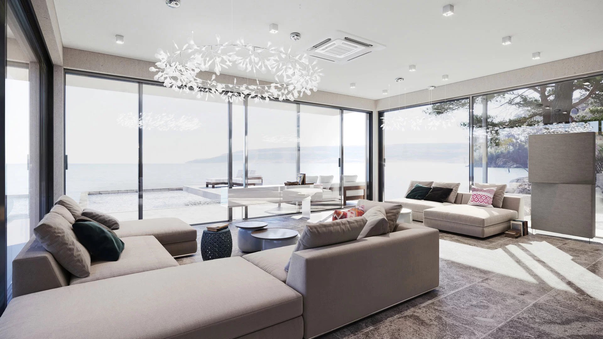
If the lighting in interior 3D visualization is right, the picture will look realistic and full of life. To achieve this effect, professional 3D artists stick to a set of rules.
Notably, the evening light should be cold, and the daylight neutral — to keep the colors in the scene natural. If the 3D visualization shows a daytime scene, the sunlight must dominate to ensure the realistic look of the picture. And vice versa: if the render displays a room in the evening time, the brightest light should come from artificial sources like pendant lights or a chandelier.
Proper illumination of objects in the scene is another major rule for getting the lighting right. The objects situated by the window must be more lit than the ones in the back of the room. Also, there should be no completely shaded parts in the image — all materials and textures have to be clear and readable.
#2. Impeccable Composition
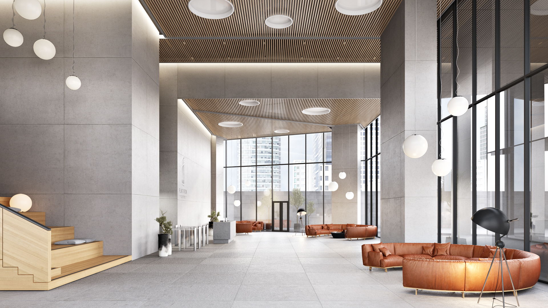
Composition is the interrelation between objects in a picture. If all elements of the interior render are properly arranged, it creates harmony and highlights the interior design strengths. To achieve the effect, the image must accord with a set of rules.
Most importantly, a 3D interior visualization should have a visual center — an object or group of objects that stand out by size, shape, or color, and thus instantly catch the eye. Though it is called “center,” it can be situated anywhere in the image.
The secondary elements of the scene should surround the central object in accordance with the laws of symmetry or asymmetry. Symmetry in an interior rendering means that objects of a similar size and shape should be placed at the same distance from the center. This ensures that the scaling looks true to life and consistent.
Take your design presentation to a new level with interior rendering
The asymmetrical composition has many variations. However, all asymmetrically composed images stick to the same rule: the objects on opposite sides of the center should have the same visual weight. So if the main elements occupy two-thirds of the picture, the third part should not be empty. For a balanced curated look, it has to include a counterbalancing element, like a large mirror or a catchy tapestry.
So when looking at the 3D interior visualization, it’s wise to consider the way the elements and space are organized. If a part of the 3D render looks visually overloaded or empty, it makes sense to check whether the composition is okay.
#3. Details That Evoke Emotions
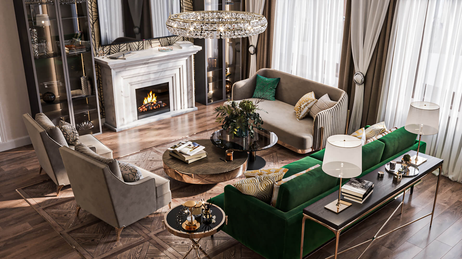
3D visualization technology allows for creating images that not only convey technical info but also touch people’s emotions. It is possible by adding smart details — small but meaningful elements that tell how wonderful it would be to live or work in the future space.
For instance, a render for a sleek minimalist office interior might include a notebook and a cup of steaming coffee on the desk. These subtle details will add life to the situation pictured and spur viewers’ imagination. They will see themselves starting a working day in that office, writing down questions for an upcoming meeting and sipping the delicious drink.
So when checking out the 3D visualizations, it’s a must to see what kind of details the 3D artist included. Do they paint a clear picture? Moreover, if the designer has any ideas at the project outset, it’s best to share them with the studio — this may save plenty of time and help to create an image with a compelling story.
#4. Style Consistency
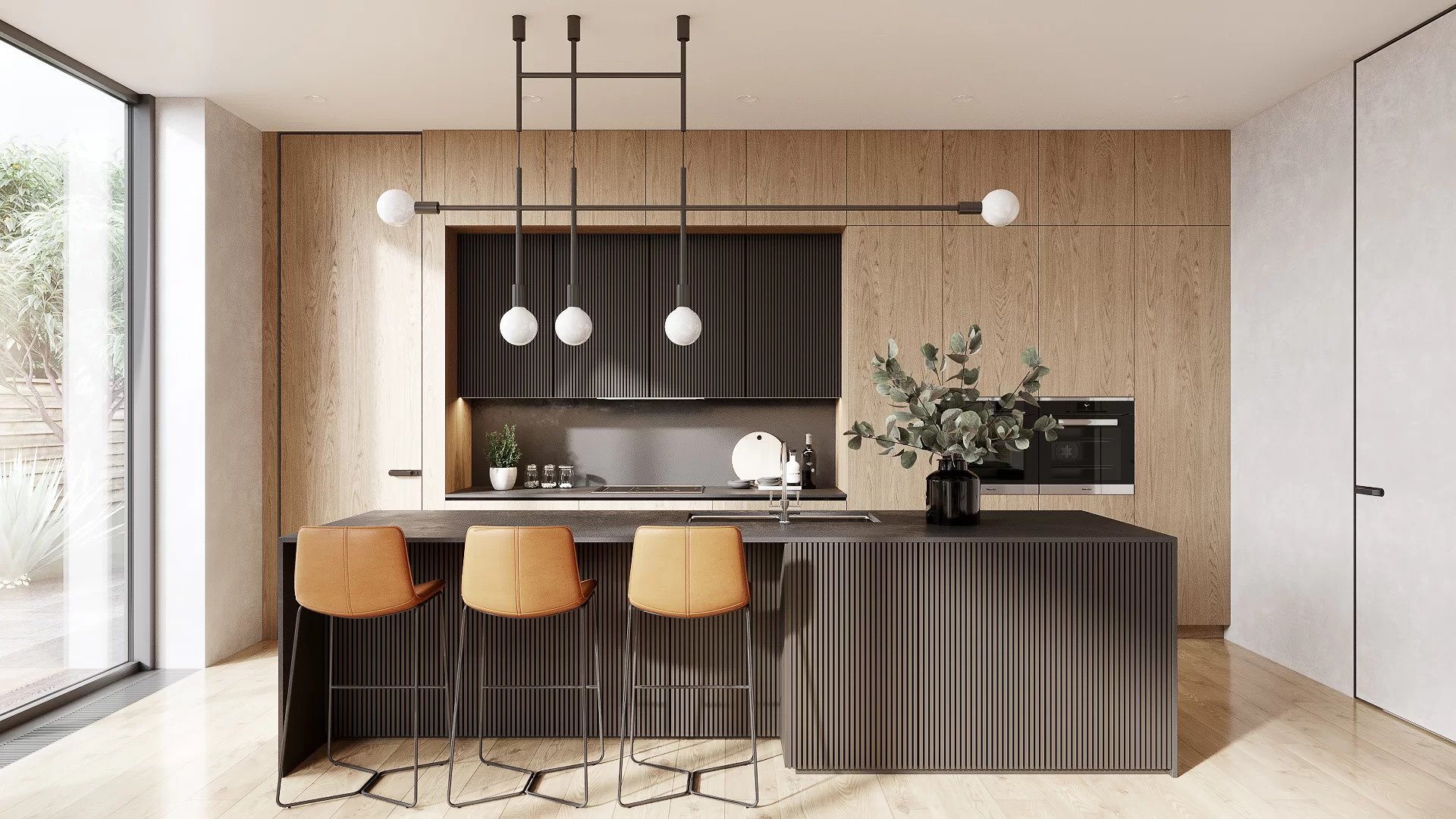
When everything in the image is consistent in style, it pleases the eye and creates an impression of wholeness. So, not a single interior detail should look extraneous in relation to other elements. For instance, a room in the Industrial style cannot include classic artwork or a crystal chandelier — it will look weird. So it’s wise to check that all details in the 3D interior visualization belong to the same style.
#5. High-Quality Textures
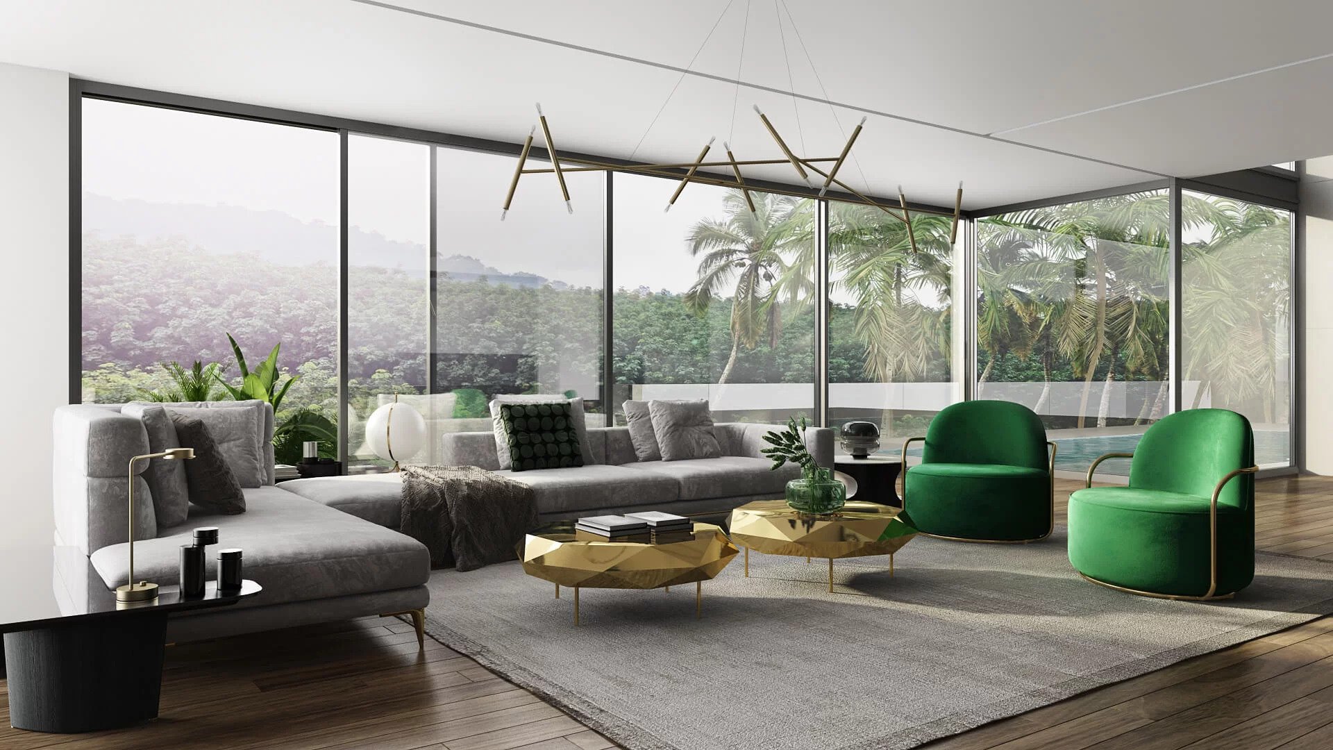
For all surfaces to look real, interior 3D rendering should contain only highly detailed textures, with realistic colors and material patterns scaling. This way, a viewer will practically feel how fluffy the wool rug is, and how soft to touch the furnishing textiles are.
The low-quality, flat textures with incorrect scaling, unnatural colors, or visible seams look fake. That’s why they are unable to evoke any pleasant associations. So if the designer finds such an error in a 3D render, they’d better send it back for corrections.
If the designer knows the key elements of the scene, they can easily prepare a detailed brief for a 3D interior rendering company. Such a brief will help the firm’s 3D artists quickly make stylish 3D renders. The information it contains will allow the artists to create realistic light, high-quality textures, and add details. This way, the designer gets the best renders in the shortest time.
Get your project estimated in just 1 hour - fill out this brief!
Need 3D architectural visualization for your design projects? Contact us and get impeccable 3D renders your clients will fall in love with.

Catherine Paul
Content Writer, Editor at ArchiCGI
Catherine is a content writer and editor. In her articles, she explains how CGI is transforming the world of architecture and design. Outside of office, she enjoys yoga, travelling, and watching horrors.


