When it comes to photorealistic interior rendering, lighting and contextual details play the key role in creating the right mood. In fact, one and the same room can have a very different atmosphere depending on the time of the day, weather, and the amount of secondary elements in the frame. And so, the viewer will perceive the picture differently as well. Therefore, it’s important for a designer to pay close attention to those things when ordering 3D visuals for a project presentation to get the desired effect.
A professional architectural visualization company can deliver incredibly photorealistic interior images that will convey exactly the mood the design author has in mind. This way, the latter can make the most impressive presentations to their clients and get the concepts approved faster than ever. Now, let’s take a look at how amazingly different one and the same project can look in different settings. After seeing all the options at work, it will be much easier to choose the right one.
Time of the Day
The time of the day is what lays the basis for the mood of an image. It’s one of the first things one needs to consider when ordering 3D rendering for interior design. So, let’s see how each option here shapes the feel of a room.
#1. Midday
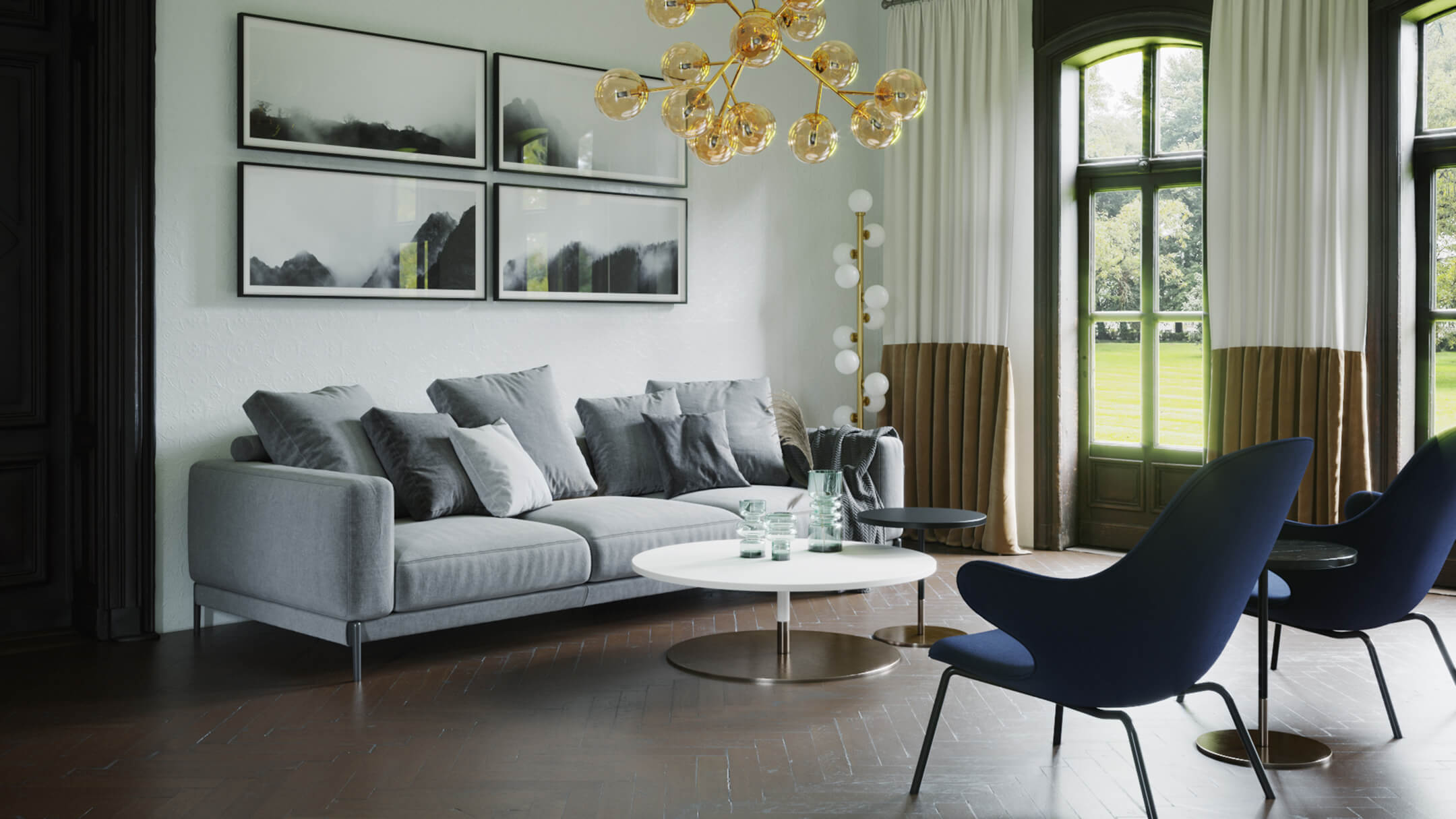
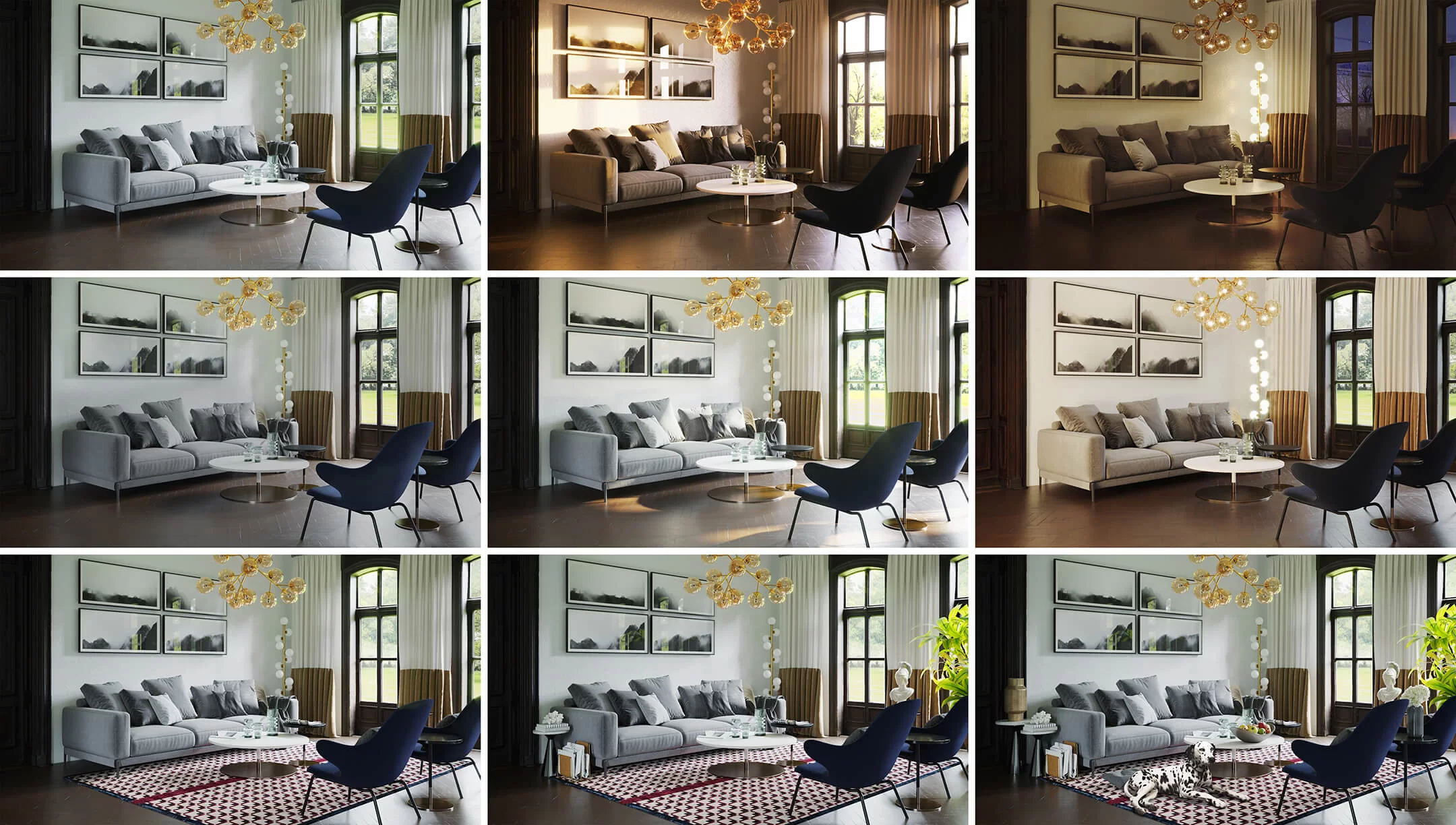
In 3D interior rendering services, midday remains the go-to lighting choice for versatility and appeal. Normally, there’s enough natural light in this kind of setting, so all the fixtures are off. This makes it a great way for a designer to demonstrate the color scheme developed for the interior. Because with midday lighting, viewers can see the colors of furniture, decor, and finishing materials in a very clear way. Most of the time, architecture and design professionals choose this time of the day for the main CG pictures in their presentations.
#2. Sunset
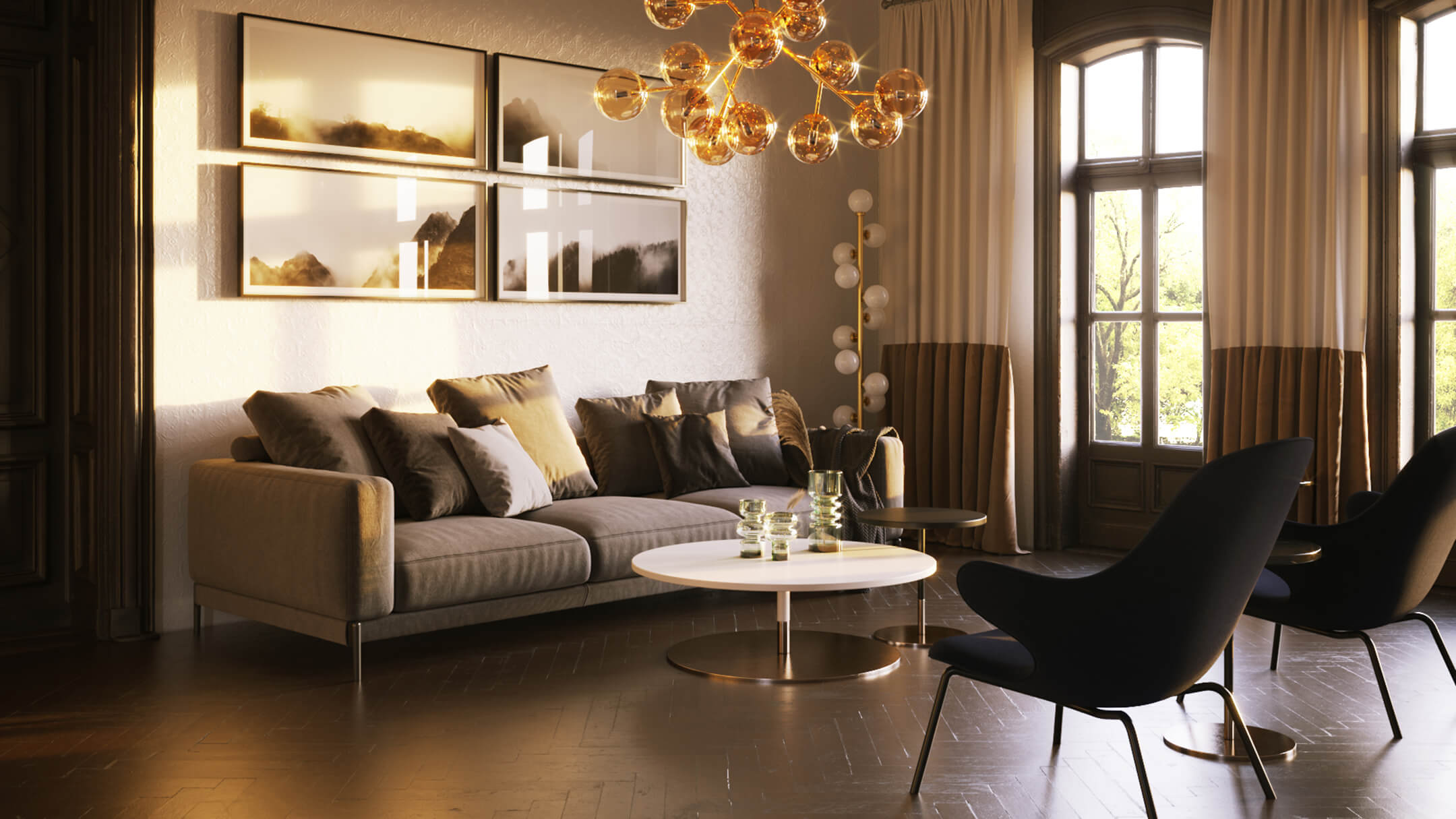
Sunset setting gives the photorealistic rendering a romantic, dreamy feel. It lays a warm hue over the colors in the room and creates bright highlights on glassy and metallic surfaces. And while that does look beautiful, it’s usually better to use such CG images in addition to the ones with daylight.
#3. Night
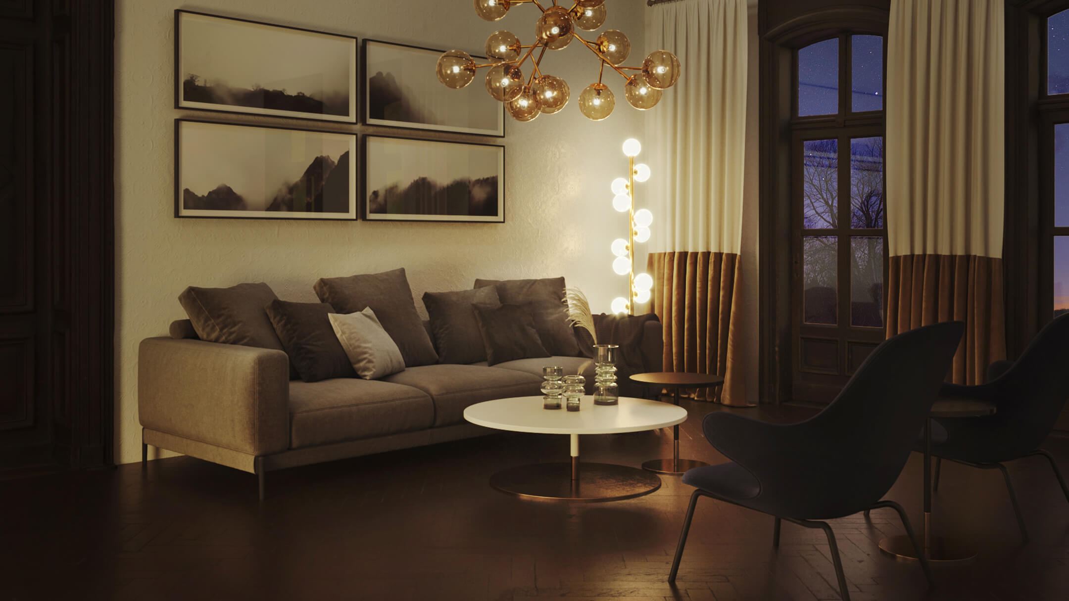
Nighttime setting in photorealistic interior rendering plays a rather practical role. It allows the viewers to see how the designer planned artificial illumination. First, there’s ambient, or general lighting provided by such fixtures as chandeliers and other ceiling lights, as well as torchieres. Next, there’s task lighting that comes from smaller, often adjustable lamps. It lights particular areas, such as desks, vanities, reading spots, and so on. And finally, there’s accent lighting in the form of can lights and uplights, wall sconces, niche lights, candlelight, etc.
A photorealistic nighttime interior rendering shows all those fixtures at work, dividing the rooms into functional sections. Moreover, it demonstrates the different qualities of light: whether it’s bright or warm, white or colored, direct or diffused. Overall, such images help the designer’s clients to see if the nighttime atmosphere of their home will be just as they want it.
Daytime Lighting Options
Since daylight is the most frequently used option in photorealistic interior 3D rendering, let’s take a closer look at 3 variations of it. The images below will show how different the mood of a place can be depending on the weather. Every variant has its pros and cons, and one might find some unexpected advantages of each of those for particular design projects.
#1. Natural Ambient Lighting — a Cloudy Day
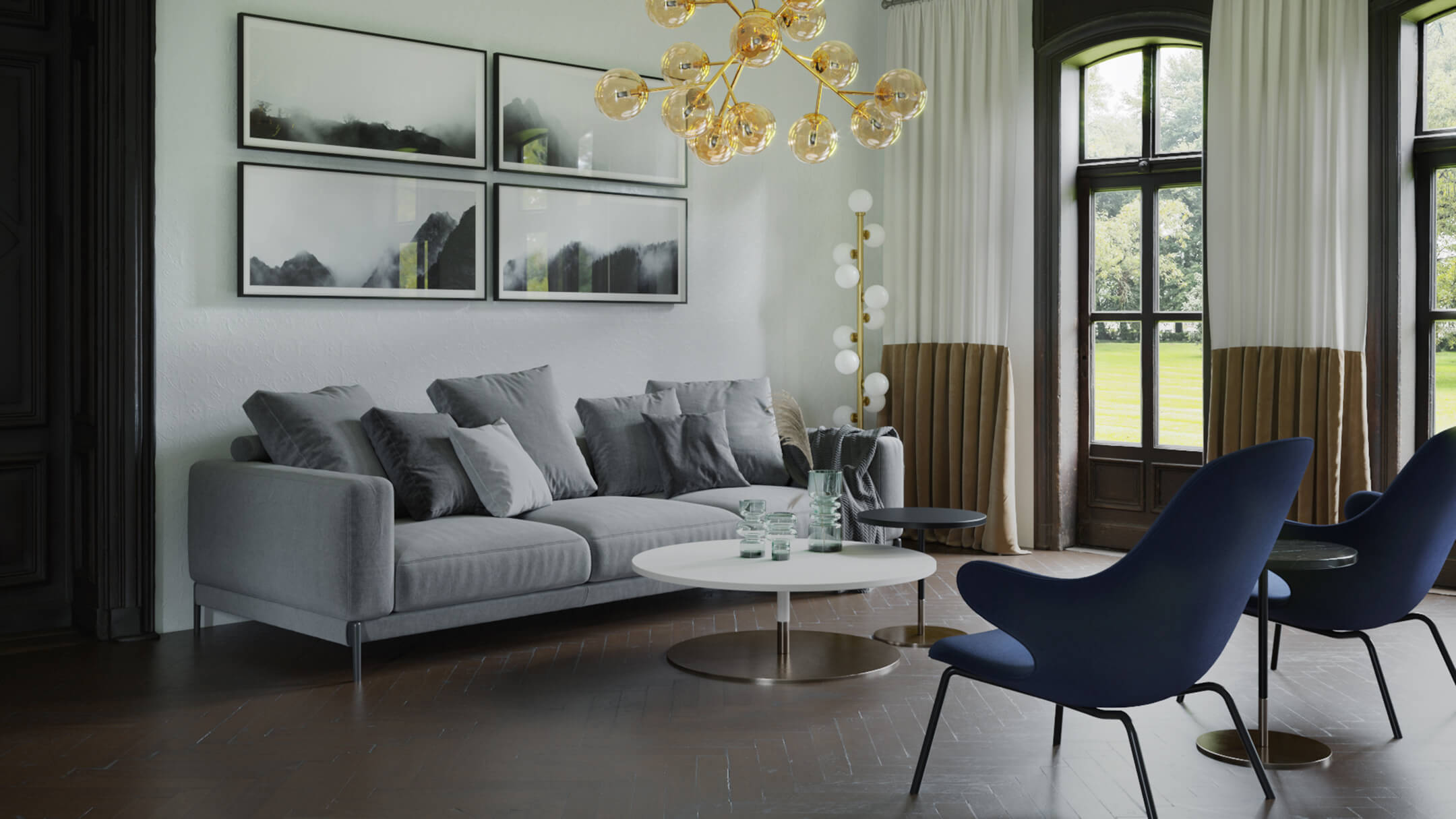
In the context of photorealistic interior rendering, cloudy weather is not a bad thing at all. It provides a perfectly neutral light suitable for showcasing any kind of design. This way, one can not just clearly trace the colors and textures, but also see the amount of natural light they can expect in a room on an overcast day. The atmosphere in such cases feels calm and relaxed, like it’s a good time to cozy up on a sofa with a book and a cup of tea.
Take your design presentation to a new level with interior rendering
#2. Natural Ambient Lighting — a Sunny Day
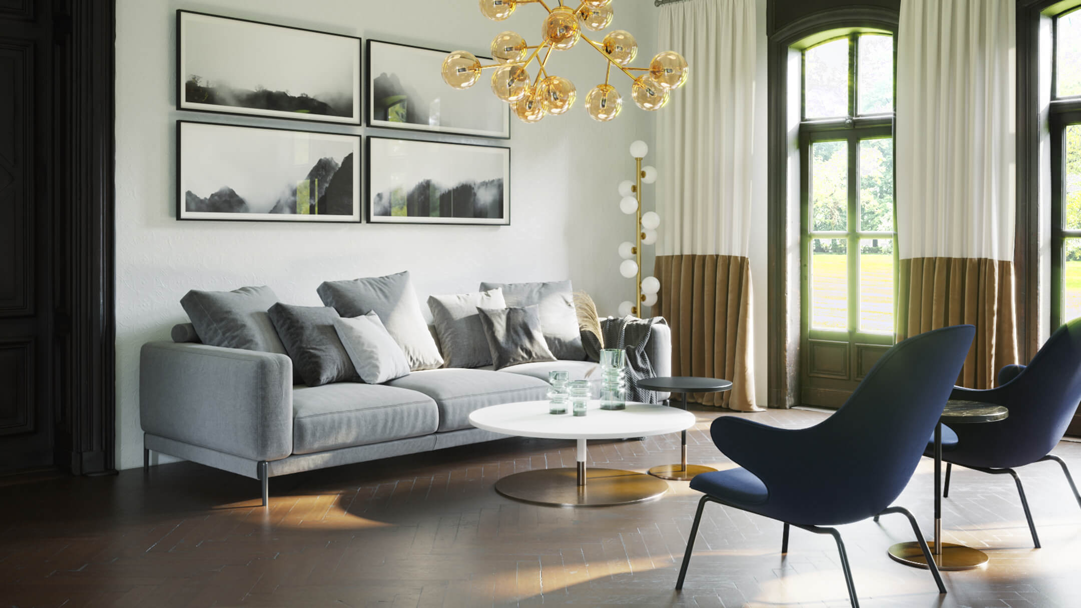
Compared to the previous option, natural ambient lighting on a sunny day gives the room a warmer, brighter look. The shadows and highlights are more intense here, and the contrast is higher as well. All of this makes interior renderings look very “alive”. This effect looks very impressive when there are large sources of natural light, such as tall windows and balconies.
#3. Ambient Lighting: Natural + Artificial
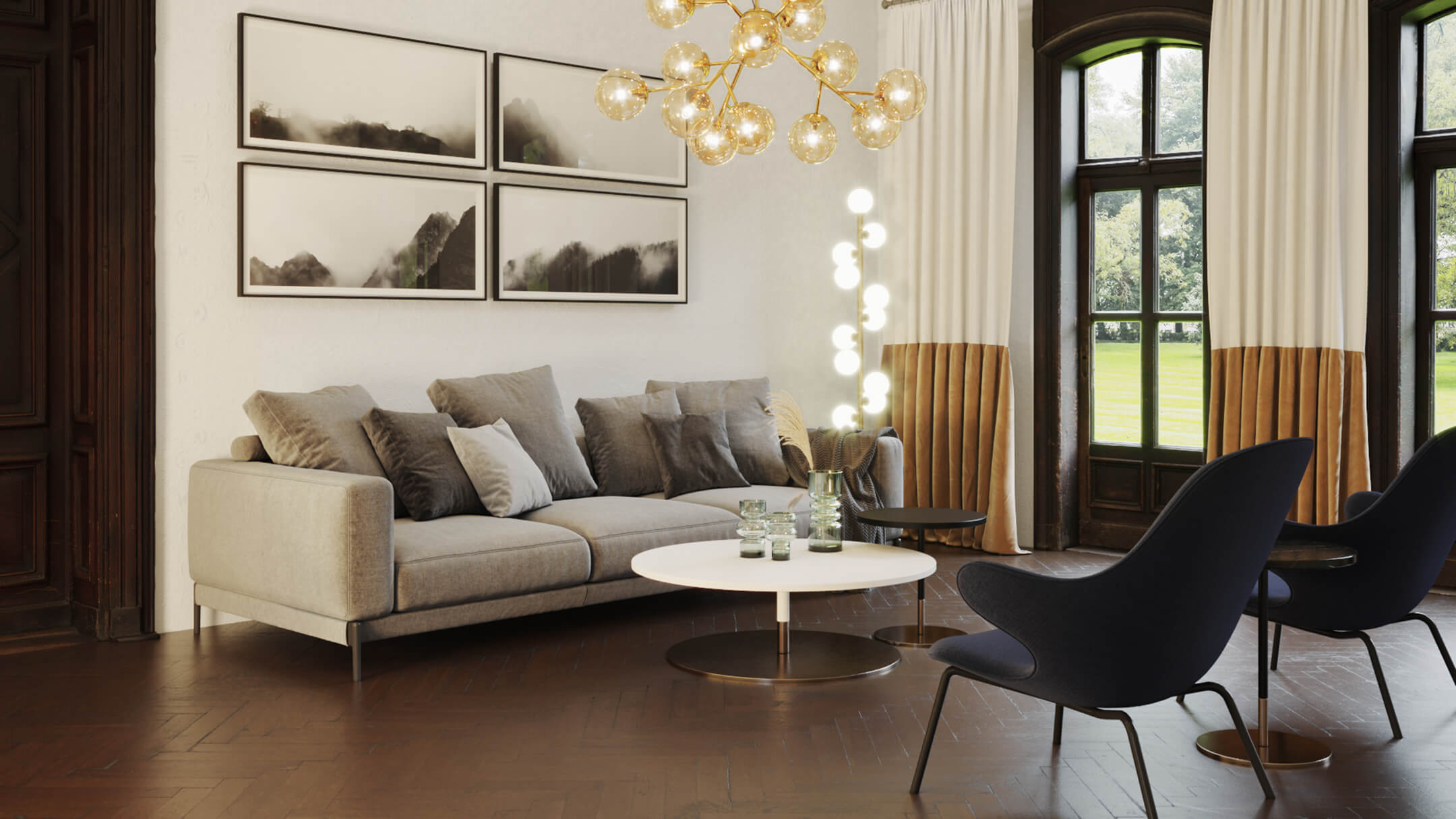
This option features a combination of natural and artificial lighting. From a practical point of view, this is a good way to show every aspect of a designer’s work in one image. Here, one can clearly see all the furniture and decor pieces, as well as the working sources of artificial light. However, photorealistic interior rendering in such cases might look a little unnatural. Because, after all, nobody turns all the lights on in the middle of the day. Furthermore, it can be quite difficult for the viewers to tell how much light is actually coming from every source.
Amount of Detail
In interior design renderings, details help to add character to the place. They complement the homeowner’s individuality, showcase their interests and tastes. However, the line between “just enough” and “too much” can be rather thin. So, let’s see how much detail to add to the renders depending on the project specifics.
#1. Low Amount
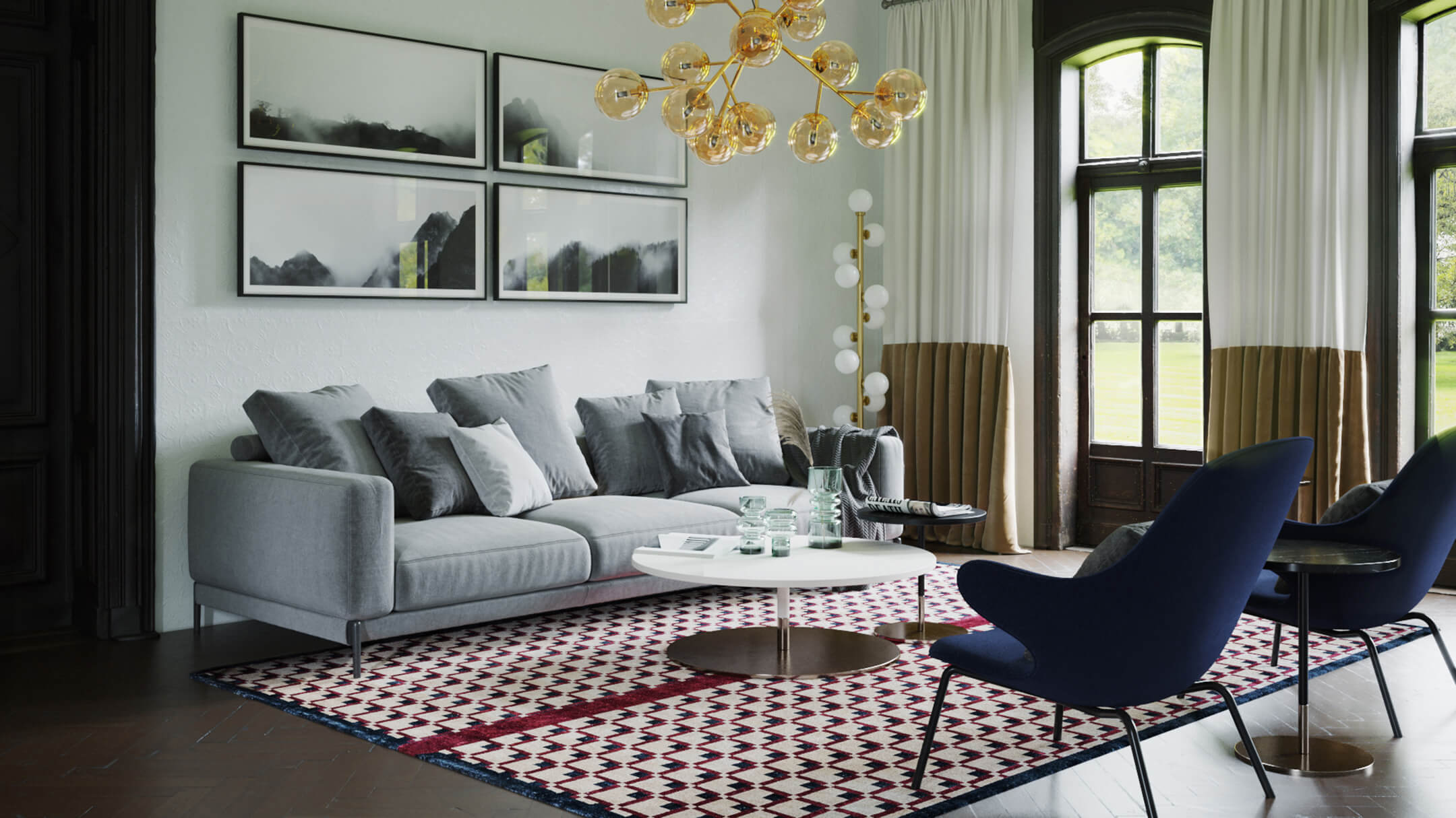
Having a low amount of detail in a photorealistic interior rendering helps to focus the viewer’s attention on the main elements. For instance, the core furniture ensemble in the room. Or, perhaps, a staple decor item, if there is one. This way, the interior will look neat and polished, and feel spacious and clean.
#2. Medium Amount
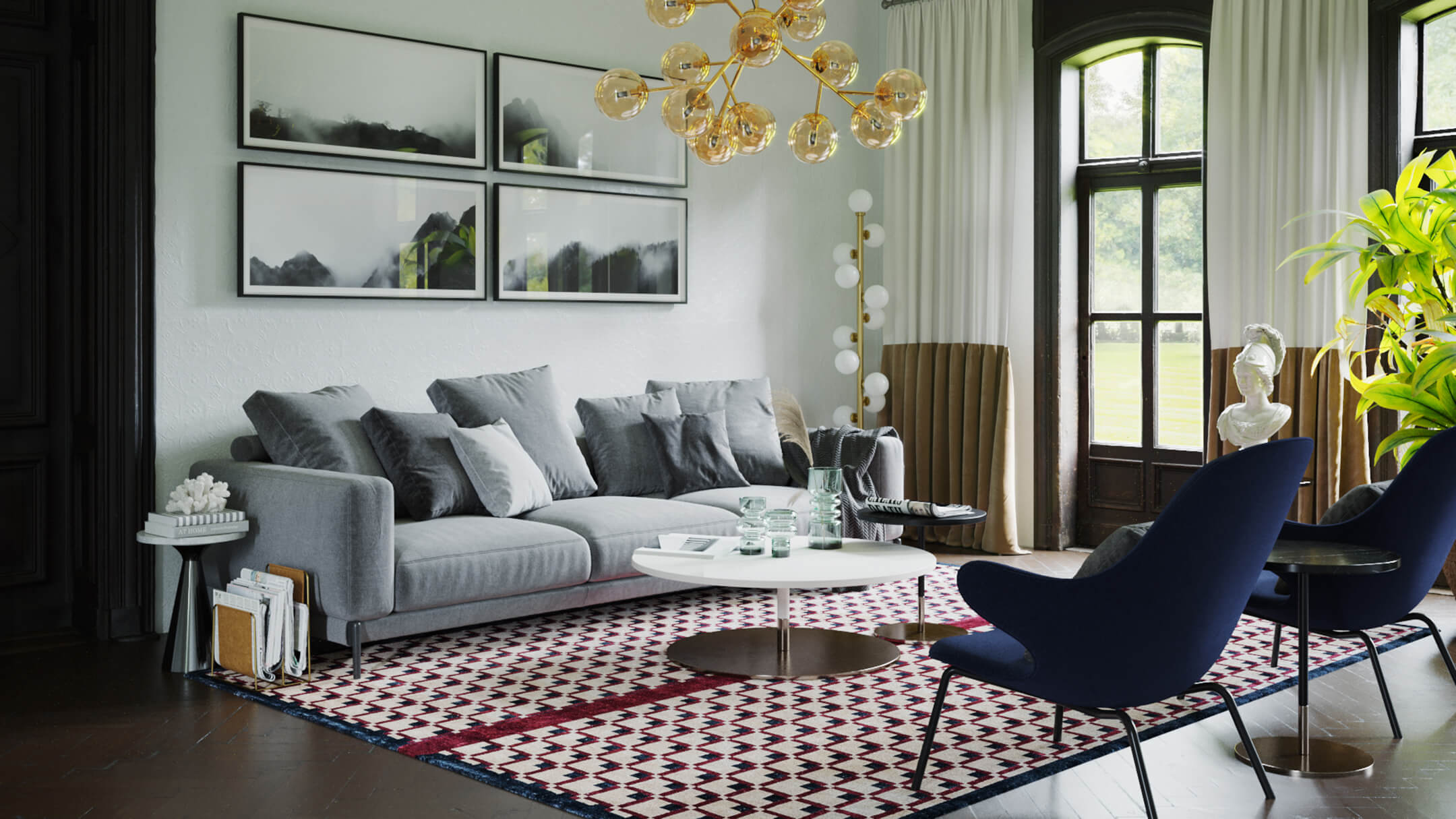
A medium amount of detail in a photorealistic 3D render makes the place seem lived-in and, therefore, more life-like. For the same reason, it can actually be good to make some details look a little messy. For example, a blanket left unfolded on the sofa will add to the realism of the image. Here, the main rule is to make sure that all the decor items are consistent with the design in terms of style.
#3. High Amount
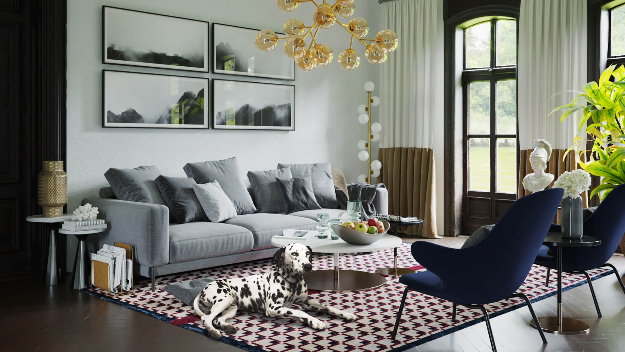
Adding a high amount of detail to a photorealistic interior 3D rendering can be good for certain styles and concepts. However, it might be distracting to see a great number of items in one picture. And if the viewer struggles to understand the benefits of design because of that, they will most likely ask for some serious corrections. Or they might even choose a different designer altogether. Therefore, one must always be careful with flamboyant projects.
If the overall tone of the interior is more reserved, a lot of details can make the place look cluttered. Needless to say, hardly anyone likes a stuffy, messy feel, especially at one’s own home. At the same time, some people dislike a lack of decor, considering it too ascetic. So, to get the best renders for a project presentation, one should find out about their clients’ preferences in advance.
An Example of Optimal Choices for a Final Render
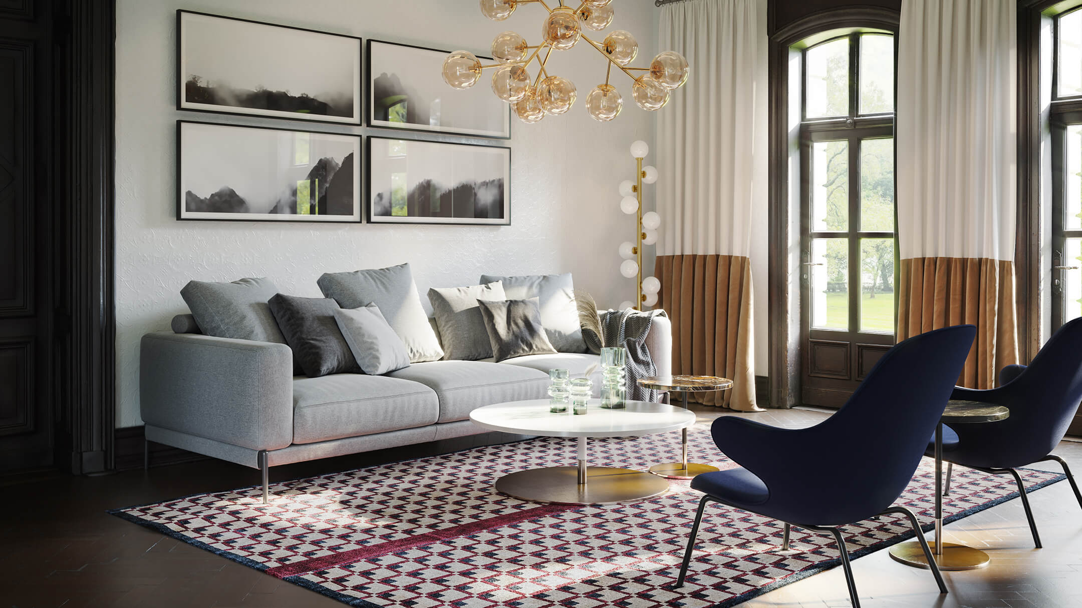
Now, here is an example of a photorealistic interior image with all 3 criteria selected to complement the design in the best possible ways. The time of the day in this picture is midday, with a bit of sunlight. As one can see, 3D rendering software allows softening the undesirable highlights and shadows, so that there are no overly bright or dark spots. The amount of detail in this render is low, which makes the room feel airy and spacious.
Well, those were the mood options that help designers to make the most out of photorealistic interior rendering. Overall, a designer should choose the type of lighting and the amount of detail based on the interior specifics and a client’s preferences and requirements. Having a certain mood in mind for every design project does aid in selecting the best options to convey it. But even if one struggles with that, there’s no need to worry! Because a professional 3D rendering studio will always help designers choose the best setting and reach their project goals.
Want to learn how much your project costs? See how we evaluate 3D rendering projects
Interested in ArchiCGI services? Contact us and get the most photorealistic interior renders to nail your next presentation!

Ana Wayne
Content Writer, Copywriter
Ana is a content writer for ArchiCGI. She has a passion for design and architecture - and for talking about it. Outside of work, she is a fan of sci-fi movies and a street food connoisseur.



Comments
Mary