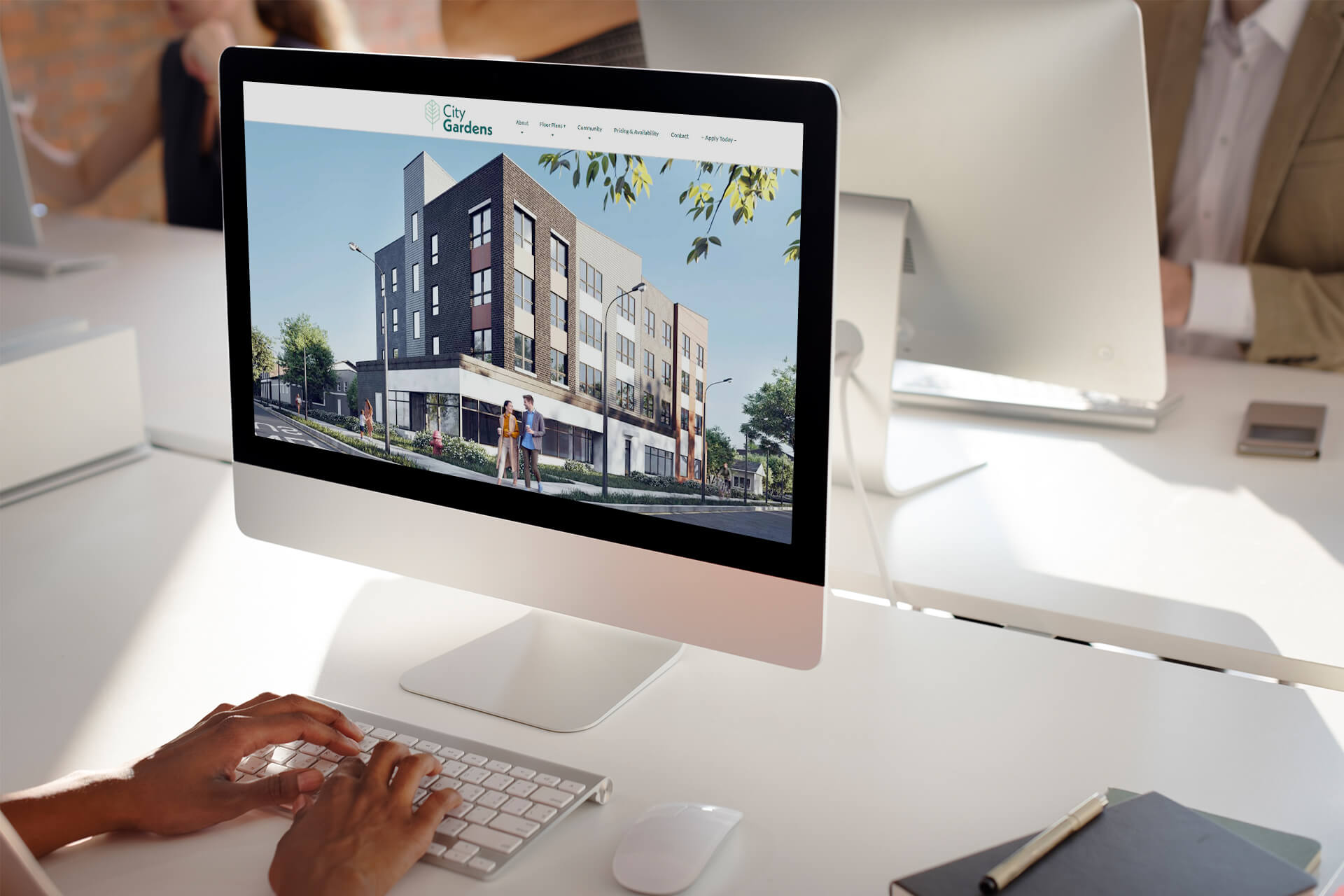
According to statistics, 97% of homebuyers use the internet at least at some point in their search for property. That means an established online presence is a must for any real estate company. And it is the website that plays a crucial role here. The site is the face of a company online, which can make or break the first impression for potential clients. How to make it nothing but stellar? When it comes to a realty company’s website design, functionality and aesthetics go hand in hand. Appealing visuals catch the potential customer’s attention while usability ensures the user doesn’t get frustrated and leaves the page. So, how to ensure your website design for a real estate company is a powerful client magnet?
Our 3D visualization company works closely with realty experts to provide them with high-quality visuals for all aspects of their online presence including web design. Plus, we are constantly working on our own website and improving it. So, it would be fair to say we are quite well-versed on the subject. And we are glad to share our knowledge. Want to know what makes for an outstanding website design for a real estate company? Read on!
#1. Make sure your web design is adaptive
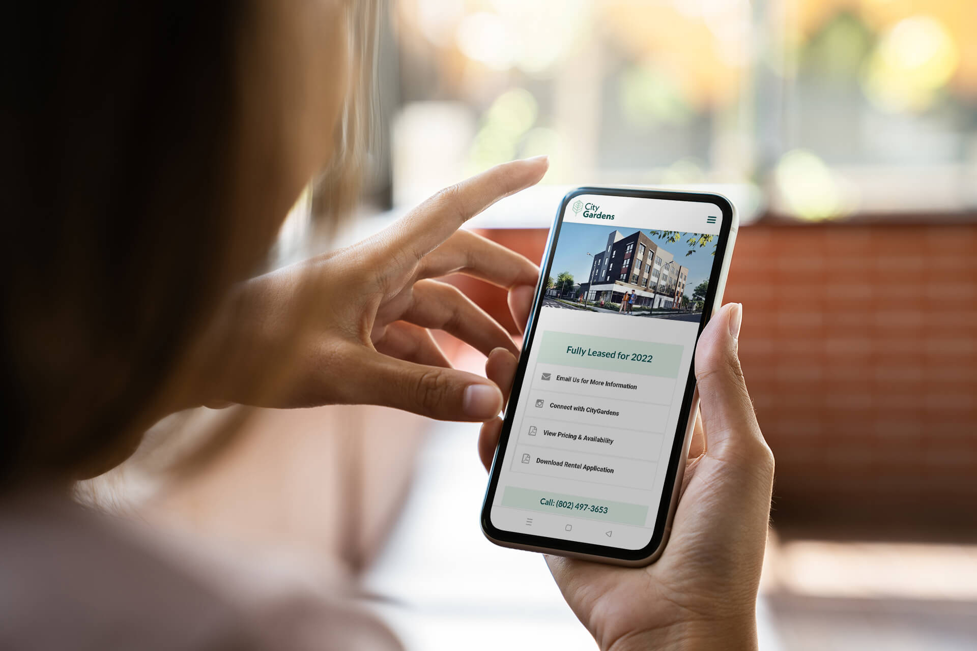
In 2022, mobile users accounted for 58.99% of all website traffic, and the trend only continues to grow. So, you need to ensure your website design is adaptive and will look good not only on a PC screen but also on mobile devices and tablets, as well as in any browser. Also, all interactive elements should be easy to use on a small touchscreen.
You can even make a design for mobile devices first. Oftentimes, it is easier to create the PC version based on an appealing and functional mobile version you already have.
We highly recommend you personally spend some time trying out your website on mobile. You might also ask your friends and colleagues to do so to identify potential weaknesses.
It is a great idea to track the traffic from desktop and mobile versions separately. This way, you will ensure your website design for mobile doesn’t fail in comparison.
#2. Optimize your homepage and landing pages smartly
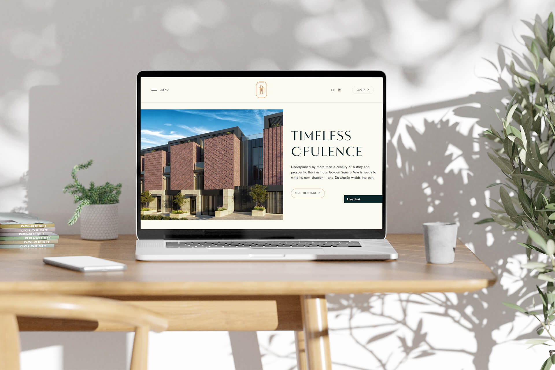
A homepage is your online business card. It introduces your real estate company to the visitors, gives an overview of the best listings, features testimonials, your achievements in numbers, and so on. A landing page, in comparison, is usually much simpler in terms of design and amount of information. While the website homepage should introduce the customer to your real estate company in general, the purpose of a landing page is to motivate a visitor to take a specific action. For example, it can offer to learn about a certain residential complex being built and to ask for additional information about it.
The design and functionality of the homepage and landing pages of your website should be aligned with these purposes. It should be clear from the very first glance what you want a user to do (that’s especially important for a landing page). So, it’s best to keep your website design clean and simple and make sure the call-to-action buttons are noticeable but not intrusively annoying. Ensure it is obvious what you are offering a visitor to do. “Click here” is better to be avoided in favor of more specific CTAs such as “Get in touch,” “View our projects”, and so on.
#3. Ensure the intuitive navigation
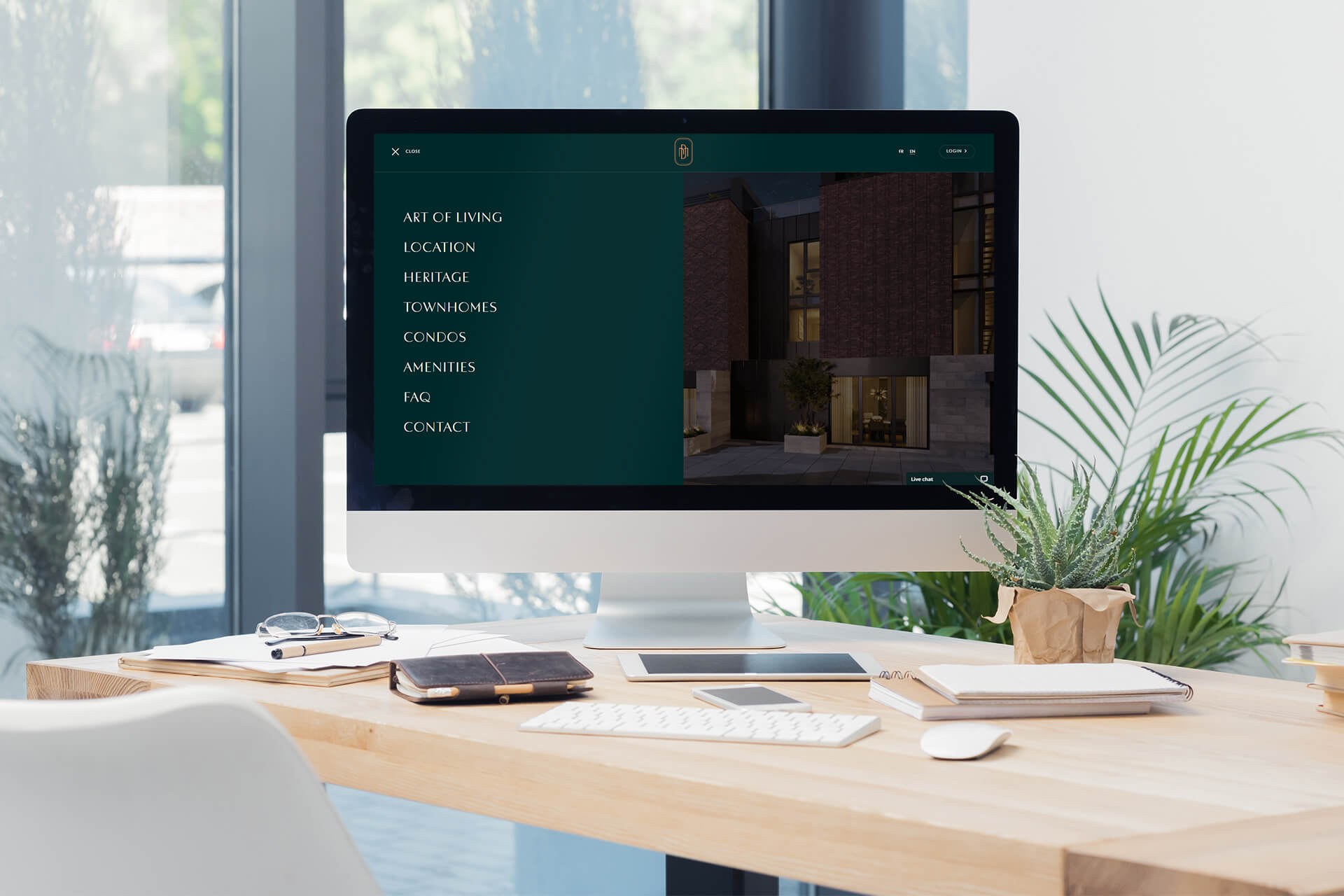
67% of users leave a webpage immediately if it is not clear enough for them how to navigate it. So, simple and highly functional navigation is a must in website design for a real estate company.
It is recommended to use fixed headers so that the main sections of your website are easy to see and accessible from every page. Adding contact information to every footer will be a wise move as well. Labels you give to your sections should be concise and topic-focused. This will not only make your website more convenient for users but will improve your SEO as well. It’s best if you limit your menu items and, whenever possible, avoid drop-down menus. That’s because they are disliked by both users and search engines.
#4. Add a user-friendly search tool
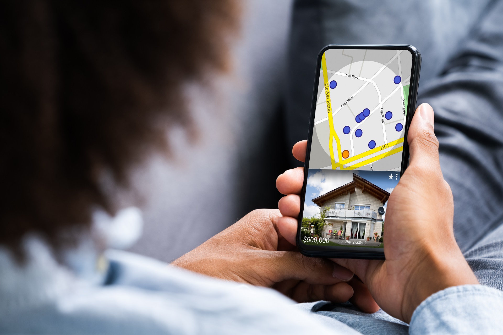
While some of your potential customers might contact you right away after viewing your page, the majority of them will prefer to spend quite a lot of time on your real estate company website looking for a suitable property. And the goal of your web design should be to help them with that.
The best option here is to have a quick search toolbar easily accessible from every page of your site. Advanced search with filters should also be incorporated. Building type, price range, square footage, and the number of bathrooms and bedrooms in a property are only some of the filters you might use.
Another good idea is to add an interactive search map to your website. Using it, a customer will be able to see all the available properties and click on the ones that fit the preferred location to learn more about them. This tool might be trickier to translate to the mobile version but it’s definitely worth it.
#5. Strike a balance between aesthetic and functionality

Beautiful visuals are an important part of website design for a real estate company. However, they should not come at the cost of sacrificing functionality. If your website is full of nice pictures but is visually overwhelming, confusing, and hard to navigate, a user is very likely to leave the page.
Immerse clients into your projects with realistic 3D animations
To avoid that, make sure your layout is clear and geared towards your purpose, whether it is to introduce the user to your real estate company and make them want to explore the website or to take a more specific action. Keep the number of fonts to two, and limit the color palette to one dominant and one or two additional colors. These colors need to work together harmoniously. You can use the color wheel or look up premade palettes for inspiration. The point here is that your website design should not look oversaturated or garish. Also, don’t overcomplicate it with unnecessary, overwhelming elements like buttons, banners, pop-up windows, and so on.
When you use high-resolution images or videos, ensure your website is still downloading quickly. If it’s not, optimize the visuals accordingly. The slow download is one of the major reasons users quit the website without even taking a proper look at it.
#6. Use high-quality visuals
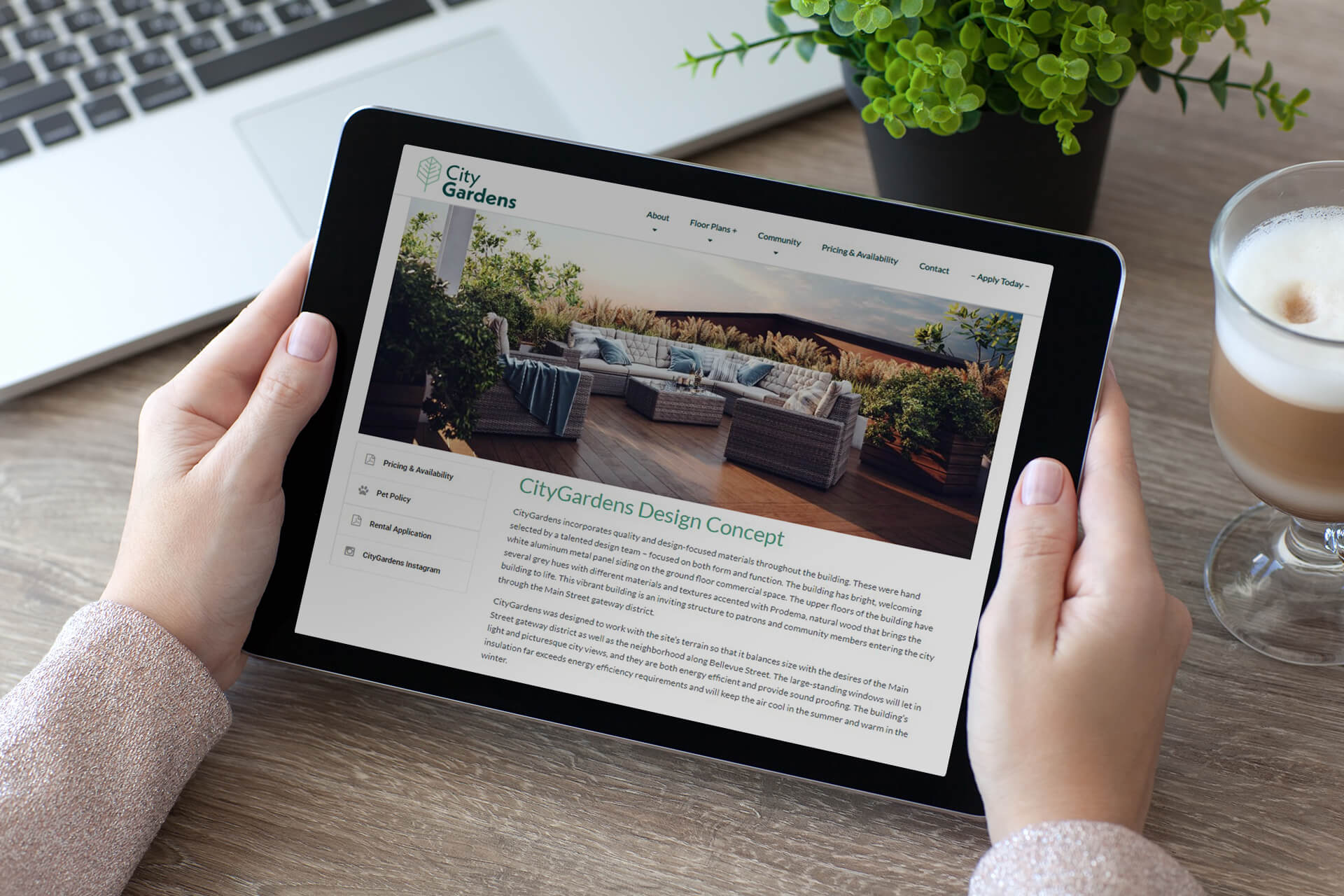
Top-class imagery is a vital aspect of website design for a real estate company. From the main page to separate property listings, images should evoke emotions and boost interest. So, when using photos, make sure they are in good resolution and informative, and show real estate objects from multiple angles and in proper lighting.
Another way to ensure you have enough catchy visuals for your website is by using real estate rendering. It offers multiple useful options. For instance, it allows you to showcase the future look of an unfinished property in photoreal images, interactive 3D virtual tour rendering, or even animations.
Your visuals should be consistent throughout the website. It’s best if you ensure they are all on-brand and have a recognizable style. Professional photography or real estate rendering services can help you with that.
#7. Include video tours

66% of people prefer learning about products and services through a short video rather than a picture or text. Potential real estate buyers and tenants are no exception. That is why video tours are a powerful asset for your real estate company’s website. Using those, you can present the property almost like in real-life home viewing. What’s more, video tours spare the necessity of numerous in-person visits. This is especially convenient if the previous owners haven’t moved out yet.
In case a property is already built and furnished, you can shoot a video tour on camera. If it’s under construction, you can commission virtual 3D tours or animations at an architectural animation company to entice potential buyers early on.
#8. Share client testimonials and useful information
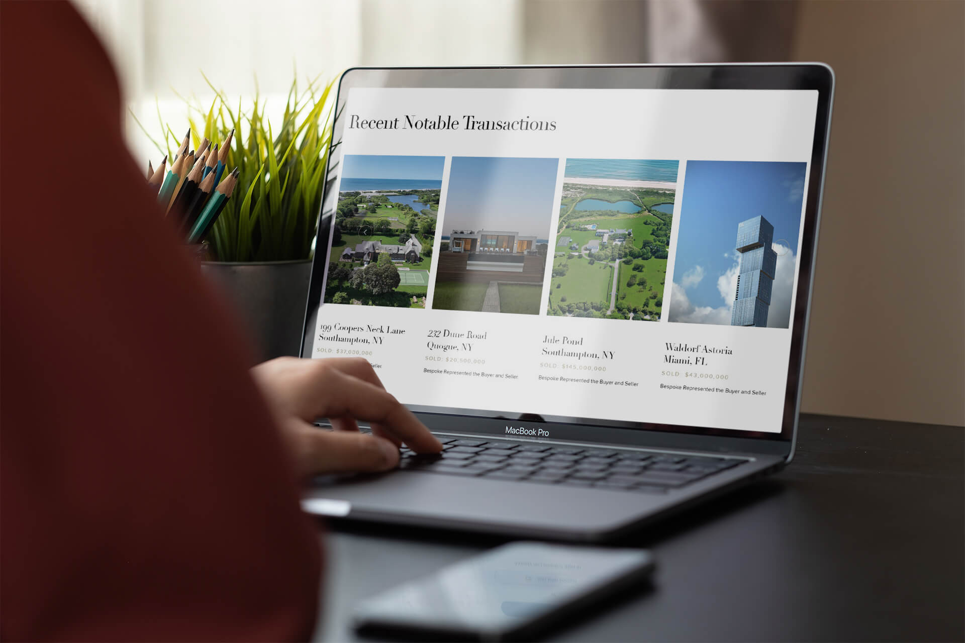
It is always a good idea to provide any information that will increase your trustworthiness in the eyes of potential customers. Client reviews as well as statistics on developed, sold, or leased properties will boost your company’s credibility and your website’s visibility on Google. Blog articles with useful tips relevant to the real estate industry, buyer’s and seller’s guides, market reports, and so on will provide your prospects with additional value and strengthen their positive impression of your business.
Website design for a real estate company must serve three main purposes. It has to catch the eye of your potential customers, convey all the necessary information in an easy-to-navigate manner, and convince them to contact you to learn about the next steps. To achieve all of that, you need a site that has a careful balance between functionality and looks. And we are always ready to help with the latter. At ArchiCGI, we provide our real estate clients with visuals that keep their company’s website visitors glued to the screens.
Looking for CGI services to establish your online presence and boost your business success? Contact us to get high-quality 3D renderings for your real estate company!

Stacey Mur
Content Writer, Copywriter
Stacey is a content writer and a CG artist. Outside of work, Stacey enjoys musicals, Star Wars, and art talk. A proud Corgi parent.


