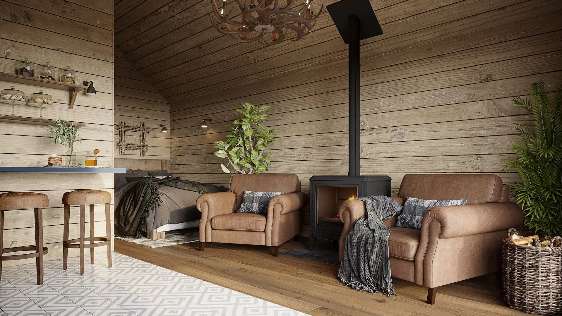
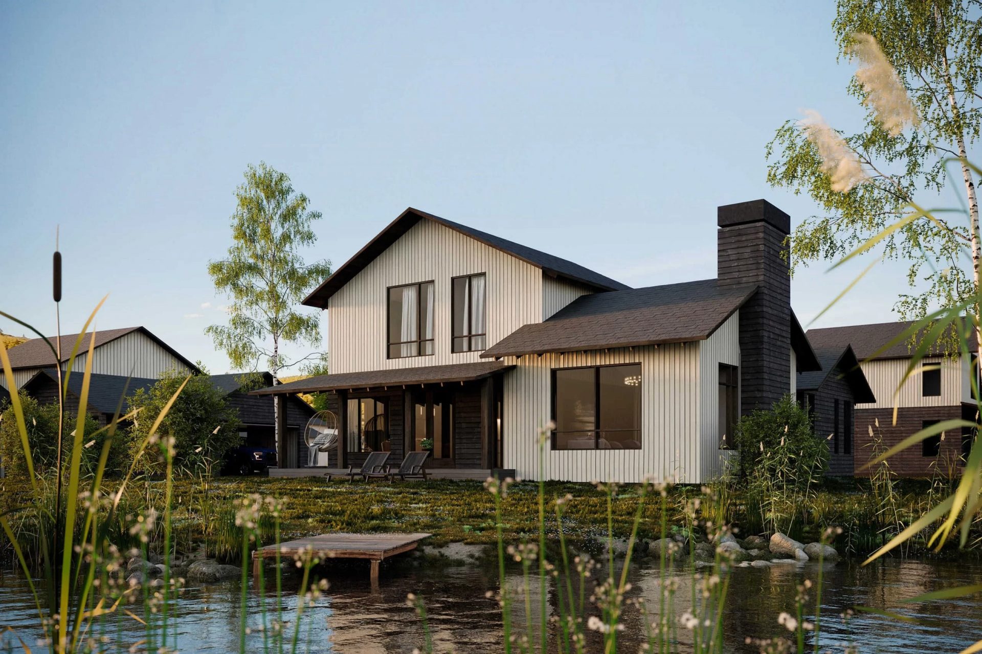
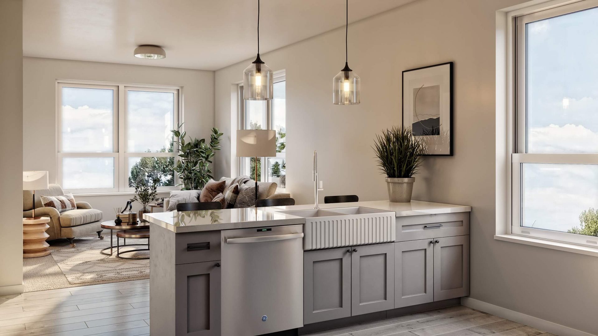
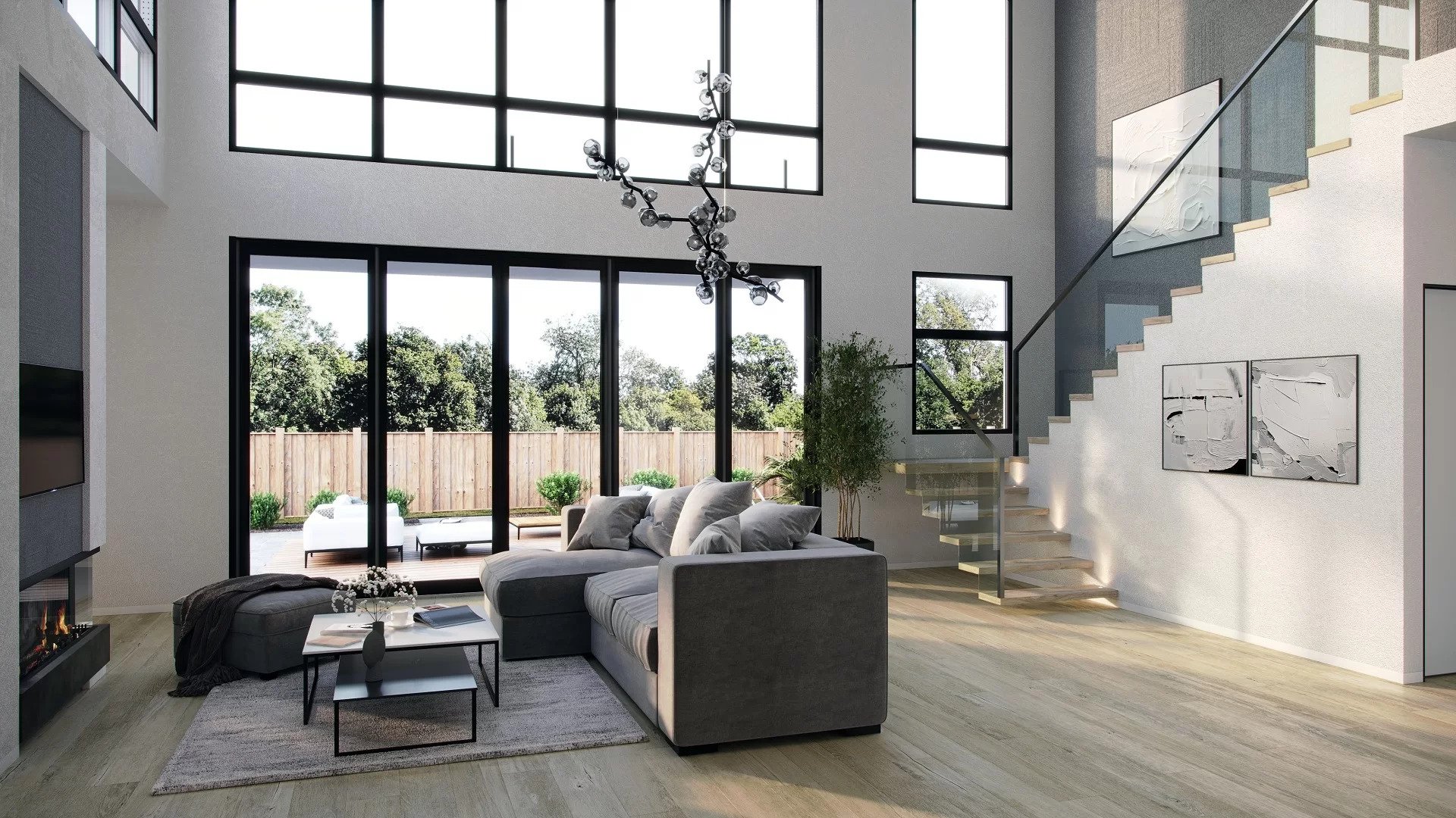
Architectural 3D images can make all the difference in an architect’s presentation. They convey important project details and evoke emotions way more efficiently than any drawings or physical models of the building. So, after considering the benefits of 3D visualization, many architects confidently decide to go for it. However, the next step, which is choosing the CGI contractor to do the work, often turns out to be much harder. Because if the company delivers low-quality, unrealistic, uninformative, or boring images, all the architect’s efforts to impress the client can come to naught.
So how to choose wisely? What distinguishes excellent CG images from mediocre ones? Thankfully, there are a few specific things to look out for in a portfolio of an architectural rendering company. Keep reading to learn the 5 signs of CG renderings made by true professionals!
#1. Realism in Small Details

The devil is in the details. Nothing spoils the impression of architectural 3D images more than minor non-compliance with the laws of physics and common sense. If a seemingly well-made rendering evokes the feeling that something’s just not quite right, the issue might be with:
- The shadows in the images. If they are too long, too short, too sharp and dark, or wrongly directed, it is a bad sign. In a masterfully made architectural render, all shadows look realistic as if it was a shot made by a professional photographer.
- The reflections. It might be rather easy to notice if something’s wrong with those in mirrors and windows. But it’s also reasonable to pay attention to the smaller reflective surfaces, such as tableware. In 3D images made by an expert, all reflections and glares on the objects strictly match the depicted surroundings.
- The ergonomics. If a viewer sees an interior render where doorknobs are located too high, the passages between the furniture pieces seem to be too narrow to squeeze through, and so on, they would perceive the depicted room as uncomfortable, unfunctional, and unrealistic. Experienced 3D artists take into account all the aspects of ergonomics, so their renders look like shots from a portfolio of a renowned designer.
#2. Consistent Theme and Story

The best architectural 3D images should tell a well-thought-out story, with no details and objects out of place. All the elements in the rendering must be interconnected and make sense of the overall concept.
- First of all, the image should be consistent in terms of season and time of the day. Weather conditions, as well as state and colors of vegetation, must paint a clearly recognizable picture of one of the seasons. Also, natural lighting should be in harmony with artificial light. If an architectural render shows high noon, the street lights must be off and the visual temperature of the picture has to be warm, not coldly bluish like at dusk.
- It‘s essential to take into account the local specifics of the area that is going to be shown in the render. The language and the style of signboards in the streets, the types of vegetation, the clothes of people — all of this should be researched and thought through by a 3D artist. All these specific details must look relevant to the country and region the scene depicts.
- The rendering should feature consistent exterior or interior style, types of materials, and decor. For instance, a classic chandelier cannot just randomly pop up in a contemporary interior.
- The lifestyle details should not feel out of place. The presence of a winter coat in the bathroom will inevitably raise questions, even if that object looks good on its own.
Showcase your architectural project like a true work of art, brought to life with cutting-edge AI-powered CGI technology.
#3. Harmonious Composition

Just like with any piece of visual art, a careful, balanced composition is a must for a realistic 3D visualization, be it an interior or exterior scene.
- The rendering should have a clear compositional center. It is a part of the picture that immediately catches the eye.
- The image should have visual accents, usually emphasizing the selling points of the project. To create those accents, a 3D artist can use colors, contrasts, or shapes.
- The composition should be visually balanced. Whether it’s symmetrical or asymmetrical, the parts of the image opposite to the center should have a similar visual weight. For example, if most of the furniture is located in the lower right third of the frame, some elements like a large painting should balance it out in the upper left corner. There should be no parts of the picture that look too empty or too cluttered.
- The placement of objects should be carefully orchestrated. No item should look like it got there by accident.
The good old rule of thirds and the golden ratio are always useful to ensure the perfect composition. It is quite easy to spot if the 3D artist took them into account in their work.
#4. Liveliness and “Imperfections”

Life is never spotlessly clean, absolutely symmetrical, or geometrically ideal — and so are the realistic architectural 3D images. Small imperfections make the rendering life-like and interesting to look at. Professional 3d interior rendering services often use these subtle details to ensure spaces feel authentic and relatable.
- There should be no neat lineups of furniture or decor pieces placed at the same angle. A well-curated, although slightly “imperfect” arrangement will make the composition more lively and compelling.
- There must be no repetitiveness. No objects should look like they were just copy-pasted and placed at the same distance between each other. There are no two identical trees, chairs, or any other things in reality, so there should be none in the CG picture as well.
- A smidge of dirt on the driveway, an unfinished cup of coffee on a table, creases on a blanket — all small details of this kind can make a huge difference to the general look and atmosphere.
#5. Usage of the Recent Industry Trends

The best architectural 3D images are not only well-made from the technical point of view but also up-to-date with the current design trends.
- An archviz artist worth their salt is not only good at using 3Ds Max and similar software but constantly updates their knowledge of the architecture and design fields. They always strive to enrich their experience — for example, by following top international design magazines, such as Dezeen, Architectural Digest, etc. And it will definitely be reflected in their work.
- The 3D images will also show the artist’s acquaintance with their clients’ local design trends. To learn about those, the CGI specialists often do their own research or even consult with their customers directly. This way, they save a lot of time on revisions and make the CG visualizations look fresh and relevant.
In order to impress any client, architectural 3D images must be technically correct, realistic, and lively. To create an image with a wow effect, a 3D artist should pay attention to all the details from the direction of light to the height of the furniture, mind the consistency of the atmosphere and aesthetics, enliven the picture with minor “imperfections”, create a visually appealing composition, and use the current design trends.
Looking for a reliable provider of CGI services? Check out our portfolio to make sure it meets all the above-mentioned criteria, and contact us at ArchiCGI for flawless photoreal renders!

Chris Kostanets
Senior Project Manager, Mentor
Chris manages the work of 2 CGI teams and teaches Middle PMs. She loves Scottish landscapes, Ancient Greek culture, and Plein-air painting. At home, Chris is a caring parent for 3 cute chickens and a magnificent rooster.


