
We’ve all seen renders that tick every technical box. Perfect geometry, spotless materials, lighting that took hours to dial in. And somehow the image still feels like nothing. You look at it and think, yeah, that’s a building. And then you move on. What actually gets people to approve a project, fund a development, or click “schedule a viewing” is storytelling — the art of directing the viewer’s attention and creating a sense of presence through composition, lighting, and context. Not scattering furniture and a potted fern across the scene. Something deeper than that.
The need shows up in three situations more than any others: pre-sale marketing, where the render has to make someone want to live there; project approval presentations, where a planning committee needs to feel confident in the design; and competition materials, where your entry has to outshine dozens of others on a jury’s screen. If you know how to describe what you want to an architectural rendering company or your in-house CG team — in terms they can act on — the whole process gets faster. Fewer revisions, quicker sign-off, less guesswork on both sides. Most articles about this topic stay theoretical. We wanted to make something you can actually hand to your 3D artist alongside the brief: seven specific archviz storytelling techniques, each with prompts to use and mistakes to dodge.
What Is 3D Storytelling in Architectural Visualization?
Think of it this way. Every render speaks the visual language of a space — camera angles, light, atmosphere, materials, and objects in the scene all working together to communicate a feeling. Visual storytelling for 3D archviz is not “making a beautiful picture.” It’s not “adding people to the frame.” It’s making every element serve a purpose: directing attention, setting a mood, reinforcing the project’s identity. If nothing in the image makes the viewer pause, feel something, or imagine themselves inside, the render is just geometry with textures on it — technically correct but emotionally empty.
Why does this matter for your business? Because a render that tells a story builds trust. An investor looking at a pitch deck makes a gut decision before they read the numbers. A planning committee member forms an opinion in the first three seconds of a slide. A buyer scrolling through listings stops on the image that feels like home — not the one that looks like a 3D model. That emotional response shortens the decision cycle, reduces the back-and-forth, and turns a static image into a sales tool. Storytelling is what connects a 3D model to a business result.
And if you’re thinking beyond still images — walkthroughs, fly-throughs, animated sequences — archviz animation takes these same storytelling principles and puts them in motion.
Drive clicks with scroll-stopping 3D ad visuals

How to Choose the Right Approach (Decision Guide)
Not every trick works for every project. A cozy residential villa and a glass-and-steel office tower need different visual strategies. The table below maps common presentation goals to the techniques that support them — and flags the ones that get in the way. Consider it a quick set of CGI composition tips to reference before you write your next brief.
| Goal | Recommended Techniques | Avoid | Key Mood |
|---|---|---|---|
| Sell warmth / comfort | Contrasting lighting, warm materials, contextual elements | Dramatic weather, cold tones | Cozy, inviting |
| Show scale / monumentality | Camera angle, human scale cues | Excess props, motion blur | Grand, imposing |
| Urban energy / lifestyle | Motion blur, night lighting, reflections | Static empty scene | Dynamic, alive |
| Premium / luxury | Clean materials, minimal props, god rays | Visible wear, clutter | Refined, aspirational |
| Family comfort / residential | Contextual elements, soft daylight | Aggressive contrast, night scenes | Welcoming, lived-in |
Select two or three of the techniques we’ll discuss next. And if you’re unsure about which render format best suits your project, such as exterior hero shots, aerial views, or street-level perspectives, consulting the guide on types of architectural renderings is a good next step.
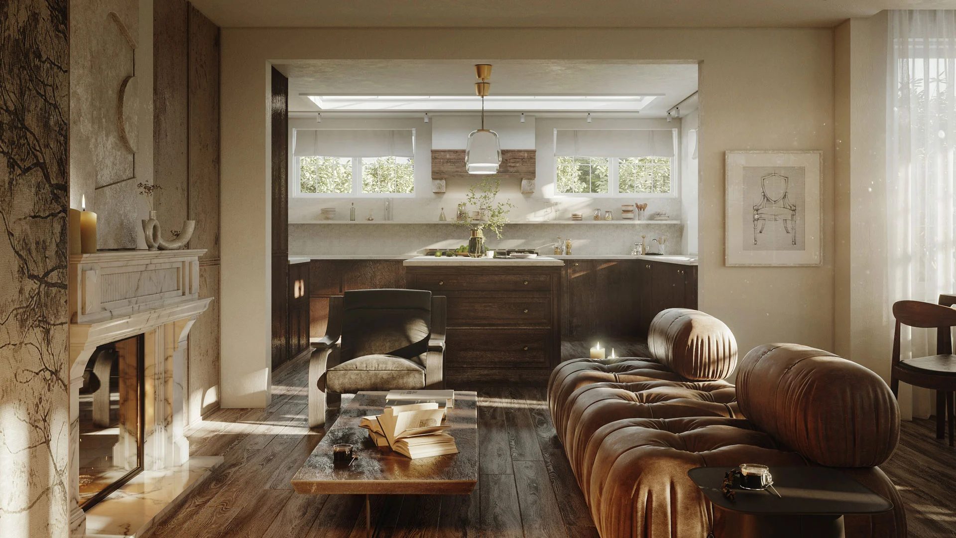
#1. Contrasting Details
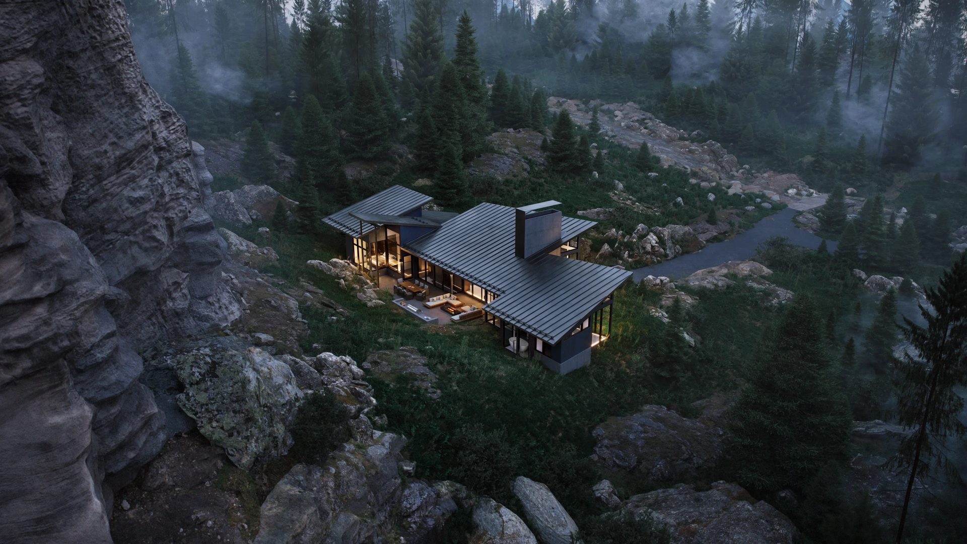
If you want someone to look at a specific part of your render, contrast is probably the fastest tool you have. It could be a temperature thing — cold blue exterior against warm amber windows. Or a material thing — polished steel next to rough-sawn timber. Or just plain light and shadow doing the work. The point is always the same: you’re creating one spot that pulls the eye, and letting everything around it stay quieter.
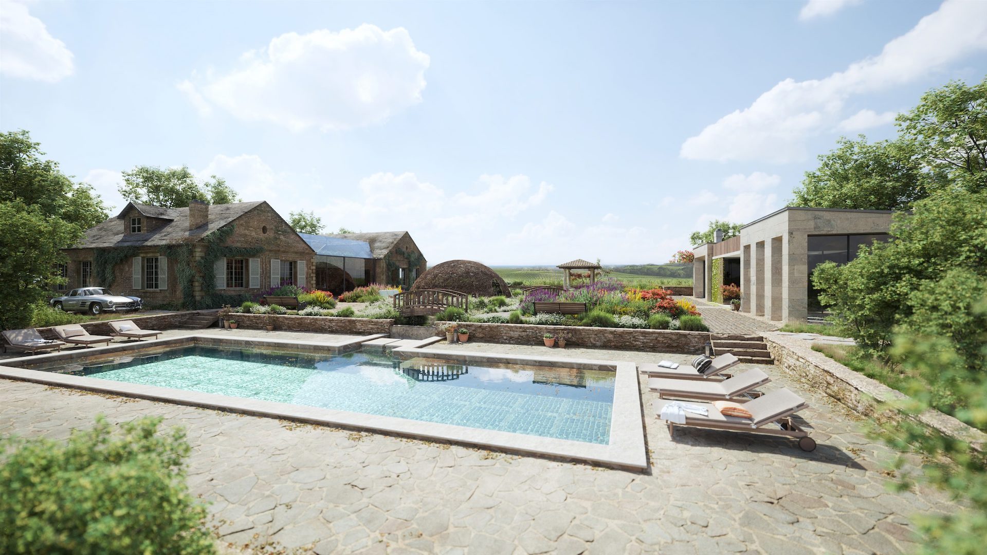
There’s a term for this in visual composition — visual hierarchy (sometimes called narrative hierarchy) — and it sounds fancier than it is. Basically: pick one main event for the image. A countryside house at dusk is a good example. The walls and the sky are composed of cool shades of blue and grey, yet a warm glow seeps through the windows. Your brain goes straight to it. You don’t even think about the driveway or the trees — they’re there; they support the scene, but they’re not competing. The story writes itself: warmth, shelter, someone’s home.
Briefing Prompts
- Decide on the type of contrast first — are you working with temperature, material texture, or light?
- Point to the one spot in the frame that should grab attention. Just one.
- Tell your team which parts of the scene need to stay quiet so they don’t steal focus.
Common Mistakes
- Cranking up contrast across the whole image. When everything screams for attention, the viewer doesn’t know where to land.
- Ending up with two focal points that are equally loud — the eye bounces between them and never settles.
#2. Motion Blur Effect
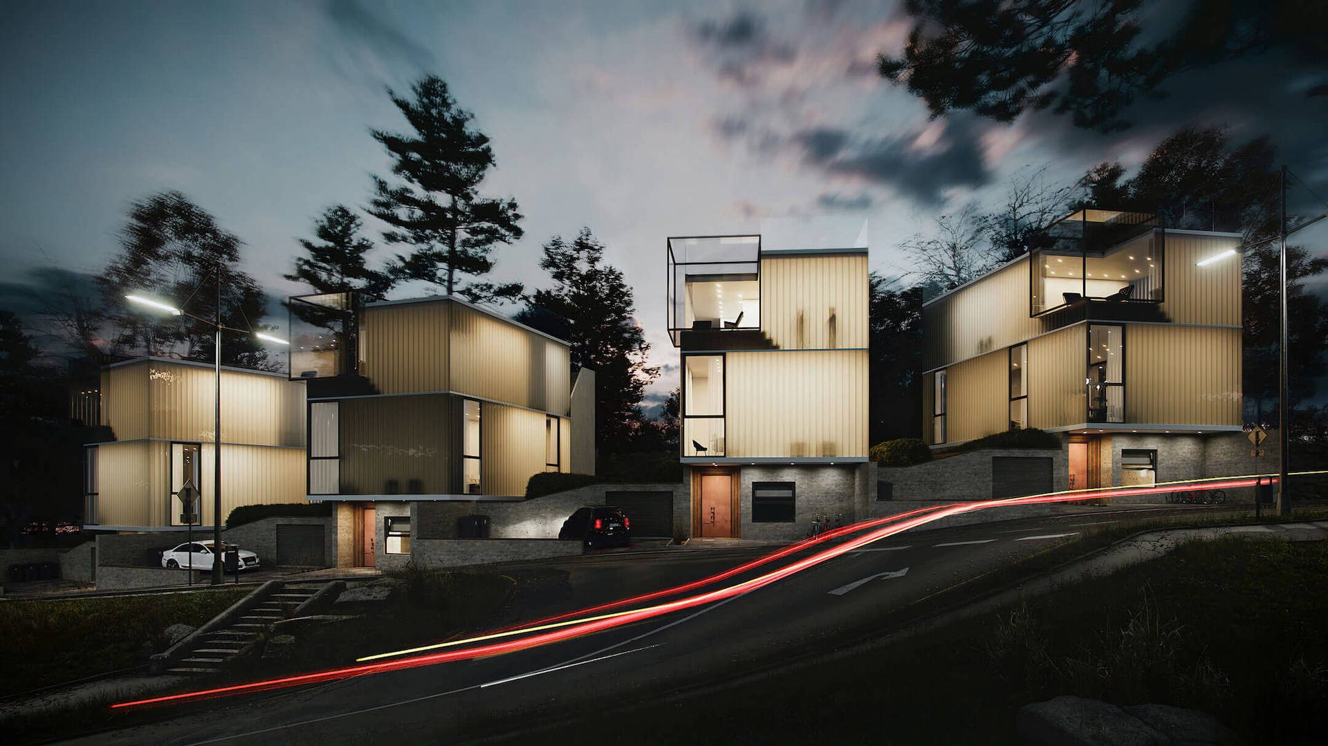
By definition, a still render freezes in time. However, motion blur introduces a sense of activity, such as passing cars, pedestrians, rustling leaves, and flowing water, transforming the scene into a moment caught mid-motion instead of a posed model.
The intensity matters. A subtle blur (think 10–20%) gives you gentle everyday movement — a cyclist going past, a flag in the breeze. A heavier cinematic blur (40% and up) creates that dramatic long-exposure feel, which is especially effective for nighttime urban scenes with streaked headlights and taillights. Big difference, and worth specifying in your brief.
Briefing Prompts
- What elements in the scene should move? (traffic, people, vegetation, water)
- How intense should the blur feel — subtle and natural, or cinematic and stylized?
- Should motion blur appear across the entire frame or only in the background?
Common Mistakes
- Blurring architectural lines or building edges. That makes the design itself look out of focus — not the effect you want.
- Overly long motion trails that look artificial rather than photographic.
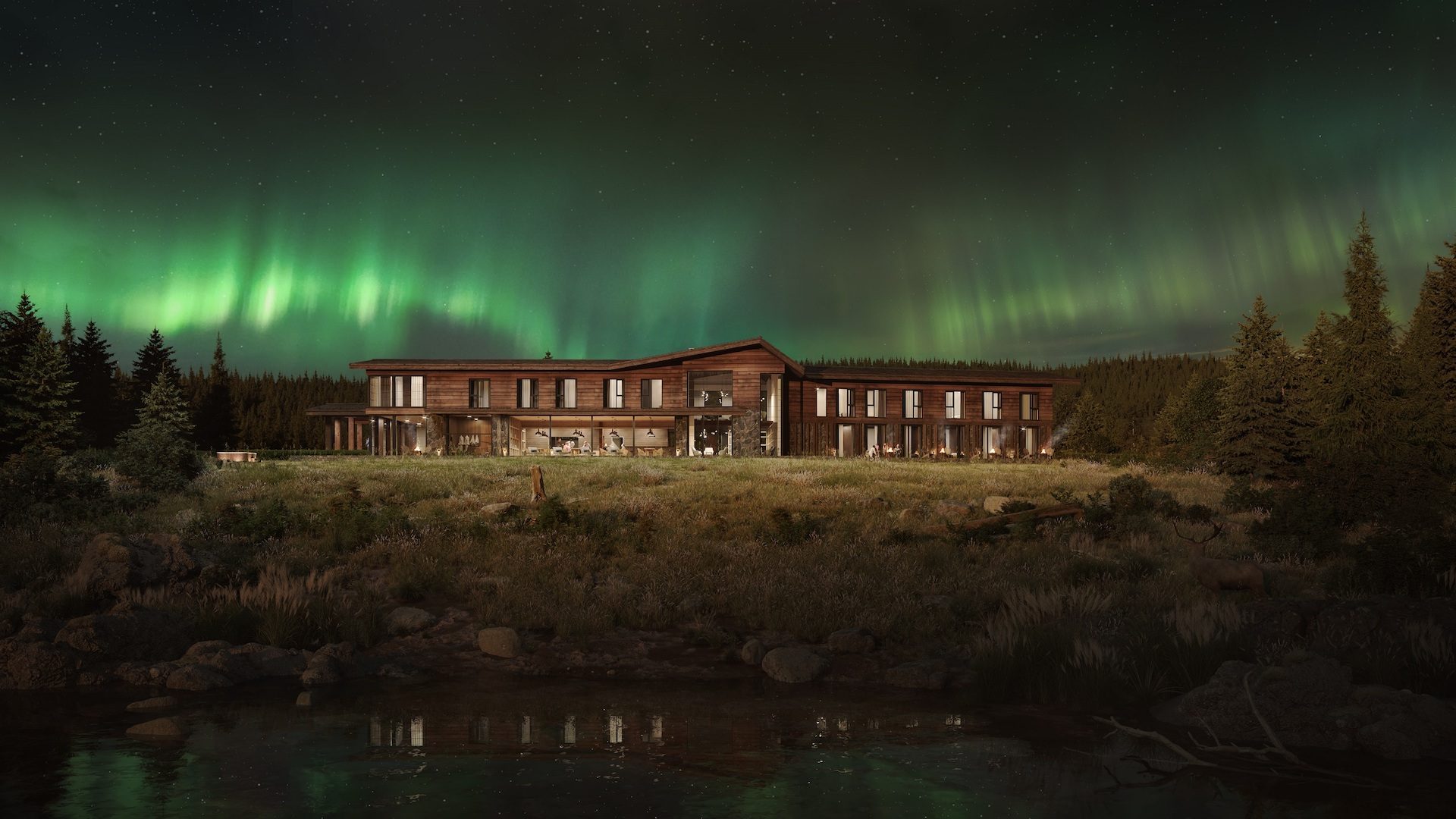
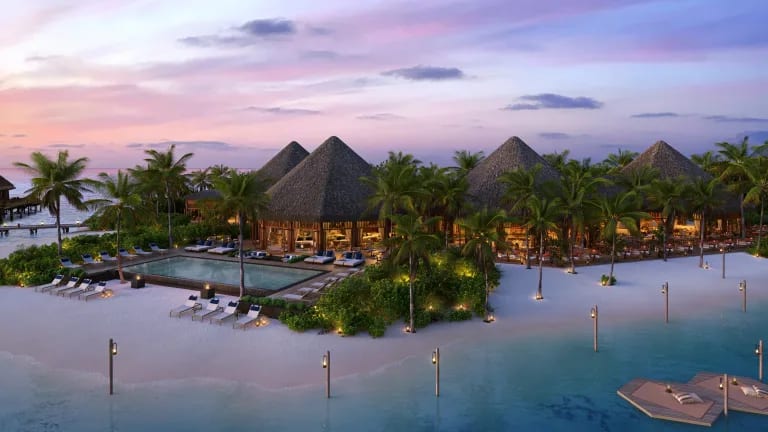
#3. Atmospheric Lighting Effects
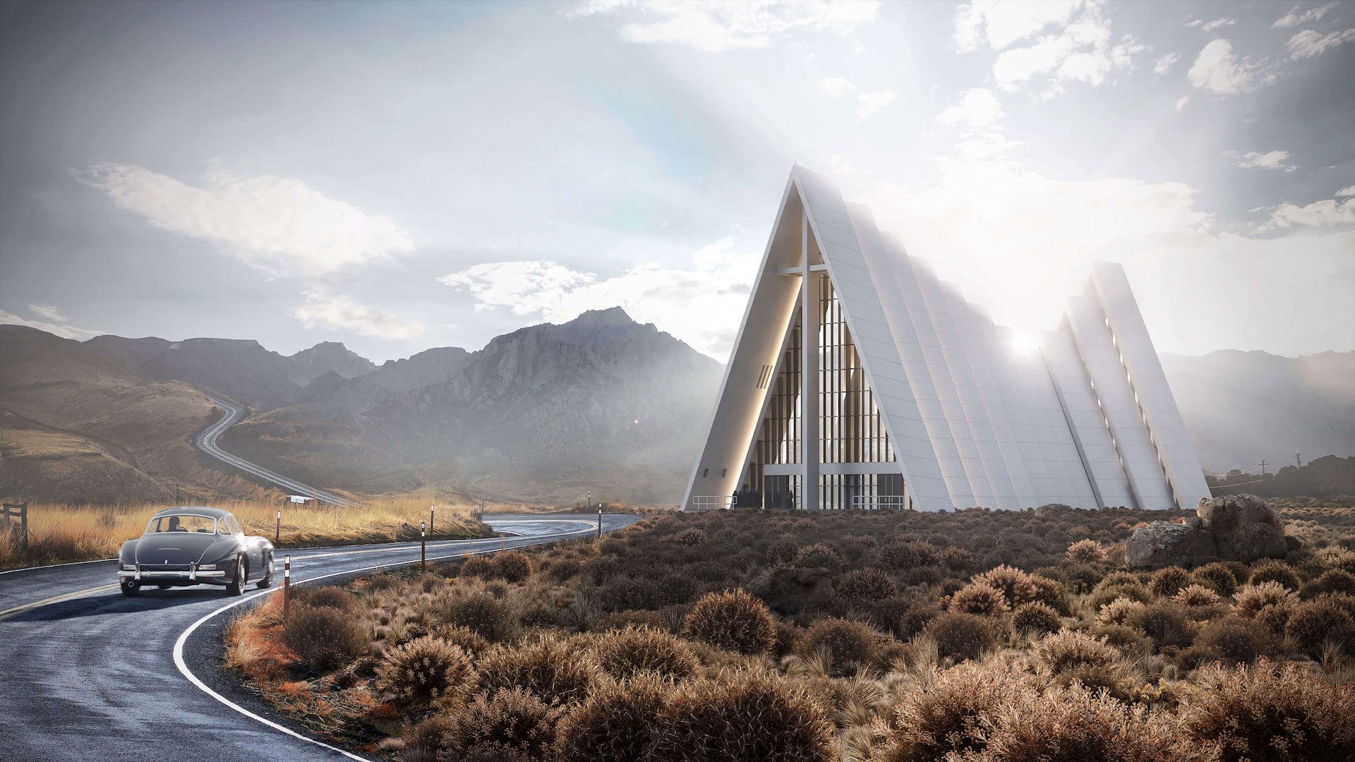
If you had to pick one single lever that makes or breaks an atmospheric architectural render, it’s lighting. And there are a few terms worth knowing when you’re briefing your CG team — just so you’re speaking the same language.
God rays (also called volumetric light) are those visible beams of sunlight you see filtering through fog, dust, or tree canopy.
Bloom is the soft halo that wraps around bright light sources — a street lamp at dusk, a sunrise peeking through curtains.
Glare is the harder, star-shaped flare you get when a camera points straight at a strong light.
HDRI dome lighting is a spherical environment map that wraps the entire scene in realistic sky-based illumination, making shadows and reflections behave the way they would in a photograph.
And color grading — applied in post-production through render passes (sometimes called render elements) — shifts the overall palette to match a specific mood. Even something as simple as adjusting the color temperature — pushing the image warmer or cooler — can completely change how a scene feels.
You don’t need to master these. You just need to know they exist so you can shape the architectural render’s mood and atmosphere you’re after when talking to your artist.
Briefing Prompts
- What time of day does this render represent, and roughly where is the sun?
- Provide two or three mood words for the light (e.g., warm, ethereal, crisp, mysterious).
- Should the final palette lean warm, cool, or neutral?
Common Mistakes
- Overexposed areas that burn out surface detail, especially on white walls or glass.
- Inconsistent light direction across multiple renders of the same project — different sun angles in images that are supposed to be the same time of day.
Elevate your exterior design project with photorealistic 3D visuals that help clients confidently approve your proposals.
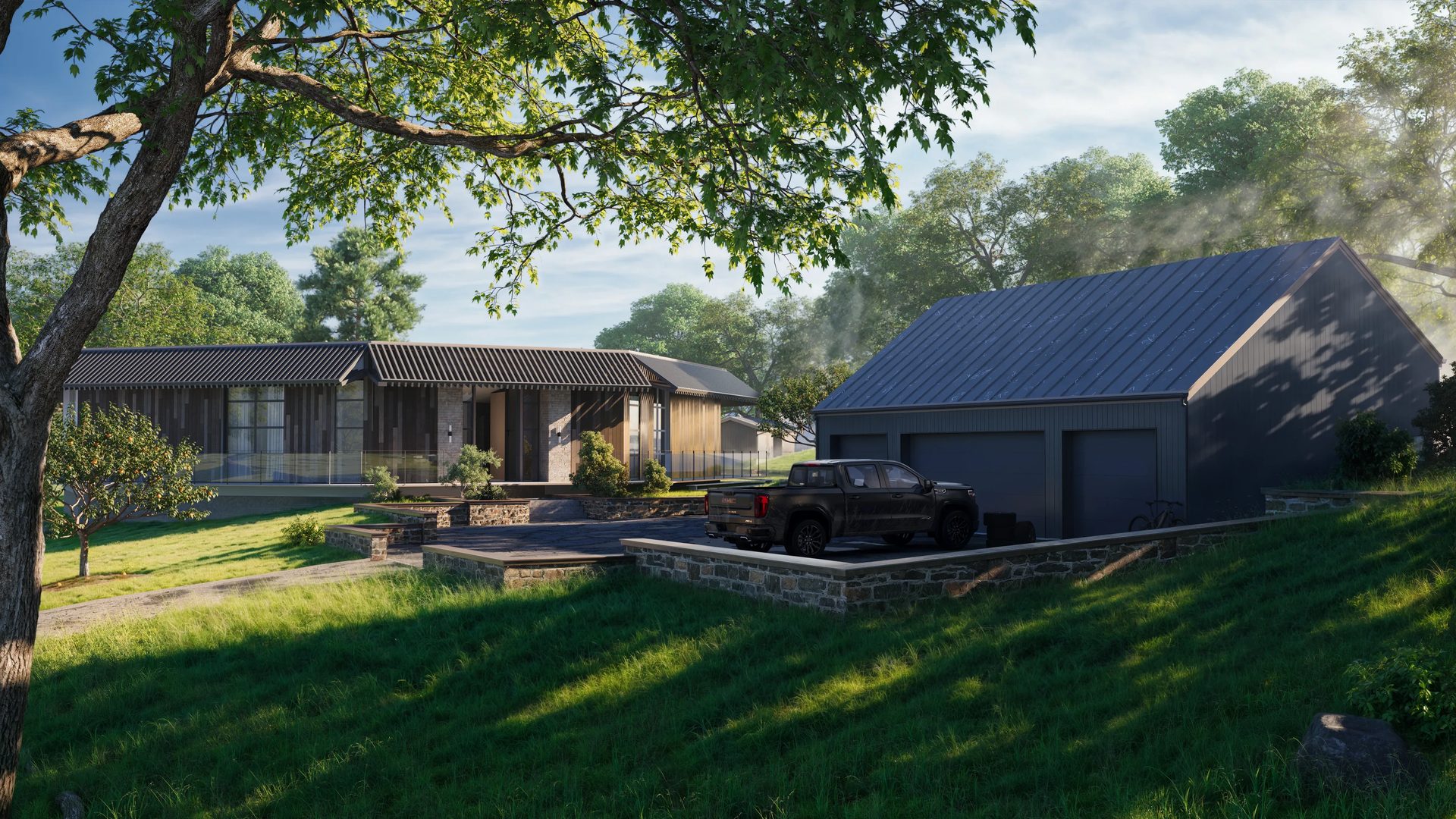
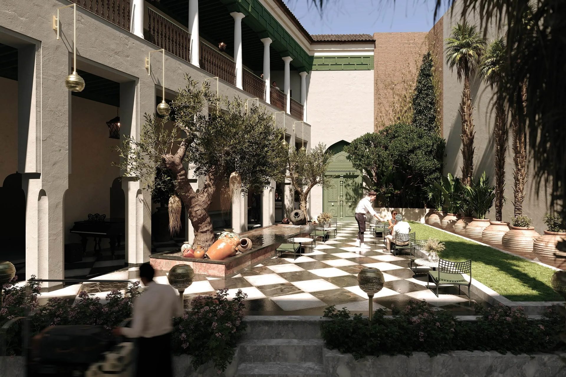
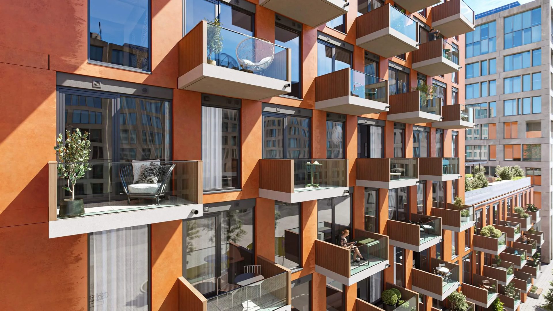
#4. Contextual Elements (Set Dressing)
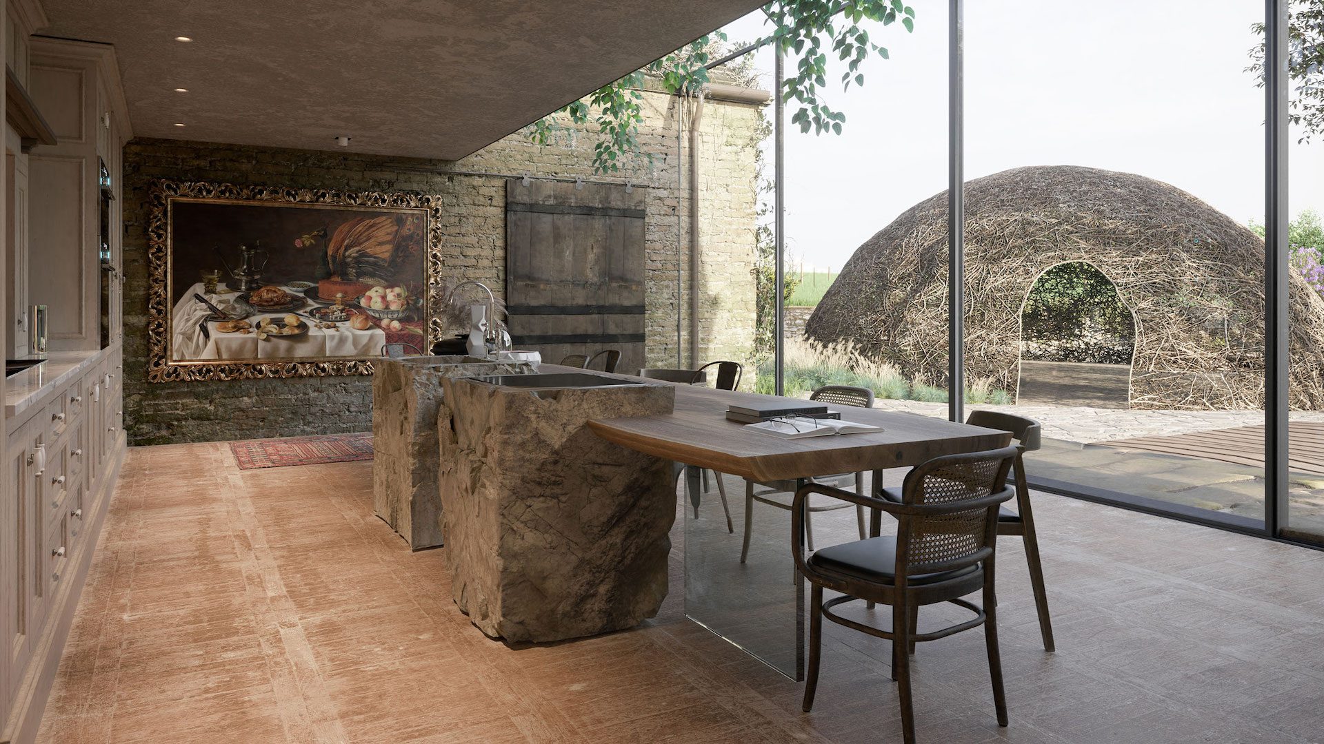
An empty 3D model is just architecture. What turns it into a place someone can imagine living in is the little stuff — a pair of glasses next to an open book, a bike helmet on a hook, a blanket tossed over a chair arm. CG artists call these contextual elements or set dressing — and if you’ve ever searched for “set dressing 3D render” tips, this is exactly that concept in action. Most experienced teams will tell you that three to five well-chosen objects per scene is the right balance. Go below that, and the space feels vacant. Go above it, and you’re decorating a flea market.
Here’s what matters most: demographic matching. The props should reflect the target audience of the project. A kitchen design rendering aimed at young professionals needs different details than one targeting retirees — these are sometimes called persona-driven props, and they make the difference between a generic scene and one that speaks to a specific buyer. And don’t forget human-scale cues — silhouettes of people, parked cars, and a dog on the lawn — that establish the physical size of the architecture without stealing the show.
Briefing Prompts
- Describe the target persona in one or two sentences (age, lifestyle, interests).
- List three to five key props that represent that persona.
- Which surfaces should stay clean and uncluttered?
Common Mistakes
- Including recognizable brand logos or products — that’s a legal risk you don’t need.
- Props that contradict the project’s positioning, such as budget furniture in a luxury penthouse render, sends the wrong message and can undermine the perceived value of the project.
Curious how set dressing works at the building scale? See how context and entourage bring exterior projects to life with CGI for exteriors.
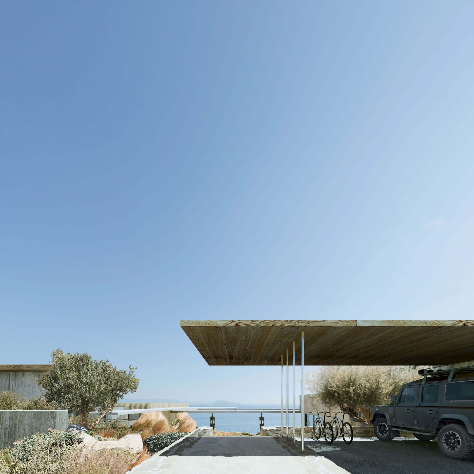
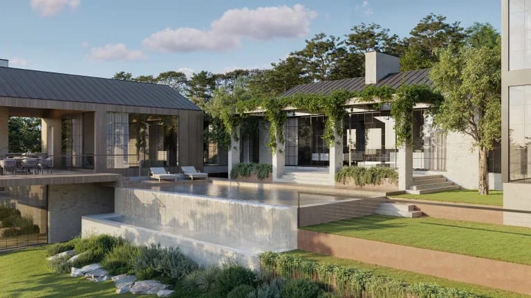
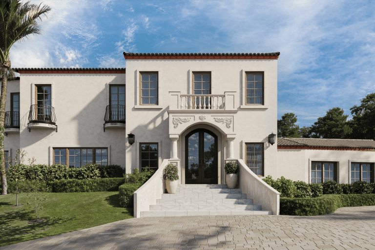
#5. Flattering Angles
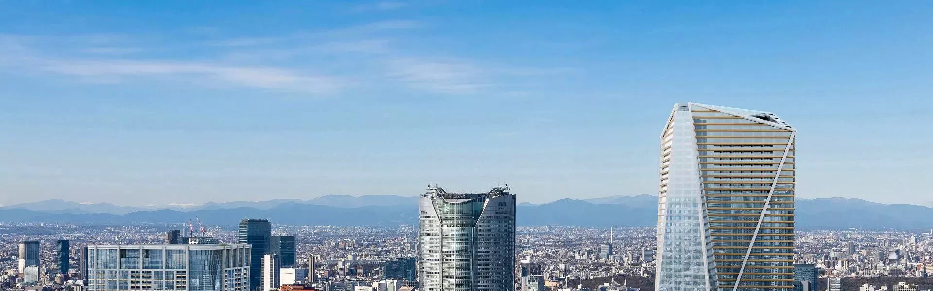
Camera placement shapes how the viewer feels about the architecture before they consciously think about it. There are really three main viewpoints to choose from: eye level (camera at about 1.6–1.8 m) feels natural and immersive — you’re standing in the space. An elevated viewpoint adds monumentality, making the building feel taller and more imposing. Aerial perspectives pull back and reveal the site plan, the surrounding context, and the relationship between structures.
Camera focal length plays a big role too. A wide lens (24–35 mm) adds dynamism but can distort edges. A standard 50 mm lens feels neutral and honest. A telephoto setting (85 mm and above) compresses perspective and makes a façade look tighter and more detailed.
Depth of field is another lever — blurring the foreground or background slightly draws the eye toward your subject, much like a portrait photographer isolating a face from the background. If you want to get specific in your brief, use the term physical camera setup — that’s the language CG professionals use for matching a virtual camera to real-world lens behavior, and they’ll know exactly what you mean. Some teams also use a clay render (a plain white or grey version of the scene without materials) to lock down composition and camera angles before committing to full texturing — worth asking about if you want to approve the framing early.
Briefing Prompts
- What is the main selling feature this angle needs to highlight?
- What absolutely must be visible in the frame? (entrance, pool, landscape, façade)
- Preferred camera height and approximate focal length.
Common Mistakes
- Going wider than 24 mm — it warps the façade, and the result looks unnatural.
- Placing two competing subjects in one frame with no clear visual anchor.
#6. Dramatic Weather Settings
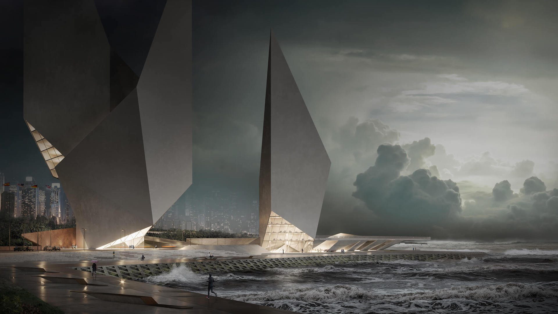
Weather is a mood amplifier. A brooding overcast sky turns a commercial tower into a bold landmark. Golden-hour sun makes a residential villa feel like a dream. The key constraint? Plausibility. The weather has to make sense for where the building actually is. A snow-covered rooftop terrace looks gorgeous — unless the project is in Miami.
For a deeper exploration of how seasonal and weather settings can be used strategically, see the full guide to atmospheric rendering.
Briefing Prompts
- What season and climate region does the project sit in?
- Cloud density: clear, scattered, or overcast?
- Moisture level: dry pavement, wet reflections, standing puddles, or snow?
Common Mistakes
- The weather is so dramatic that it hides key design elements — the roofline disappears into clouds, and the entrance is lost in shadow.
- Climate mismatches that break believability. Tropical foliage with frost. Desert plants with rain.
#7. Realistic Imperfections
Here’s a counterintuitive truth: perfect surfaces make a render look fake. Our brains are wired to notice when something is too clean, too even, too flawless. If you’ve ever wondered how to make architectural renders realistic, this process is one of the biggest levers — subtle, material-appropriate signs of use that make a scene feel grounded.
Think in terms of surface character — what the industry calls material weathering. On glass: fingerprints, micro-scratches, rain droplets. On metal: faint oxidation at edges, hairline scuffs. On concrete: water streaks, a whisper of moss in expansion joints. On wood and fabric: natural grain variation, soft creases.
A simple way to calibrate this with your team is a 0–10 scale. Zero means “pristine showroom.” Ten means “heavily lived-in.” Most residential projects land somewhere around 3–5. Most premium commercial projects stay below 2.
Briefing Prompts
- Is this a “new build” look or a “lived-in space”? (use the 0–10 scale)
- What overall level of surface cleanliness works for this project?
- Which surfaces should stay perfectly clean? (e.g., hero façade, showroom floor)
Common Mistakes
- Visible wear on a premium project. It undermines the perceived quality immediately.
- Applying a single weathering texture uniformly across all surfaces is ineffective. A concrete wall, a brass handrail, and a hardwood floor all age differently — if they look like they went through the same washing machine, the illusion breaks.
Common Storytelling Mistakes
Each of these seven techniques works well on its own. The trouble starts when you try to use all of them at once — or forget the basics while chasing the atmosphere. We see four mistakes more than any others:
- Stacking too many effects into one frame. Motion blur plus god rays plus heavy set dressing plus dramatic weather? Now, nothing has room to breathe. The eye doesn’t know what it’s supposed to feel. Stick to two, maybe three techniques per image — that’s where the magic actually happens.
- No anchor for the eye. This one’s surprisingly common. The render looks polished, the lighting is great, but there’s no clear “look here” moment. You need a dominant subject — a front entrance, an open terrace, a lit pool — or the viewer just scans and moves on.
- Sun that can’t make up its mind. You deliver five renders of the same building, and the shadows point in three different directions. Maybe one image is golden hour, another looks like noon, and a third has overcast light. Individually, they’re fine. As a set, they look like five different projects glued together.
- Post-production on steroids. A little bloom, a tasteful color grade — great. But push it too far (oversaturated HDR, heavy vignetting, everything glowing), and the image starts looking like a video game screen. Clients want to trust what they’re seeing, and over-processing kills that trust fast.
Quick Briefing Checklist
Lock These Decisions Before Rendering Starts
- Mood keywords and two or three moodboard references (images, links, or descriptions).
- Target audience and distribution channel (pitch deck, website, outdoor advertising, social media).
- Time of day, weather, level of spatial occupancy, and surface cleanliness.
- The single most important selling feature is what the render must showcase.
- Consistency notes for the full image set: sun direction, color palette, prop style.
Schedule a free demo of 3D solutions for your business
Ready to put these techniques to work? Explore ArchiCGI’s full range of 3D visualization services or request a project brief to get started.

Ana Wayne
Content Writer, Copywriter
Ana is a content writer for ArchiCGI. She has a passion for design and architecture - and for talking about it. Outside of work, she is a fan of sci-fi movies and a street food connoisseur.
What is 3D storytelling in architectural visualization?
It’s basically the difference between a render that someone glances at and one that makes them stop scrolling. You’re using light, camera work, props, atmosphere — all the tools available in a scene — to make the image communicate something. Not just “here’s what the building looks like,” but “here’s what it would feel like to be there.” When that clicks, the viewer responds emotionally before they start picking apart the details.
How do I choose the right storytelling approach for sales vs. approvals?
Think about who’s looking at the image and what you need them to do. Selling a lifestyle? Go warmer — golden light, a few props that suggest someone already lives there, maybe some moody weather to set a tone. Trying to get a permit approved or survive a design review? Pull it way back. Clean lighting, honest materials, nothing that distracts from the architecture itself. Same building, completely different render strategy.
When does motion blur help, and when should it be avoided?
It’s great when you want a scene to feel alive — cars passing on a street, people walking through a plaza, headlights streaking through a nighttime shot. That kind of thing. But if the whole point of the render is showing architectural detail clearly — a façade study, a technical submission, anything where precision matters more than vibe — blur is going to work against you. It softens edges you probably need sharp.
What's the difference between bloom, glare, and volumetric (god ray) lighting?
People lump these together all the time, but they do very different things. Bloom is that dreamy, soft glow you see around a bright window or a lamp — it wraps the light and makes it feel warm. Glare is more aggressive, that sharp flare you get when sunlight hits the lens head-on. And god rays — volumetric light — are the actual visible beams, like sunlight cutting through morning fog between trees. Mixing them up in a brief means your artist might deliver something completely different from what you had in mind, so it’s worth using the right word.
How can I keep the story consistent across multiple render views?
This is one of those things that seems obvious but gets skipped constantly. Before the first render even starts, agree on where the sun is, what the overall color palette looks like, and what style the props should follow. Put all of it in the brief — on paper, not just discussed on a call. Otherwise, you end up with five images that individually look fine but together feel like they came from five different projects.
How do I request realistic imperfections without making the project look damaged?
Language matters more than you’d think here. If you write “add some wear and tear” or mention “cracks,” your team might take that literally and deliver something that looks neglected. Better approach: use the 0–10 cleanliness scale from this article, name the specific surfaces that should stay pristine, and describe what you want as “surface character” or “lived-in texture.” That gives your artist a clear lane to work in without accidentally making a luxury project look like it needs renovation.