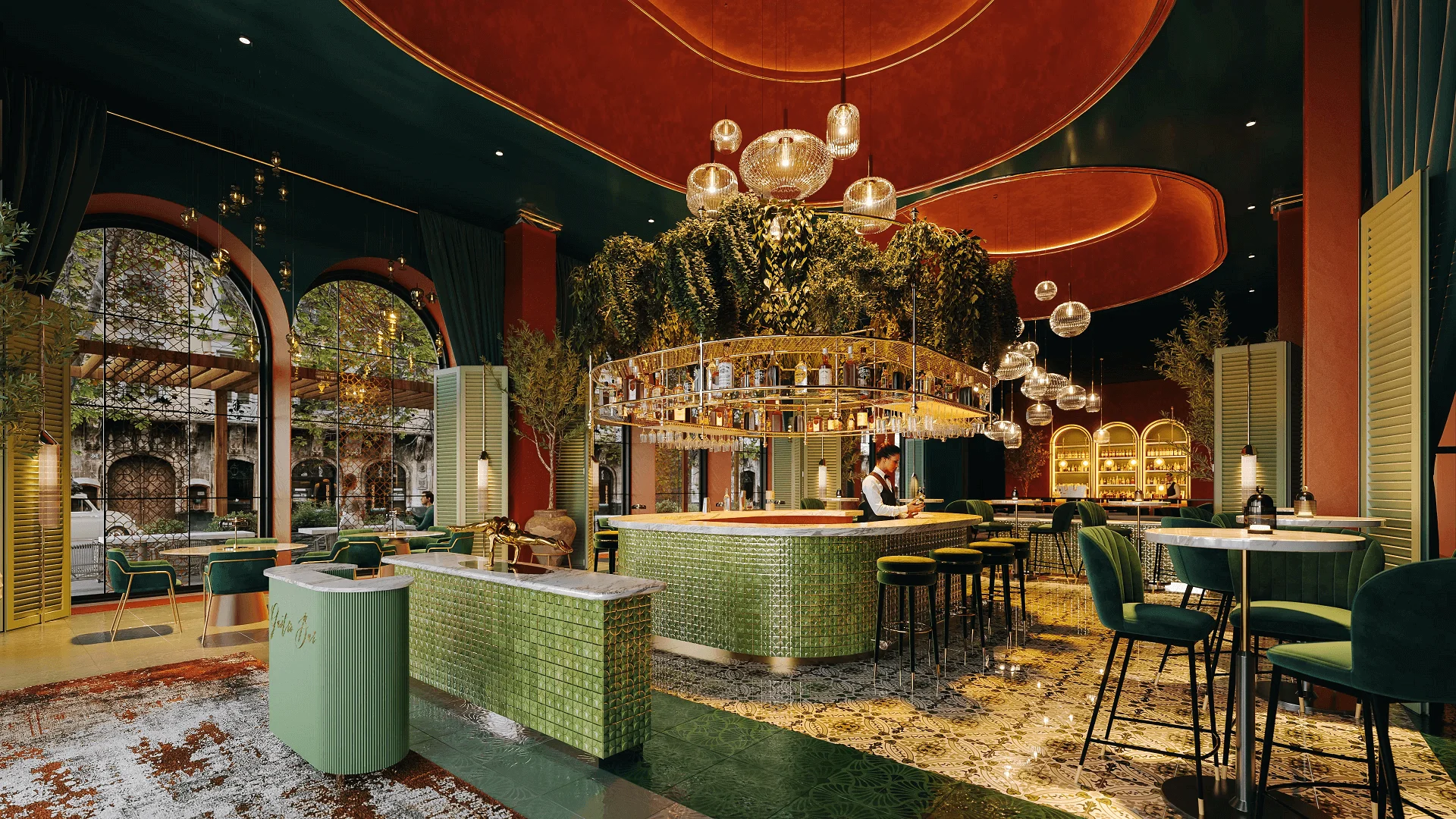
Designing a restaurant interior involves finding the perfect balance in the details – furniture, materials, and finishes – as well as the overall atmosphere and brand identity. And, of course, presenting the concept to stakeholders in the most appealing way is a challenge of its own. Throughout this process, 3D visualization for restaurant interiors provides invaluable support. Restaurant interior CGI allows designers and architects to perfect every concept detail, present their ideas clearly, and make confident decisions before construction begins.
Our 3D rendering studio works daily with restaurant designers and architects. And we’re ready to share insights based on real cases and industry know-how. In this guide, you’ll discover how CGI supports every stage of restaurant design and learn practical tips on making the most out of this tool. Let’s dive in!
#1. Why 3D Visualization Is Essential for Restaurant Interior Design
3D visualization for restaurant interiors allows designers and architects to communicate ideas with impact, reduce misunderstandings, and win the stakeholders’ trust early in the process. How so?
#1.1 Interiors’ 3D Visualization Brings Concepts to Life
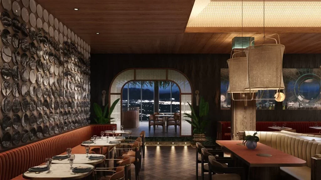
Clients often struggle to imagine a space from plans or moodboards. Photoreal 3D visualization shows the full picture – lighting, materials, layout – exactly as it’s meant to be. This clarity helps secure approvals and builds confidence in your vision.
#1.2 3D Visualization Beats Hand Sketches in Flexibility during Presentations
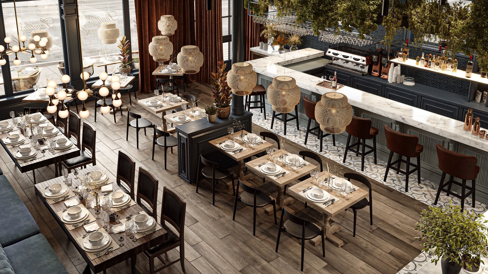
Hand-drawn sketches are useful in early ideation but fall short during presentations. Restaurant architectural rendering services, on the other hand, offer precision and flexibility. Every detail can be refined and updated quickly based on feedback.
#1.3 3D Visualization Goes Beyond Static Images
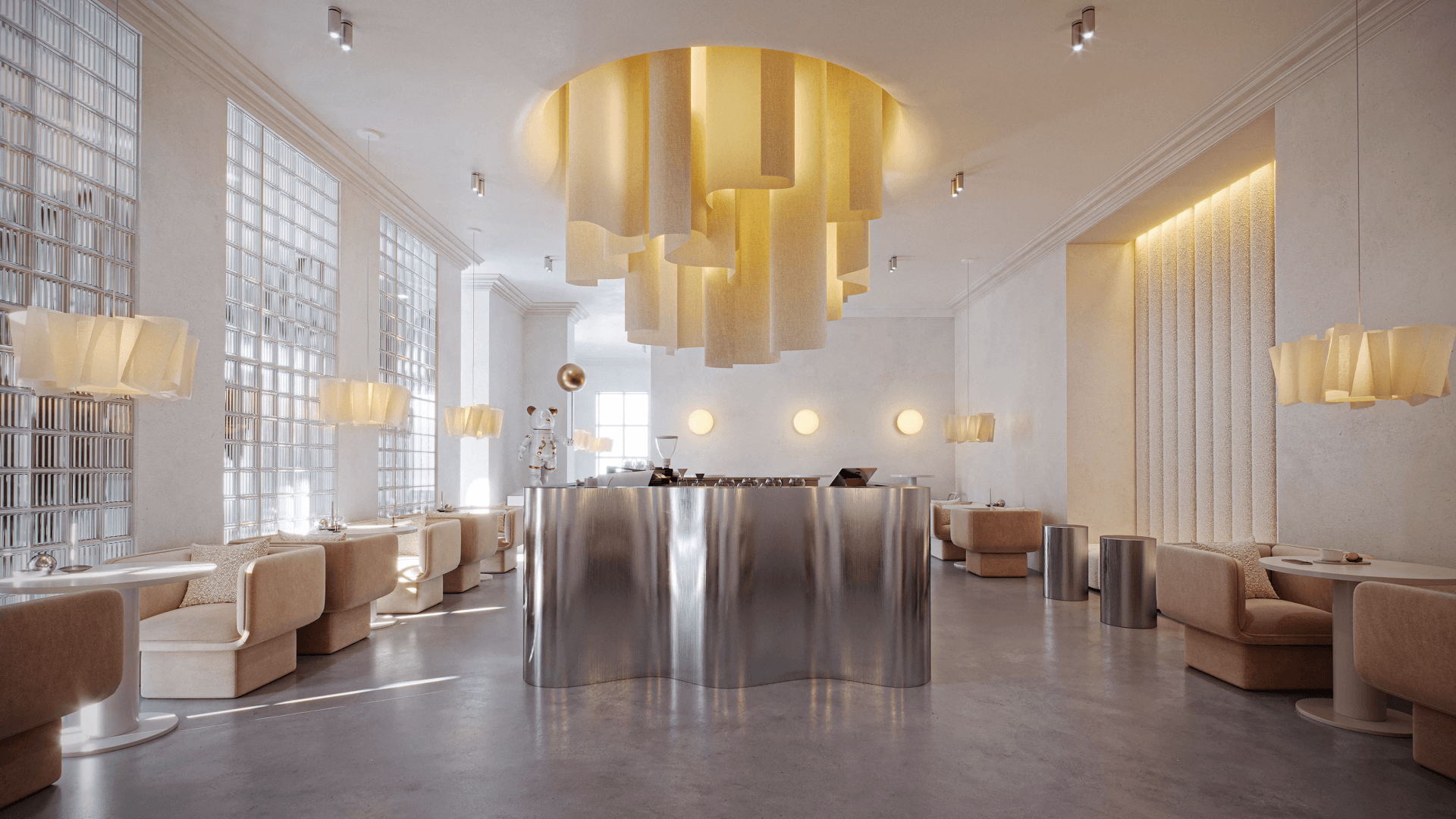
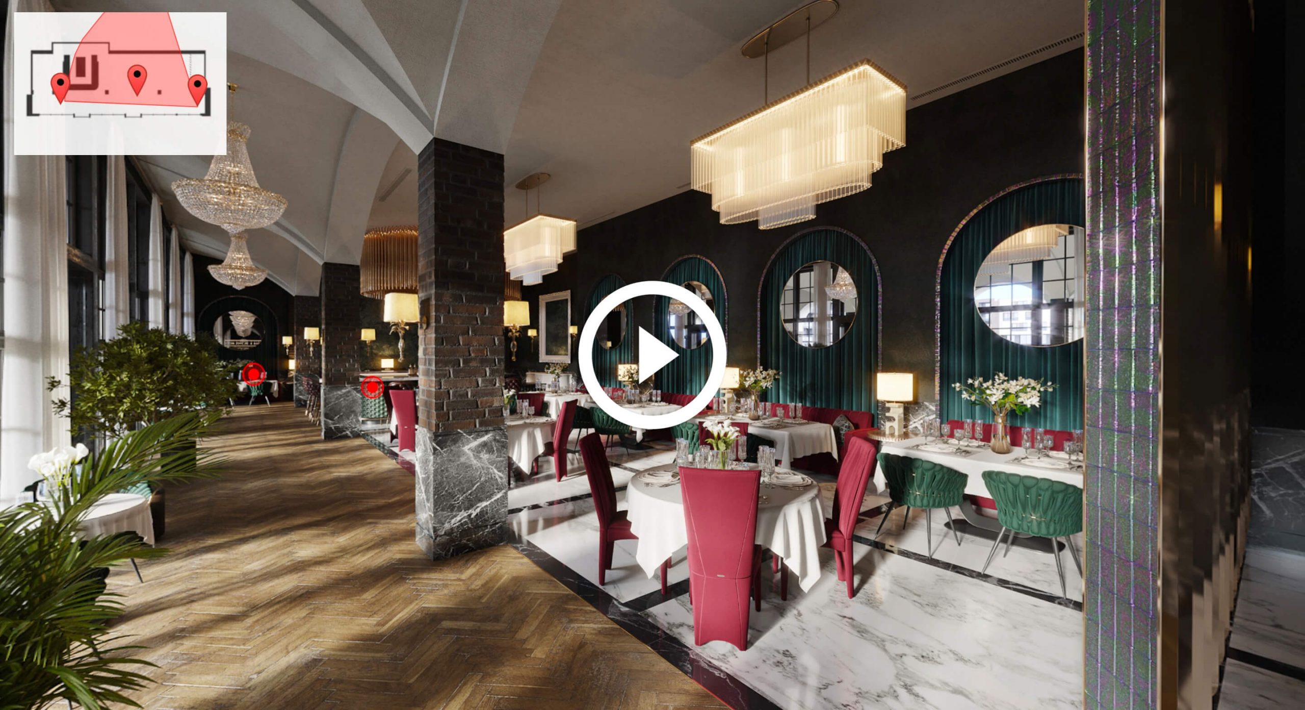
Still renders are only one of the options. With CGI, you can get an architectural walkthrough or a virtual tour. These formats create emotional impact and help clients connect with the project on a deeper level.
#1.4 Interactive Visualization Engages Stakeholders
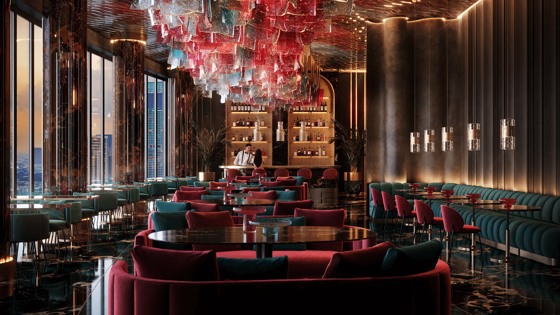
Using tools like immersive tours or VR, clients can actively explore and tweak the design. That level of interactivity makes presentations more dynamic and memorable.
#1.5 3D Visualization Highlights the Key Selling Points
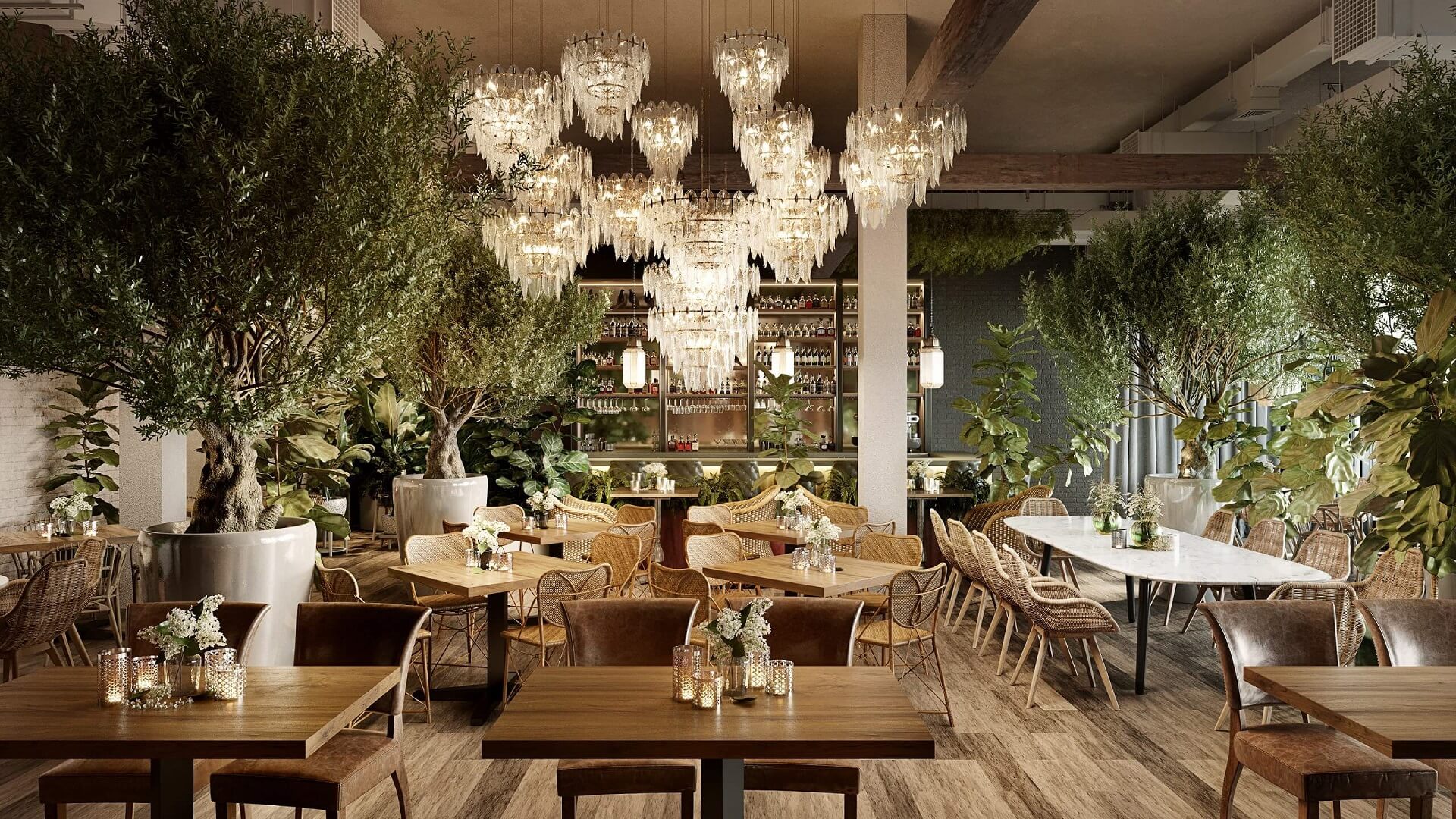
With 3D renders, you can emphasize what makes your restaurant interior concepts unique. This can be a feature ceiling, a statement bar, or a signature lighting setup. CGI lets you put focus on these details to ensure they stand out and support your vision.
#1.6 3D Rendering Helps Assess Functionality Before Building
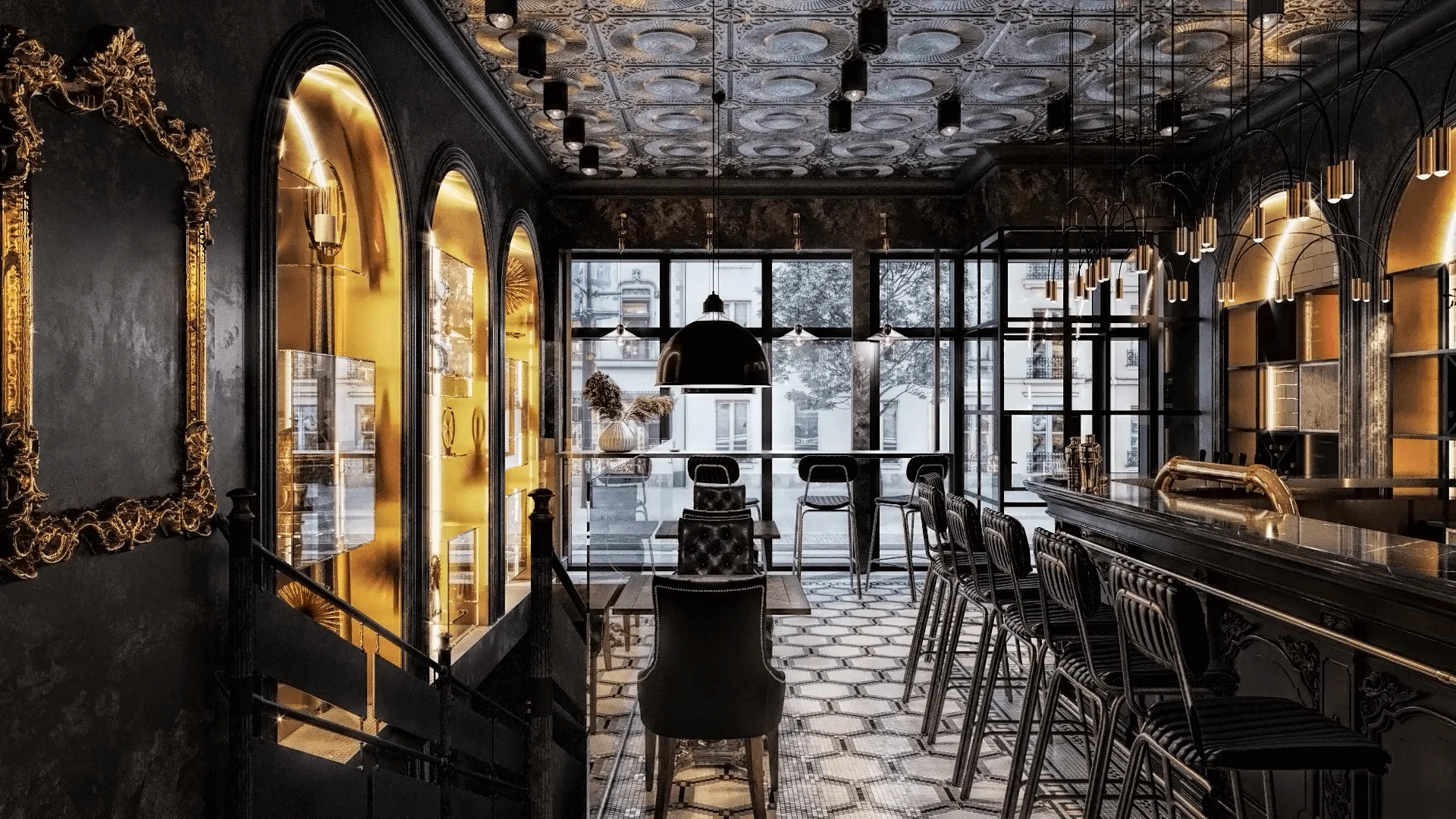
3D visualization for restaurant interiors enables you to visualize how the layout works for staff and customers. It can show everything from the efficiency of service routes to the accessibility of entrances, restrooms, and seating areas. This makes it easier to spot potential issues and adjust them before any construction costs arise.
#1.7 3D Visualization Simplifies Collaboration with Teams and Investors
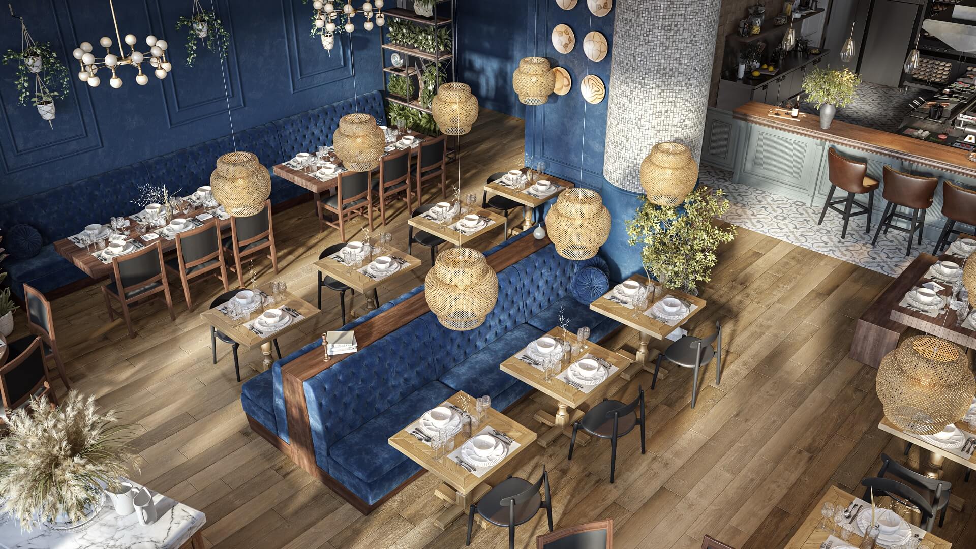
High-quality 3D visuals help ensure all stakeholders are on the same page. Everyone can see what’s being designed and contribute feedback early, keeping the project on track.
#1.8 3D Visualization Helps Convey a Unique Atmosphere
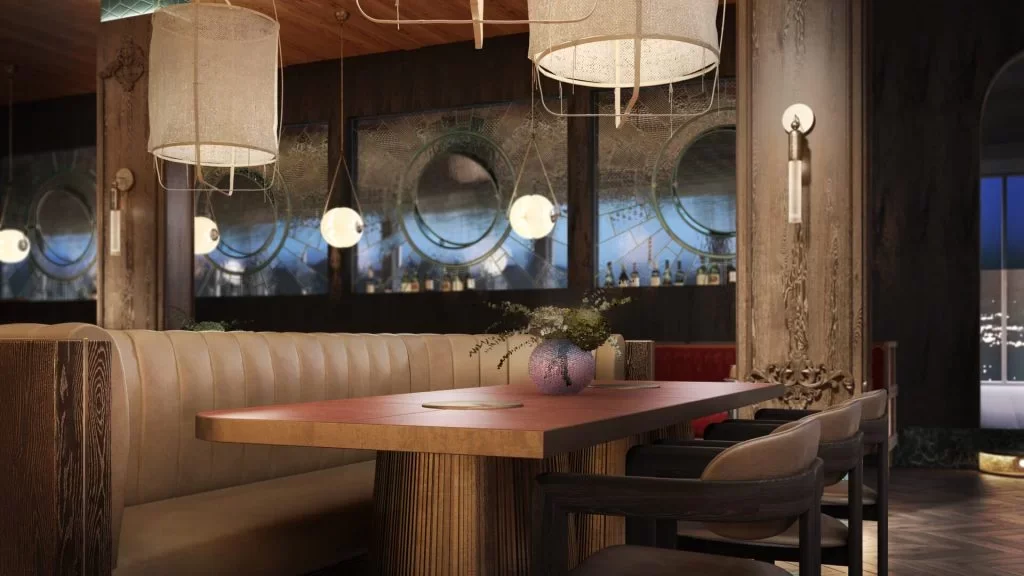
Lighting, textures, furniture – everything can be fine-tuned to express the mood and concept you have in mind. Whether it’s cozy, luxurious, or minimalistic, 3D visualization makes the special vibe of your design unmistakable. This is especially vital for chain restaurants where visuals of different places, sometimes created by different designers, need to convey the same atmosphere.
#1.9 3D Visualization Elevates Designer Brand and Portfolio
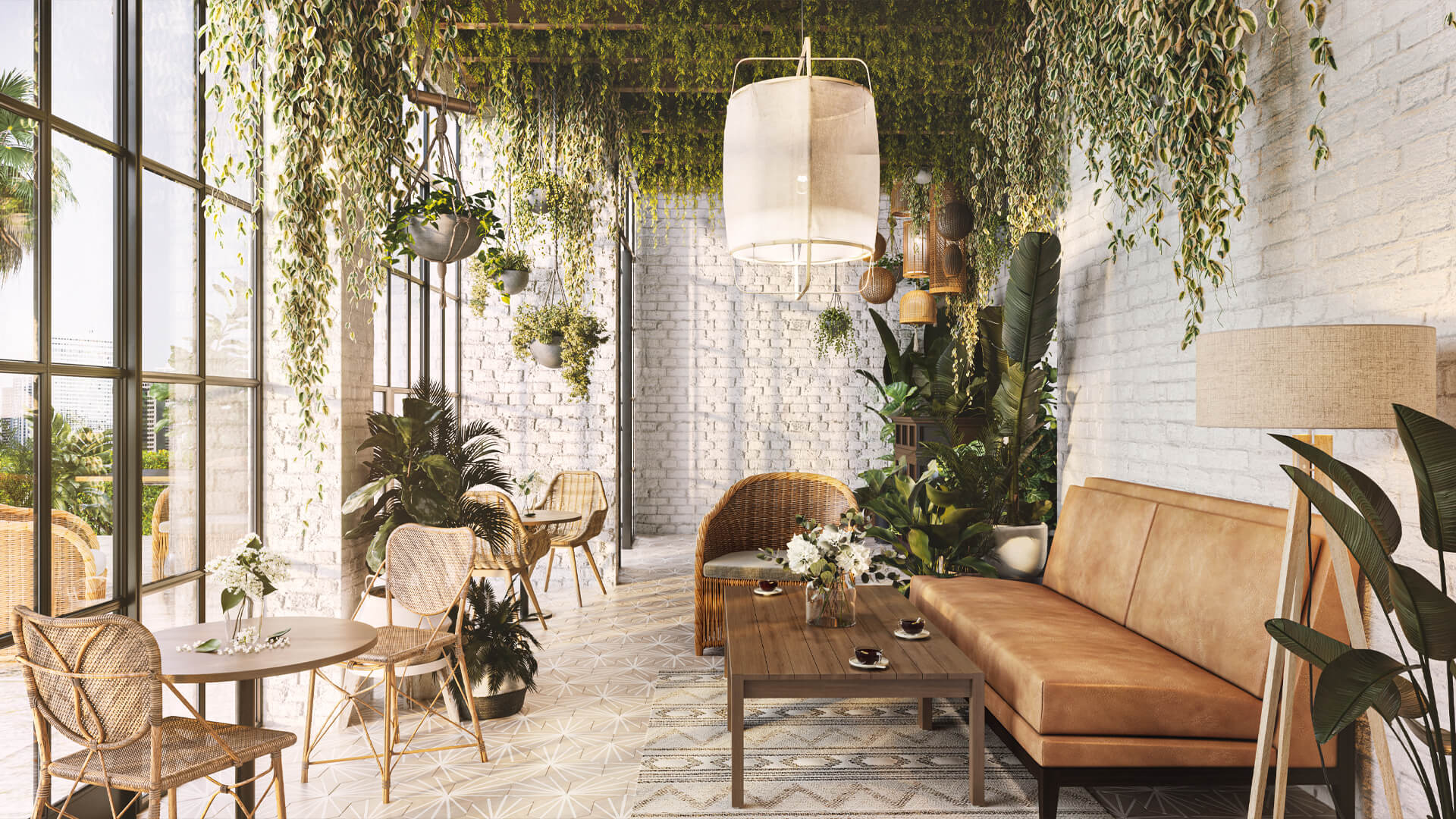
Finally, CGI can be great not just for clients but for your work as well. High-end visuals do more than impress clients – they boost your brand. You can use 3D visualization for restaurant interiors in your marketing materials and portfolio to showcase your capabilities and win new clients.
#2. Key Types of 3D Visualizations for Restaurants
Depending on your client’s needs, you can use various types of 3D visualization. The combination of several types can be the most effective.
#2.1 Interior Renders
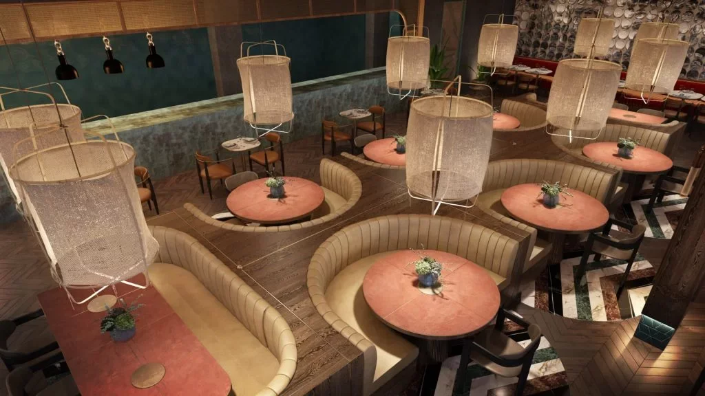
These high-resolution still images focus on the ambiance, materials, lighting, and layout. They’re perfect for showing how every element creates a cohesive experience.
#2.2 360-Degree Tours
#2.3 Animated Walkthroughs
An architectural animation studio can provide architects with impressive video marketing materials. 3D animations simulate a guest’s journey through the place. They help convey flow, mood changes from day to night, and the storytelling behind the design. Walkthroughs can be especially useful for high-end presentations.
#3. How to Make the Most of Restaurant Rendering Services
So, how do you make sure the 3D visualization for the restaurant interiors you commission is worth every dollar you spend?
#3.1 Outsource 3D Visualization Services
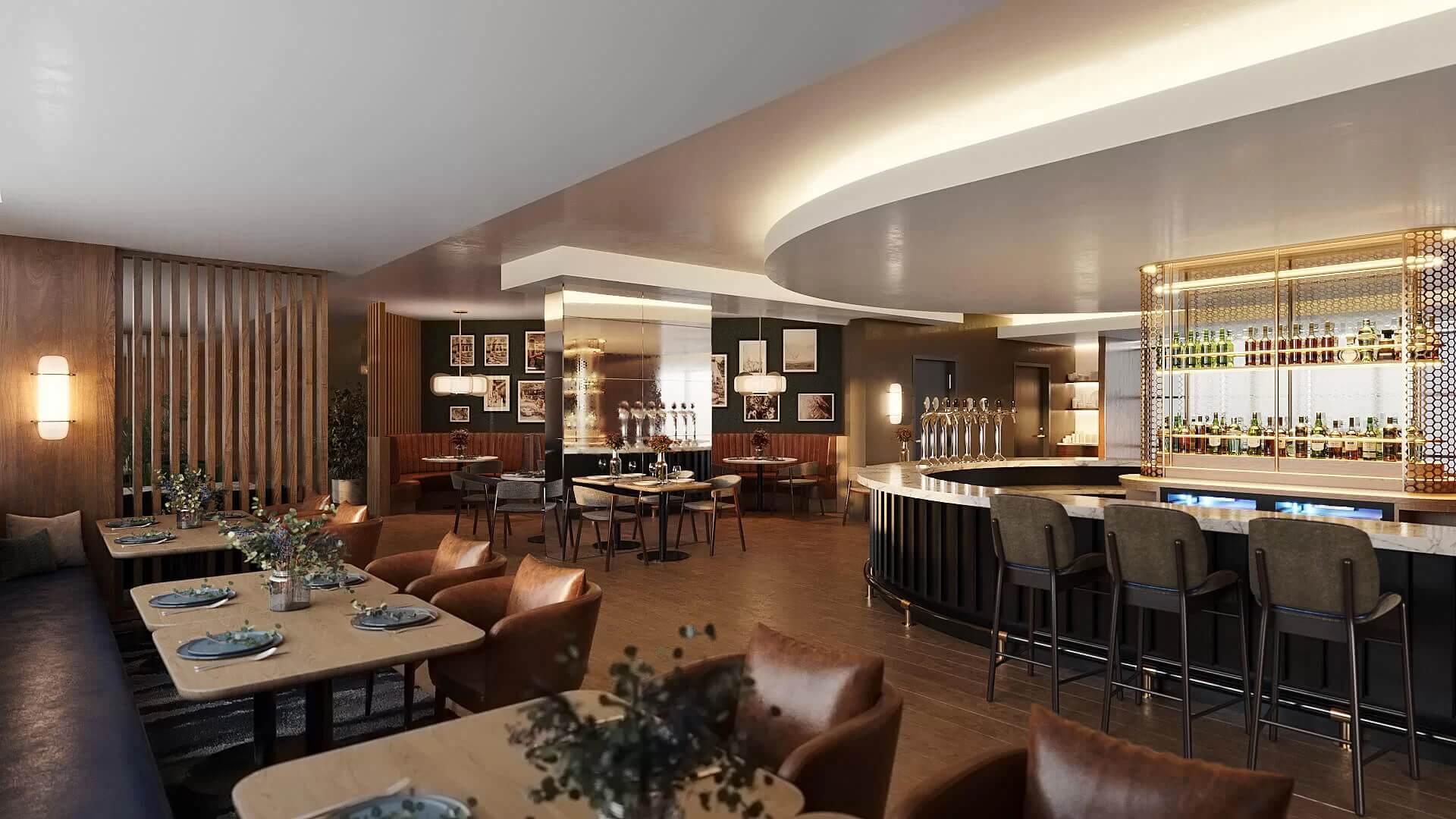
Having in-house 3D artists is not always enough to handle large-scale projects. This is especially true when deadlines are short or when the artists lack specific skills. In such cases, outsourcing 3D interior rendering services to a CGI studio is a good solution. At ArchiCGI, we have 600 artists. There is always a CG professional ready to start working on your rendering right away. Our PMs, art direction, and QA teams make sure the quality is always impeccable.
#3.2 Choose a Restaurant Rendering Services Provider Wisely
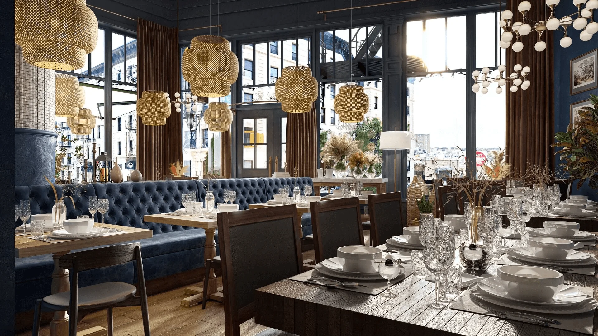
Various issues can arise from working with small or inexperienced contractors. Some companies have a long turnaround. Others might have quality issues, overlook your preferences, or make repetitive mistakes when it comes to following your brief.
At ArchiCGI, we organized our work in a way that made all the above-mentioned impossible. We save all of your requirements and preferences in our CRM, starting with our first project. So we are always well-equipped to produce consistent, high-quality renderings according to your needs. And our double-check quality control ensures we always deliver top-notch results.
#3.3 Ask for Multiple Restaurant Interior Views
To demonstrate all the details of a concept, one 3D visualization for restaurant interiors is not enough. You’ll probably need to show the interiors of all zones, the layout, and convey the general mood of the place. You may also consider a 3D exterior rendering service. It will help you convey the exterior design and lighting.
You can ask for multiple views. This will help you show all aspects of the design and get quality imagery within your deadline. Furthermore, additional rendering views can qualify for a discount. We will cover this subject later in this article.
#3.4 Order Atmospheric Renderings of a Restaurant
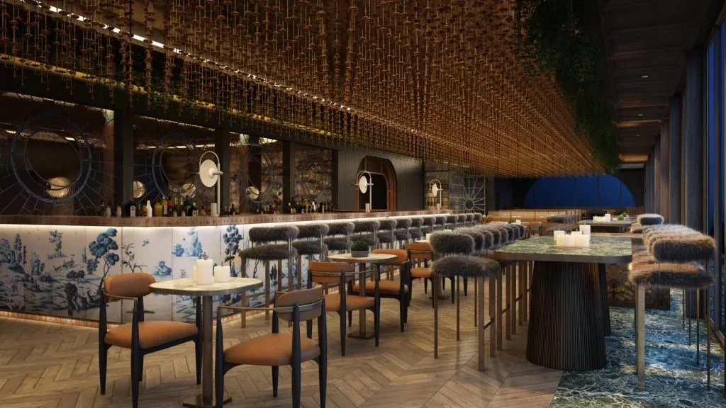
Capturing the ambiance of restaurant designs is essential for successful presentations and marketing. Using renders with various lighting scenarios, close-ups, and detail shots helps to convey the intended atmosphere. These types of rendering help the audience establish an emotional connection with the future space and make them wish to visit it.
#3.5 Make Use of Dynamic CGI Formats
3D animations, virtual tours, and other dynamic visualization formats offer unparalleled opportunities. Animation, for example, can make the project look more compelling by showing it in motion. This helps to increase engagement on Instagram Reels or TikTok.
Virtual tours go even further by introducing interactive features. Just imagine: when viewing such a tour on your website or in an application, one can ”walk around” the future restaurant as if it was already built. These dynamic solutions enhance engagement and facilitate a better understanding and appreciation of your design concepts.
#4. Successful Restaurant 3D Rendering Case Studies from ArchiCGI
Here are a few standout examples of how 3D visualization helped our clients bring their restaurant concepts to life.
#4.1 Lavitta’s Creole, New York, USA
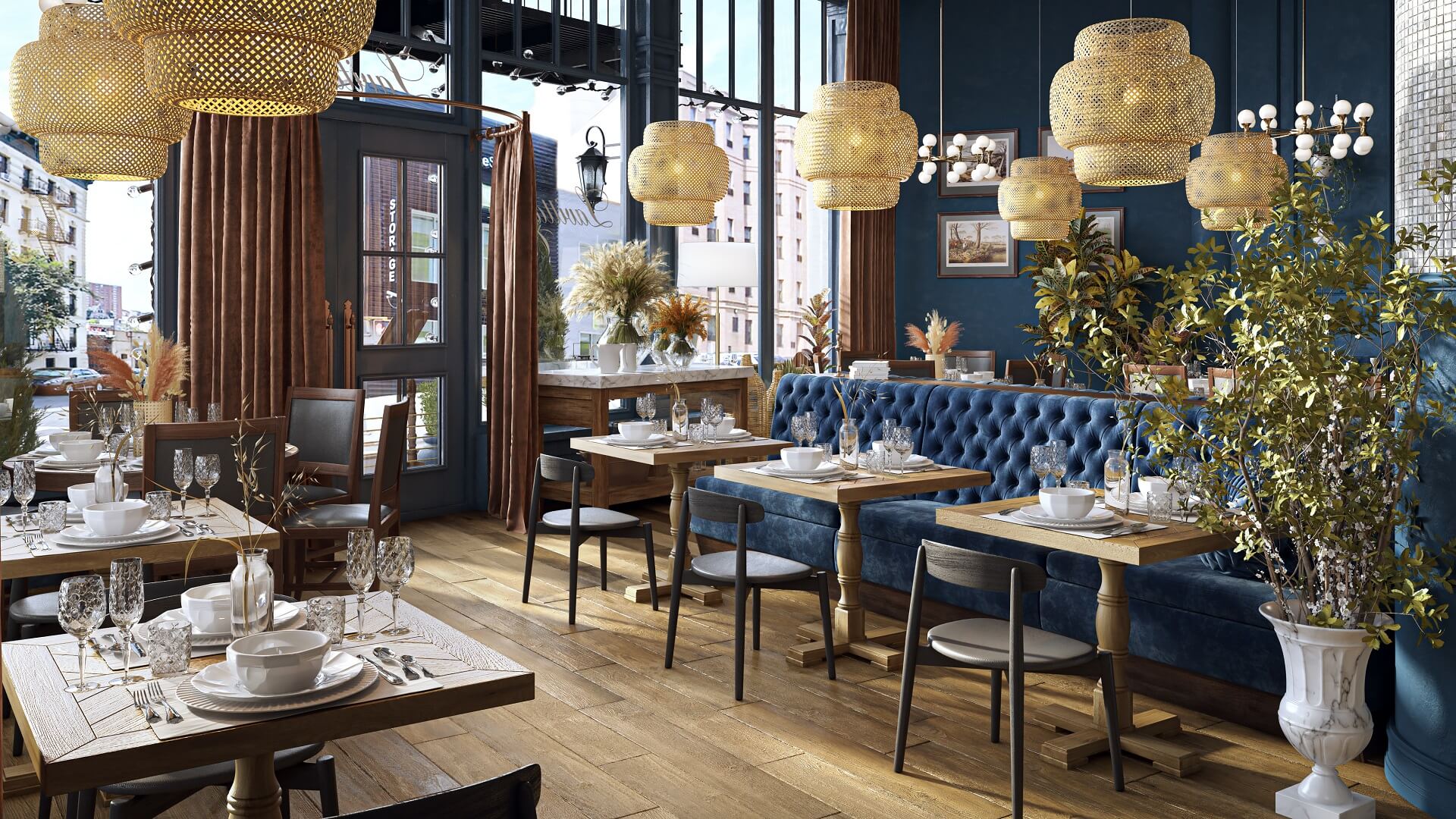
Chef Jimmy Thomas needed both interior and exterior renders for his new restaurant in Manhattan. Though there were multiple changes in the venue location, our team provided accurate, atmospheric restaurant design 3D rendering for each version. The final CGI helped secure construction permits. Today, Lavitta’s Creole is open and welcoming guests.
#4.2 Clay Restaurant, Manama
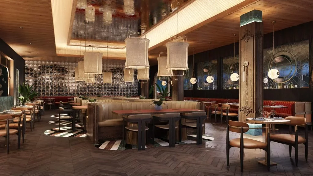
Next up is restaurant 3D rendering for a renowned interior architect and our long-term client, Tristan du Plessis. He commissioned visuals for a fine dining venue in Bahrain. The goal was to impress investors, so we created full interior renders and detailed close-ups of the set tables. This presentation captured the smart fusion of Peruvian and Japanese design. It helped secure the project approval and was used for social media marketing later.
#4.3 Aba Restaurant, Florida, USA
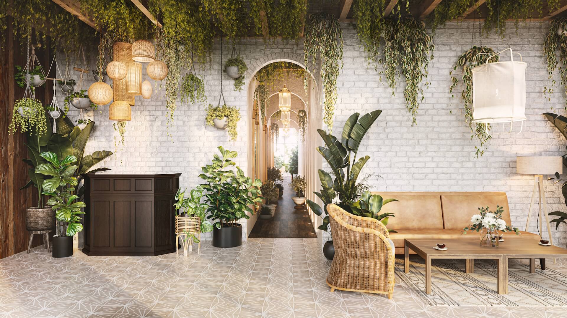
For the Mediterranean-inspired Aba Restaurant in Miami’s Bal Harbour Shops, the designer required photoreal 3D visualization for restaurant interiors showcasing natural materials and lush greenery. Our CGI accurately reflected the relaxed yet refined concept. It led to a successful presentation. The finished venue looks exactly like the renders.
#5. Twelve Discounted Views for Restaurant Designers from ArchiCGI
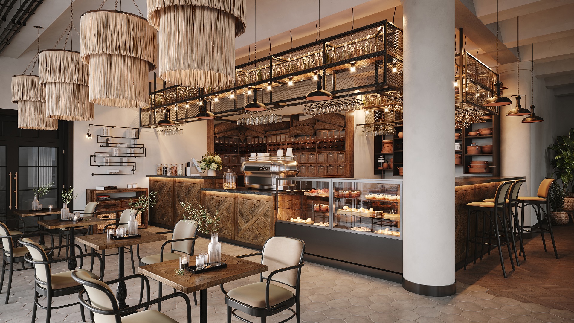
Using various camera angles in visualization can help you showcase your restaurant’s design in the best light possible. And because the 3D artist doesn’t need to create the model from scratch for each render, lots of such views come at a discount. Let’s take a look.
#5.1 Ratio Change 3D Visualization
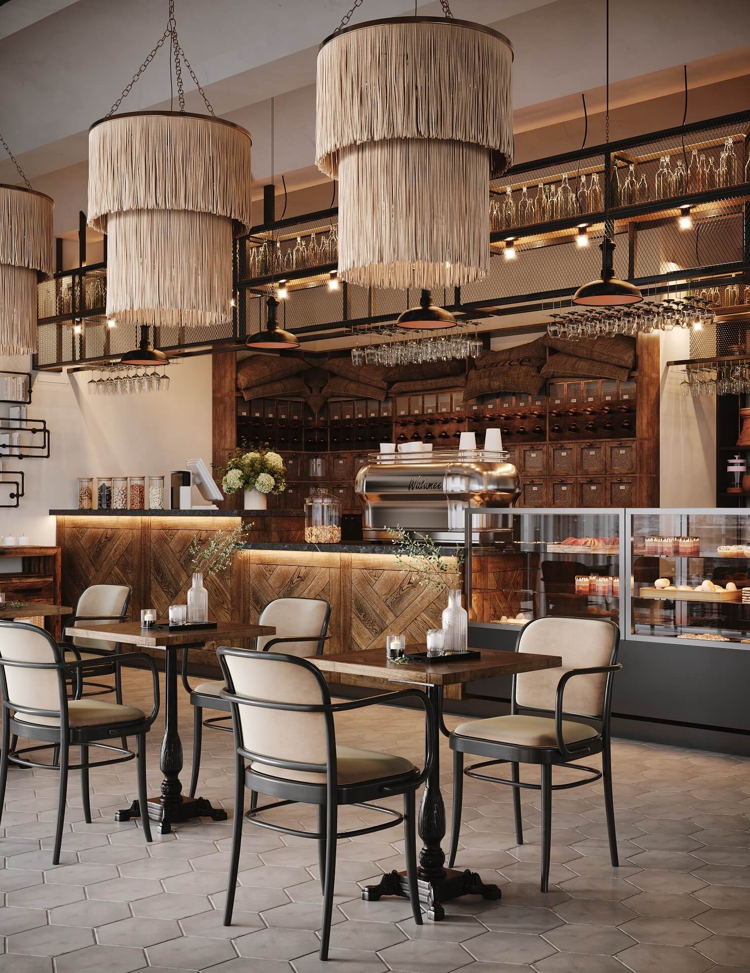
In this 3D visualization option for interiors, we keep the initial camera angle while changing the image proportions. This is useful for platforms like Instagram or TikTok where vertical content works best. So, by adjusting the ratio, you can effectively showcase your restaurant interiors and engage with the audience in different channels.
#5.2 Camera Angle Change Visualization
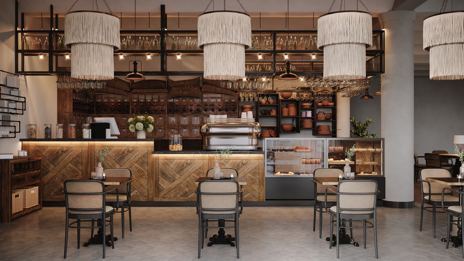
This 3D view demonstrates the same space. But as you can see, the angle has changed a bit. Here, instead of a corner view, we have a head-on 3D visualization. This option helps to broaden the understanding of spatial layout and design within interiors.
#5.3 Opposite View
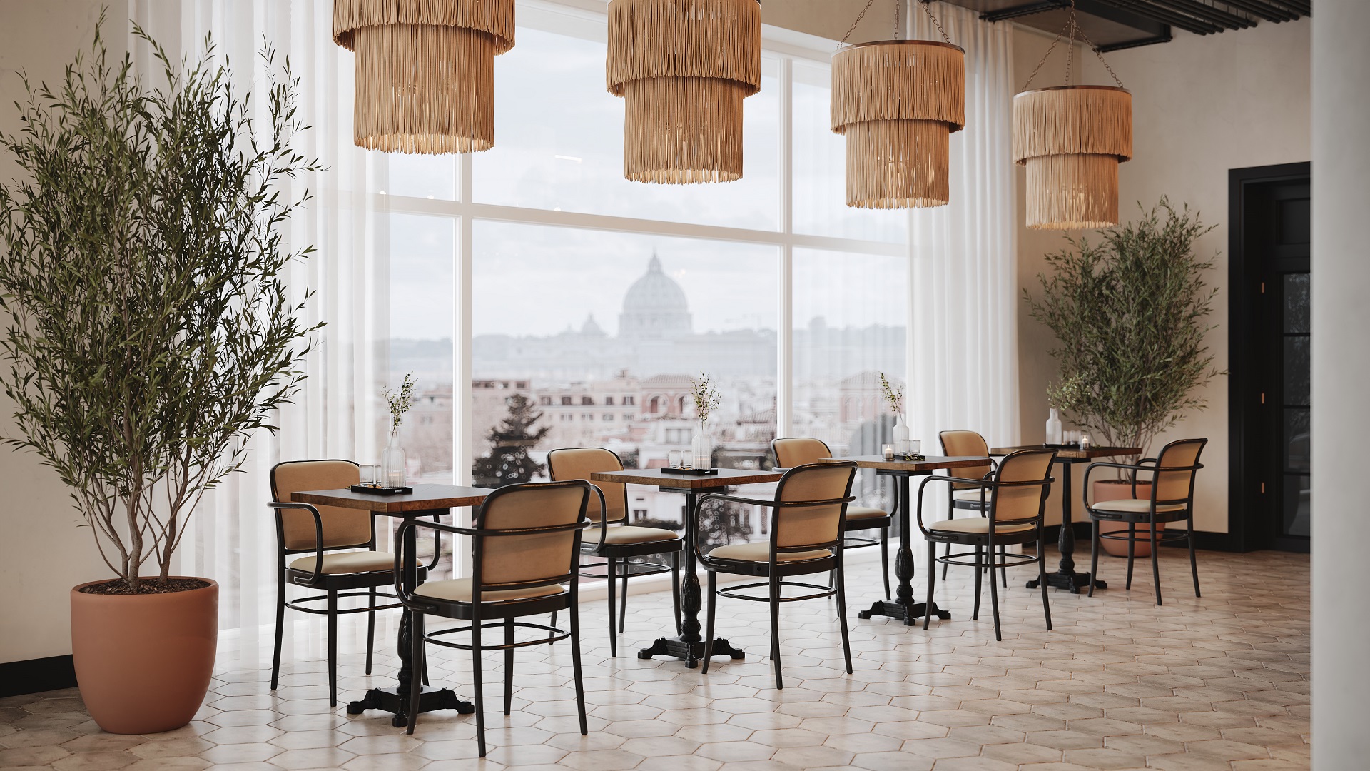
This option offers a new perspective by showcasing the opposite side of the restaurant interior in a visualization. Paired with the initial 3D render, it provides a comprehensive understanding of the concept. You can also use it to showcase the neighboring space or a window view to add context to your presentation of interiors.
#5.4 Layouts Change Visualization
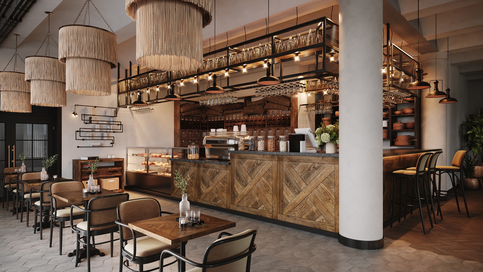
With such a 3D visualization, you can experiment with different arrangements within restaurant interiors. From furniture placement to spatial zoning, this option allows for creative exploration and optimization of the restaurant’s functionality and flow. If your client has yet to decide on what they want, this type of restaurant rendering for interiors will surely help with their decision-making.
#5.5 Zoom out 3D Rendering
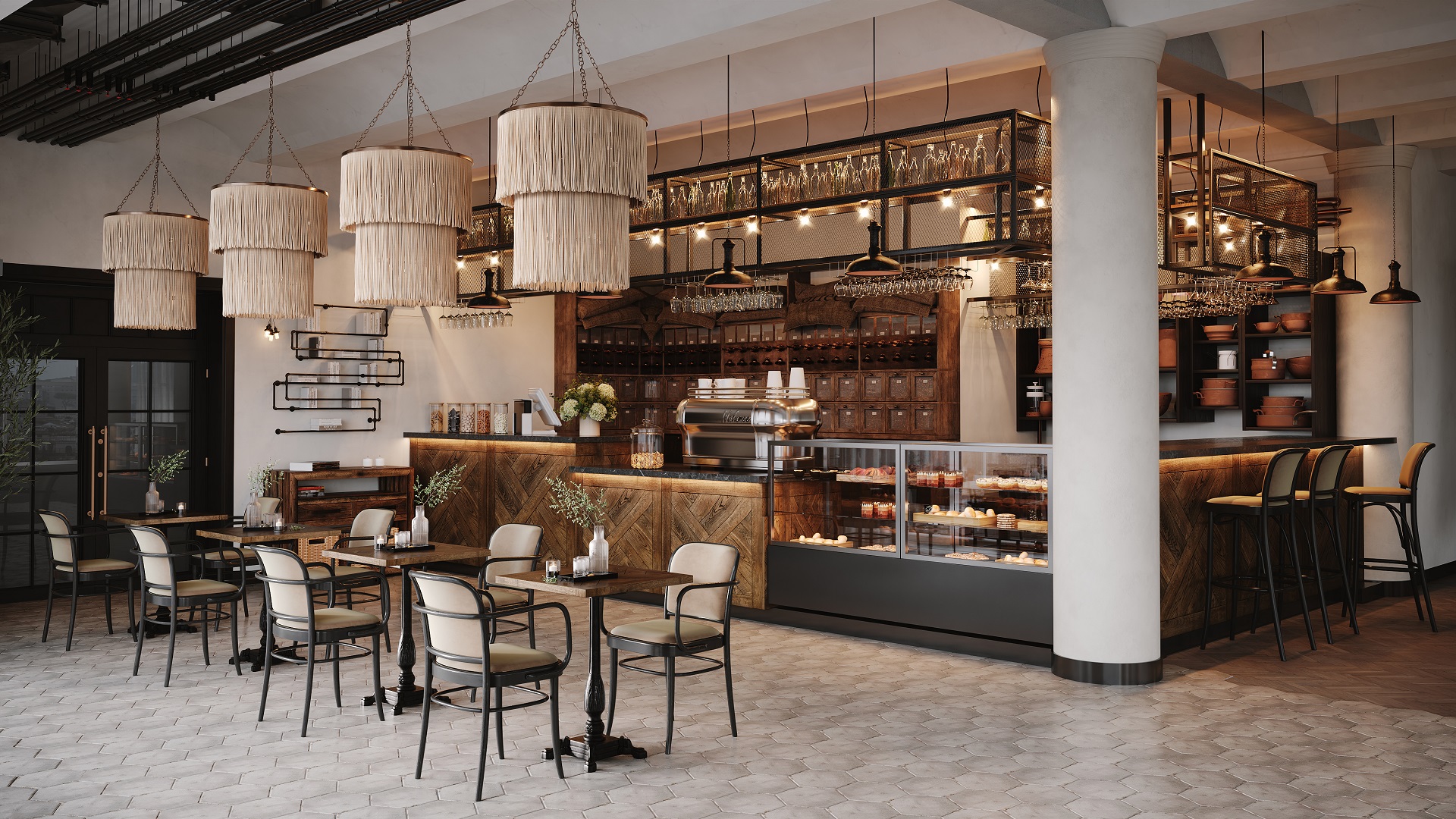
Such a visualization offers a broader perspective, capturing more of the place. A wider angle like this one provides a holistic view of the restaurant’s interior. It’s perfect for showcasing spacious dining areas.
#5.6 Zoom in 3D Rendering
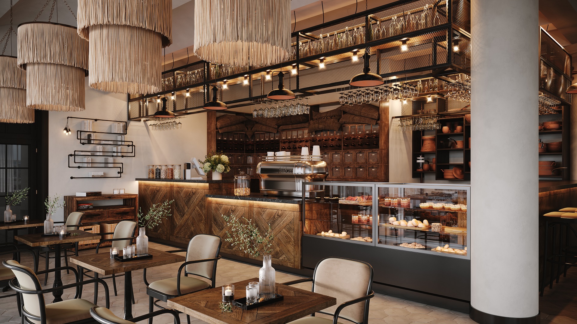
This kind of 3D visualization for restaurant interiors allows us to take a closer look at the details. Focusing on a certain area helps to highlight materials and intricate design elements. It also better conveys the atmosphere, establishing an emotional connection with the viewer.
#5.7 Furnishings Change Visualization
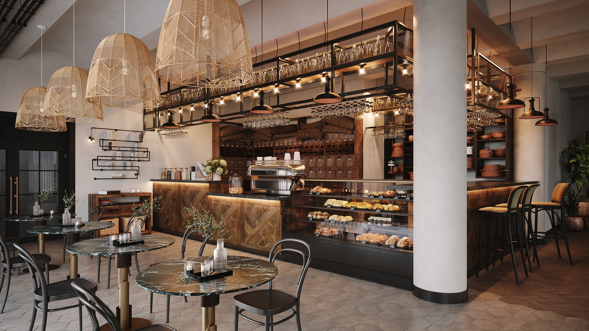
With this one, you can explore different furniture arrangements and styles. Whether experimenting with seating configurations or introducing new furniture pieces, this 3D solution allows for flexibility and customization. With it, one can enhance the ambiance and functionality of the dining space.
#5.8 Decor Change Visualization
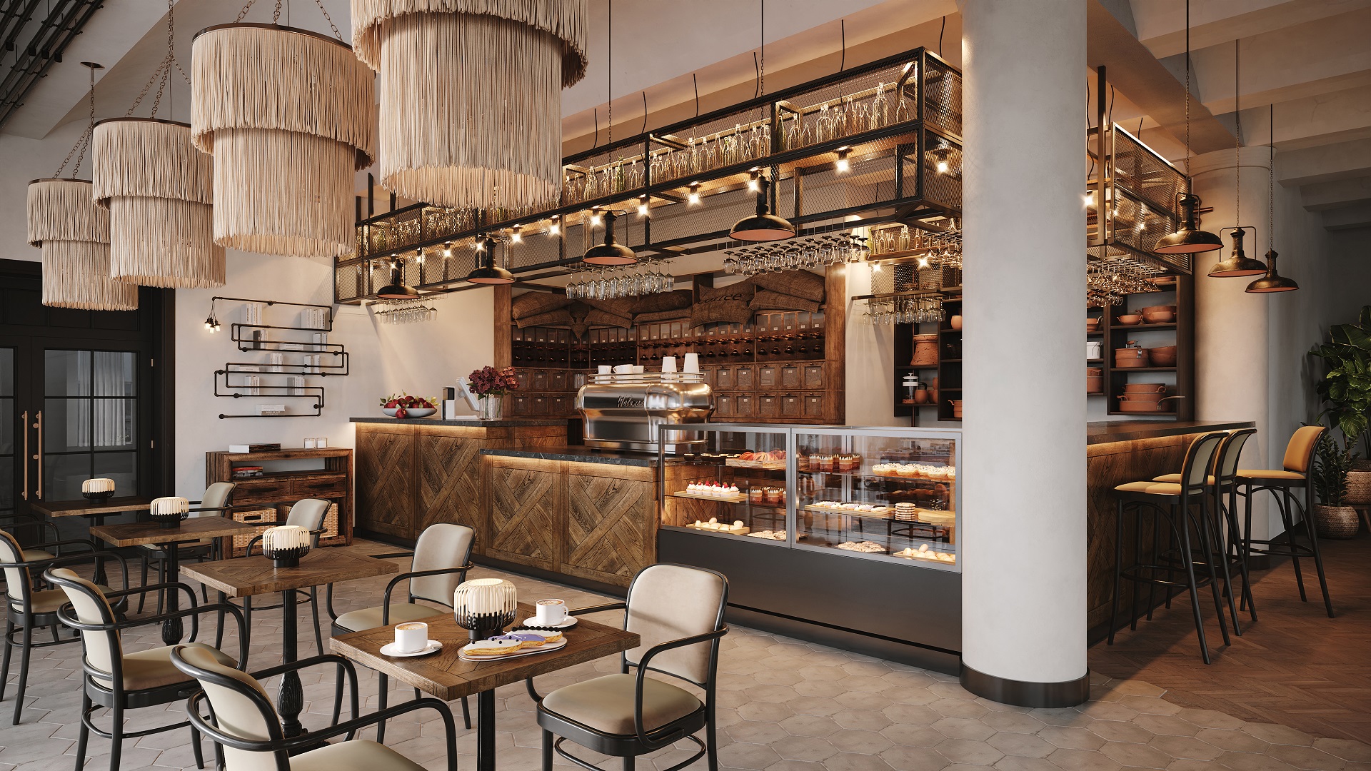
This type of 3D visualization helps you to experiment with different decorative elements when figuring out the best approach to restaurant interiors’ looks. From wall art and accessories to lighting fixtures and decor accents, this option offers endless possibilities for enhancing the aesthetic appeal of the restaurant interiors.
#5.9 Color Change 3D Visualization
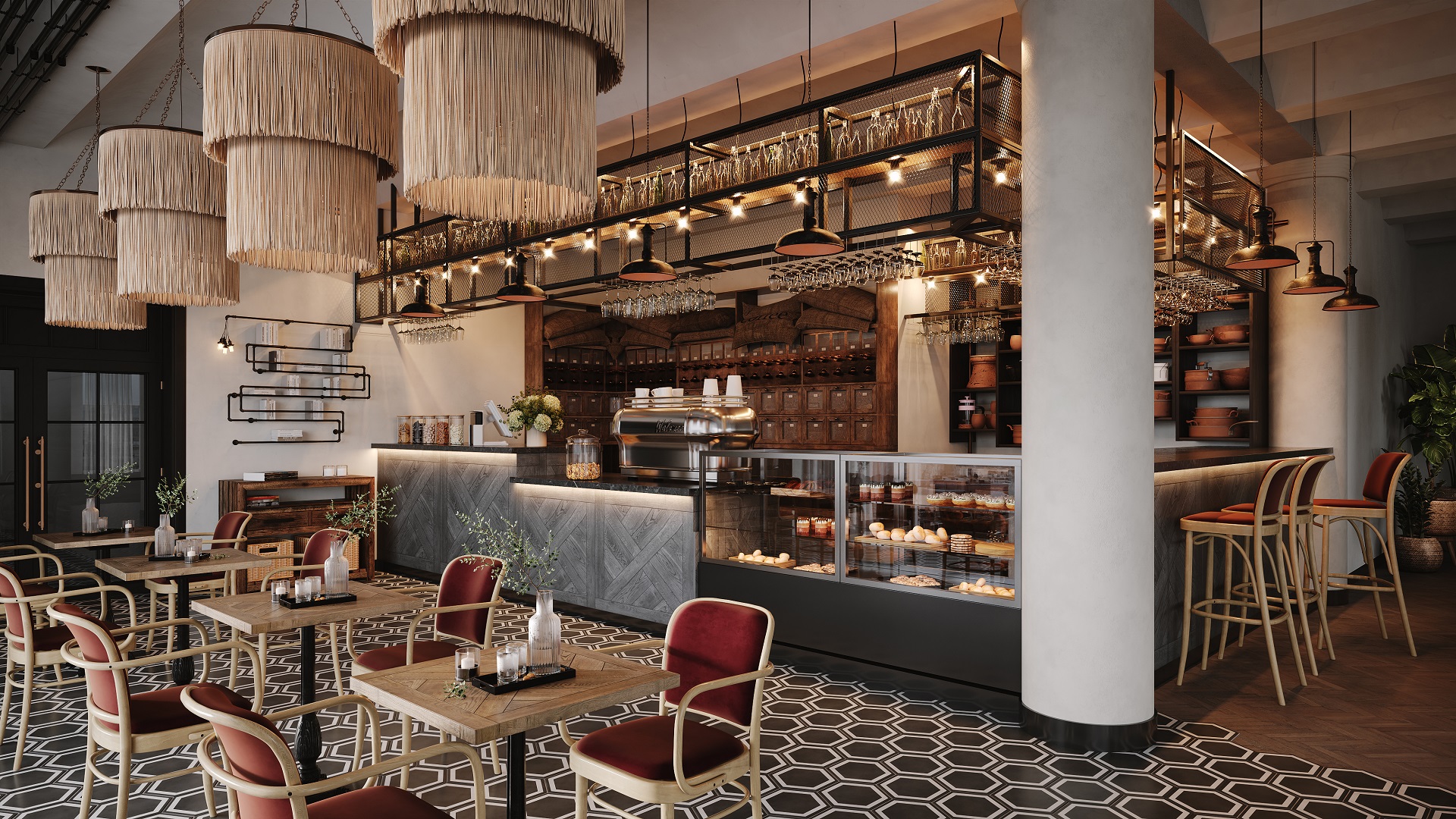
With this type of visualization for interiors, you can explore various color schemes without altering the textures. By experimenting with various hues and tones, you can evoke different moods and vibes.
#5.10 Finishes Change 3D Visualization
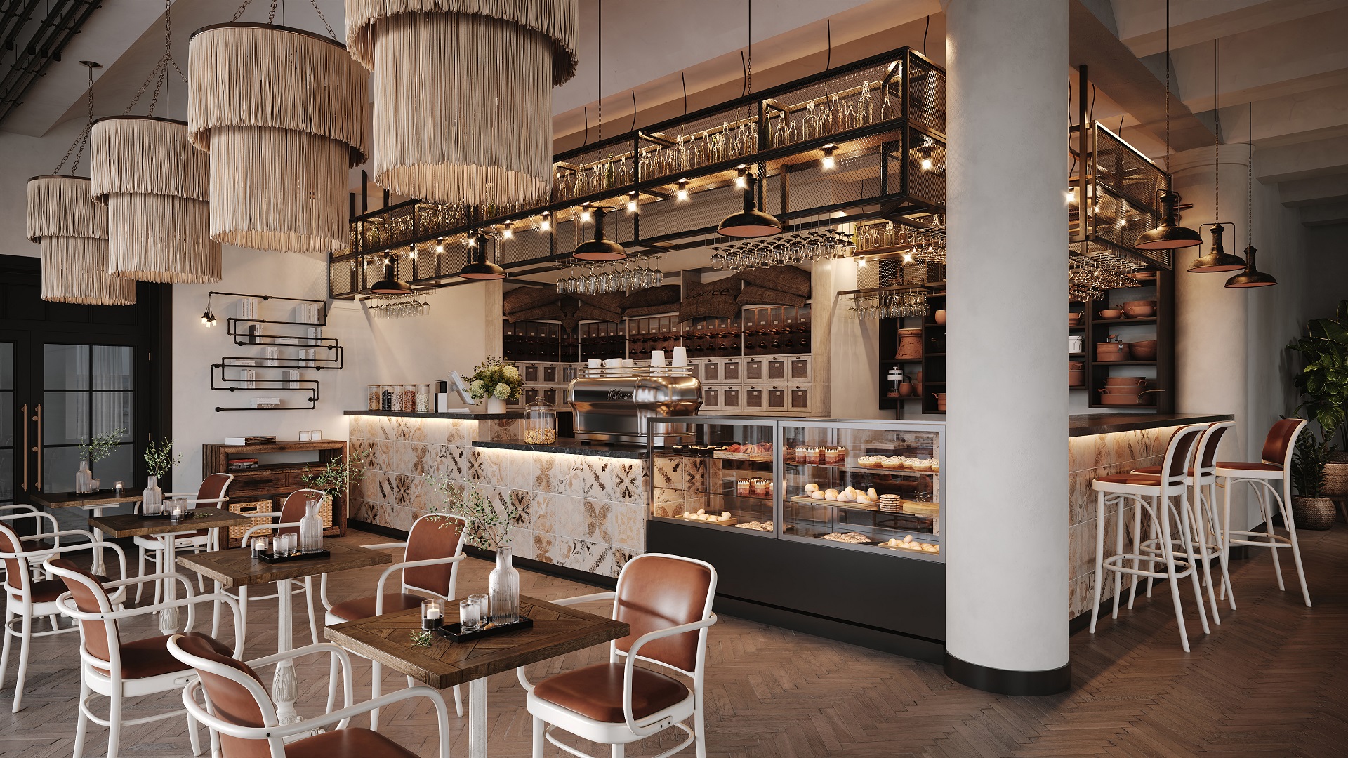
If playing around with colors is not enough to come up with the perfect design solution, this rendering comes to the rescue. From wood and stone to metal and glass, this option offers versatility in trying out unique textures and visual contrasts within the restaurant interiors.
#5.11 Lighting Change Visualization
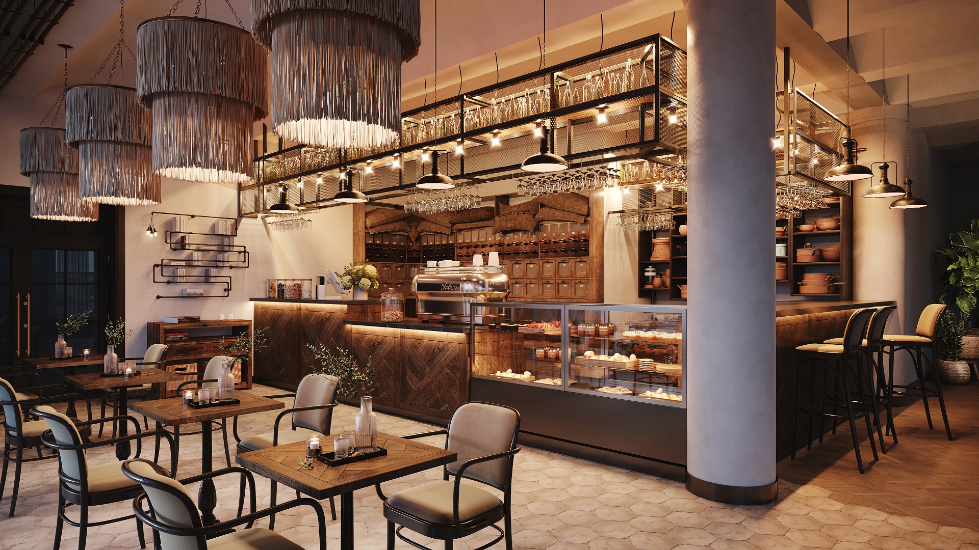
Showing lighting scenarios is vital for conveying different types of ambiance in 3D visualization for restaurant interiors. A shot with cozy warm dim lighting and nighttime outside will differ dramatically from a daylit scene. Why choose only one though? With 3D visualization, you can present every possible scenario.
#5.12 Detail Shot
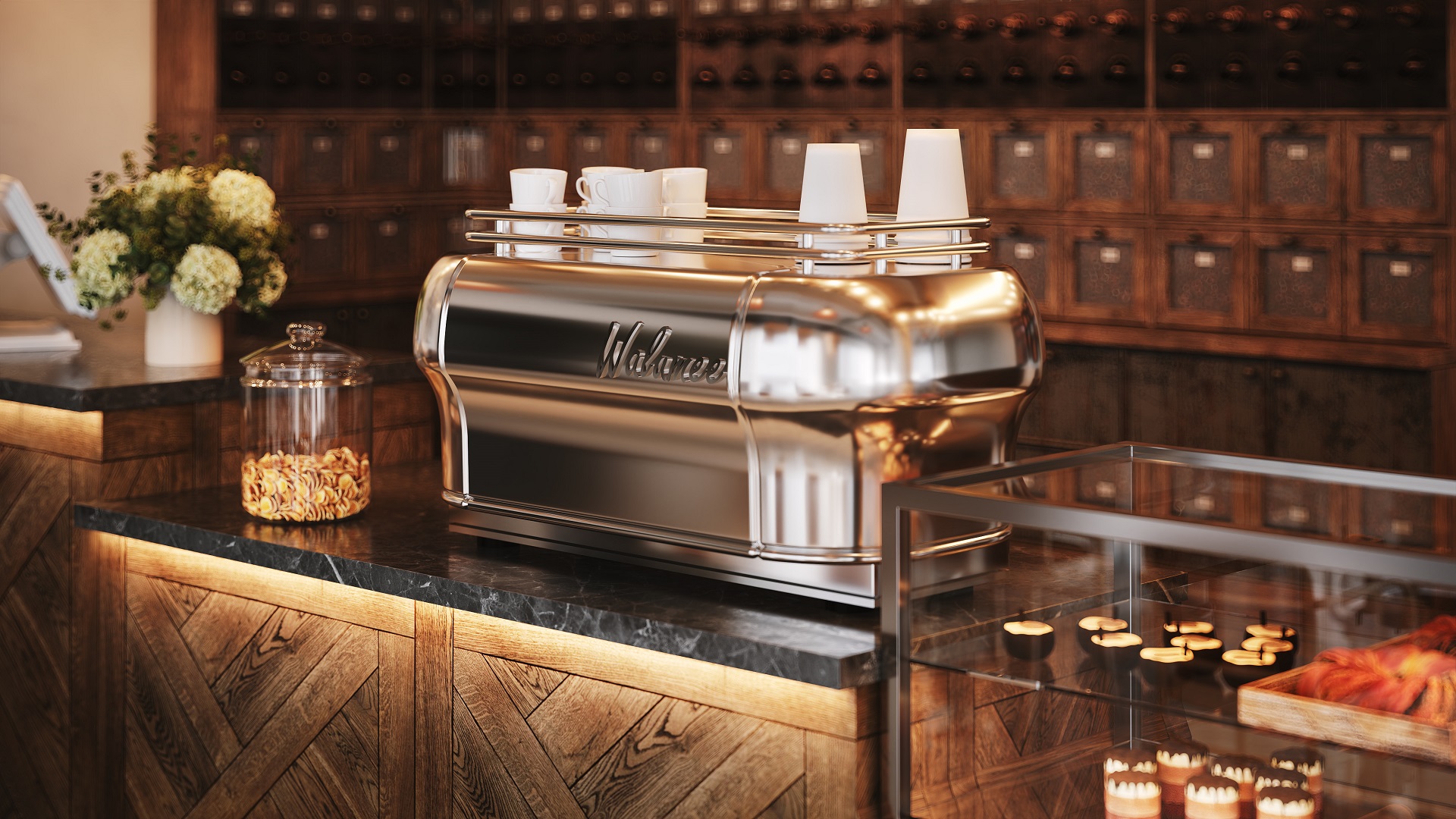
A close-up visualization zooms in on specific design elements. Whether highlighting a brand feature or showcasing a bespoke piece, this perspective adds depth and storytelling to the narrative of the restaurant interiors. It adds a lot to the perception of the overall atmosphere.
Take your design presentation to a new level with interior rendering
3D visualization for restaurant interiors is a great tool to support every stage of the design process – from developing ideas to winning client approval. With the right types of visuals, it becomes much easier to collaborate on designs and showcase that the spaces you create are not only beautiful but also functional and atmospheric.
Looking for CGI services to bring your restaurant designs to life? Get in touch with ArchiCGI and benefit from a large professional team, consistent top-tier quality, and fast turnarounds.

Stacey Mur
Content Writer, Copywriter
Stacey is a content writer and a CG artist. Outside of work, Stacey enjoys musicals, Star Wars, and art talk. A proud Corgi parent.


