

In pre-construction sales, the property is marketed before it exists, so listings must show the finished result long before construction makes it visible. Plans and site photos describe the project effectively. However, they cannot present the end state clearly enough for a buyer who is making a decision based on a listing page. That is why developers, brokers, and marketing teams rely on CGI (computer-generated imagery) for real estate listings when launching pre-sales campaigns. Real estate renderings enable the audience to assess space, light, and surroundings as if the building has already reached completion.
To get such photorealistic assets, developers usually work with an architectural rendering company. Before starting the collaboration, it helps to have a clear vision that can be described in a brief for the CGI contractor. There is no need to train the eye by reviewing thousands of references the way 3D artists do. Developers can rely on a few basic principles instead. These property rendering tips are outlined in this article.
Buyer behavior makes this approach to imagery production necessary. A LendingTree survey of more than 1,000 homeowners found that 47% of recent buyers made an offer before seeing the home in person, which means the listing itself must communicate the value of the future property with enough clarity to support a decision. When visuals carry that much weight, the render set has to be planned as part of the sales strategy, not produced as decoration.
In this guide, we will look at five practical principles used in pre-construction marketing to make 3D rendering for real estate more effective. We will focus on how to choose views that highlight selling points, how to build atmosphere instead of showing only geometry, how to keep lighting consistent across images, how seasonal variants can support campaigns, and when motion formats work better than static shots.
Why Property Renderings Matter for Listings
In off-plan campaigns, the difficulty is not in explaining the project but in making the future result believable to someone who has never seen it. Technical drawings describe dimensions precisely, yet they do not show how large a room feels, how light enters the space, or how the environment will look at human height. Because of this limitation, property marketing CGI is used to turn design data into imagery that can be understood without an architectural background.
During the pre-construction phase, there is no finished property to photograph, no staging to arrange, and no location footage that reflects the final product. This is why real estate rendering becomes the only format that can present the completed building before it exists. Developers rely on it when launching sales, brokers use it when explaining the offer to clients, architects review it to control how the project is represented, and marketing managers need it to build campaign materials that match the positioning of the development.
When visuals are prepared with this purpose in mind, 3D renderings for real estate do more than illustrate the layout. They allow the viewer to imagine being inside the property, which changes the way the listing is perceived. Instead of analyzing plans, the buyer reacts to the scene itself, understands the scale faster, asks fewer clarifying questions, and reaches a decision with less hesitation.
Key Terms and Types of Property Renderings
Before going into practical tips, it is useful to clarify a few terms that will appear throughout this guide. In real estate marketing, the same concepts are often described with different wording, which can make professional discussions harder to follow, especially for those unfamiliar with the terminology used in the industry.
Understanding the basic vocabulary used in property rendering production will make the recommendations in the next sections easy to understand.
These definitions are not theoretical. They reflect how developers, brokers, and marketing teams actually talk about types of architectural renderings when planning listing visuals, presentations, and pre-sales campaigns. Also, they help understand what is cgi in real estate.
Below are the key terms used in this article.
- Property rendering / CGI / 3D visualization are interchangeable terms used to describe digitally created images of a property before or during construction.
- Hero image is the main image of the listing, shown first and used to attract attention in search results, portals, and ads.
- Supporting images are additional visuals that enhance the presentation of the real estate. The set can include interior rendering for real estate, as well as amenity, detail, and context renders.
- Daytime render is an image with natural daylight lighting. Such renderings are considered the standard format for most listings.
- Twilight render is a dusk or evening image with artificial lighting turned on. The lighting choice is used to highlight atmosphere and architectural lighting.
- Amenity render visualizes a specific area of a real estate asset. An example of such an area could be a lobby, pool, rooftop, gym, or lounge.
- Detail render is a close-up image that showcases the materials, finishes, or furniture of a real estate asset. Detail renderings are used to confirm quality and design level.
- Image set is the full visual package prepared for real estate marketing, usually including the hero image plus supporting and detail renders.
It is also important to understand the full range of CGI formats available for real estate marketing. Developers, brokers, and marketing teams rarely rely on a single image. Instead, they combine different rendering types depending on the scale of the project, the sales stage, and the target audience.
The table below illustrates the prevalent formats and their typical usage scenarios.
| Type | What It Shows | When to Use |
| Exterior render | Façade, landscaping, surroundings | Always — foundation of the listing |
| Interior render | Layout, finishes, furniture, atmosphere | For residential and hospitality projects |
| Aerial / site render | Location, infrastructure, context | Large developments, mixed-use projects |
| Floor plan render | Layout, proportions, spatial flow | Improves understanding of the layout |
| Amenity render | Specific zones: lobby, pool, gym, rooftop | When the amenity is a USP |
| Animation / walkthrough | Narrative movement through the space | For complex or premium properties |
Tip #1: Focus on Benefits — Turn USPs Into Shots
In real estate marketing, the visual set should follow the sales logic of the project. Renders are not produced as isolated images but as part of a structured presentation where each shot corresponds to a specific selling point. This principle becomes critical in 3D commercial property rendering, where the buyer often evaluates the asset through visuals long before construction is completed.
One useful way to plan the image set is to turn each USP into a specific visual response. Start by identifying the core benefit, then define the buyer question it answers, and finally determine which view communicates that answer most clearly. This approach ensures that every render is tied to a commercial objective rather than produced for aesthetic variety alone.
This makes the real estate 3D rendering package easier to read and prevents situations where images look polished but fail to communicate why the property is worth attention.
Typical mapping works as follows.
- Location / views — courtyard view, terrace with a panorama, approach or entrance perspective
- Amenities — separate render for lobby, rooftop, pool, gym, coworking, or other shared spaces
- Layout — interior perspective that shows how the space actually reads in depth
- Finishes — close-up showing materials, façade elements, kitchen, or bathroom solutions.
When structuring the visual package, it is useful to separate detail renders and amenity visuals because they perform different roles in marketing communication. Amenity images describe the level of comfort and positioning of the project, while detail shots are used to confirm build quality or premium specifications.
Projects that compete through lifestyle or service levels normally require dedicated amenity rendering, especially for lobby, rooftop, and pool areas. These zones often define the perceived class of the development, so they should not be combined into one generic interior view. If an amenity is presented as a USP (unique selling proposition) in the brochure or listing, it usually needs its own render.
Detail images should remain selective. One or two are usually enough, and only when there is a clear reason to show material quality, façade treatment, or interior finish level. Overusing close-ups shifts the focus from the property itself to technical details, which weakens the overall presentation.
From a buyer’s perspective, every render should answer a concrete question. What exactly is offered here, how does the space feel, and what makes this property different from competing listings?
Choosing Camera Angles for Property Renderings
| Camera angle | Best for | Caution |
| Eye-level / street view | Sense of scale, entrance feel, pedestrian perspective | Avoid it if the entrance looks unattractive |
| Elevated 3/4 view | Classic hero shot — façade + landscaping + context | Make it unique through staging |
| Aerial / bird’s eye | Large developments, site context, master plans | Façade details get lost — not ideal for residential focus |
| Corner view | Shows two façades at once, adds volume perception | Can look unbalanced |
| Interior perspective | Spatial flow, furnishing, atmosphere | Avoid extreme wide-angle — distortion reduces trust |
| Detail / close-up | Materials, textures, premium finishes | Use only to support a specific selling point |
Mini-checklist for a CGI Brief
The points below summarize what should normally be agreed upon with the CGI team before rendering begins, from defining the scope of the image set to selecting the best angles for real estate rendering.
What to request with a CGI company:
- List of property USPs — list of shots with defined camera angles
- Amenity renders for the top 3 zones
- Eye-level approach shot (orientation view)
What to provide in the brief:
- List of key property advantages
- Floor plans with amenity areas marked
- Street context and entrance orientation
Common mistakes to avoid:
- Too many angles without connection to a specific benefit
- Amenity render without scale references (people, furniture)
- No people or cars — scale becomes unclear
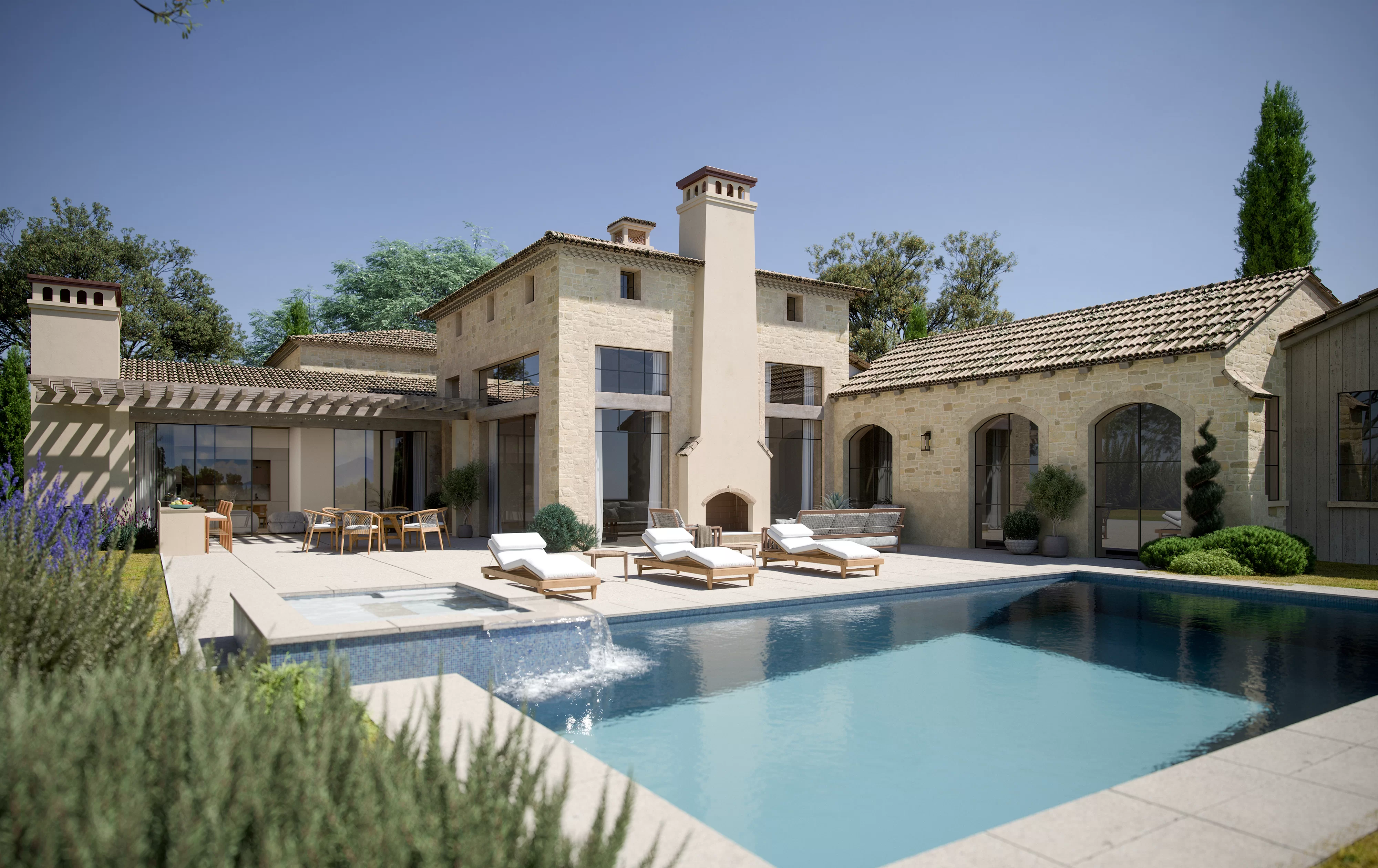
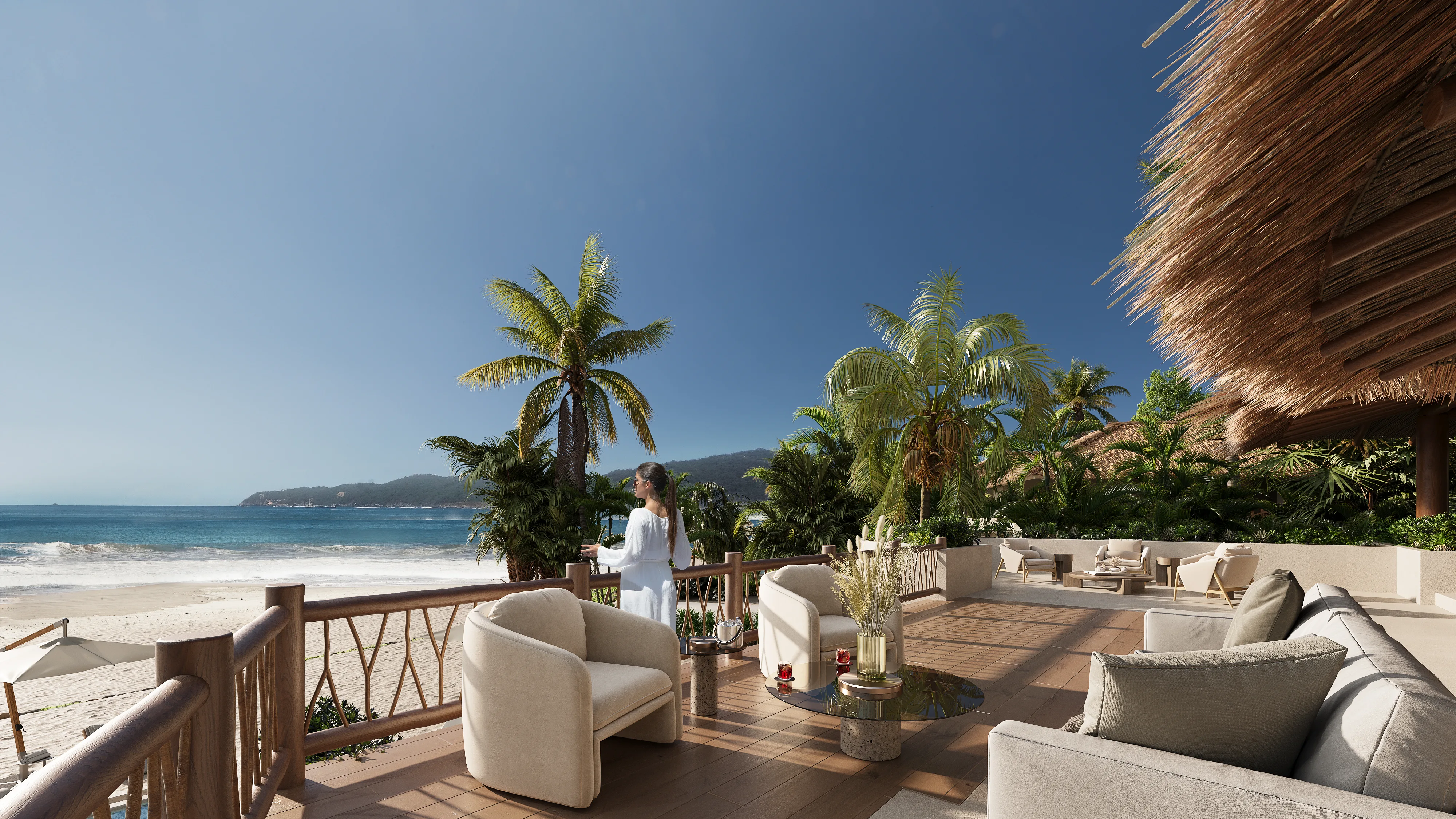
Tip #2: Convey the Atmosphere — Lifestyle, Not Just Geometry

A property render should communicate how it feels to live there, not only how it is built. Geometry proves accuracy. The atmosphere drives desire. In real estate marketing, that difference often defines whether a viewer scrolls past or pauses.
Start with mood controls. Color temperature sets the emotional tone. A warmer palette suggests comfort and evening calm. Cooler light signals clarity and productivity. Staging style, material palette, and carefully selected props reinforce that direction by creating an inviting atmosphere that resonates with potential buyers and reflects the lifestyle they aspire to. Every object in the frame should support the story of the future resident.
At the same time, realism matters. Material renderings must avoid the plastic look. Reflections, roughness, and glass should behave as they do in real life. Correct scale cues are equally critical. Cars, trees, and furniture must be proportionally accurate to prevent an uncanny sense of distortion.
Human presence helps, but it should be restrained. Silhouettes or neutral figures communicate scale without locking the image into a specific demographic. They suggest activity without turning the render into a lifestyle advertisement.
Interior and exterior continuity builds trust. The view from the window has to match the exterior context. Lighting direction and weather conditions must align. If branding or signage appears in the frame, it should remain subtle and secondary to the architecture.
To support premium positioning, include one or two detail renders that focus on facade materials, a refined lobby, or a kitchen or bathroom finish. These close views validate quality claims and demonstrate craftsmanship.
Amenity visuals also play a strategic role. They show how shared spaces such as lounges, terraces, or coworking areas function in practice. The key is balance. The image must feel aspirational, yet believable. A dream without credibility does not convert.
CheckList for a 3D Rendering Brief
What to request:
- Mood board or reference images aligned with the target audience
- 1–2 detail renders for premium elements
- Scale figures such as silhouettes or neutral people
What to provide in the brief:
- Target audience profile such as family, professional, or investor\
- Material specifications or reference photos
- Key advantages and spatial proportions
Common mistakes to avoid:
- Overdone postproduction leading to unrealistic shine or oversaturation
- Cluttered staging with too many props
- Inconsistent furniture style within one image set
Tip #3: Show Different Lighting and Weather Scenarios
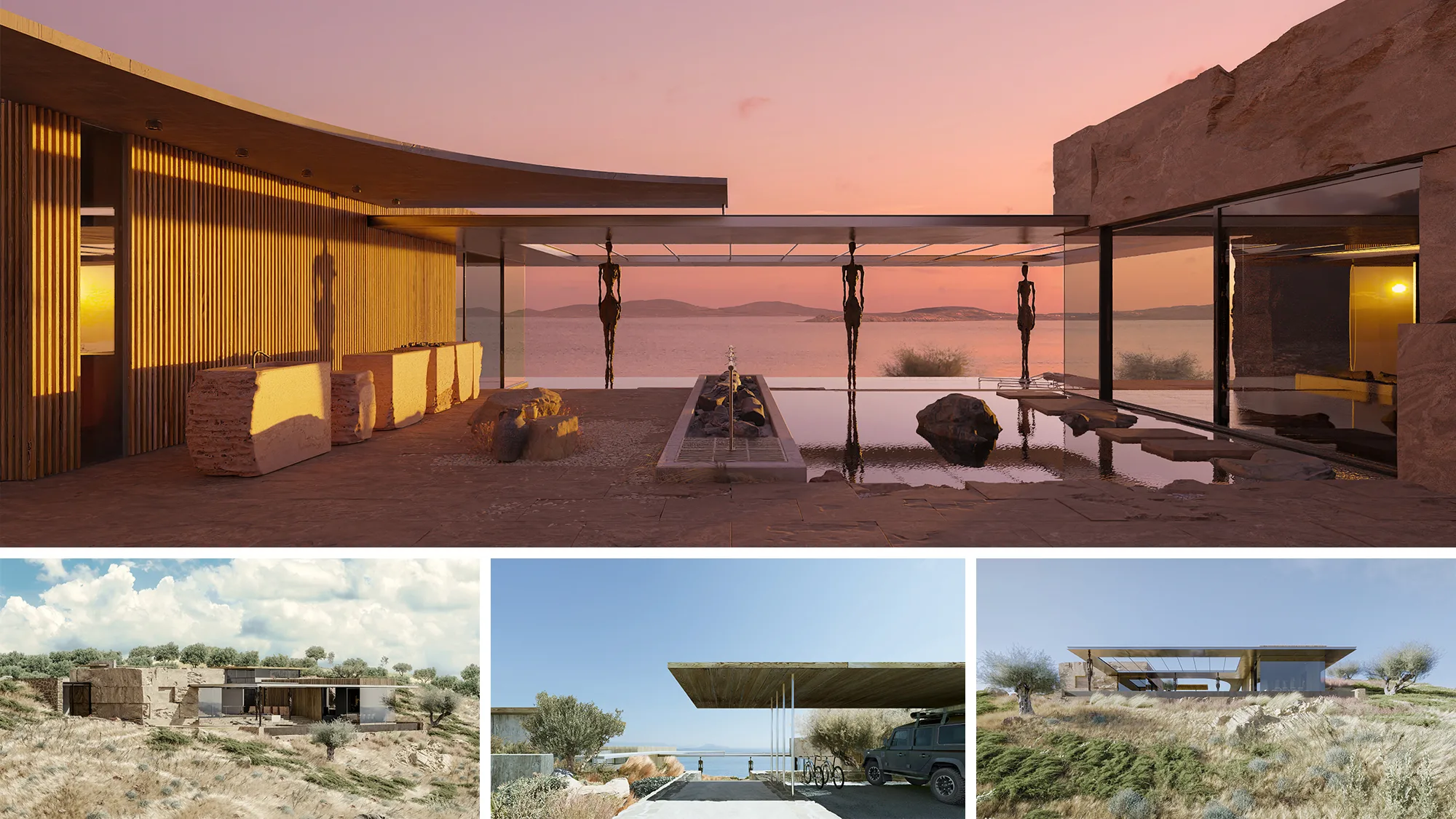
Lighting is not an aesthetic add-on. It directly affects how long visitors stay on a listing and whether they move closer to a viewing request. Market data supports this pattern. VirtualStaging.com reports that listings featuring a twilight hero image attract 76 percent more views, while PhotoUp research indicates that twilight visuals can generate three times more showings. Despite that performance gap, only 8 percent of listings currently use twilight imagery. That imbalance signals underutilized potential rather than creative preference.
For real estate marketing teams, the question is not about lighting and weather scenarios in CGI as such. It is how each scenario functions within the sales narrative. A clear daytime render communicates architectural logic, material accuracy, and urban context. A twilight property rendering shifts attention toward lifestyle, privacy, and atmosphere. Together they frame both rational and emotional drivers without increasing visual noise.
For interior scenes, lighting choices become even more nuanced. In our article on mood in photoreal interior imagery, we examine how different lighting setups influence perceived warmth, value, and spatial depth. Interior rendering is not only about realism. It is about guiding perception in line with pricing and audience expectations.
When lighting scenarios are defined at the briefing stage rather than improvised at the end of production, rendering stops being decorative content and becomes part of the conversion strategy.
Summary of Lighting Scenarios for Exterior Renders
| Scenario | Best for | Caution |
| Daytime | Standard natural light, landscaping, facade readability | Overcast conditions may look dull without mood elements |
| Twilight | Exterior lighting, atmosphere, prestige, emotional appeal | Do not hide architectural details in darkness |
| Night | Dramatic effect for commercial properties | Rarely suitable for residential projects, it may deter buyers |
| Overcast | Neutral lighting, no harsh shadows | It may appear flat without additional mood elements |
Types of Renders to Choose from
However, variation must not turn into inconsistency. One defined sun direction, one season, and one coherent color palette should guide the entire image set. If the facade faces west in one frame and north in another, the problem is not technical. It is strategic. Buyers may not articulate it, but visual contradiction weakens trust.
In most residential projects, one strong daytime hero combined with one twilight image is sufficient because each serves a distinct purpose within the marketing narrative. The daytime scene establishes architectural clarity, material accuracy, and context, which allows buyers to evaluate the property rationally. The twilight view, in contrast, enhances atmosphere and memorability, helping the project stand out in a crowded listing environment. Together, they address both analytical and emotional decision drivers without expanding the image set unnecessarily.
Supporting frames should then build on that foundation rather than compete with it. Detail renders can be used to isolate entrance treatments, facade textures, or balcony finishes, reinforcing perceived quality while remaining consistent with the primary lighting direction and season. This layered approach keeps the visual story coherent while gradually increasing depth.
Amenity visuals should follow the same strategic logic. A gym presented in crisp morning light communicates scale and functionality, which is critical for buyers assessing practical value. The same space rendered in softer evening tones positions it as exclusive and lifestyle-oriented. The choice is not stylistic. It should reflect how the amenity contributes to the overall positioning of the development.
The funnel stage also influences lighting decisions. During the teaser phase, atmospheric twilight imagery often performs better because it creates intrigue and emotional engagement. As the campaign moves into a sales-ready phase, clean daytime visuals with clear architectural detail reduce uncertainty and support more confident decision-making.
Mini Checklist for 3D Rendering Company
What to request:
- 1 daytime hero + 1 twilight image if lighting is a USP
- Consistent sun direction across the set
What to provide in the brief:
- Building orientation north, south, east, or west
- Priority facade side
Common mistakes:
- Mixing different seasons within one image set
- Night render without proper lighting resulting in a dark and unreadable image
Tip #4: Use Seasonal Variants as Campaign Assets
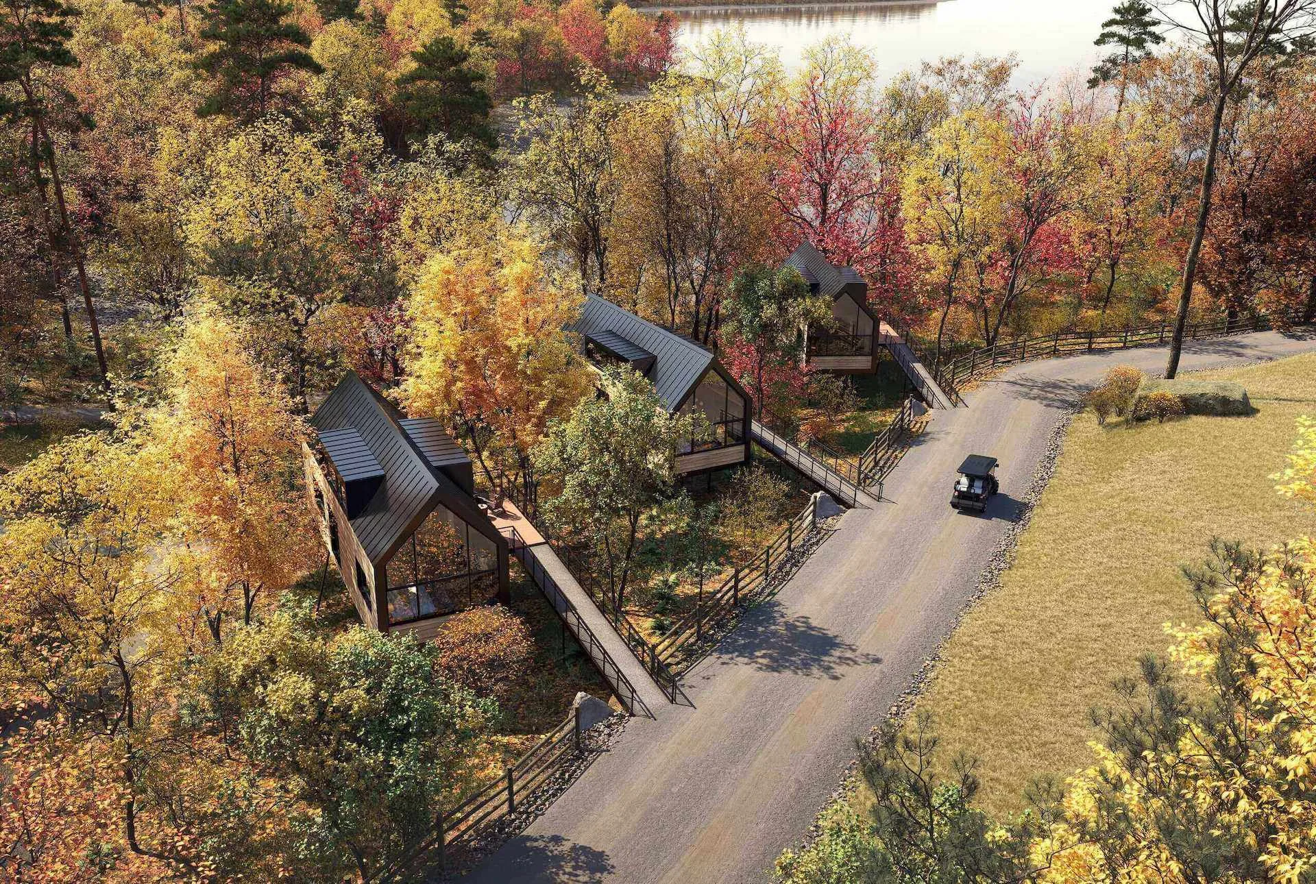
Seasonal visuals can extend the life of a single hero image without requiring a new rendering set. The architecture remains unchanged. What shifts is the environmental setup within the scene. A layer of winter frost on the landscape, spring blossoms near the entrance, or a warm summer evening sky can reposition the same property for a different campaign moment.
A winter 3D rendering can support messaging around comfort, glazing performance, and interior lighting during darker months. A well-planned fall 3D rendering can reinforce material warmth, landscaping maturity, and facade depth through seasonal color tones, while the building model and camera angle stay exactly the same.
The base hero image should remain unchanged. It serves as the stable reference point across listing portals and core sales materials. Seasonal versions are not replacements. They function as campaign assets used for targeted marketing initiatives where timing and context matter.
This is the point where real estate seasonal marketing ideas move beyond surface decoration and start working as deliberate, revenue-driven campaign tools. The chosen season must reflect the target market’s climate, local culture, and calendar context. A northern European audience will interpret seasonal cues differently than a Mediterranean one. Alignment builds credibility. Mismatch creates doubt.

Decorative elements should never compete with the building. Even during Christmas marketing, the architecture must remain the focus. Lights, wreaths, or props should support the story, not overwhelm the facade or obscure key design features.
It is also worth remembering that seasonal messaging does not need to rely on holidays. Concepts such as “move-in ready,” “summer entertaining,” or “winter warmth” often feel more universal and commercially flexible. They communicate lifestyle value without tying the project to a single date on the calendar.
Channel choice matters. Seasonal variants tend to perform well on social media and in email campaigns, where audiences expect timely and contextual content. Listing portals, however, should always feature the base hero image to maintain visual consistency and brand recognition.
If you need deeper guidance on selecting the right weather conditions, light quality, or seasonal effects, refer to our article on atmospheric rendering. It explains how subtle environmental adjustments can influence perception without altering the architectural integrity of the project.
Seasonal Staging for Listings

In traditional practice, seasonal and holiday staging for listings means physically bringing decor into the property before photography. That can include installing a Christmas tree and exterior lights in December, adding autumn wreaths and pumpkins for fall campaigns, or refreshing textiles and outdoor furniture for summer. Each change requires delivery, setup, styling, photography, and later removal. For multi-phase campaigns, this cycle repeats. Costs stack up. Timelines stretch.
With 3D rendering, those adjustments are executed inside the scene file. Snow can be added to the landscape. Foliage can shift from green to amber. Exterior lighting can move from bright daytime to winter dusk. No contractor visits the property. No reshoot is required. The base asset remains intact while seasonal versions are generated for specific campaign windows.
If the listing already relies on photography, virtual staging provides another route. Seasonal elements such as holiday decor or seasonal accessories are digitally overlaid onto existing images. The property stays untouched. The marketing calendar stays flexible.
Mini Checklist
What to request:
• Base hero image + 1–2 seasonal variants
• Seasonal staging without branded elements tied to specific holidays
What to provide in the brief:
• Target market and typical climate
• Campaign calendar indicating when each variant will be needed
Common mistakes:
• Season does not match the market (for example, snow in a warm climate)
• Over-theming, where decorative elements overshadow the facade
Tip #5: Add Dynamism — Choose the Right Motion Format
Motion content should clarify space, not decorate it. In high-value listings, movement has one job: explain how the property works.
A virtual tour rendering provides spatial understanding through self-guided exploration. Prospects move at their pace, revisit rooms, and access the property 24/7 from any device. Well-built 3D virtual tours for real estate replicate the logic of being inside the space, which static images cannot achieve. This format answers structural questions before a single call is made.
By contrast, architectural animation for real estate follows a narrative structure. A 3D walkthrough or flythrough creates a controlled sequence, often beginning at the entrance and progressing naturally toward key zones. The path feels intentional. This way, while a 3D virtual tour for real estate invites exploration, 3D animation guides attention. Understanding this distinction is central to positioning virtual tours vs static renders within the sales funnel.
The measurable impact is difficult to ignore. According to Matterport, listings with a 3D virtual tour sell 31% faster and for 9% more. The same source reports 95% more phone inquiries, while PhotoUp notes that 54% of buyers ignore listings without virtual tours. Additional data from Matterport shows that listings with immersive content receive up to 87% more views. These figures clarify the tangible benefits of virtual tours for real estate beyond aesthetics.
From a production standpoint, duration matters. A standard walkthrough should run between 60 and 120 seconds, with an absolute ceiling of two to four minutes for extended versions. Social distribution requires shorter edits, ideally 15 to 30 seconds. Whether the format is real estate animation or interactive exploration, pacing must communicate flow and functionality rather than visual spectacle.
Immerse clients into your projects with realistic 3D animations
The format should be defined by the sales objective. When the primary concern is spatial organization, interactive 3D virtual tours for real estate provide the clearest answer, as they allow viewers to understand layout, proportions, and room relationships at their pace. If the emphasis is on the experience of moving through the property, from the entrance to the apartment or from the lobby to amenities, a structured walkthrough animation communicates that sequence more effectively. In cases where location and surroundings are central to the value proposition, an aerial 3D flythrough helps place the building within its broader context. When the decision depends on finishing options, material palettes, or layout variations, still renders offer greater precision and comparison clarity than motion formats.
In practice, strong campaigns combine virtual tours and animations for listings with carefully curated still imagery. Each format performs a distinct role within the marketing mix. The strategic choice is not about adding motion for impact but about selecting the format that explains the property most clearly.
How to Plan a Listing Image Set
A strong listing set does not rely on isolated images that compete for attention. It is built around control. The hero holds the first position and must survive reduction to a small thumbnail without losing clarity or impact. At 300 by 200 pixels, composition flaws become obvious. If the building shape, entrance, or main volume cannot be read instantly, the image fails its primary task.
After the hero image secures attention, the rest of the visuals must work together to clarify and substantiate the project. The context shot places the building within its urban setting, which makes orientation and surroundings immediately understandable. Building on that, the amenity render isolates the core advantage and turns it into visible proof rather than a vague promise. Interior views then translate this value into everyday experience by showing scale, daylight, and finish quality, while detail shots reinforce credibility through close attention to materials and craftsmanship.
Motion content enters the sequence only when spatial relationships are too complex to communicate through still frames. In this way, the set develops as a continuous argument, with each image extending the previous one instead of repeating it.
Discipline is essential. A listing should be built around one defined season, one fixed light source, and one coherent color scheme across all visuals. Mixing lighting conditions or seasonal cues creates visual inconsistency that weakens credibility. The environment must feel coherent.
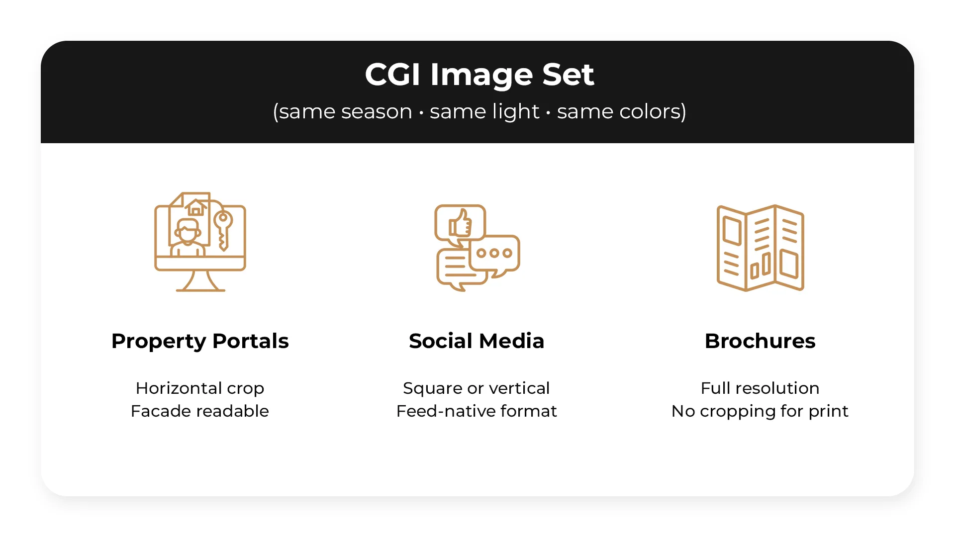
Distribution shapes format decisions from the start:
- Property portals typically require horizontal crops, so the façade must remain clear and readable within that frame.
- Social channels favor square or vertical compositions that take up more screen space and feel native to the feed.
- Brochures demand high-resolution files without cropping to protect print quality and detail.
Planning for each format early prevents visual compromises and last-minute adjustments later. Overall, the image set should be structured around clear functional roles and channel priorities. The table below maps each shot type to its purpose and required placement.
| Image | Role | Channel Priority |
| Hero exterior (daytime) | Thumbnail + first impression | Portal: mandatory |
| Context / approach shot | Orientation, street and surroundings | Portal: mandatory |
| Top amenity render | Confirmation of key benefit | Portal: mandatory |
| Key interior view | Sense of space and finishes | Portal + brochure: mandatory |
| Detail render (1–2) | Confirmation of premium claims | Brochure + hoarding: recommended |
| Twilight exterior | Atmosphere, lighting features | Social + brochure: if lighting is present |
| Virtual tour or animation | Spatial understanding | Portal + presentations: for complex projects |
Common Mistakes That Make CGI Listings Underperform
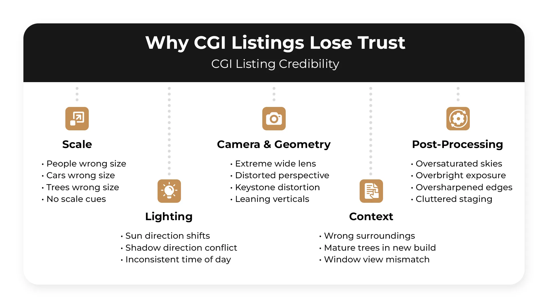
Scale errors are among the most damaging. People, cars, and trees placed at the wrong size relative to the building create an immediate sense that something is off, even when viewers can’t identify exactly what it is. Closely related is the wide-angle lens problem — extreme focal lengths make interiors and facades read as larger than they are, which doesn’t hold up once a buyer visits the site and loses trust in the material entirely.
Verticals matter more than most teams budget for. Keystone distortion — where the building appears to lean or fall — is a common output of uncorrected camera angles and signals a lack of technical control to anyone who notices it. Inconsistent sun direction across a set of images is a similar issue: when shadows fall from different angles across renders that are supposed to represent the same moment, it registers subconsciously as something wrong even if the viewer never articulates why.
Post-processing often leads to the ruin of otherwise solid CGI. Oversaturated skies, blown-out brightness, and over-sharpened edges push visuals into territory that reads as fake rather than aspirational. Cluttered staging compounds this — props and furniture added to fill space end up pulling attention away from the architecture itself.
Context errors are harder to recover from commercially. Surrounding buildings that don’t reflect the actual neighbourhood, mature landscaping shown at handover when the site will be bare for years, and exterior views that don’t match what the interior windows are showing all create a credibility problem that buyers and agents pick up on quickly. Empty spaces with no people or furniture leave scale entirely to the imagination, which rarely works in the project’s favour.
Pre-Publishing CGI Checklist
Every visual asset going to market should clear this list. It covers the criteria that keep CGI listings accurate, credible, and built for the channels they’re published on.
Accuracy
- Materials match the specification
- Massing is correct
- Key features are visible and clearly readable
Marketing Clarity
- Each image answers a specific buyer question
- No image is present without a clear purpose
Trust Cues
- Materials read as realistic
- Scale is verifiable against human or environmental references
- Lighting is consistent across the full set
Thumbnail Test
- Hero image is readable at 300×200px
- Building is identifiable at portal crop size
Legibility
- Key features are not buried in shadow
- Contrast meets accessibility standards
Consistency
- One season across the full set
- One time of day across the full set
- One colour palette across the full set
Channel Readiness
- Hero image framed correctly for portal crop
- Detailed renders sized for brochure use
- Detailed renders sized for hoarding use
Summary — Property Rendering Tips
A CGI set that performs commercially is built on a clear brief, not creative instinct alone. Each shot needs to map to a specific USP, with camera angles chosen for what they communicate rather than how they look in isolation. Atmosphere comes from the combination of lighting conditions, deliberate staging, and PBR materials that read as credible at close range — supported by one or two detail renders that add tactile weight to the wider views.
Lighting decisions have a direct impact on how much of the market the set can cover. One daytime and one twilight render handle most channel requirements, provided sun direction stays consistent across every image in the set. Seasonal variations follow a different logic — the base hero remains unchanged, and seasonal versions are produced as campaign assets for specific marketing windows rather than applied across the full set.
Where stills reach their limit, motion picks up. A virtual tour addresses spatial understanding in a way that static images can’t, while animation carries narrative across a sequence and works best when the project has something worth telling. When assembling the final set, order affects how a listing is experienced: hero, context, amenity, interior, detail, and motion, in that sequence.
Before anything goes to market, the full checklist applies — accuracy against specification, thumbnail test at 300×200 px, legibility and contrast, consistency across lighting and season, and channel readiness for both portal crop and print formats.
More information and solutions are available on this page about 3D visualization deliverables.
Get your project estimated in just 1 hour - fill out this brief!

Irma Prus
Content Writer, Copywriter
Irma writes articles and marketing copy for ArchiCGI. Her dream is that more people discover the power of CGI for architecture. Irma is into neuromarketing, ruby chocolate and Doctor Who series.
Frequently Asked Questions
1). What is property rendering in real estate listings?
Property rendering is a CGI or 3D visualization that shows a completed building or unit before construction is finished. Unlike photography, which captures what physically exists, rendering depicts the intended end state — the finishes, light, and atmosphere a buyer can expect upon handover. It has become a standard tool in off-plan sales, where there is simply nothing yet to photograph.
2). How many CGI images should a listing include?
A credible listing needs at least four to five renderings: a hero exterior shot, a context view showing the building within its surroundings, an amenity space, a main interior, and a detailed image highlighting finishes or a signature feature. Complex developments with multiple unit types or phased construction benefit from a larger set. Fewer than four images tends to leave buyers with unanswered questions that slow down decisions.
3). What’s the difference between a daytime and a twilight render?
Daytime renders are the industry standard, showing a property in clear, neutral light that reads well across all platforms and communicates scale, materiality, and context without distraction. Twilight renders prioritize atmosphere: warm interior light spilling outward, a dramatic sky, and a mood that daytime cannot replicate. The choice comes down to what the property needs to sell. Twilight works best for luxury developments, hospitality projects, or any listing where emotional impact matters as much as factual information.
4). What are the best camera angles for property renderings?
The choice of angle depends on what the image needs to communicate. Eye-level shots place the viewer inside the scene and make the scale feel human, while an elevated three-quarter or corner angle shows the building’s massing and its relationship to the surrounding context. Aerial views earn their place in large-scale developments where location is a primary selling point. For interiors, a wide establishing shot handles the room as a whole, and a detail angle closes in on the finishes or views that justify the price. Most listings benefit from combining at least three of these perspectives rather than repeating a single one.
5). What should you provide in a brief to avoid revisions?
The more specific the brief, the fewer surprises come back from the studio. At minimum it should cover materials and finishes, building orientation, a clear list of selling points you need the image to support, and who the target buyer actually is. Mood references are worth including even if they feel subjective, because they calibrate atmosphere faster than written descriptions. If the visuals are tied to a campaign or launch date, that timeline also belongs in the brief too, since it affects how the studio prioritizes and sequences the work.
6). How do you make CGI look believable?
Believability in CGI comes from getting several things right at once rather than getting one thing perfectly. Scale is the most common failure point: furniture, door heights, and human figures that are even slightly off immediately read as artificial. Materials need to behave the way real surfaces do under light, which means proper PBR textures that show variation, reflection, and imperfection rather than flat, uniform finishes. Natural lighting tied to a real sun position and consistent interior to exterior light continuity remove the last layer of artificiality that makes a render look like a render.
7). When is a 3D virtual tour better than still images?
Still images can show a room beautifully but cannot explain how rooms connect to each other, and that is exactly where a virtual tour becomes the stronger tool. For complex floor plans with split levels, open-plan zones that flow into one another, or units where the sequence of spaces is itself a selling point, a tour gives buyers the spatial understanding that no single frame can provide. It is particularly effective for overseas or remote buyers who cannot visit in person and need to build a mental map of the property before committing to a decision.
8). How do you review and approve a rendering before publishing?
Start with accuracy: check that materials, finishes, and architectural details match the specification documents, because errors at this stage are expensive to fix after launch. Then assess whether the image actually supports the marketing message and whether the key selling points read clearly without explanation. Run a thumbnail test, since most buyers will see the image small before they click, and a render that loses its impact at low resolution will underperform regardless of its technical quality. Finally, confirm that the image works across every channel it is intended for, checking proportions, legibility, and consistency with the rest of the visual campaign before signing off.