

3D Renderings for Handel’s Homemade Ice Cream: A Multi-Location Project
When a franchise with 80+ years of heritage needs to open new locations across the country, ice cream shop interior design becomes more than an aesthetic exercise — it becomes a brand-integrity challenge. Handel’s Homemade Ice Cream, founded by Alice Handel in 1945 in Youngstown, Ohio, partnered with ArchiCGI to produce exterior and interior 3D renderings for new stores across the U.S., each tailored for real estate proposals to landlords, investors, and municipal authorities. What follows is a detailed look at how those renderings came together — from layout logic to localized branding — across walk-up, walk-in, and drive-thru formats.
Project Overview — A Multi-Location Franchise Rollout
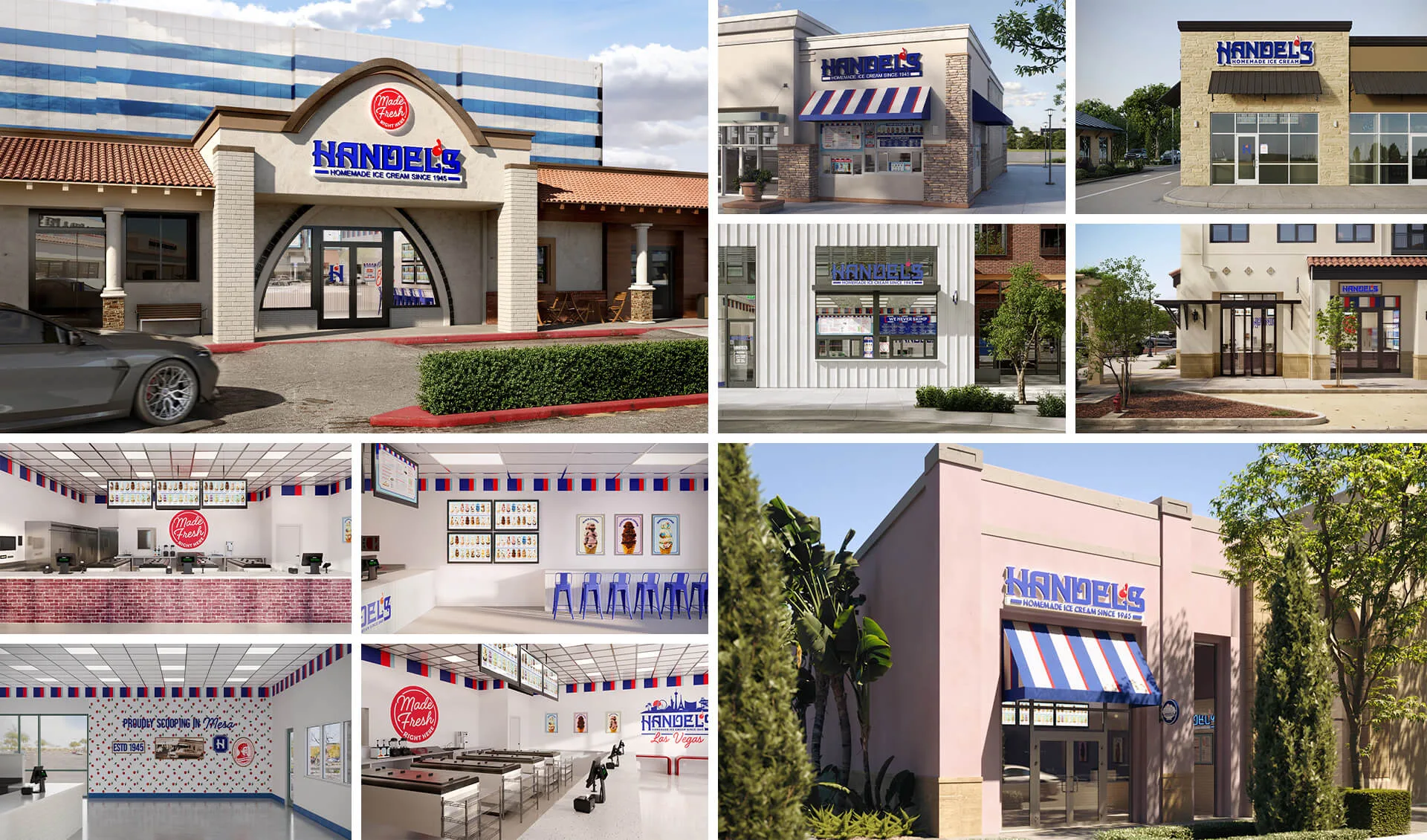
Handel’s operates a growing network of ice cream shops across the United States, each following one of three storefront formats: walk-up windows for high-foot-traffic areas, full walk-in parlors with interior seating, and drive-thru configurations for suburban and highway-adjacent locations.
ArchiCGI’s scope covered photorealistic 3D visualization for each new location — exteriors set within real-world site context and interiors accurate down to countertop placement and dipping cabinet arrangement. The primary use case: real estate proposals. Franchisees use these renderings to pitch concepts to landlords, secure investor buy-in, and navigate city permitting processes. The visuals function as proof-of-concept documents that carry a project from “idea” to “approved lease.”
The Challenge of Designing for a Growing Franchise
Handel’s needed a rendering partner who could do two things simultaneously: maintain absolute brand consistency across every new location and adapt each rendering to the specific architectural context of its site. That’s a tension that only tightens as a franchise scales — every new city brings different zoning, different building shells, and different sightlines.
The deliverables had to serve a dual audience. For landlords and real estate developers, the exteriors needed to demonstrate that a Handel’s location would be a visual asset to the property. For internal stakeholders and permitting bodies, the interiors had to show a fully operational store: equipment placement, customer flow, service zones, and brand elements all present and accurate.
Ice Cream Shop Exterior Design Across the U.S.
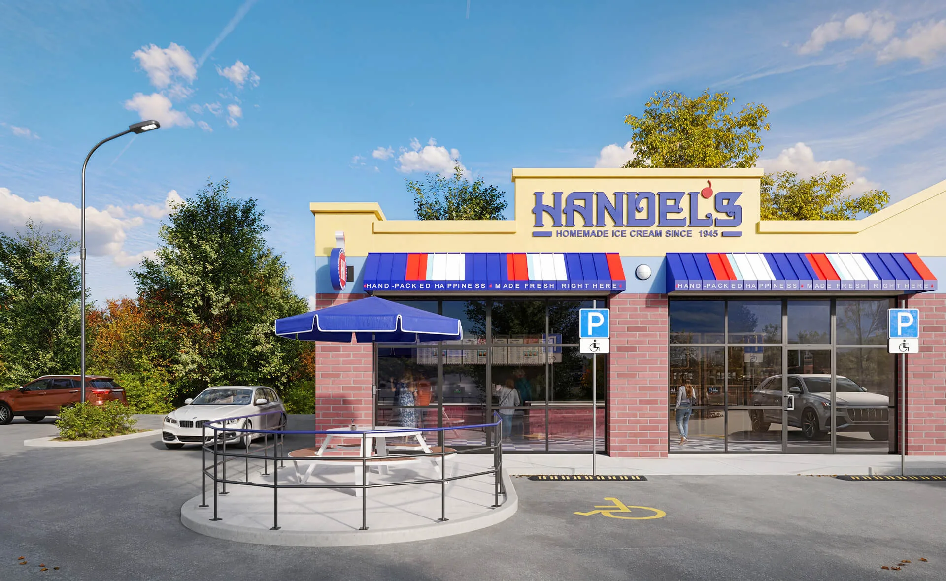
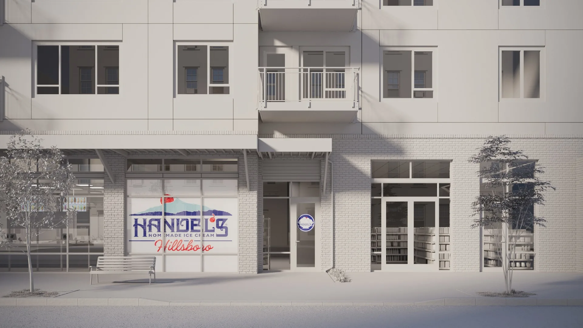
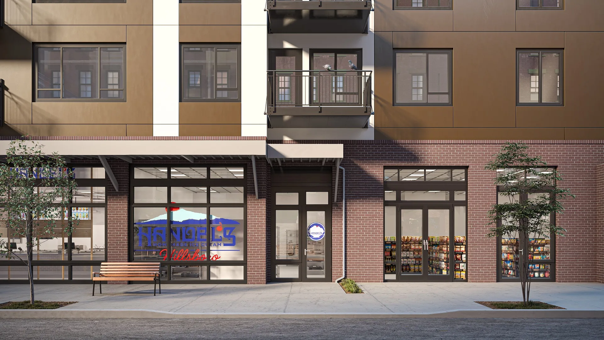
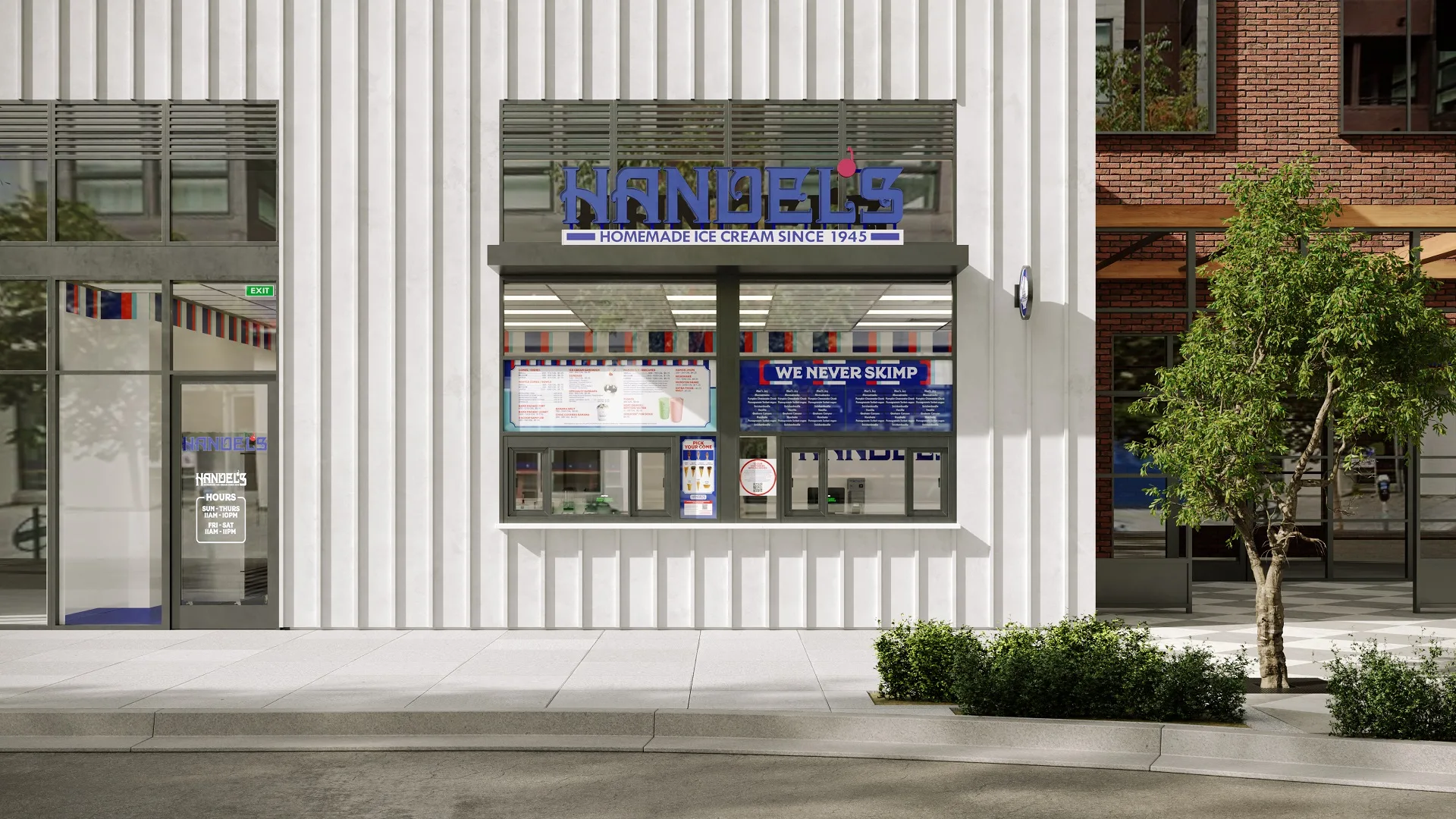
Every Handel’s exterior rendering starts with a clear objective: show this store belonging in this place. The ice cream shop exterior design has to balance franchise signage and brand identity with the architectural vocabulary of the surrounding neighborhood. A walk-up window on a bustling downtown strip reads differently from a standalone drive-thru building off a state highway, and the rendering needs to capture that difference.
Featured locations span multiple states and formats. Each rendering places Handel’s storefront within its real-world site context — neighboring structures, parking configurations, landscape elements, and local signage visible in frame — so the viewer isn’t looking at an ice cream shop in a vacuum. They’re seeing it where it will actually be.
Walk-Up, Walk-In, and Drive-Thru Formats
The walk-up format is Handel’s most compact configuration: a service window facing the sidewalk or parking lot, minimal interior square footage, and maximum street presence. These work best in dense retail corridors and seasonal locations where the queue itself becomes part of the experience.
Walk-in stores are the full parlor experience — interior seating, branded wall treatments, a full counter, and a dipping cabinet run. Drive-thru locations add a vehicular service lane, menu board positioning, and a separate order-confirmation window. Each format demands a different rendering approach, different camera angles, and different emphasis in the final deliverables.
Adapting Exteriors to Real-World Context
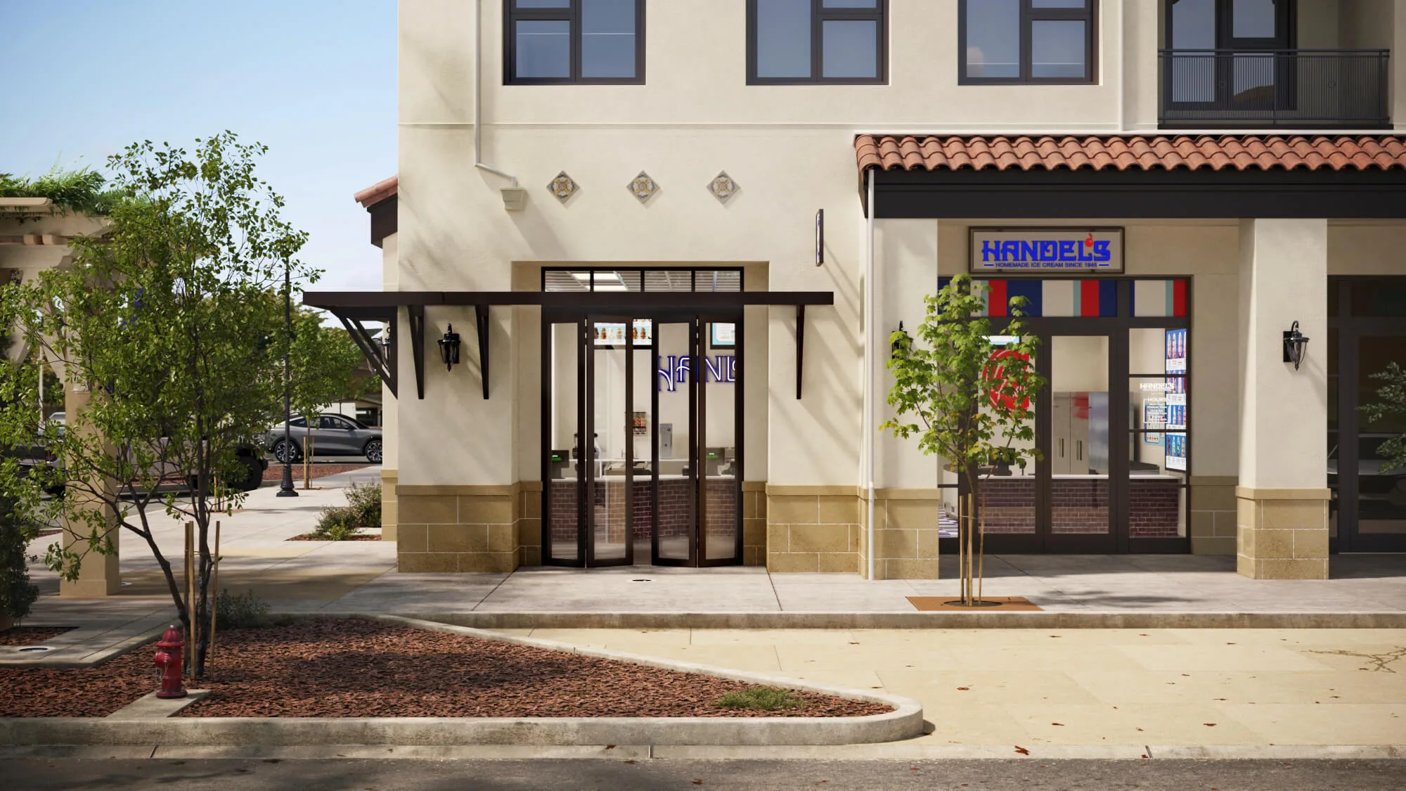
A rendering that floats in white space doesn’t convince a landlord. ArchiCGI integrates each Handel’s storefront into its actual site surroundings — neighboring facades, existing signage, road infrastructure, landscaping, and pedestrian patterns all figure into the composition. The goal is environmental fit: the store looks like it was always supposed to be there.
This extends to material and color matching. If the adjacent buildings use exposed brick, the rendering reflects that context. If the local architectural character favors stucco and terracotta, the Handel’s exterior adapts its palette accordingly while keeping brand constants — the signature blue logo with its cherry icon, the “Homemade Ice Cream Since 1945” tagline, and the red-white-blue palette threaded through awnings, window graphics, or facade accents — intact and prominent.
Ice Cream Shop Interior Design — Inside the Stores
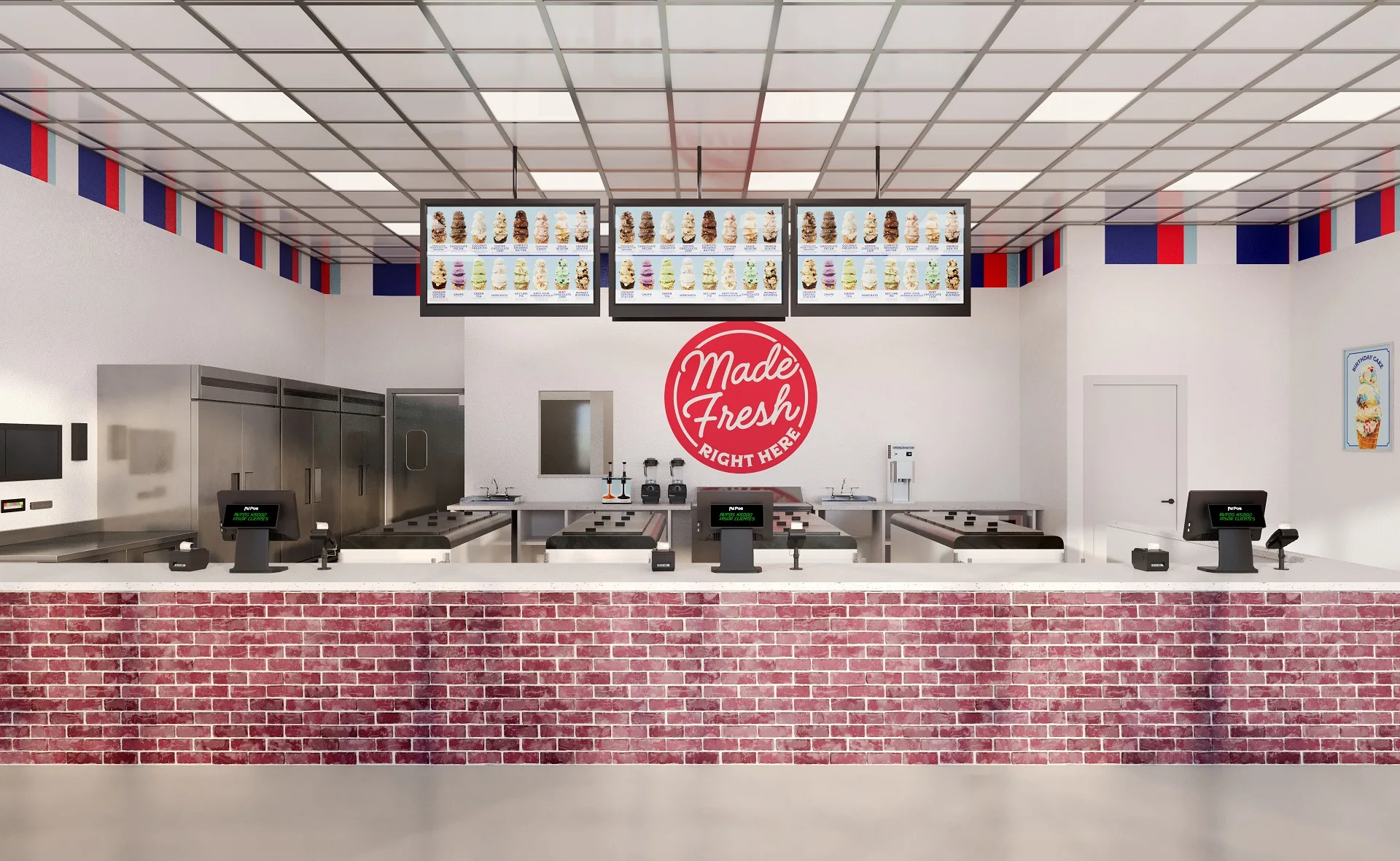
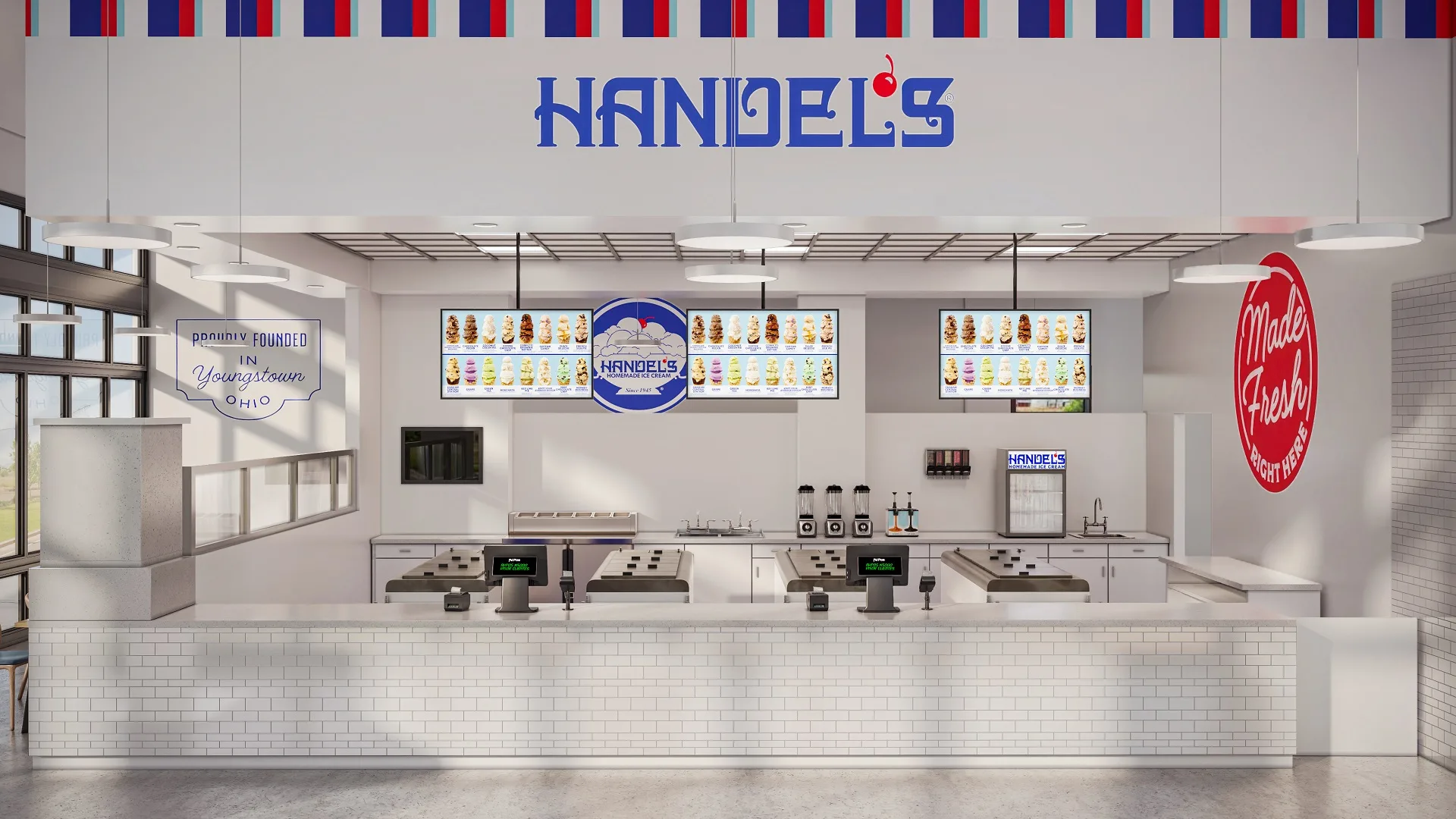
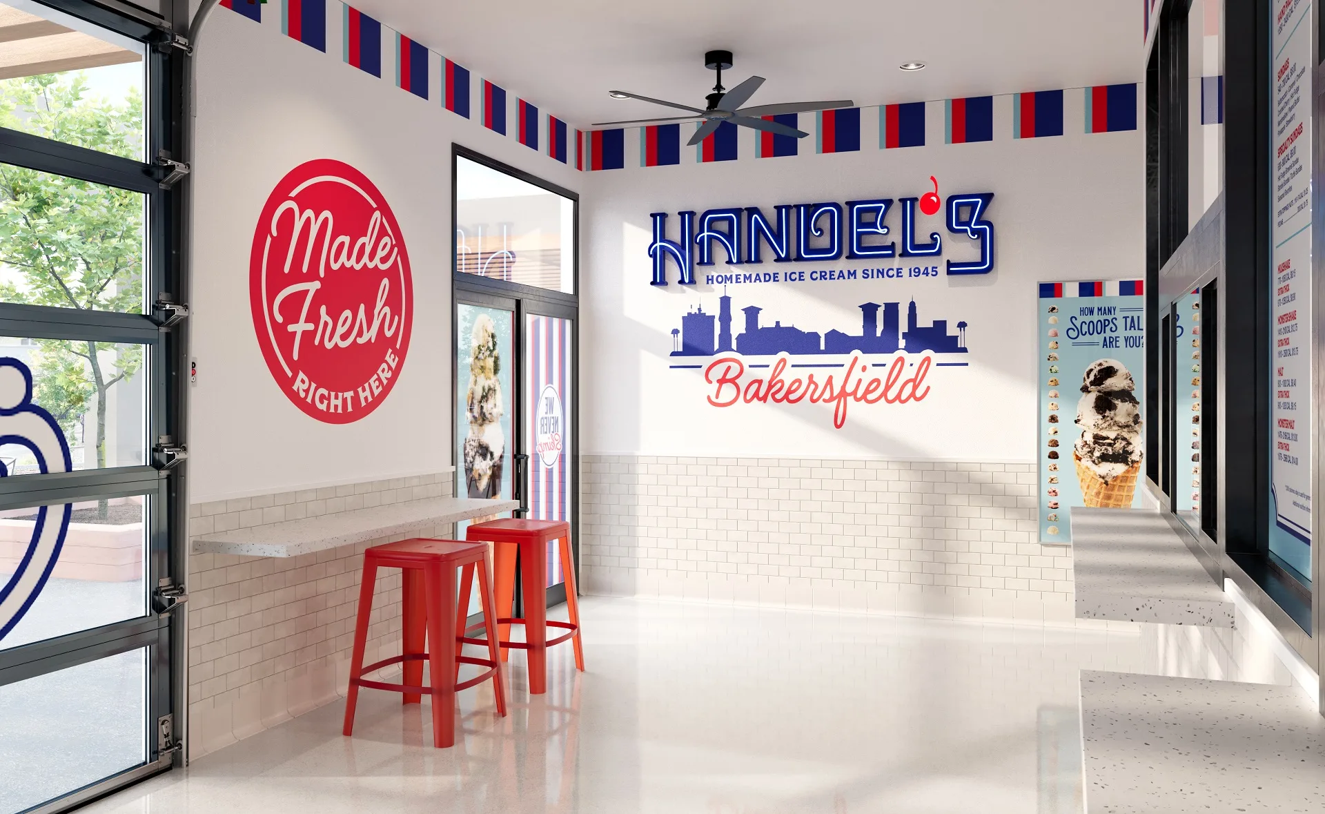
If the exterior gets a franchisee through the landlord’s door, the ice cream shop interior design is what closes the deal with permitting authorities and investors who want to see a fully realized concept. Handel’s interiors follow a consistent visual language: a red-white-blue striped border running along the upper wall, white subway tile or beadboard wainscoting behind the counter (varying by location), branded menu boards with flavor imagery, and signature wall decals — including the “Made Fresh Right Here” roundel — that anchor the brand story.
ArchiCGI’s interior renderings capture all of this at a level of detail sufficient for construction planning — not just aesthetic approval. Equipment dimensions, counter depths, ceiling heights, and material finishes are all rendered to specification.
Counter and Service Area Design
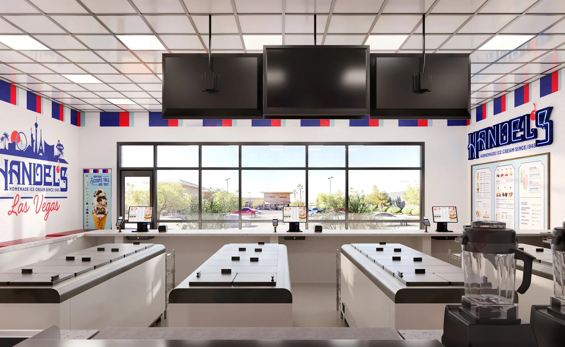
The ice cream shop counter design is where brand meets operations. Handel’s counters house a full run of dipping cabinets — chest-style freezers with hinged metal lids — flanked by service sinks, point-of-sale stations, and secondary storage freezers. The counter configuration determines customer throughput, staff movement patterns, and sightlines from the entrance.
In the renderings, every element is positioned per operational specifications: cabinet spacing that allows staff to pivot between flavors without collision, counter heights that accommodate both adult and child customers, and clearance behind the counter for back-of-house access.
Menu Boards and Wall Branding
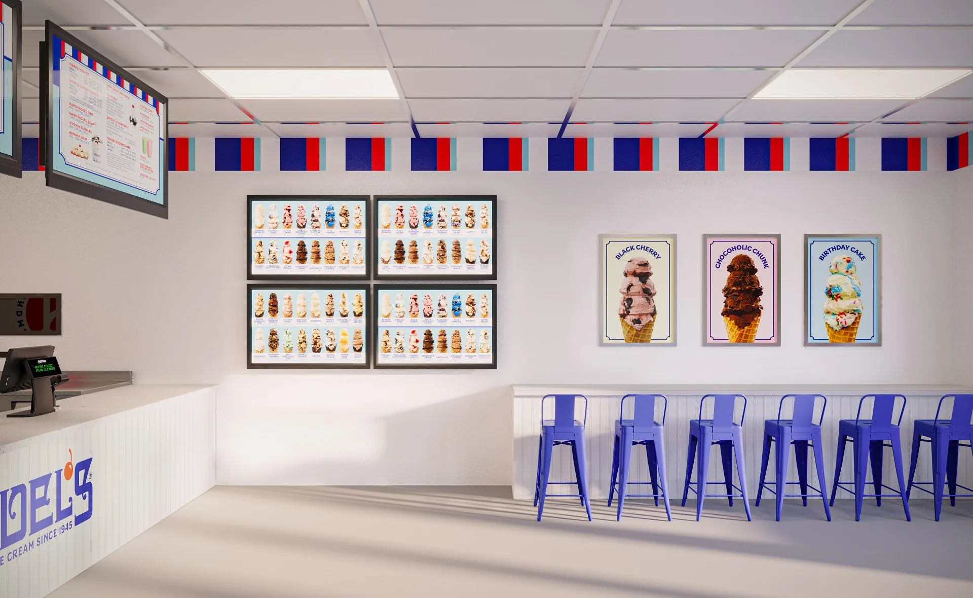
The ice cream shop menu design is a branding workhorse. Handel’s uses printed menu boards featuring full-color flavor visuals — mounted overhead and along the walls — alongside large-format flavor posters (Black Cherry, Chocoholic Chunk, Birthday Cake) that double as decor. The boards carry the same red-white-blue palette as the rest of the interior, reinforcing brand identity at the exact point where the customer is making a decision.
Wall branding extends beyond the menus. Large-format flavor posters in branded frames, the “Made Fresh Right Here” roundel decal, and the signature striped border treatment layer heritage cues onto a clean, contemporary commercial interior. In the renderings, these elements are placed with precise attention to sightlines: what the customer sees first upon entry, what draws their eye while waiting in line, and what reinforces the brand message at the point of purchase.
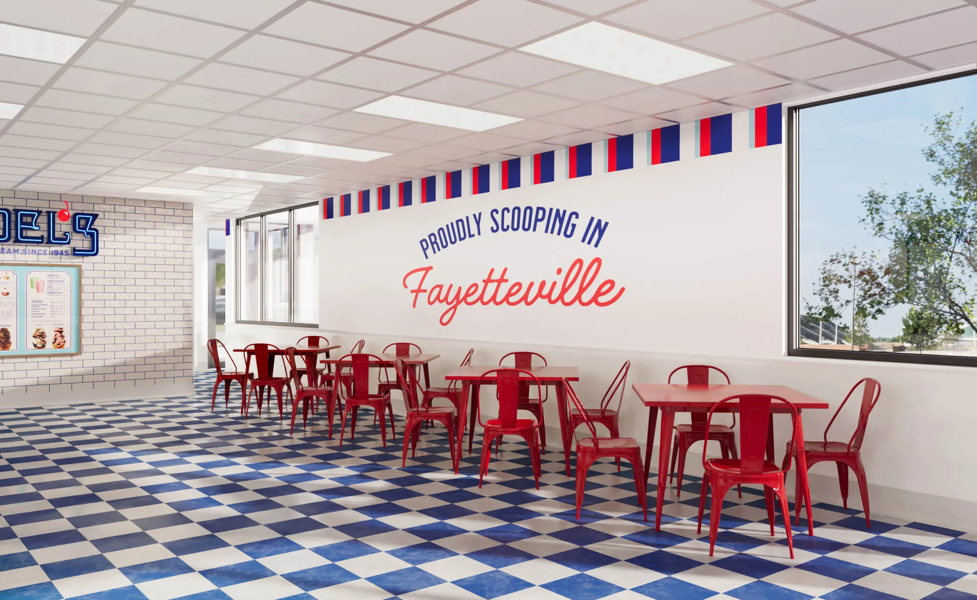
Localized Wall Decals — “Proudly Scooping In…”
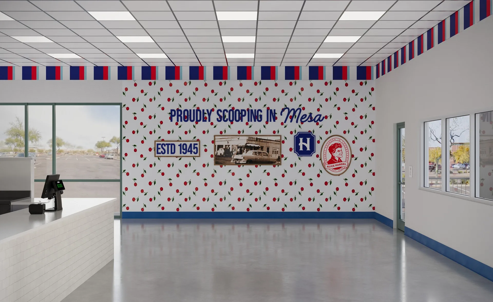
One of Handel’s most distinctive brand elements is the localized wall treatment: a prominent decal reading “Proudly Scooping In [City Name]” that gives each location a sense of place. It’s a small detail with an outsized impact — it signals to customers that this isn’t a generic chain outpost but a store that belongs to their community.
Each rendering includes the location-specific version of this wall element, positioned in its designated spot within the interior layout. For franchisees presenting to local stakeholders, this detail often lands harder than any other single element in the rendering package.
Ice Cream Shop Layout — From Floor Plan to 3D
An ice cream shop layout that works on paper doesn’t always translate to a space that works in practice. The jump from a 2D floor plan to 3D visualization is where spatial problems surface — and where they get solved before a single tile is laid. ArchiCGI converts flat architectural plans into dimensionally accurate 3D environments that reveal sight-line conflicts, circulation bottlenecks, and equipment clearance issues that are invisible in plan view.
Customer Flow and Service Areas
A typical Handel’s store centers on a single service counter — customers enter, queue facing the counter and overhead menu boards, place their order at the POS station, watch staff scoop from the dipping cabinets directly behind the counter, and either grab a seat at the perimeter bar stools or head out. It’s a one-interface model, not a multi-station flow, and the rendering maps this sequence spatially — showing exactly where the queue forms, how staff move behind the counter between cabinets, and where congestion could build during peak hours.
Seating varies by location and format. Some walk-in stores use a bar-stool ledge along the perimeter wall — casual, compact, designed for quick stops. Others feature a full dining area with metal tables and chairs, creating a sit-down zone separate from the service path. In both cases, the 3D rendering makes the spatial relationship between seating and queue flow legible in a way flat plans can’t — showing whether a four-top blocks the entrance path or a stool run crowds the counter.
Kitchen and Back-of-House Considerations
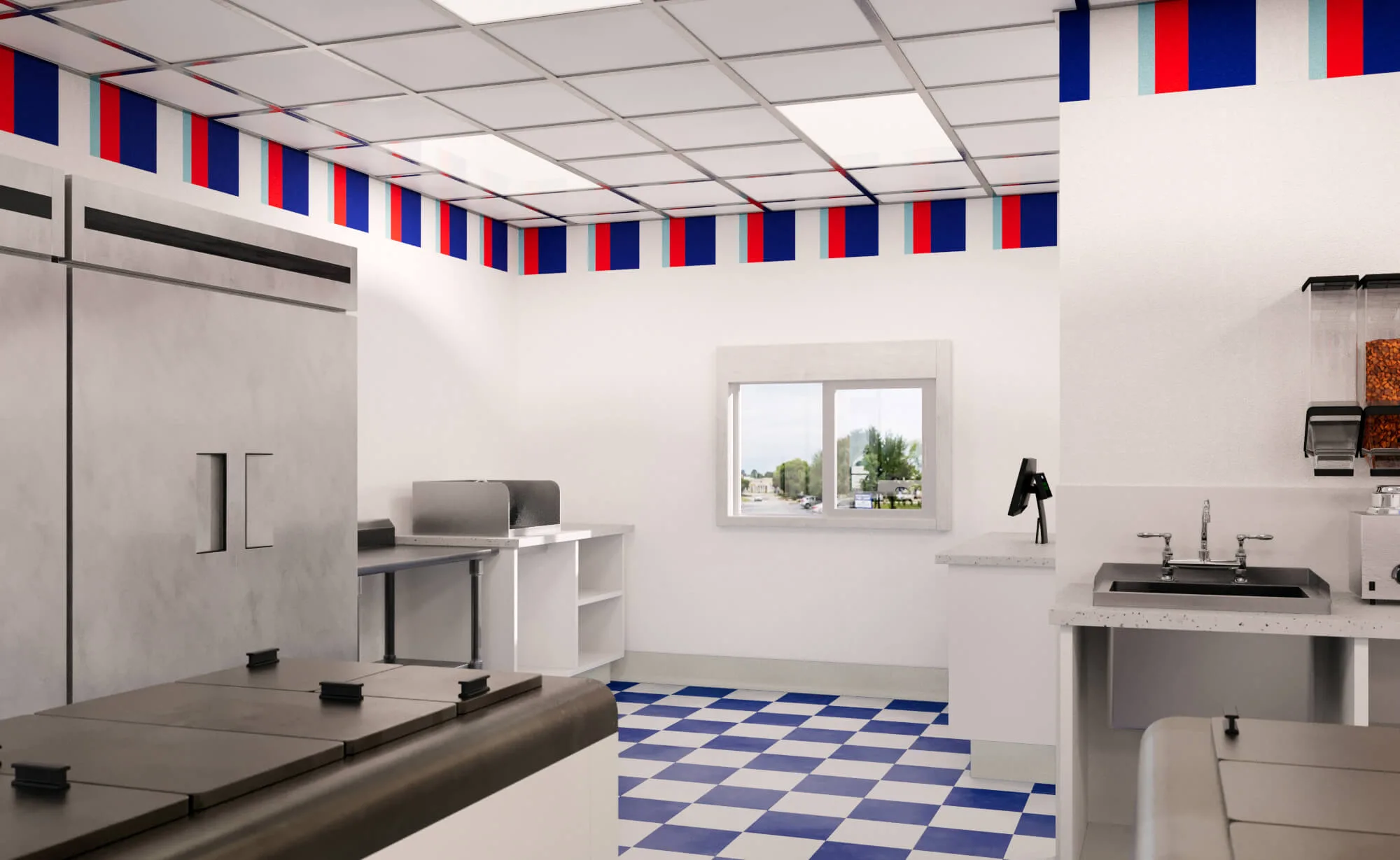
Some locations include a dedicated back-of-house zone rendered with the same precision as customer-facing areas: commercial freezers, drive-thru pickup windows, prep stations, sinks, and topping dispensers all positioned per health-code and operational requirements. The ice cream shop kitchen layout is compact by design — Handel’s product arrives pre-made from the Youngstown production facility — so the back-of-house focuses on holding, portioning, and sanitation rather than production. Permitting authorities review these spaces closely, and a rendering that accounts for utility connections and ADA clearances from the start helps franchisees move through approvals faster.
From Clay Render to Final — Our Two-Stage Process
Every ArchiCGI rendering goes through two distinct stages. First, a clay render — a monochrome, material-free version of the 3D scene that isolates geometry, proportions, and spatial relationships. Think of it as the skeleton of the image: no textures, no lighting, and no colors. Just shape and space.
This clay stage is where structural feedback happens. Are the proportions right? Does the signage scale correctly against the facade? Is the counter depth accurate? The client reviews and approves geometry before ArchiCGI applies materials, lighting, landscaping, and brand elements in the final render.
The result is a two-checkpoint process that eliminates the most expensive kind of revision: discovering a spatial error after the final render is complete. For a multi-location rollout like Handel’s, where the same team is producing dozens of renderings in parallel, this discipline is what keeps quality consistent and timelines intact.
Why 3D Renderings Power Real Estate Proposals
A franchise concept that exists only as a floor plan and a brand deck is an abstraction. A photorealistic 3D rendering turns that abstraction into something a landlord can react to viscerally: “Yes, I can see that on my property.” That shift — from conceptual to concrete — is where renderings earn their cost back several times over.
For Handel’s franchisees, the renderings serve three audiences simultaneously. Landlords see a tenant that will enhance property value. Investors see a concept that’s been thought through down to cabinet placement. And city permitting bodies see a proposal that’s already addressed the spatial, operational, and aesthetic questions they’re going to ask.
Learn more about how 3D renderings help get retail projects approved.
From Pitch Deck to Construction — Renderings That Close Deals
The impact of 3D renderings extends beyond real estate approvals. For Handel’s, renderings have become a franchise recruitment tool: prospective owners see their exact future store — not a generic concept deck — and commit faster.
Once signed, the same renderings carry through to construction. The franchisee has already approved exactly what they’ll get, so there are fewer contractor disputes, no revision rounds mid-build, and no “this isn’t what I pictured” conversations after the walls go up. The rendering becomes the single source of truth from pitch to handover.
Maintaining Brand Consistency Across Locations
Scale is the enemy of consistency. The more locations a franchise opens, the more opportunities for brand drift — a slightly off-palette awning here, a menu board at the wrong height there, a striped border that’s three inches too narrow. Over dozens of locations, these micro-deviations compound into a brand that looks different depending on which store you walk into.
ArchiCGI’s approach locks brand-critical elements — signage dimensions, color values, material specifications, and decorative placement rules — into the rendering workflow so they carry forward automatically from one location to the next. The per-location adaptation happens around these fixed points: the building shell changes, the surrounding context changes, but the Handel’s DNA stays identical.
The result is a franchise that can open its fiftieth location and have it feel indistinguishable in brand terms from the fifth. That’s not a design achievement — it’s a systems achievement.
Get 3D Renderings for Your Ice Cream Concept
Whether you’re developing ice cream parlor design ideas for a single flagship or rolling out a creative ice cream store design across a multi-state franchise network, ArchiCGI delivers photorealistic 3D renderings that move your project from concept to approval. Our team has rendered ice cream shops, restaurant interiors, and hospitality spaces for brands across the food-service industry.
Looking for retail 3D rendering services to support your next franchise rollout? Let’s talk.
Schedule a free demo of 3D solutions for your business

Catherine Paul
Content Writer, Editor at ArchiCGI
Catherine is a content writer and editor. In her articles, she explains how CGI is transforming the world of architecture and design. Outside of office, she enjoys yoga, travelling, and watching horrors.