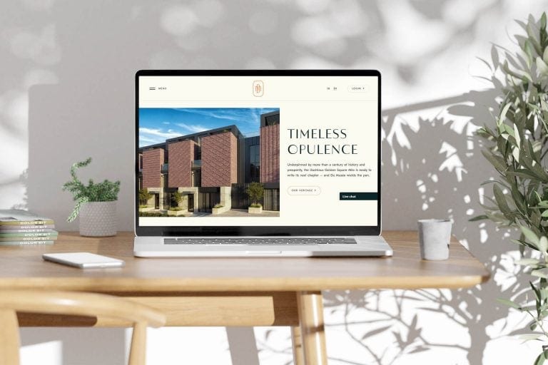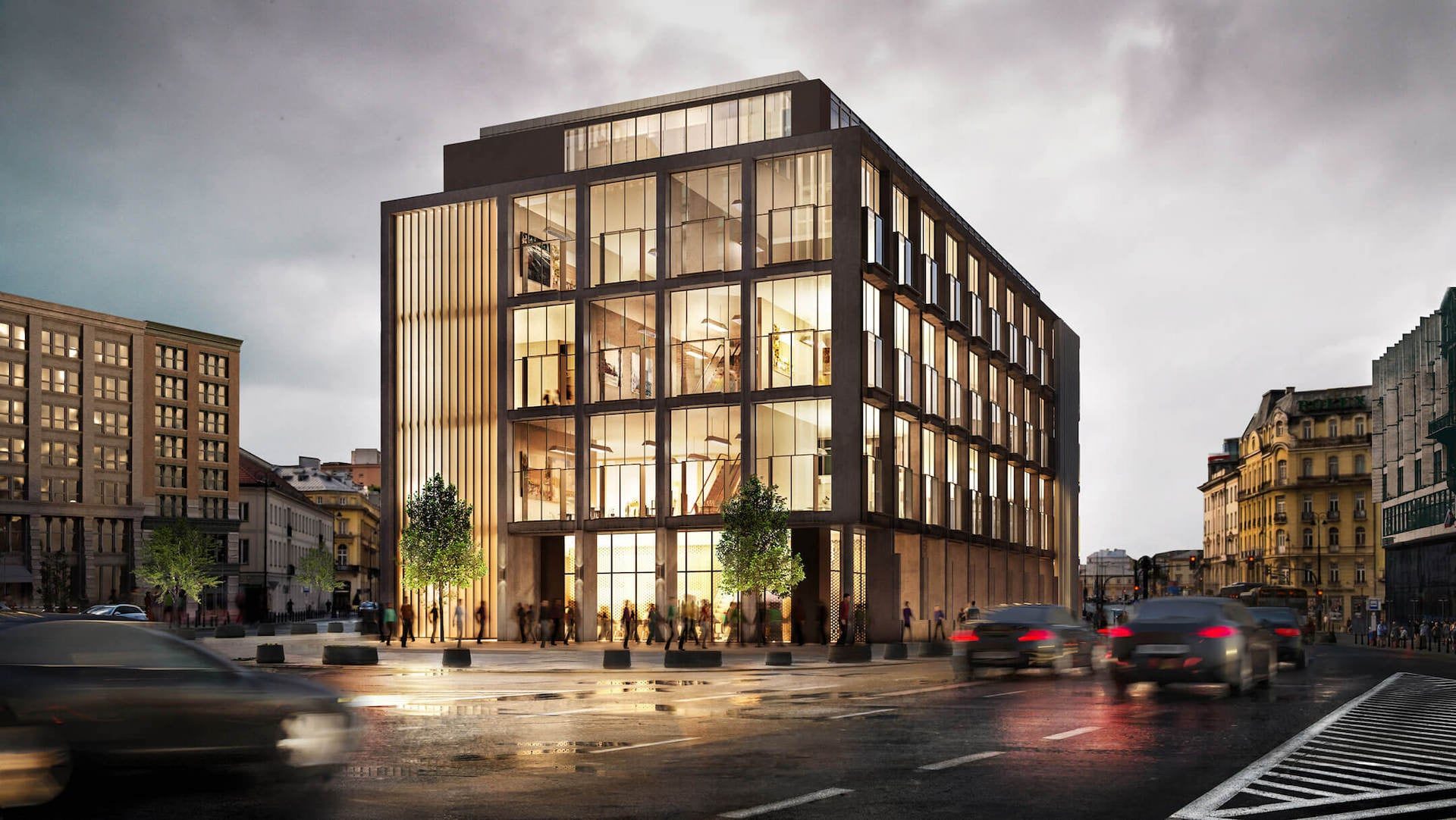


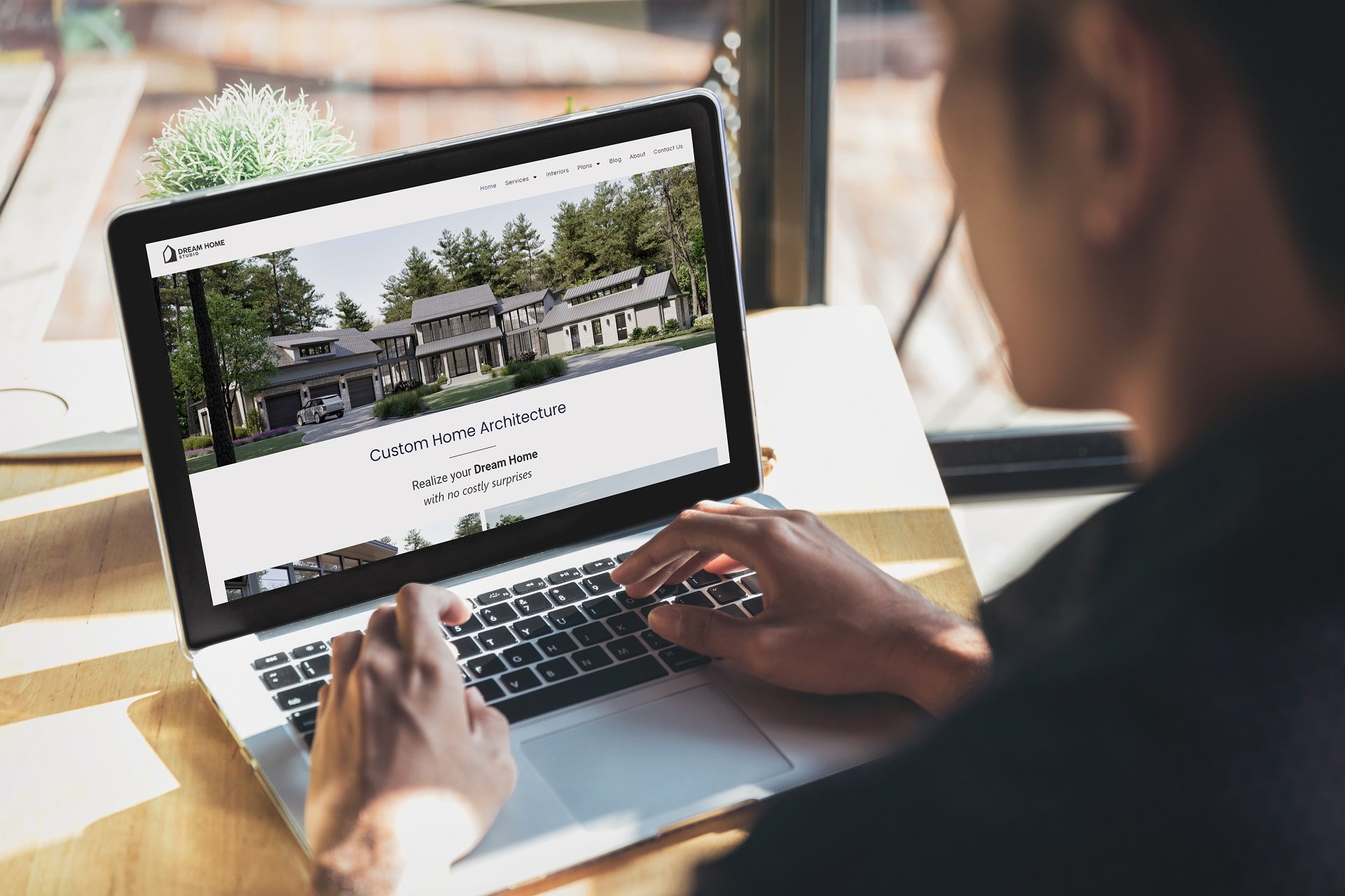
Why does website design for architects matter? A website is often the first point of interaction with prospects. It’s the cover by which the book (in this case, architectural services) will be judged. And often, it takes potential clients just a couple of seconds to close the website if they don’t like it. Usually, this happens because of poor design. A website’s design can make or break the prospects’ impression, and their decision to engage your services.
Our 3D rendering company works with architects around the world, providing the visuals they need to make their online presence look as sharp as the work itself. So, we’ve gathered 7 tips on how to make website design for architects an asset instead of an enemy.
#1. Research Your Target Audience and Cater to It

Knowing who your audience is (what they’re looking for, how they browse, what convinces them to reach out) should shape every decision about the site, from layout and interface down to how the copy sounds. As an example, if as an architect you target homeowners, you may emphasize personalization and comfort. For commercial entities, on the other hand, it might be better to focus on functionality and innovation.
Be very specific about your website’s target audience. Don’t stop at a vague idea like “middle-class people who need residential design.” Instead, it’s better to create detailed client personas and use them in planning website design for architects. Personas are fictional representations of your ideal clients. They include demographics, preferences, and architectural needs. Here’s what architects’ client persona can look like.
Residential Remodeling Client
Name: Emily Thompson
Age: 40-50
Occupation: Marketing Director
Location: Suburban area, San Francisco Bay Area
Family status: Married, two children aged 8 and 12
Interests: Home design, sustainability, gardening, technology
Technological proficiency: High (uses technology daily for both personal and professional purposes)
Key characteristics:
- Values quality and has a high appreciation for aesthetics.
- Prefers environmentally friendly and sustainable building materials.
- Seeks a functional home space that accommodates a busy family life.
- Often researches extensively before making major decisions.
Goals with the remodeling project:
- To create an open, flexible living space that blends indoor and outdoor environments.
- To increase the home’s energy efficiency and reduce carbon footprint.
- To have a modern, tech-friendly home that simplifies daily routines.
Pain points:
- Overwhelmed by the choices in materials and technologies available.
- Concerned about the duration of the project and the impact on her family’s daily life.
- Anxious about staying within budget without compromising on quality and sustainability.
Media consumption habits:
- Frequently uses Pinterest and Instagram for design inspiration.
- Reads blogs and magazines about modern home design and sustainable living.
- Prefers video content for understanding complex subjects like smart home technology.
How your website can cater to Emily:
- Showcase a portfolio that emphasizes modern, sustainable residential projects.
- Provide clear, accessible information on the latest home technology integrations.
- Feature client testimonials focusing on efficiency, satisfaction with the final product, and adherence to budget and timeline.
- Include a blog with articles on sustainable materials, home automation, and trends in home design.
- Offer an easy-to-navigate gallery with high-quality images and descriptions of past projects. Highlight before-and-after transformations.
#2. Optimize for User Experience (UX)

Beautiful website design for architects means little if it isn’t functional. Here are some tips for ensuring a website’s functionality.
- Your website navigation should let visitors find what they need within a couple of clicks. That sounds obvious, but most firm websites bury key information under vague menu labels or sprawling dropdowns. How many items belong in a main menu? Seven is a reasonable ceiling. Beyond that, visitors spend more time parsing the menu than actually using it (and bounce rates reflect this). For an architectural firm, a menu might run: Home, About Us, Portfolio, Services, Blog, Contact Us. Six items. Each one maps to a clear intent a visitor already has when they arrive.
- Labels matter as much as structure. “Our Process” tells a visitor what to expect. “Solutions” does not. Use language your audience already thinks in, if a potential client would search for “residential projects,” don’t file that work under “Endeavors.” It is best to avoid vague or too creative labels. They might confuse visitors about what content they can expect under each section. So, instead of “Creations” use “Portfolio”; instead of “Insights” use “Blog”. This ensures that users know exactly what they will see without second-guessing.
- For architects’ websites with a large amount of content or a comprehensive portfolio, including a search bar helps users find specific projects or information quickly. Make sure the search feature is easy to find and use.
- Use breadcrumbs. They are navigational aids that show users their current location on the site and provide links back to parent pages. Breadcrumbs are especially useful on architects’ websites with multiple levels of content hierarchy.
- Optimize for mobile. Your navigation needs to work just as well on a phone screen as it does on a desktop monitor. A responsive menu that collapses into a hamburger icon (the three horizontal lines) and expands on tap is the standard approach. Visitors expect it, and anything clunkier will cost you bounce rate. With mobile devices accounting for over 60% of internet traffic as of 2024, a site that’s awkward to navigate on a phone isn’t a minor inconvenience. It’s where the majority of your visitors are having their first impression.
- Also, optimize your website’s loading times. This can be done by compressing images and using modern coding practices. Speed enhances user satisfaction and boosts SEO rankings.
#3. Showcase Your Portfolio Effectively
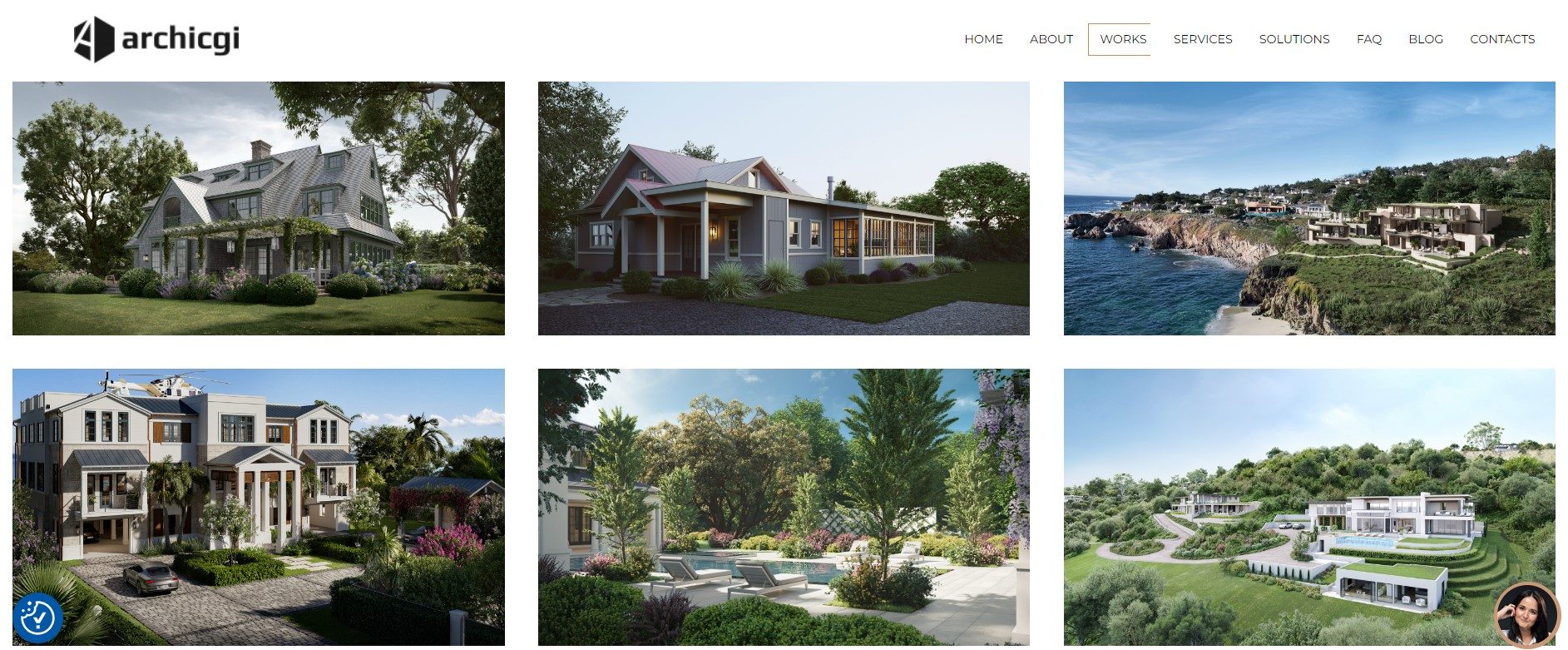
Architecture professional portfolio is the cornerstone of your website. It should not only display high-quality images and videos of completed projects but also tell compelling stories. Use professional copywriting to create engaging case studies. They should provide insights into the design process and the value delivered through your work. Ensure that the portfolio is diverse yet focused, highlighting the types of projects you wish to attract more of. Be cautious about including works that no longer align with your architects’ firm’s direction.
Using CGI is an effective way to ensure architects have high-quality visuals to demonstrate their approach. This tool helps showcase how the yet unfinished projects will look when ready. Before/after comparison can be incredibly efficient as well, especially if you work with renovations. For example, you can demonstrate a 3D render showing what you promised at the start of the project and photos of a finished home taken afterward.
Want to learn how much your project costs? See how we evaluate 3D rendering projects

#4. Implement Strong Calls-to-Action
CTAs are vital in guiding visitors through the architects’ website and directing them towards taking action. It may be contacting your firm, downloading a price list, and so on. Place CTAs strategically across your website to catch attention without being overwhelming. Use clear, compelling language that incites action. Vary the types of CTAs to cater to different user engagements, from signing up for newsletters to scheduling consultations.
Examples of effective CTAs for architects:
- Schedule Your Free Consultation Today
- Join Our Newsletter for Exclusive Insights
- Request a Project Estimate
- Explore More Designs
- Contact Us Today
And here’s a practical example of how a CTA can look:
Get your project estimated in just 1 hour - fill out this brief!
#5. Leverage SEO Best Practices

Optimize your website for search engines to increase visibility and attract more traffic.
- Figure out what potential clients are actually typing into Google when they search for firms like yours. Tools like Google Keyword Planner, Ahrefs, or SEMrush show you search volume and competition for specific terms. “Residential architect in [city]” behaves very differently than “architecture firm.” Once you’ve identified the right keywords, work them into your page copy and headings naturally. Stuffing them in where they don’t belong reads poorly to visitors and search engines alike.
- Regularly create valuable content. This can be blog posts that address common questions or topics of interest to your clients.
- Finally, ensure all meta tags are optimized. They include URLs, titles, descriptions, and headers. This helps to improve your site’s search engine ranking and draw more relevant visitors.
No need to look for examples further than this article. If you’re reading it (and especially if you’ve gotten this far), there’s a very high chance you googled something like “website design for architects”. And that was because you wanted to know how to create one. This is your search intent and we’ve created and optimized content for it.
#6. Integrate Client Reviews

Testimonials do more conversion work than most firms give them credit for. A prospect browsing your portfolio thinks “this looks good”. A prospect reading a quote from someone in their industry thinks “this worked for someone like me.” That second reaction is closer to a buying decision.
Feature them on your homepage and service pages, not buried on a standalone testimonials page nobody clicks. Photos attached to quotes outperform plain text (a face makes the endorsement feel like a person, not a copywriter). Video clips go further: even two or three short ones can shift how a prospect perceives your firm before they ever reach out.
#7. Use Analytics to Continuously Improve

Finally, the design and optimization of your website should be an ongoing process. Use tools like Google Analytics to track how visitors interact with your site. Focus on key performance metrics. They include:
- Bounce rate. It measures the percentage of visitors who leave your site after viewing only one page. A high bounce rate can indicate that your pages are not relevant or engaging enough to encourage visitors to explore further. This could be due to a variety of reasons, including poor page design, unclear navigation, or irrelevant content.
- Pageviews measures the total number of pages viewed by visitors. This metric helps you understand the overall traffic and engagement level on your site. Obviously, the more, the better.
- Average session duration. Longer sessions typically suggest that visitors find your website valuable and spend time reading your content or exploring different pages.
- Conversion rate is the percentage of visitors who complete a desired action on your site, such as filling out a contact form, signing up for a newsletter, or requesting a quote. It is a direct indicator of your website’s effectiveness.
Regularly review these metrics and use the insights gained to make improvements. This will ensure your website remains effective and relevant to your audience’s needs.
Schedule a free demo of 3D solutions for your business
Website design for architects that attracts and engages ideal clients requires a mix of strategic content, technical skills, and continuous optimization. By following these 7 steps, you’ll create a site that highlights your expertise and approach, resonating with potential clients.
A good site needs something worth showing. 3D rendering services for architects fill the pages with photoreal projects, including the ones still under construction, and our architect marketing guide covers the channels that bring visitors to the site in the first place.
Ready to elevate your architectural firm’s online presence with stunning 3D visuals? Contact us today to see how our expert real estate 3D rendering services can bring your projects to life. Related reading: how architects use Houzz.

Stacey Mur
Content Writer, Copywriter
Stacey is a content writer and a CG artist. Outside of work, Stacey enjoys musicals, Star Wars, and art talk. A proud Corgi parent.