Five things decide how good a realistic architectural rendering actually is. Precise geometry. Accurate scale. High-resolution photorealistic textures. Natural lighting with correct shadows. And solid composition. These rules work the same way for exteriors and interiors. A photorealistic 3D rendering either hits these marks or it doesn’t.
Geometry and scale come first. Every object in a scene has to match real-world proportions. Put a door handle at the wrong height or give a window frame sloppy edges, and the whole image falls apart before anyone notices the textures. Speaking of textures, they need to be high-resolution and physically accurate. Wood grain should follow the surface shape. Concrete should have variation in it. Glass has to respond to light the way actual glass does.
Then there’s lighting. Lighting and shadows are the difference between a high quality 3D rendering and something that looks flat and fake. Light sources have to behave consistently across the scene. Some surfaces absorb light, some reflect it, some transmit it. There shouldn’t be any blown-out highlights or patches that are too dark. What really pushes a good 3D photorealistic rendering into “is this a photo?” territory is imperfections. A flawless scene looks fake. Subtle wear on edges, slight color variation in materials, and natural irregularities in surfaces are what make professional 3D rendering actually convincing.
To understand how quality standards differ across the five distinct types of photorealistic architectural visualization, check the detailed breakdown. And for a real-world example of how all of this comes together, take a look at the hyperrealistic 3D rendering for a hotel concept project.
If you want to go beyond standard quality into genuinely exceptional work, the 5 secrets of hyperrealistic visualization from professional 3D artists covers the techniques that make the difference.
Below, we break these quality signs down by rendering type. First, a quick checklist of universal quality markers. Then, what photorealism actually means in practice. After that, specific criteria for exteriors and interiors. And finally, common quality issues to watch for when reviewing renders or evaluating studios.
High quality architectural 3D rendering meets seven standards:
- Precise geometry. Every structural element has clean edges, accurate proportions, and no visible mesh errors.
- Photorealistic textures. Materials look physically convincing, with correct grain direction, natural variation, and accurate reflectivity.
- Realistic lighting. Light sources behave consistently across the scene with no blown-out highlights or flat shadows.
- Accurate shadows. Shadow direction, softness, and intensity match the light setup, with contact shadows anchoring objects to surfaces.
- Balanced composition. The main subject dominates the frame while background elements stay in a supporting role.
- Intentional imperfections. Subtle wear, surface irregularities, and slight color shifts keep the scene from looking sterile and obviously CG.
- Consistent scene logic. Seasons, clothing, reflections, and lighting all tell the same story with no contradictions.
Use this as a checklist when reviewing high quality architectural renderings. The same standards apply to realistic architectural renderings of both exteriors and interiors. The sections below cover the type-specific quality signs.
The gap between a mediocre render and a convincing photorealistic 3D rendering comes down to five elements. Get all of them right, and you end up with an image that people genuinely can’t tell apart from a photograph.
- Realistic geometry and proportions. Geometry is the skeleton. Walls have to meet at precise angles, curved surfaces need smooth subdivision, and every structural element should match real-world dimensions. A photo realistic architectural rendering falls apart the moment a ceiling height feels off or a staircase has the wrong rise-to-run ratio. Simple test: if an architect looks at the image and something feels spatially wrong, the geometry needs work.
- High-resolution photorealistic textures. Textures give surfaces their identity. In high quality photorealistic 3D renderings, every material has the right detail level for the camera distance: wood grain follows the object’s shape, tile grout sits at correct depth, fabric shows the right weave. Resolution matters most up close, where a kitchen countertop needs much higher detail than the same material seen from across the room. Stretched, blurry, or obviously repeating textures are still one of the most common quality failures out there.
- Accurate lighting and shadows. Lighting makes or breaks it. In a good 3D photorealistic rendering, light sources behave the way they do in the real world: sunlight enters at the right angle for the time of day, artificial lights produce the correct color temperature, and ambient light fills a space naturally instead of evenly. Shadows follow the same logic, sharp under direct light, soft under overcast skies, always falling in a consistent direction. For a detailed look at how lighting decisions actually get made, check Chapter 6 on the rendering process.
- Material behavior: reflection, refraction, and absorption. Every surface interacts with light differently, and photorealistic 3D renderings have to get that right. Glass transmits and refracts, polished stone reflects at a low angle, matte concrete absorbs light with barely any bounce. This gets especially tricky in photorealistic interior rendering, where marble floors, glass partitions, and metallic fixtures sit next to each other and each responds to the same light source in its own way. A glossy surface that looks flat or a mirror that doesn’t show the actual room will kill the illusion fast.
- Small imperfections: wear, dust, and wrinkles. Here’s the weird part: perfection ruins realism. Real spaces have entropy: fingerprints on glass, slight discoloration where materials meet, dust in crevices, soft wrinkles in upholstery. Professional 3D rendering studios add these details on purpose because a spotless scene reads as CG immediately. Done well, you don’t notice them at all. Left out, you notice their absence right away.
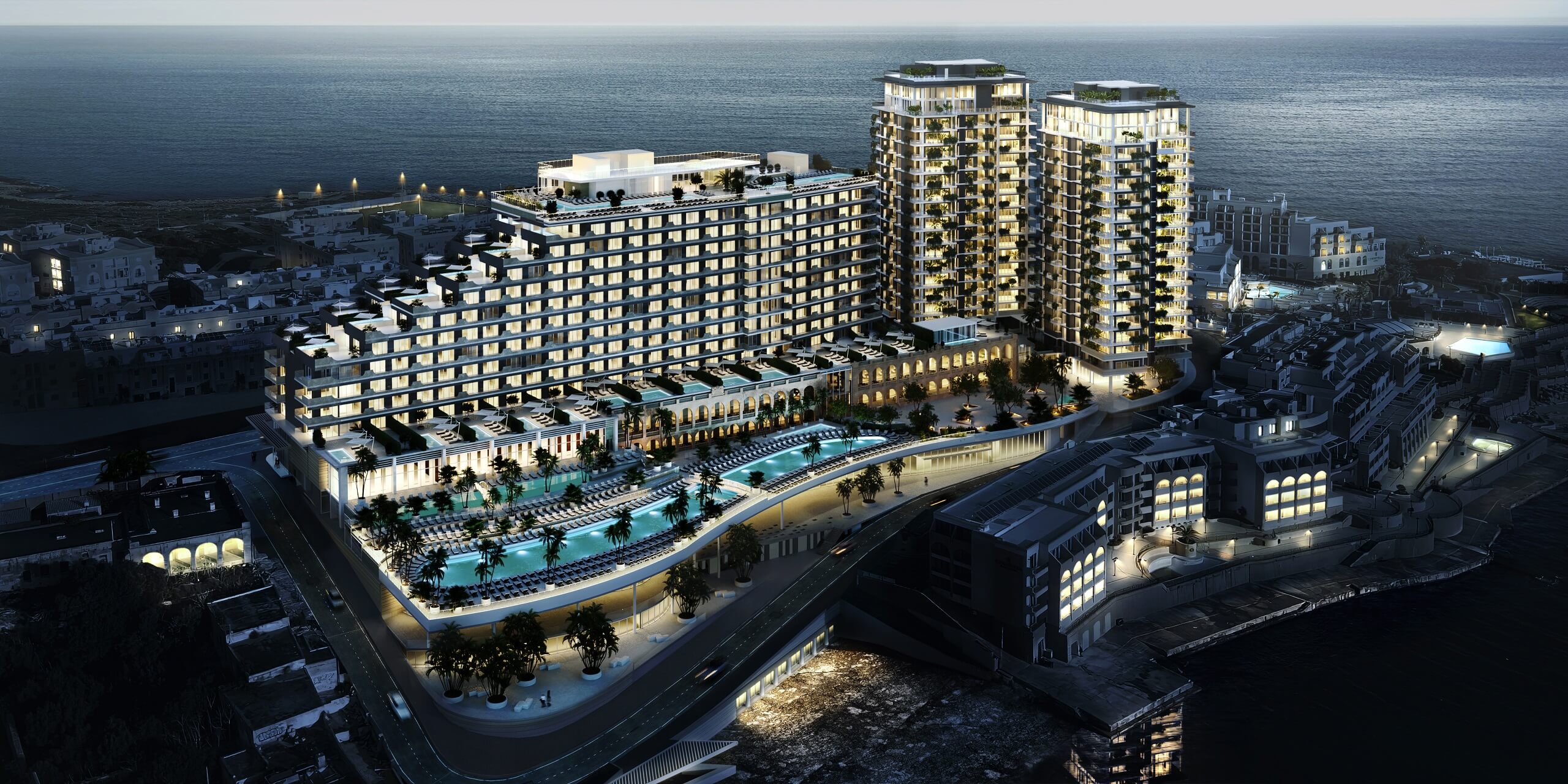
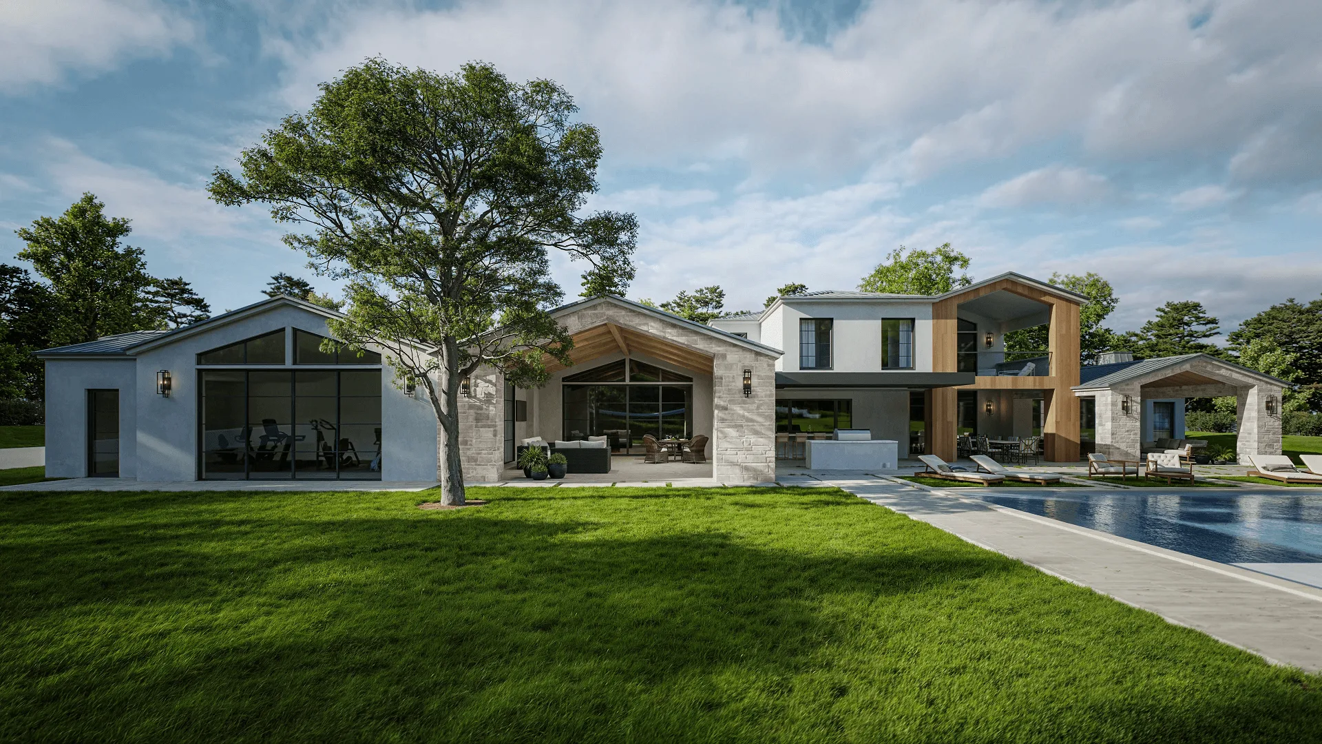
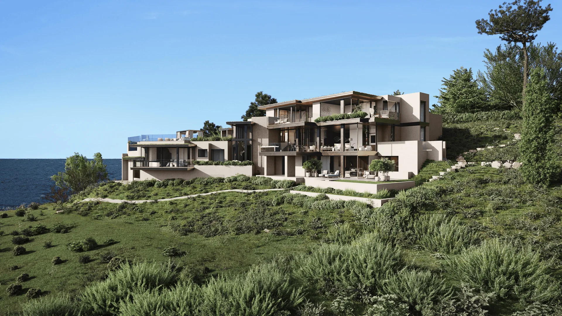
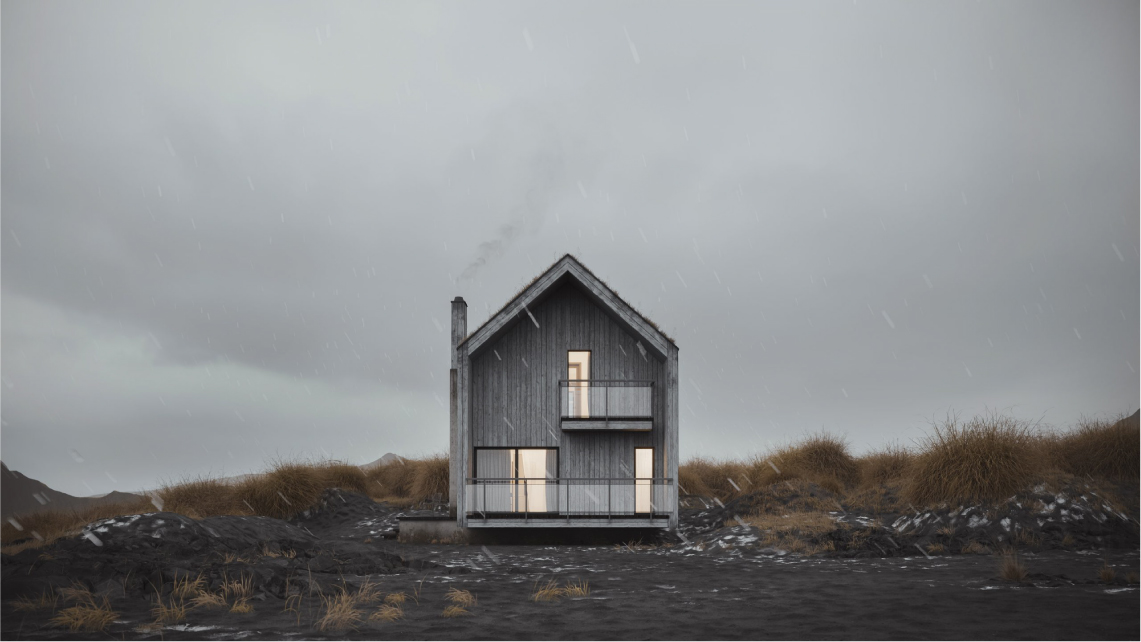
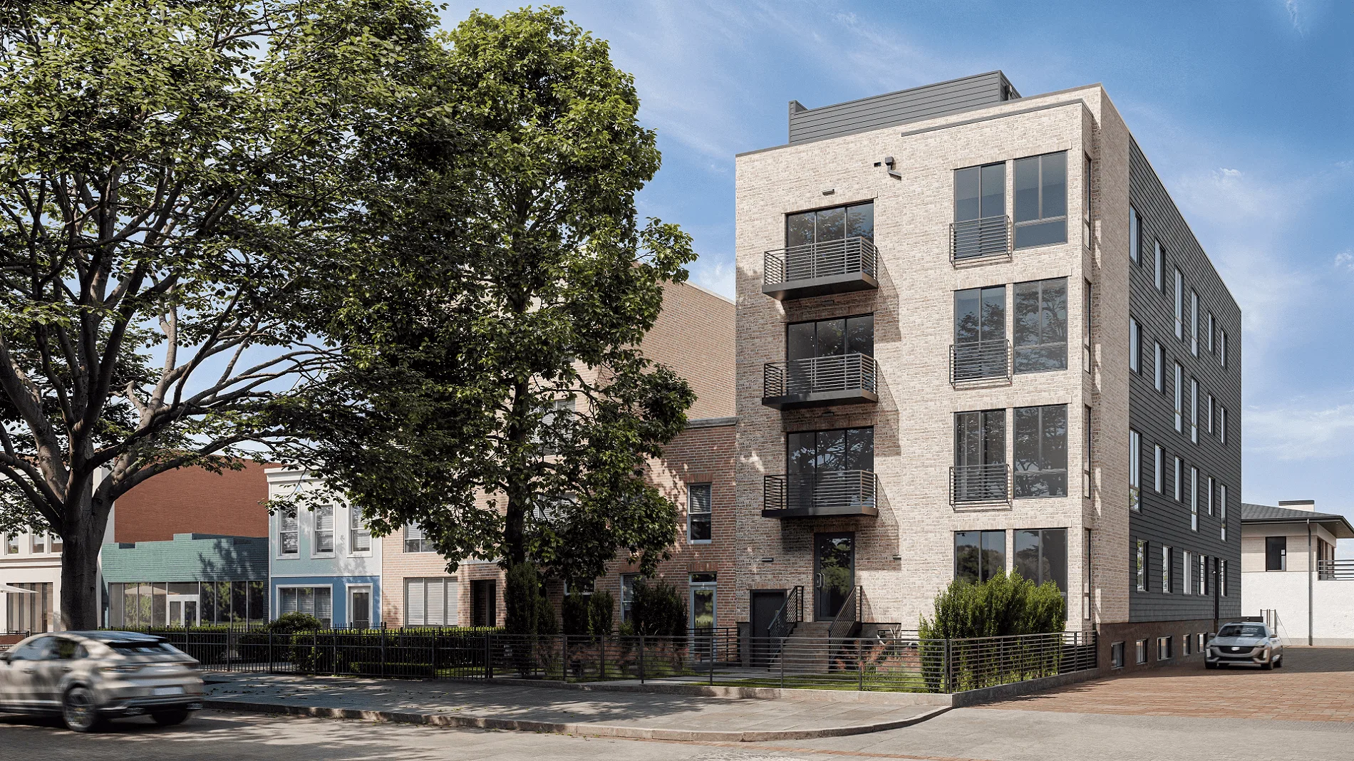
Exterior scenes are tough because you’re not just rendering a building. You’re rendering a building inside an entire environment. Sky, landscape, street context, weather. A realistic architectural rendering of an exterior works when the building looks like it belongs there, not like someone dropped it onto a stock photo background.
- The building dominates the composition. It should be the obvious focal point. Trees, neighboring buildings, sky: they support the scene but don’t fight for attention. If your eye wanders away from the architecture, the framing needs work.
- Perspective and angles are physically accurate. Wrong vanishing points or lens distortion will make a building look disproportionate. In a photo realistic architectural rendering, vertical lines stay vertical (unless there’s a deliberate tilt-shift effect going on), and the camera angle looks like something an actual photographer would shoot from.
- Environmental context is consistent. If the light says late afternoon in autumn, the vegetation has to match. Shadows need to fall at the right angle. People in the scene should be dressed for that weather. Put summer trees under winter light and the whole image stops making sense.
- Landscape and hardscape feel natural. Grass doesn’t grow in perfect rows. Gravel varies. Paving stones shift slightly in color and alignment. Realistic architectural renderings of exteriors demand the same texture care for the surroundings as for the building itself. A stunning facade on a flat, plastic-looking lawn loses all credibility.
- Atmospheric effects are present. In real outdoor scenes, distant objects lose contrast. Air carries a subtle haze. Light scatters differently depending on the weather. These effects are what give a render actual spatial depth instead of looking like a scale model.
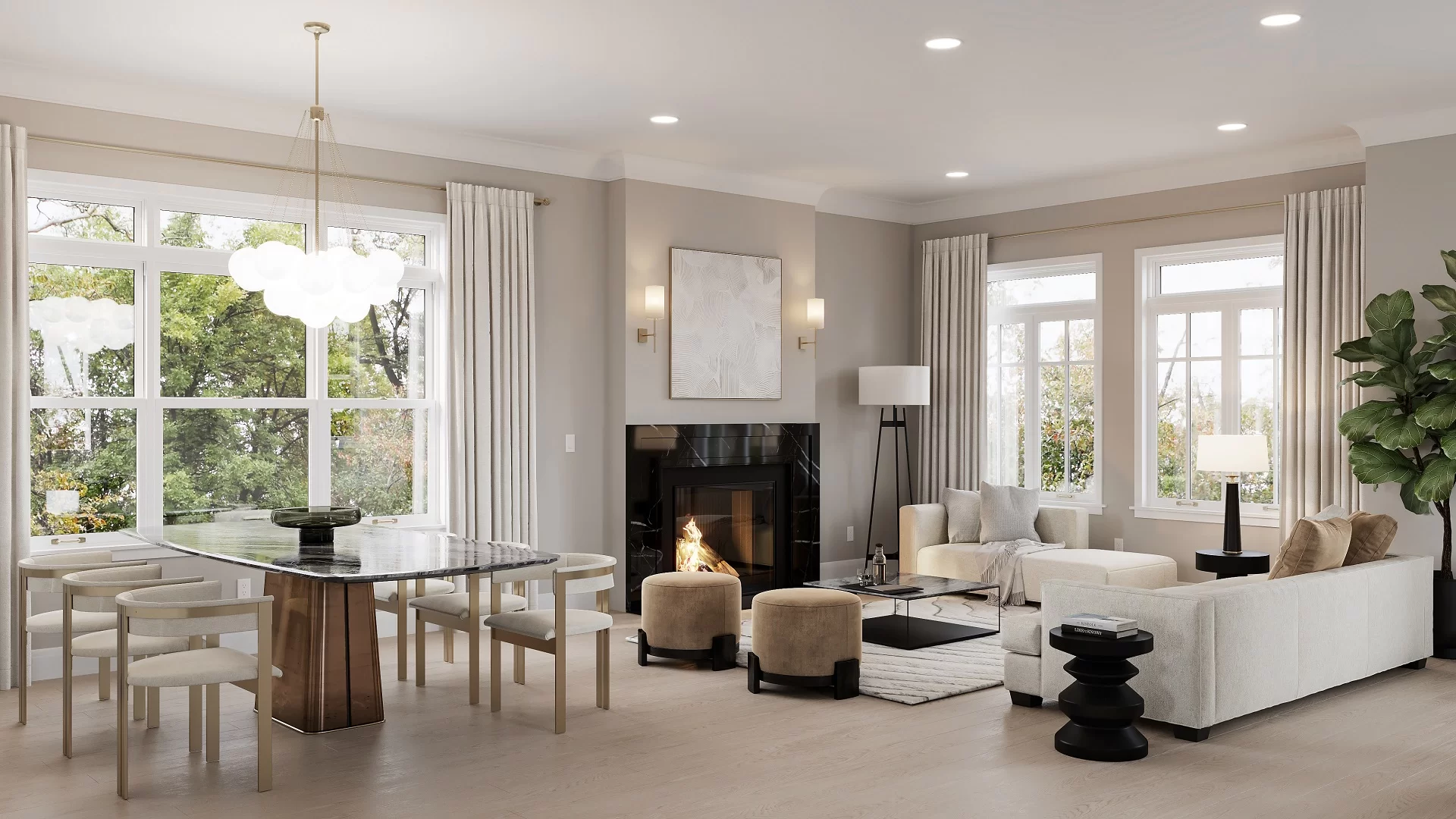
Interiors are harder to fake. People know what rooms look like. They live in them. A photorealistic interior rendering gets scrutinized more than exterior work because the camera is closer, the materials are more familiar, and there’s nowhere to hide mistakes.
- No geometric intersections or floating objects. This is the bare minimum. Chair legs touch the floor. Cushions compress against surfaces. Nothing clips through anything else. In photorealistic digital interior renderings, these errors are like typos in a headline. Small, but you can’t unsee them.
- Furniture is scaled to real-world proportions. Make a sofa 10% too large and the room feels cramped. Set a dining table at the wrong height and the chairs look weird. Everything should match manufacturer dimensions or standard ergonomic specs. Quick test: if there are people in the scene, do they look natural using the furniture?
- Decor adds atmosphere without creating clutter. Books, plants, kitchen stuff, bathroom accessories. These bring a scene to life, but too many of them create visual noise. In a good realistic 3D render, every decor item earns its spot. It sets a mood, supports the design style, or draws the eye somewhere useful. If you could remove it and nothing would change, it shouldn’t be there.
- Patterns and textures follow the geometry. Herringbone flooring has to align at walls and transitions. Upholstery wraps around cushion edges with natural stretching. Wallpaper matches at seams. A lot of interior renders get this wrong. The texture itself might be high quality, but if it’s applied flat without following the object’s shape, it looks like a sticker, not a real material.
- Interior lighting feels layered. Real rooms have multiple light sources working together. Daylight through windows, ceiling fixtures, table lamps, under-cabinet strips. Each one adds something different. A photorealistic interior rendering needs to show that: warm pools from accent lights, cooler tones from daylight, soft gradients on walls. One flat light across the entire room is how you spot amateur work.
Knowing what good looks like is half the job. The other half is recognizing bad work when you see it. This matters most when you’re reviewing studio portfolios or looking at first drafts. Here’s what separates professional 3D rendering from work that does more harm than good.
- Flat, uniform lighting. Everything is lit the same way with no variation in intensity, color temperature, or direction, usually because someone used a single ambient light instead of a proper setup. How to spot it: if there’s no visible light source and shadows don’t fall in any particular direction, the lighting is flat.
- Oversaturated or unnatural colors. Grass looks neon green, sky is aggressively blue, wood is uniformly orange. Usually a post-processing problem where saturation got cranked to cover up weak textures. How to spot it: put the render next to a photo of similar materials and see if the colors look cartoonish.
- Visibly repeating textures. The same brick pattern or grass tile repeats in an obvious grid across a surface, which is a sign of low-effort material work. How to spot it: look at any large surface and scan for a repeating unit. Your eye picks it up fast, especially on organic materials.
- Geometric intersections and floating objects. Furniture legs sink into floors, wall corners don’t line up, or objects hover above surfaces. Basic modeling errors that any 3D rendering professional workflow should catch in the first QA pass. How to spot it: zoom into contact points where objects meet floors, walls, and each other.
- Inconsistent shadows. Shadows on one side of the scene fall left while shadows elsewhere fall right, or some objects cast shadows and adjacent ones don’t. How to spot it: pick three or four objects and trace their shadow direction. They should all point the same way.
- Scale errors. Door handles at waist height, windows you couldn’t reach, ceiling fans that look tiny. Proportion mistakes that feel off even when you can’t explain why. How to spot it: imagine yourself standing in the scene and see if anything feels uncomfortably big or small next to a person.
- Blurry or low-resolution backgrounds. The foreground looks sharp but background buildings, trees, or sky drop off in quality noticeably. Some depth-of-field blur is intentional, but when the whole background looks uniformly soft, the studio probably cut corners. How to spot it: check the transition from foreground to background. In good work it’s gradual; in bad work it’s abrupt.
One issue by itself might be a mistake. Multiple issues in the same image point to a bigger problem, and a good reason to ask for revisions or look at other studios.